I work on a hobby site, https://peepshowquot.es, which lets you search for your favourite quotes (in gif form) from Peep Show. Check it out!
I use Netlify for hosting the site, as it’s free, fast, and has great CLI tooling and GitHub integrations. But I use AWS S3 for hosting the gifs, as there are many gigabytes of them and they don’t need regular re-deployment.
I wanted to have these gifs available on the subdomain https://images.peepshowquot.es, rather than expose an obscure bucket URL in my application. It took a bit of wrangling – so here’s how I did it.
Create an S3 bucket
I already had an S3 bucket, but it needed to have the same name as the intended subdomain*. So I created one called images.peepshowquot.es and re-uploaded all my gifs into that. I also made it Public and readable by the world, though I can tighten up this security later.
* It’s possible this isn’t needed if you’re going down the CloudFront route – I originally just planned to point my subdomain to the S3 bucket directly, and this is a restriction I’d run into. But for SSL to work, I had to use CloudFront, which sits between my DNS and my S3 bucket, so possibly isn’t opinionated about the name of the bucket. Let me know in the comments if it wasn’t needed!
Create a certificate
Use AWS’ Certificate Manager to create your SSL certificate – you’ll need this to be able to connect via HTTPS. There’s some talk on the internet about this costing $600 per month, which gave me a heart attack, but that’s actually for private SSL certificates. All we need is a (free) public one.
I used DNS for validation, taking the random code it gave me and appending .images to it, as my DNS provider would automatically append .peepshowquot.es to the end of that. So the Name ended up being _some-random-string.images.peepshowquot.es, and the Value was _some-other-random-string.jfrzftwwjs.acm-validations.aws. (note that there is a . at the end of the value – this may or may not be important so I made sure I kept it in).
It didn’t take long for the SSL certificate to go from Pending to Issued.
Create a CloudFront distribution
Go to CloudFront and create a new distribution, using mostly the default settings, but obviously selecting your S3 bucket for the Origin Settings, and your custom SSL certificate in the SSL section.
I also switched away from a couple of the defaults where it seemed to make sense, e.g. allow ‘Compress Objects Automatically’ (reduces data sent over the wire, which is what you’re charged for, so why wouldn’t you?) and ‘Use only U.S., Canada and Europe’ for Price Class (I don’t expect much traffic outside these countries).
Check it works
I visited https://my-random-distribution-ID.cloudfront.net/s1/e1/gifs/1.gif and verified that a) it connected over HTTPS and b) I was looking at a gif. 🎉
Now all that was left was to hook it up to a custom domain.
Point domain to CloudFront
This was surprisingly simple in the end – create a CNAME record with Name images.peepshowquot.es and Value my-random-distribution-ID.cloudfront.net. After waiting a few moments, I loaded up https://images.peepshowquot.es/s1/e1/gifs/1.gif successfully.
I knew what a foreign key was, but I didn’t know the impact of the on_delete callback. Looking around the codebase, other options were used too: :nullify and :cascade. And several searches online didn’t help to explain what any of these actually did.
A colleague pointed me in the direction of the PostgreSQL docs, which explained it for me:
:restrict prevents deletion of a referenced row (i.e. if you try to delete a user in the example above, an error will be raised if there are any revisions associated with that user)
:nullify will set to null (i.e. if you delete a user, any revisions associated with that user will have their created_by_id set to null)
:cascade will cascade the deletion (i.e. if you delete a user, any revisions associated with that user will be deleted too)
Hopefully this post will save another developer from fruitlessly Googling things. Let me know in the comments if this post helped you!
It’s standard practice to set a Cache-Control: max-age=31536000 on assets which are expected not to change, such as images.
This header instructs the browser to cache the asset for 31536000 seconds, which is one year. Which raises two questions for me:
Why a year? Why not ten years, or six months?
Do we actually expect browsers to cache this asset for a year?
Let’s find out.
Why a year?
The short answer is, the protocol doesn’t allow any value longer than a year. In the absence of a “cache this asset forever” header, a year is the longest possible time we can cache for.
The RFC actually says the following, which I find phrased quite vaguely:
To mark a response as “never expires,” an origin server sends an
Expires date approximately one year from the time the response is
sent. HTTP/1.1 servers SHOULD NOT send Expires dates more than one
year in the future.
The header is open to interpretation – a 1 year cache could mean “this asset expires in a year, at which point you should fetch a fresh copy from the server”. Or it could mean “this asset never expires, so don’t ever bother downloading this file again”. Reading the RFC I suppose it should mean the latter, but I don’t think this is commonly implemented in the industry and most people (and systems) will take “max age 1 year” at face value.
There is no explicit Cache-Control: cache-forever option. But everyone seems ok with this because a year is basically forever in the land of the internet. Well, everyone except me – it bothers me that we have no explicit way of communicating our intention! Setting an arbitrarily long max-age feels hacky, and I wish we had a dedicated header value that explained it better.
The closest thing I can find that fits the bill is the Cache-Control: immutable extension. This tells the browser that the asset will not change for the duration of its validity. In other words, if you have an image with a 3 month cache, it’s pointless fetching it again from the server because it won’t have changed, so just serve it from the cache.
You’d be forgiven for thinking that the max-age value would have done that anyway. I’d have thought that if an asset has, say, a max-age: 60, then the fact that it says it’s cacheable for a minute should therefore mean it always fetches from the cache until the asset has expired.
However, if the user has reloaded the page by explicitly clicking the ‘refresh’ button, the browser will often make requests to the server ‘just in case’ to see if the file has changed, even if the local asset in the cache hasn’t expired. In these cases, the amount of data transferred is minimal; the server returns a 304 Not Modified response and thus the browser downloads only a few bytes per asset rather than re-downloading the assets in their entirety. But it’s frustrating that the browser makes these requests if you’ve already explicitly stated that the assets will not change for a year.
That’s where immutable comes in – assets served with the immutable extension will not be re-validated against the server even if the user clicks ‘refresh’ in their browser. immutable is no replacement for (and should be used ‘in conjunction with’) max-age, and it’s worth noting that browser support is currently somewhat limited:
Cache-Control: max-age: 31536000, immutable
So in terms of a “cache forever” header, it looks like the example above is the best option we have for now. It essentially means: “cache for a year – except, don’t cache for a year but actually treat this as ‘never expires’, according to the RFC – and it’s immutable, so don’t go asking the server about this asset ever again. Yes, even if you explicitly refresh the page”.
As an aside: before HTTP/1.1, we did used to set a cache value of longer than one year using the Expires header, which takes a timestamp of expiry rather than a relative time. It was common practice to set an expiry date “to the maximum future date your web server will allow“, which was Sun, 17-Jan-2038 19:14:07 GMT (the maximum value supported by the 32 bit Unix time/date format). This is longer than a year, but still not quite ‘forever’. Anyway, we now use Cache-Control as it’s generally more flexible – Expires should only be used as a fallback for older browsers.
So, do browsers actually cache this asset for a year?
Browsers have a limited amount of cache space they can use. As users browse the web, the cache fills up with more and more content until it’s full, at which point older things start getting dropped from the cache (in what’s known as a “least recently used”, or LRU, cache replacement strategy).
So in order for an asset to stay in a user’s cache for an entire year, we’d need a large enough cache to cope with a year’s worth of internet browsing. Most people don’t even have a big enough hard drive that would be required to accommodate the 1020 GB annual internet use per per household. But even assuming an infinitely large hard drive, most browsers cap their cache to around 100 MB – 200 MB (based on personal experience – citation needed!).
Therefore, it’s highly unlikely a user would see an image on a site and then revisit the site a year later and have the same image served from their cache. In fact, a Facebook study found that in 42% of cases, a cache is no more than 47 hours old.
If a browser is never reasonably expected to cache an asset for a year, why are web developers collectively peddling the lie that they do?
The answer is that the 1 year cache isn’t really expected to apply to the browser itself, but is expected to apply to any intermediate proxies employed by CDNs (Content Delivery Networks) such as Akamai, Varnish, Google’s AMP cache, etc.
CDNs are designed to deal with extremely high levels of traffic, across multiple regions, and thus reduce the load on the origin server. They essentially act as a middle layer between the user and your original server.
When a request is made for an asset via the CDN, the CDN will serve it from its own cache if it exists, otherwise it will fetch the asset from the origin server and then store it in its own cache, to be stored for as long as the Cache-Control header is set. So in this case, the CDN would cache the asset for a year, as it isn’t subject to the same cache restrictions as the browser is.
This can make a big difference to the performance of your server. Think about it.
Browsers are ‘forgetful’ (small cache, regularly cleared) and have major FOMO (a refresh will make additional requests to your server to re-verify that the cached assets haven’t changed), so even if you only have return visitors, your server still has to re-deliver those same assets (or at least a 304 Not Changed response).
If we employ a CDN as middleware, the request for those assets only happens once – by the CDN itself – and all those subsequent repeat requests can be handled directly by the CDN.
And because we can purge CDN caches (something we’re unable to do with users’ browser caches), we can even specify different cache values for the CDN and the browser, to balance the best of both worlds. A shorter cache on the client guarantees their asset doesn’t stay stale for too long if we update our asset, and a longer cache on the CDN minimises revalidation requests on your server.
Cache-Control: s-maxage=31536000, max-age=86400
The above value instructs the CDN to cache your asset for a year, but the browser to cache the asset for a day. If you update your asset, you can instruct your CDN to purge its cache and to grab a fresh copy.
Are we missing a trick here?
Consider the current situation – a one year cache on CDNs, fetching a ‘fresh’ version from the origin server a year later, even if the asset never changes. (And, in practice, anything that’s set to cache for a year is not going to change).
Even with a CDN in place, we need to hold onto the original asset on the origin server so that when the CDN revalidates in a year’s time, there is still an asset to replace their cached version with. If the asset no longer exists on the origin server, then it is generally removed from the CDN too.
This means that we need to hold on to all of our assets, and keep our server running, even though we’re paying for a CDN which is handling most of the traffic to our site.
What if we had a Cache-Control: cache-forever option?
With our assets cached by the CDN, we could remove them from our origin server. Heck, within reason, we could even shut down our origin server altogether – let all the traffic be handled by our CDN. Without the need to revalidate in a year’s time, we can cut costs (and help the environment) by shutting down unneeded instances and deleting unneeded assets.
It seems that a 1 year cache is basically shorthand for “cache this asset for, like, ever” – so why don’t we have a value that actually shows that intent?
Food for thought.
Summary
We set a 1 year cache because that’s the largest value allowed by the protocol.
Browsers don’t store things in their cache for a year, but CDNs do.
The world would be a better (and more understandable) place if we had an explicit cache-forever option. But we don’t.
I attended DeltaVConf a couple of weeks ago, and there was a lot of talk about preloading fonts to improve web performance. Without preloading fonts, the browser fetches HTML – which in turn downloads CSS – and then parses the CSS, and only much later do the associated font files get downloaded when it looks like they’re going to be applied to elements in the DOM.
With preload, the fonts are fetched much earlier on (before CSS is parsed), saving significant time on the first render (as much as a second in a lot of cases).
It looked like a quick win that I could apply to my Google web fonts.
A Google Font link is a stylesheet link
Now, I’ve seen a lot of articles showing how to preload fonts using link rel="preload", but they all provide examples for local font files rather than Google fonts. Their examples look nice and easy:
Oddly, my fonts were still not being applied to my document, even though I could see the request being made to Google (this time with the correct Type: ‘style’).
It turns out preload serves as a hint to the browser to download the asset as soon as possible, as it will be needed later. But it doesn’t know when you’re going to need that asset – it’s just believing you when you’ll say you need it. For example, you may load that stylesheet in the head, or you may dynamically load the stylesheet using JavaScript.
Whilst preload downloads the asset, it doesn’t actually apply it, because it shouldn’t until you tell it to.
I therefore had to add my original stylesheet call back in:
This pre-fetches my stylesheet, and then immediately requests the stylesheet for applying as CSS. I now have my fonts again – woohoo!
But really, this has done nothing to boost the performance of my page – I’m not downloading the CSS any quicker than before, and the fonts themselves are still taking a while to download. This is because the fonts are external requests made by my call to googleapis.com. I can pre-load the googleapis.com stylesheet but that’s no guarantee it’ll download the fonts any quicker.
What I actually need to do is go and preload the font files, not the Google stylesheet. This is where things get a little messy.
Let’s look at third-party code!
I need to manually preload the external fonts that the Google stylesheet will download.
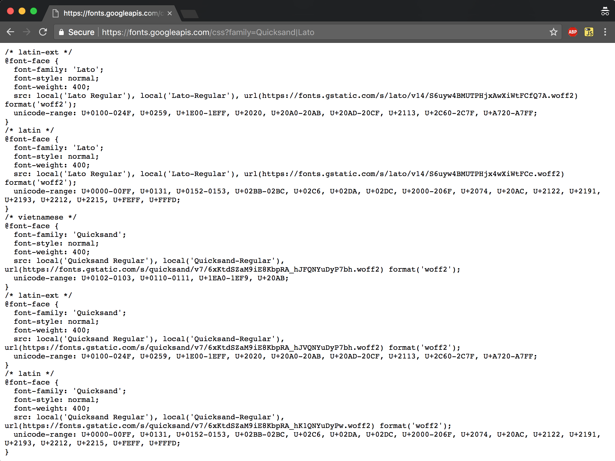
And to do that, I need to dig into the Google CSS file to see which fonts are needed.
This lists five different font files. I don’t need all these – I just need the latin font. I don’t use Vietnamese on my site.
I don’t need latin-ext fonts either: this stands for Latin Extended, and whilst Latin caters for Western European languages, Latin Extended supports Eastern European characters, for example Å, Ä, or Ö. I never need to use these on my site, so I’ll only preload the Latin character set from both fonts.
Notice the crossorigin attribute, which is required to preload assets that exist on another domain.
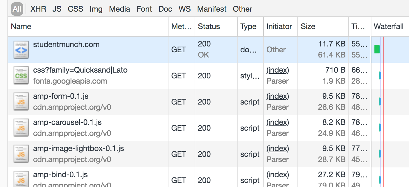
Another way of figuring out which font files you need is to check your Network tab. This has the handy advantage of explicitly showing you how much bloat you’re adding to your page in KB!
Preconnect
If you’re making a few round trips to a CDN to download assets, you can shave a few milliseconds off those requests by opening up a preconnection to the server. From w3.org, the preconnect resource hint initiates an early connection of DNS lookup, TCP handshake and optional TLS negotiation, saving subsequent requests from having to repeat those steps.
I added this resource hint just above my font requests:
We’ve optimised to the point of opening early requests to CDNs, digging into third-party CSS, cherry-picking external assets and then pre-fetching those dependencies manually. So, do we really need that original external stylesheet anymore?
We’ll still need to declare those @font-face styles somewhere on our site, but we can now choose to do this inline or in our own internal pre-fetched stylesheet, saving a round-trip HTTP request to the Google Fonts stylesheet.
I accomplish this by putting the @font-face declarations inline immediately below my preload resource hint:
As stated earlier, this is risky because fonts are regularly updated by Google and there is no guarantee that older fonts won’t be expired at some point in the future, killing performance on your site with failed requests while users only see your fallback fonts.
I elect to download the fonts myself later and preload locally hosted fonts, but for now let’s do some benchmarking.
Is it any faster?
It’s hard to tell, but I think – think – my site is up to 19% faster at rendering.
On a simulated slow 3G connection, my site originally had a First Meaningful paint of ~12.4 seconds. After preloading the fonts, I got this down to ~10.4 seconds.
I was pretty happy at this point, but then discovered Addy’s talk on YouTube and decided it was probably best that I make a local copy of font files rather than continue to use Google fonts at high risk of breaking.
Here is my final code
After downloading local copies of the fonts, this is my final code (I’m just showing ‘Quicksand’, for brevity):
Of course! Apart from the almost 20% improved rendering time, I feel more in control over the assets of my site and more informed as to which fonts are used where, how big they are, and when they should be loading. It was a useful chance to review my practices.
For example, I realised that at first, I was pulling in these fonts:
This defines font-faces for multiple font-weights and italic style – even though I only use the ‘normal’ style of font.
Whilst these extra font faces aren’t downloaded unless your CSS depends upon it, the CSS file itself is a little larger, at 5.7KB rather than 1.9KB – so even without the preload optimisation, this exercise was worth doing!
And of course, I removed the dependency on the Google font CDN altogether, so that 1.9KB of CSS is now just 728 bytes of inline CSS (minified), with just the latin fonts downloaded.
Your WordPress theme might have multiple loops in the page. For example, there may be a ‘Featured’ section at the top of your homepage, and a ‘Recent Posts’ section below that.
These are separate loops, but could contain the same post. For example, your most recent post might also be in the Featured category.
You only want the post to appear once. How do you manage it?
Avoid showing duplicate WordPress posts
The answer is surprisingly simple. Put the following in your functions.php.
<?php
add_filter('post_link', 'track_displayed_posts');
add_action('pre_get_posts','remove_already_displayed_posts');

$displayed_posts = [];

function track_displayed_posts($url) {
  global $displayed_posts;
  $displayed_posts[] = get_the_ID();
  return $url; // don't mess with the url
}

function remove_already_displayed_posts($query) {
 global $displayed_posts;
 $query->set('post__not_in', $displayed_posts);
}
We only want to hide posts which have been displayed already – so we hook into the post_link() function call and make a note of the post we’re displaying.
We then want to hook into any new WordPress query to tell the query to not include any of the posts we’ve already seen. We do this by hooking into the pre_get_posts function and passing it our list of already-displayed posts.
And if you find this plugin or this code snippet useful, please comment below and let me know!
Want some more great WordPress tools? Check out my other plugin: Secretary.
This post was updated in December 2019 to refer to the new way of detecting which posts have been displayed, using post_link rather than the_title as a hook, as post previews don’t always use the_title (they may be thumbnail only) but they DO always have a link.
As a perfectionist, by definition, something is only ‘good enough’ if it is perfect.
I really struggle to live with untested code, or shoddy code, or duplicated code. I come from a world where code can be beautiful, and code is the thing I have complete control over; something I understand and can make better through my own actions.
I seek to make the world a better place; one line of code at a time, even where the ‘world’ is often no more than a small bubble of half a dozen colleagues who will see the benefits.
I seek to optimise my world as much as possible. If there’s an element of manual labour to any of my work, I’ll try to automate it. Once I automate it to the point of just having to run a command, I’ll try to find a way of automatically triggering the command too.
I see technical solutions as beautiful things, especially when they make the right use of inheritance, of micro-service architecture, of scalability and of reusability. When modules are perfectly-named, comprising of small, discrete functions, throwing testable, well-defined and expected errors.
Any sub-par solution in this ecosystem sticks out like a sore thumb. My first reaction, my overbearing, immediate, overwhelming instinct, is to go in and fix it; whether the fix takes 20 minutes or 20 days to implement.
Good enough
Lately, I’ve been trying to distance myself from this idealistic view of the world, and put my business hat on instead.
I need to remind myself that code does not exist in and of itself, and is not, in isolation, of any use. Code is written purely to fulfil a business requirement. Without the business, there would be no requirement and there would be no code.
I need to remind myself that the business has aims and objectives. It cares what gets delivered on the surface, and not necessarily what is happening beneath.
Obviously, the business cares that any technical solution is robust, performant and maintainable. There is an increasing awareness from non-technical stakeholders that these non-functional requirements are, indeed, requirements, and not merely some utopian whims from egotistical, precious, pretentious programmers.
But ultimately, the business will have a thing, or it may have lots of things. The thing is written in code. The thing works. People are using the thing. The thing is achieving its business purpose.
It may have the odd bug, in which case a fix will be prioritised. It may need the odd enhancement, which can be iteratively delivered. But ultimately, it’s a thing, it’s providing value to the business, and it’s good enough.
“But the controller has business logic in it! This needs a refactor!”
“I don’t like all these if-else statements – can’t we use the dictionary pattern?”
“In our new service X, we moved this authentication logic to its own module – shouldn’t we now update our old service Y to use the same module?”
Stop!
Can the change be justified?
We hardly ever touch ‘service Y’ anymore. It’s still being used, it does its job, it’s not fallen over yet. It’s a legacy piece of software – we have new features we need to build. Do we really want to go ahead and start refactoring this old code which might be getting retired soon anyway?
Can we justify to the client that we should spend a sprint refactoring this stuff, addressing all the technical niggles, when really, on balance, taking a step back and looking at what we have… it’s not terrible.
I’m lucky enough to work in a place which gives more freedom than most to make refactor decisions which aren’t business critical. However, in my freelance work I am charging an hourly rate, and have to be constantly mindful of whether I’m developing for my client or for my ego.
In 2014 I built a WordPress site for a client, from scratch. It was my first WordPress site, and it grew to become quite complex, amounting to quite a bit of code.
In 2015 I was commissioned to create four more sites for the same client. These four sites had quite a lot of shared functionality, so I architected them in such a way that I could write the shared functionality once and all the sites would benefit from this shared ‘common’ theme, before developing four small child themes which override where necessary.
My dilemma: the perfectionist in me is crying out to refactor the original 2014 site, converting it into a child theme and inheriting from the common theme in the same way as the other sites. It feels like the right thing to do, saving me from duplicating fixes across two codebases and making for less of a learning curve for any new developer joining the project.
But undertaking this refactor would probably be a couple of weeks’ worth of work. By the end of the refactor, I may even have broken parts of the design or functionality, sacrificed for the sake of simplicity and consistency with the sister sites.
The truth is, this refactor would be of a benefit to me, but not the client. I can’t in this case properly justify what I want to do, even though it feels like the right solution. It’s really not so bad to duplicate the odd bit of code.
I need to keep telling myself: what I have is good enough.
I recently found myself really wanting to use RequireJS with WordPress, to manage the various JavaScript dependencies a client site had. Unfortunately, this was easier said than done.
WordPress is historically not very compatible with RequireJS, as it provides jQuery and a myriad of other JavaScript files out of the box, which are difficult to shoehorn into your RequireJS configuration. There are loads of WordPress plugins out there which rely on jQuery being a global variable in the page.
Also, any attempt at loading RequireJS into the page will often result in errors because many JavaScript modules first check if require is defined before they execute. This means that the very act of including RequireJS in the page will change how some code is executed, and cause you lots of headaches!
We need require to be defined so that we can make lots of lovely require calls throughout our webpage, but we can’t actually define require until all of WordPress’ native dependencies and plugin JS files have sorted themselves out.
I managed to hack together a solution, and it seems to work rather well.
Edit your header
First of all, edit header.php (I put this just above the wp_head() call):
We’re going to store any require() calls in a queue: queueForRequire.
Then require your modules as normal. Well, as semi-normal: as mentioned previously, many JavaScript files will check if require is defined and misbehave if it is, so instead of mocking require, I’ve made a custom function r which we’ll use instead.
<script>
r(['subscribe-cta'], function (subscribe) {
    console.log('This is my callback');
});

<?php if (is_home() && apply_filters('require_slider', $shouldLoadSlider)) : ?>
r(['slider']);
<?php endif; ?>

<?php if (is_archive() || is_home()) : ?>
r(['infinite-scroll']);
<?php endif; ?>
</script>
At this stage, all we’re doing is adding require calls to a queue – nothing is being downloaded just yet.
Edit your footer
Now edit footer.php (put this right before the closing </body> tag):
<script src="https://cdnjs.cloudflare.com/ajax/libs/require.js/2.2.0/require.min.js"></script>
<script>
    require.config({
        baseUrl: '/wordpress/wp-content/themes/tc-magazine-core/js',
        paths: {
            'readmore': 'https://cdnjs.cloudflare.com/ajax/libs/Readmore.js/2.1.0/readmore.min'
        },
        waitSeconds: 15
    });

    if (typeof jQuery === 'function') {
        define('jquery', function () { return jQuery; });
    }

    for (var i = 0; i < window.queueForRequire.length; i++) {
        require(window.queueForRequire[i].deps, window.queueForRequire[i].callback);
    }
</script>
Only at the very end of the document do we go “now I’m ready to load RequireJS. WordPress has done its thing, so it should be safe for us to do ours now”.
So, this is pretty standard stuff: we’re downloading the RequireJS library from a CDN and initialising it with a config. jQuery is a strange special case handled in lines 11-13: we want our modules to be able to pull in jQuery as a module, but know jQuery is probably a global already, so here we’re creating a jQuery AMD module on the fly.
The magic happens on lines 15-17: now that we have RequireJS, we can go ahead and download all the things we’ve queued already (and call their callbacks if those were passed as arguments).
RequireJS with WordPress
There you have it – RequireJS working nicely with WordPress and all its plugins!
The short answer to “when do I need a non-JavaScript solution”? Always. The long answer? Keep on reading…
When I test a new feature built by another developer in my team, one of the first things I do is to turn off JavaScript and see what happens.
Developers often act surprised at this, and look at me disdainfully for inevitably breaking their application when I choose to access it in this way. “This is a client-side calculator! Of course it’s going to break without JavaScript!”
Similarly, when I sit in on meetings with developers and stakeholders discussing what they are hoping to build, “fallback images” and non-JavaScript solutions are often treated as a bit of an afterthought. When I put forward the question of fallbacks, it doesn’t surprise me when the answer is a smirk and a “well, I suppose we’d better give IE8 something“.
We’ve all become so used to modern browsers and increasingly powerful mobile devices that the concept of a non-JavaScript solution seems an unnecessary extra effort; an additional burden on designer and developer alike. After all, the actual proportion of users who access the website without JavaScript enabled is never more than a couple of percent.
However, ignoring fallbacks due to the low percentage of users most affected is short-sighted and is missing the point.
We’re all non-JavaScript users
You may have looked at the proportion of users who access your website with JavaScript turned off through no fault of their own (e.g. corporate users of IE8) or deliberately (self-aware tech-savvies who are sick of being tracked with cookies) or who don’t even have JavaScript available in the first place (anyone using increasingly popular proxy browsers for reduced data consumption). The combined total of these users might be a tiny proportion of your overall users. Heck, it might even be zero.
This is no excuse for ignoring your non-JavaScript implementation. Why? To paraphrase somebody on Twitter:
“Every user is a non-JavaScript user until the JavaScript loads.”
We’re not all on fiberoptic broadband connections. If you’re on a mobile phone on the train and you’re about to enter a tunnel, you’ll be stuck with whatever content arrives in the few kilobytes you managed to download before the signal cut out. Which would you rather see: a sea of whitespace and badly formatted text accompanied by nothing but the prospect of a seven-minute data vacuum, or the core article text with some basic but sufficient styling?
Varying degrees of non-JavaScript solutions
Non-interactive features (such as datapics) have no interactive element and thus should get the core content, untainted by “Turn your JavaScript on!” messages. The content of the feature should be accessible and readable without jumping through hoops. Perhaps it’s not possible for the content to look quite as polished as the JavaScript version (though if we’re disciplined about using CSS for presentation and JavaScript only for interaction, this should not be the case).
Some features, such as quizzes, require client-side interaction to be of any real benefit to the reader. Is a non-JavaScript solution necessary, or even viable?
When it comes to content where advanced functionality is the core content, I still expect a few things for non-JavaScript browsers:
Though I’m not expecting anything particularly exciting or useful, I would expect the page to not look broken.
I’d expect a message something to the effect of “You must turn on JavaScript in order to view this content.”
And I wouldn’t expect lots of unnecessary markup containing questions I can’t answer and buttons I can’t click.
To paraphrase another anonymous tweet:
Use JavaScript to inject the markup your interactive application requires.
So, the answer to “when do I need a non-JavaScript solution?” is… always.
Other benefits of providing a non-JavaScript solution
A better experience for corporate users of IE8 and for mobile users in temporary data blackspots aren’t the only advantages of implementing a defaults-first solution. Reasonable core-content experiences provide benefits in a number of other situations:
Reasonable experience if another script on the page breaks your JavaScript.
Bugs can and do creep into live pages. Maybe the ID of the element your script hooks into has been changed, or another script on the page is re-defining jQuery at runtime, or you’ve accidentally deleted a JavaScript dependency from the server. Instead of the page spewing a load of JSON or unused markup to the user, the user will be presented with a simpler version of the same content.
Accessibility for screen readers
Canvas-based interactives are not usable by screen readers. If they get a description of the fish game that they could be playing in a more modern browser, disabled users at least get an understanding of what content is on the page.
Search engine optimisation
Canvas-based interactives are not crawlable by search-engine spiders. However, a simple description of the canvas content will give search engines an idea of what content exists on the page.
Support for harsh browser environments and future compatibility
Who knows what lies ahead technologically? We may one day browse the web on our toasters, pub urinals, coffee cups and Boris Bikes. We have no way of knowing what level of sophistication such browsers would support. By providing core content to all, we’re future-proofing our content as much as possible.
Clearer separation of concerns – content, presentation, interaction
It’s well known that HTML is for content, CSS is for presentation and JavaScript is for interaction. Keeping the three areas separate is good architecture, and supports a defaults-first development style. By delivering our non-JavaScript solution through our markup and CSS alone, we’re fitting into this programming ideal.
Clearer separation of concerns means more maintainable code, meaning fewer bugs, bugs which are fixed more easily, the improved ability to work in parallel with other developers (e.g. one on presentation, one on interaction), and so on.
Cohesive codebases and fewer bugs means hitting deadlines, and if you’re lucky, bonuses and pay rises. As developers, we’ll have gained a stronger handle on the advantages of keeping each area separate (the Single Responsibility Principle), and will strive for similar ideals in the rest of our codebase, leading to better use of object orientation and the like.
EDIT (6th February, 2015): since publishing this post, I’ve been informed about Element Queries; a W3C discussion about the need for element queries and their required implementation. When I say “Localised CSS”, I was referring to what the world now knows as Element Queries – only I didn’t know it yet. It can be hard to know what to Google in preparation for your blog post! Anyway, I have now contributed my Localised CSS polyfill to the Element Queries group.
For historical note, the original blog post is captured below in its unedited form.
We’ve been doing responsive design all wrong.
I’m not talking about what the end-user sees. If we follow current best practices (mobile-first, progressive-enhancement, unobtrusive JavaScript and the like), mobile users and those reliant on screen-readers have never had it better than they do today.
I’m talking about the way we develop. We’re making lives hard for ourselves, setting ourselves up for challenges we can’t possibly win. We’ve tried to make life easier by using pre-processing tools like SASS, allowing us to use variables in our CSS and split it into logical modules. We use CSS linting tools to spot bugs and duplication before it happens. We try and follow a “mobile-first” development mindset, standardising the approach we take to development, improving consistency in our codebase and lessening the learning curve for other developers joining our projects (as well as providing an efficiency boost when rendering on mobile devices).
Despite all this; robust and elegant responsive designs are very hard to achieve. Why? Because they require the developer to keep a massive, ever-growing mental model of the design in their heads.
Example: imagine a typical WordPress template. Its sidebar contains a widget-like list of the latest articles, represented by a title and thumbnail. Clicking on any of these list items takes the user to the corresponding article page.
Typical WordPress template, with sidebar showing latest popular posts.
On a narrow viewport width of say, 300px, the screen is too small to accommodate the sidebar on the side, so the sidebar slots underneath the main content. Within the sidebar, we want the article thumbnail to stretch to the width of the screen (width: 100%) and the article title to slot below it. This is our “mobile” view*.
Our WordPress theme at 300px. Image thumb is at full width, sidebar is below the main content.
Stretch the viewport width to say, 500px, and now the article thumbnail is looking pixelated and taking up too much screen space. We want to set a width of 50% for the thumbnail, and have the items listed horizontally (float: left) so that we have two article thumbnails per line.
At 500px, we decide to half the size of our thumbnails to prevent them from looking pixelated.
Viewing the theme on an even wider viewport, say 800px, means we have enough space for the sidebar to float to the right hand side of the page now. It no longer needs to slot underneath the main content. But, naturally, the sidebar itself is no longer the full width of the screen.
At 800px, the sidebar is now to the right hand side of the main content – and our two-column design is no longer appropriate.
The sidebar is now about 200px wide, but our thumbnails are set at 50% width, so are only taking up a pitiful 100px each – we need to add an additional media query to make the thumbnails 100% width again when the viewport is 800px wide.
So we add an additional media query to make the thumbnails full-width again when we reach 800px.
That’s complicated, which is bad enough. But even worse than complicated media queries are unmaintainable media queries.
Let’s say a couple of months down the line, designers decide to change the width at which the sidebar is able to float to the right, from 800px to a new threshold of 900px. If we forget to update the media queries for our article list, anyone coming to the site on a 850px screen will see the sidebar below the main content (i.e. full width of the screen) but with MASSIVE 100%-width thumbnails!
This scenario is just one component of the website. Most websites are made up of dozens of individual components. Think of the world’s largest websites, where different components are developed by different teams. How on earth do they communicate and keep that kind of information up to date?
Wouldn’t it be nice if we could write CSS that responds locally to changes in the size of element containers, rather than globally to changes in the size of the viewport? Instead of a bunch of horrible, complicated media queries which require the developer to maintain a mental model of every breakpoint in their responsive design, we could write simple CSS like this*:
In this proposed solution, we’re instructing the browser to apply a width of 50% and a “float: left” style to the “list-item” class only when the “list” element is a minimum width of 500px. The keyword here is inside the media query, and that word is “local”.
For a proof of concept, I created a GitHub repository: Localised CSS.
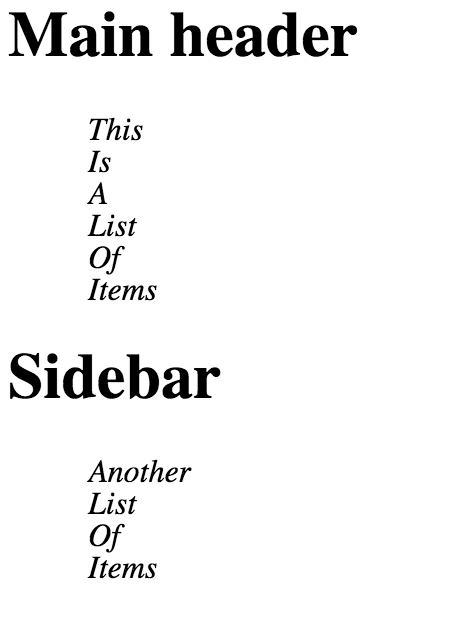
Localised CSS – narrow screen. Both lists are display: block
Here is the working example from the repository. When the viewport is narrow, the list of items is displayed as a block (i.e. each one sits below the previous one).
When the viewport is a bit wider, the “display: inline” comes into effect, and the list items display one after the other in a horizontal line.
Localised CSS – normal screen. Both lists are display: inline
So far, there’s nothing special here – both scenarios can be easily achieved using standard media queries. But let’s make our viewport a little wider…
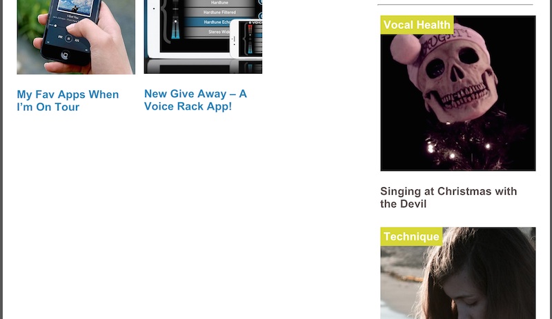
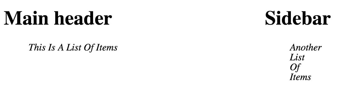
This screenshot shows our localised CSS working with a wider screen. Now that the screen is sufficiently wide, I’ve made the decision to move the sidebar up alongside the main container, thereby making the sidebar smaller. The really exciting thing here is that both lists are displayed according to the contexts of their containers, NOT the viewport.
The implications of this are massive. By writing localised CSS, we are no longer required to think what the state of the system will be globally when deciding how we should render our element locally. We’re effectively decoupling the responsive design of our components from the responsive design of the system as a whole. We could create truly elegant, reusable, portable components, and fluid, robust, truly responsive overall designs.
Localised CSS is not without its problems, and we face a number of difficulties:
The fact that it’s a JavaScript library means there’ll be a momentary “flash” of unstyled content while the JavaScript is downloading and executing. Also, users with JavaScript disabled will only see the default (mobile**) CSS you supply.
Getting hold of the raw CSS – since we’re using JavaScript, only stylesheets from the website domain can be processed. External stylesheets raise cross-domain issues.
How to write the CSS in the first place (should it be an element nested inside a media query, or a media query nested inside an element? Should both be allowed?)
Parsing the CSS is a fairly complex problem.
How to apply that localised CSS (e.g. if setting ‘style’ attribute directly, we risk overriding any existing style attribute).
How should we re-render efficiently? On each render, the script performs element width calculations. DOM manipulation is expensive.
How can we handle infinite loops? For example, let’s say a child element is set to be 400px wide if its container is less than 300px wide. This naturally makes the container 400px wide, meaning we remove the child’s 400px-wide style on the next render, meaning the container becomes less than 300px wide again, and so on…
If we can overcome these issues and make localised CSS a viable technique, thousands of developer-hours spent on complicated front-end bugs can be saved, amounting to billions of dollars in saved revenue, allowing for accelerated advancement in other key areas of tech, meaning we get time travel machines and water-to-chocolate generators that little bit faster.
My tongue may be somewhat in my cheek, but I genuinely believe a more modular approach to front-end development is a critical step to improving site maintainability.
Are you a front-end developer? This is a call to arms. Fork my Localised-CSS repository, help me overcome these difficulties, and make this dream a reality.
Become a part of the next web development revolution! The world needs localised CSS.
Footnote: * This CSS isn’t as clear as I’d like it to be. I tried a few things such as setting the container explicitly, i.e. “@media only local and (container: ‘.list’) and (min-width: 300px)”, but the “container” attribute is invalid and means this block of CSS is not delivered correctly via the JavaScript CSSStyleSheet property API. ** I disapprove of the term “mobile” view, since mobiles have such a range of dimensions these days, and the line between “mobile” and “tablet” is definitely blurring. Still, it gets the point across.