Category: month11y

  • month11y issue 39

    Welcome to your monthly frequent11y newsletter, brought to you by @ChrisBAshton. I hope you enjoy these a11y articles I’ve collated and summarised for you. (Psst – if you find these emails too long, consider switching to shorter, more frequent updates). Now on with the show!

    Everyone Watches TV with Subtitles Now. How’d That Happen?

    I thought this article was interesting to call out, as in my experience we still often assume captions should be an ‘opt in’ thing. But perhaps things have pivoted to them being ‘opt out’. Indeed, some captions are now ‘on’ by default on social media.

    In a 2022 survey of 1,200 people, language learning company Preply determined that 50 percent of Americans used subtitles and closed captions the vast majority of the time they watch content.

    According to Preply, 57 percent of all Americans watch shows or movies or videos in public on their mobile devices, but a very significant 74 percent of Gen Z do the same. Even if you’re (hopefully) using headphones while in public, it’s likely you’re getting poor audio quality… subtitles are practically a necessity.

    The article also cites ‘habit’ as one of the main reasons. People are simply more used to using subtitles; the article cites that in 2020, nearly 30 percent of on-demand streaming was for non-US shows.

    Finally, there are some modern technical issues that could explain why hearing dialogue is more difficult:

    For some, the problem is the design of modern televisions; the majority of which place internal speakers at the bottom of the set instead of facing towards the audience, causing significantly worse audio quality. Other issues are caused by sound designs optimized for theatrical experiences, which can result in compressed audio when translated to home.


    Become an accessibility champion by using simple mockup annotations

    “Accessibility annotations” detail interaction design behaviours in UI designs. They communicate the intended experience for keyboard and screen reader users, allowing developers to implement the design just as they would implement a visual one. This speeds up the design QA and development process, but also ensures designers have thought about accessible interactions from the start.

    The article shows screenshots of some annotated designs, with symbols clarifying the intended focus tab order of a component, or call-outs to screen-reader-specific text. Even the underlying semantics – whether a list should be ordered or unordered, for example – are clarified with markup annotations.

    There is also a Jira ticket template “to facilitate design accessibility review discussions while reviewing the visual mockups”.

    The article links to Deque’s downloadable accessibility annotations toolkit, which has files for Adobe Illustrator and Sketch as well as individual SVGs.


    The difference between Increased Contrast Mode and Windows High Contrast Mode (Forced Colours Mode)

    Martin Underhill describes Increased Contrast Mode (ICM) – a setting that users can opt into, and which website designers/developers can accommodate through a media query:

    @media (prefers-contrast: more) {
        /* High contrast styling goes here */
    }

    Not a lot of people know about this, or they don’t have it high on their list of priorities. It’s utterly reliant on the website creator to support.

    Windows High Contrast Mode (WHCM), on the other hand, is a ‘forced colours mode’. It doesn’t rely on the website creator, and instead forces the chosen theme onto the website. It has a well supported media query like ICM, but only allows a handful of carefully selected things to be styled:

    @media (forced-colors: active) {
        /* WHCM styling goes here */
        /* Limited to things like text colour, background colour and keyboard focus outline colour */
    }

    Martin has made the decision to not attempt to define styles for WHCM users, instead delegating this to the user’s operating system. It should mean they have a more consistent/familiar experience, and it will automatically support their choice of dark or light theme.


    Don’t meddle with user input

    Martin Underhill warns against designs that manipulate user input, and the maxlength attribute in particular, which prevents users from typing anything beyond a certain character limit.

    Whilst these features are often implemented with the best of intentions – to assist the user in inputting data in the correct format, for example – they’re not very accessible solutions.

    Martin references the GOV.UK Design System’s Date Input component, which expects a format like 27 3 2007 but does not prevent users from typing longer numbers (or indeed typing a-z characters). Someone raised a GitHub issue to discuss adding maxlength to the fields, but Hanna Laakso responds:

    If you use maxlength attribute on a form field to limit user input, users might not receive appropriate feedback of the limit. For instance, the user might not notice that not all the information they entered appeared in the form field … It is generally better to let users enter their information in a way that suits them and allow them to submit the form.=

    Instead, using hint text to nudge the user in the right direction, alongside validation to tell the user how to fix the problem in any particular form field, is the suggested way forward. Martin notes that “this should also help satisfy 3.3.2 Labels or Instructions and 3.3.3 Error Suggestion, respectively, from the Web Content Accessibility Guidelines (WCAG)”.


    Toggles suck!

    This somewhat inflammatory headline by AxessLab leads into a very long but enjoyable article about toggle design. The author argues that real world toggles (light switches) work well because:

    1. It’s clear whether it’s worked, via the context (the light immediately comes on)
    2. One can press the switch as many times as one wants, and have the same outcome (i.e. pushing down extra hard on the switch to make sure something comes on).

    In the digital world, the design doesn’t carry over so well. For setting things like cookie preferences, there is no obvious visual feedback to enabling/disabling the setting. And activating the switch will flutter back and forth between ‘on’ and ‘off’.

    There are lots of illustrations and screenshots in the article, highlighting that it’s often unclear what state a toggle is in. Designs vary, and whilst “most western designers seem to assume that “right = active””, that’s not always the case.

    It is possible to make accessible toggles. The author links to articles by industry heavyweights: Heydon Pickering’s article on Toggle Buttons, an article on Toggle Switch design by Sara Soueidan, and Under Engineered Toggles by Adrian Roselli.

    The author also cites examples of toggles done well. They show a screenshot of a toggle for filtering on Airbnb, where a toggle button limits the amount of available houses. “Users can understand by the reduced amount of houses that the filter is active, even if they don’t understand the toggle control. The number in the button is physically close to the toggle control, and many users will notice the change as it happens and draw the correct conclusion from context”.

    But whilst Airbnb is a big name, other big names are content to not use toggles. The author shows screenshots of Amazon using plain old radio buttons, and Slack using plain old buttons. The author concludes with advice to “just use a checkbox or radio group”.

    There were a few other bits of interesting info tangential to the theme of toggles.

    “In our user tests, a majority of users will assume an empty text field is actually mandatory and expect an input to be made. So much so that we even recommend you to not use asterisks * to indicate mandatory fields, and instead mark optional fields as “optional”.”

    Indeed, “the “filled in = active / touched / done” pattern is so well recognized that if a text input field is not empty, many users will believe it’s done and requires no more work. That’s why you should try to avoid placeholder text and labels that are positioned inside the input field like the commonly used Material UI component, even if it “moves away” on focus.”

    A worthwhile read!


    The only accessibility specialist in the room

    It’s hard being the only one in your organisation or team responsible for accessibility. If that sounds familiar, I salute you, and this one’s for you.

    This article by Henny Swan might resonate with some of you. Henny has some advice:

    1. You are not the only person responsible for accessibility. You may be the only person with “accessibility” in your job title, but it’s everyone’s responsibility, from CEOs to content editors, designers and developers.
    2. Your role is as much about relationships as it is about accessibility. Look for the managers and decision makers who can make things happen, and look for the designers, developers, editors and testers that want to get into accessibility: they can be powerful advocates.
    3. Find ways to scale. Think about what questions you’re asked the most, and document your answers in shared spaces (Confluence, wiki, design system documentation, etc). Document processes that can be followed within teams, e.g. reviewing designs for accessibility, triaging a11y issues or writing user stories for accessibility.
    4. You can’t know everything. Tell people you will need to go and research something, and come back with options for them to consider. Get a consultant if specialist knowledge is needed. If you need a budget, invest some time in writing a business case for accessibility.
    5. Build a support network. Set up an a11y Slack channel. Join the Champions of Accessibility Network (CAN) on LinkedIn, and the WebAIM discussion list. Consider getting a mentor, e.g. at Accessible Community.

    WebAIM Million Report 2023

    In March, WebAIM published their annual accessibility report. A number of well-informed folks have read the report and written articles with their key takeaways.

    Manuel Matuzović picks up on one figure in his post, “50.1% empty links“. The number of websites containing links with no text (usually when linking an image that lacks alt text) has risen by 0.4%. He tests out various screen readers on an ’empty link image’ and documents the result, which is universally garbage, albeit with some differences.

    Manuel concludes that you should “test your sites at least with an automatic testing tool like axe, Lighthouse, or Wave, and label linked graphics. I’ve described several ways in “Buttons and the Baader–Meinhof phenomenon.”“.

    In “We need accessibility action“, Eric Eggert goes deeper. He notes that WebAIM’s tests are all automated (and test home pages only), so show us trends but only find a subset of accessibility barriers. Highlights:

    • Average errors per page went slightly down (to 50). 96.3% of all pages have easily detectable WCAG failures – this is down 1.5% in four years.
    • ARIA usage has increased a lot, and “pages that use ARIA are more likely to be inaccessible”.
    • 96.1% of all errors are in one or more of the following categories:
      • Low contrast text
      • Missing alternative text for images
      • Empty links
      • Missing form input labels
      • Empty buttons
      • Missing document language
    • As noted on the report itself, “Addressing just these few types of issues would significantly improve accessibility across the web.”

    Eric finds these figures “embarrassing”. These WCAG requirements are not new – they’ve “all been around since WCAG 1.0” which is now 24 years old. For 96% of websites to still have issues underlines the need for “better strategies to educate people about the issues”.

    Eric suggests that browsers themselves could fix some issues – “a ramp built into a train will generally be more available than a situation where every stop needs to provide its own”. Mitigation for low contrast text could be built into the browser, for example.

    Other errors, like empty links and lack of alt text, really require developer intervention – and Eric argues that such errors should be highlighted in the browser’s console error messages. “There is no reason why JavaScript programming errors trigger messages, and accessibility issues do not. Tooling is bizarrely oblivious to accessibility.”

    As for ARIA: “essential ARIA functionality must be transferred into HTML. ARIA needs to be a specialist tool that you only get out if you don’t have any other options. Many of the ARIA techniques are very intricate and for 90% of developers they should never be exposed to that kind of complexity and power.”

    Eric concludes that the release of WCAG 3 won’t necessarily help. We have standards already, and people are unable or unwilling to follow them. “In the best case, web accessibility will drag on. In the worst case, we will have multiple standards to follow that have entirely unique ideas of how to test and measure accessibility”.


    Interview with Jamie Knight (and Lion)

    This landed in my inbox only recently (despite being published in April last year). I remember Jamie from my days at the BBC, so it’s always nice to find out how people are doing!

    Jamie has autism and mobility issues. Denis Boudreau interviewed Jamie about the accessibility of virtual and in-person events.

    One of the worst things speakers can do to ruin an attendee’s experience is to make assumptions. Jamie is “semi-speaking” and an unexpected demand to speak can be difficult – so don’t assume someone can speak at a moment’s notice. Another assumption is that someone can move. Jamie needs a harness to sit upright, “so for that reason, a 10-minute ‘break’ often means sitting alone for 10 minutes as that’s not enough time to unstrap, transfer and move anywhere”.

    The rest of the interview is largely focussed on how speakers can help their audience to focus. Visual structure for slides is important: “slide numbers, visually indicated sections (colours, icons etc), and coming back to something consistent at the end of each section”. This allows audiences to pace themselves and follow the narrative. Most people will be relying on at least two of three means of access: spoken words, visuals, and something textual or signed. Finally, events should “be joyful. The most engaging accessible content treats any topic in a playful way”.

    Jamie ends with “Assumptions are the root cause of most barriers. If you keep on top of the assumptions, then most of the barriers can be avoided.”


    Don’t use custom CSS scrollbars

    Eric Bailey writes a comprehensive article on why you should never, ever provide custom styling for your website’s scrollbars.

    The post begins somewhat philosophically: Eric highlights the area of a browser window that is your responsibility (the web page) and then highlights what isn’t (the browser ‘furniture’, URL display, and yes, the scrollbar).

    But it’s more than just ideological – people who use Windows themes or Forced Colors Mode / High Contrast Mode may be doing so for aesthetical reasons or because they have accessibility requirements. By overriding their choices, you’re potentially excluding them from being able to use your scrollbar. Windows, Eric reminds us, is incredibly popular – something that developers using shiny MacBooks can sometimes forget.

    It is possible to set scrollbar width to 1px – the browser won’t stop you. This is obviously a bad idea. Eric’s point is that by taking on styling for the scrollbar, you’re taking on its WCAG requirements too. It’s now on you to ensure it has a large enough touch area, a high enough contrast, and so on. Eric evaluated a number of scrollbar-code-generators and none of them accounted for this stuff.

    Modifying a scrollbar’s visuals breaks external consistency. “Digital literacy is also a spectrum. When digital things don’t look or behave the way they are expected to, people tend to internalize it as a personal failure—they broke something, they’ve been hacked, they’re being spied on, etc”.

    Eric’s key takeaway is “maybe you should write less code and in doing so allow more people do more things”.


    I Made a Site Leveraging AI: How Accessible Was It?

    Interesting experiment by Mark Steadman, who used Durable to generate a website.

    Using axe-core to scan the site, he found 17 accessibility issues, of which 11 were ‘critical’ and 6 ‘serious’. These included:

    • All form elements in “Contact us” section were missing labels
    • The carousel buttons were missing an accessible label
    • All the images in the “Gallery” were missing alt text

    Manually discovered a11y issues included keyboard focus indicators being highly inconsistent – some elements would get it, some would not – and an entire set of images in the gallery being totally inaccessible to the keyboard.

    Screen reader support was quite poor too, with multiple links and buttons having the same text, as well as images with poor alt text such as “banner image”.

    Mark’s conclusion is fairly positive. AI is here to stay, and the output here is not as bad as it could be (Mark likes the use of native HTML, some practical use of ARIA, and “great” resize support). Mark hopes that one day AI could generate fully accessible websites, but fears that that day won’t come any time soon.


    The ultimate inaccessible UI components

    This is just a bit of fun from Reddit. Engineers competed to see who could build the worst possible UI.

    Highlights include:

    • A “Delete your account” button hidden behind three red cups that shuffle like a magic trick. Good luck finding the right one!
    • A volume control slider that doesn’t stop at 100% (the sider will just fall off the end and break)
    • An “unsubscribe” button next to a fan, which ‘blows’ your mouse cursor away when you try to click the button
    • “Real dark mode” – everything is pitch black except for a few pixels of light emanating from your cursor

    …the list goes on. Images and videos demonstrating the designs are in the article.


    A Deep Dive into Accessibility APIs

    I’ve read this three-part series by Neill Hadder, who works at Knowbility. Below is a perhaps oversimplified summary – I’d encourage you to click through to the articles themselves if you’re keen to learn more!

    Part 1: Swinging Through the Accessibility Tree Like a Ring-Tailed Lemur

    This is an introductory article that still goes into a fair bit of depth, explaining the history of the document object model (DOM) following the earlier Windows component object model (COM) and Mac’s OS X Coco API. The ‘accessibility tree’ is a web document object whose children include all the accessible objects from the DOM. Some elements, such as SVG, are omitted from the tree, unless they’re given an explicit role.

    When something important happens, e.g. the display of new content, it’s up to the application to post an event notification to the platform API. Assistive tech (AT) registers what type of events it wants to listen for. The same responsibilities can work the other way too, where AT sends actions to the application. Passing messages between running applications is called inter-process communication (IPC).

    Part 2: The Road to Good Intentions Is Paved with Hell

    This article introduces the off-screen model (OSM), which is the idea of intercepting low-level drawing instructions from applications (and the operating system itself) “in order to build a database with which the screen reader could interact as if it were text mode”.

    The first OSM program was OutSpoken for Mac, released in 1989 as a kind of “virtual white cane”. It used the numeric keypad to emulate a mouse to visualise and explore the screen layout. Mac’s next AT was VoiceOver, in 2005.

    Meanwhile a number of mostly short-lived screenreaders were created for Windows. “Microsoft created the IAccessible specification, which put in place the now-familiar tree structure of semantic information about UI objects”.

    Neill dives further into the inner workings of OSMs. Here’s a taster:

    The work of an OSM is extremely complex. It starts with reading Strings of ASCII characters from text-drawing functions. The OSM also needs to keep track of the bitmap in order to insert text at the right place in the OSM when, for example, typed characters are being drawn on a line one instruction at a time as part of the same word. It has to keep track of what’s visible or not, too, such as when areas on the bitmap are transferred off screen and replaced in order to convey the illusion of 3D pull-down menus or layered windows

    Evidently, this model wasn’t sustainable. “Developers had to slowly add special code for each application that didn’t exclusively use standard UI elements”. Misrecognitions, memory leaks and accumulated garbage were an issue.

    Part 3: Your Browser May Be Having a Secret Relationship with a Screen Reader

    Windows screen readers very early hit upon a terrific strategy for highly-efficient web page review that has endured, largely unchanged, for over twenty years. It centers around creating a buffered copy of a web page that the user can review like a standard text document.

    Or, put a different way: “the one thing that screen readers no longer do is read the screen”.

    Screen readers have two modes. “Browse mode” allows users to jump along headings, lists, tables and so on, and also to use virtual cursor movement (not unlike the “caret browsing mode” that is built into major browsers, and which I hadn’t heard of until today!). To interact with most controls on the page, screen reader users switch to something historically known as “forms mode”.

    “Screen reader access to page semantics came all at once with Internet Explorer 5’s Microsoft Active Accessibility (MSAA) support”. MSAA later lacked the vocabulary for all the new control types being added into HTML: this is where ARIA comes in.

    MSAA also lacked dynamic change support, for anything that happened after the initial page load. “One work-around was the introduction of a screen reader hotkey to refresh the virtual buffer” – this only worked intermittently.

    Microsoft introduced its newer UIA accessibility API in 2006 with Windows Vista. In late 2006, the IAccessible2 API arrived, a platform-independent open standard developed by IBM, working closely with screen reader developers and corporate stakeholders. Unlike UIA, IAccessible2 extended MSAA’s IAccessible code library to fix its shortcomings. Firefox quickly implemented it alongside its existing MSAA support, while Google Chrome followed suit in the early 2010s. Meanwhile, Internet Explorer would ultimately rely on a scaled-down version of UIA. IAccessible2, which is what JAWS and NVDA use today, is not a Windows platform API: the libraries are part of the browser.

    IPC (from part 1) is the secure, reliable means of handing info back and forth between applications through an operating system API. Low-level hooks, on the other hand, are effectively ‘code injection’, insofar as AT has forced some of its code to run inside the other application’s space. ATs are basically the only non malicious programs that use this technique.

    IAccessible2 allowed screen reader developers “direct access to the browser’s API implementation” using low level hooks:

    When a web page loads, JAWS and NVDA need to go through every element on the page to create a virtual buffer. If they were to use IAccessible2 only through IPC, then they’d have to send many, many messages back and forth between the screen reader and browser processes; and, even as fast as computers are, that’s relatively slow. But with code injection, some of the screen reader’s code can run directly inside the browser, gather all the information it needs for a virtual buffer (which requires some complex logic specific to the screen reader), then communicate back to the main screen reader process at the end.

    However, “Apple and Google operating systems don’t allow code injection. Windows-based Firefox and Chrome increasingly keep their doors locked while continuing to give assistive technology a pass. [Code injection’s] days are numbered.”. There is little incentive for screen reader developers to migrate all of their code from low level hooks to IPCs, especially as this can cause significant slowdown. Neill suggests the developers may need help from browser developers or Microsoft.

    As for the current state of play, taken more or less verbatim from the article:

    • Windows screen readers rely on MSAA, as well as a few other Windows APIs, in older areas of Windows like the desktop and taskbar, while UI Automation provides access to components added since Windows 8.
    • JAWS and NVDA use IAccessible2 in Chrome, Firefox, and Chromium-based Edge. They additionally use ISimpleDOM when they need information not able to be plucked from the accessibility tree. These are code libraries incorporated into the browsers, not Windows.
    • Both Firefox and Chrome have more or less ignored UI Automation for all this time. The Edge accessibility team have contributed their UIA implementation to Chromium, but it’s still not turned on by default in Chrome.
    • Microsoft incorporated a bridge that allows ATs that rely on UIA in web browsers (Narrator) to communicate with applications that use IAccessible2 (Chrome and Firefox). This bridge continues to interact with ATs solely through IPC but injects its code into the browser whenever possible for the performance boost. This is what’s happening under the hood when using Narrator in those browsers. On the other hand, Narrator predictably uses UIA in Microsoft Edge.

    Neill concludes “Mac, IOS, and Android all implement their platform APIs throughout their systems, including third-party browsers. If VoiceOver began to support IAccessible2 or UIA, other Mac and IOS browsers would be ready. What seems likely is that Windows will sooner or later fall in line with other operating systems by shutting down third-party code injection. Screen reader developers will then be forced to undertake the [work to replace hooks with IPCs], and everyone will indeed use the Windows platform API, the performance of which will by then very likely be up to the task”.


    Whew, that was a long newsletter! Did you know that you can subscribe to smaller, more frequent updates? The dai11y, week11y and fortnight11y newsletters get exactly the same content. The choice is entirely up to you! Curated with ♥ by developer @ChrisBAshton.
  • month11y issue 38

    Welcome to your monthly frequent11y newsletter, brought to you by @ChrisBAshton. I hope you enjoy these a11y articles I’ve collated and summarised for you. (Psst – if you find these emails too long, consider switching to shorter, more frequent updates). Now on with the show!

    A Practical Approach to Automated Accessibility

    Mark Steadman writes a mini series on automated accessibility. In this introductory article, Mark introduces his three-step plan for introducing automated accessibility checks into your pipeline:

    1. Phase 1: Linting
      • Linting is a quick and easy step for catching issues by statically analysing source code.
      • In his subsequent article, Mark recommends axe Accessibility Linter that enforces around 30 accessibility rules. He also recommends webhint and HTML Validate.
      • Mark claims that linting is expected to catch around 20-25% of accessibility issues: basic ones such as images missing the alt attribute.
    2. Phase 2: Automated Accessibility Libraries
      • You can add a library such as axe-core or pa11y into your pipeline, configuring it with a list of routes to visit. The library will perform some general accessibility checks on your application at runtime, as opposed to just looking at the source code. This can catch contextual issues such as a piece of text having poor colour contrast against its background.
      • In Mark’s accompanying article, Automated Accessibility Part 2: Mobile Web Testing, Mark elaborates on how to configure these libraries to run against responsive views of your application. For example, you can run pa11y against the ‘mobile’ view of your application by pairing it with a browser emulator tool such as Cypress.
    3. Phase 3: Accessibility Regression
      • Mark’s final phase of automation is to create “regression tests”. These are specific, accessibility-focused unit tests, written in code. For example, you can write a test that checks that aria-expanded is being properly set every time a user clicks on an expand/collapse section.
      • Mark builds on this in his article, Automated Accessibility Part 3: Regression Tests, which builds on the Cypress automation of the previous article and shows example code for interacting with the page and asserting conditions.

    There are a lot of different testing approaches and tools out there, so having a three phase plan for testing is a useful way to make the process less daunting.


    The Surprising Truth About Pixels and Accessibility

    Josh Comeau dispels the myths around using px, rem and em in your designs. He introduces these with no assumed knowledge, gradually explaining when to use each one, using inline interactive examples to aid learning. It’s really worth checking out.

    My takeaways:

    1. A reminder that px doesn’t actually map to hardware pixels, but it’s the most concrete measurement we have.
    2. There are two main ways a user can make the text on their screen bigger: “zooming” ( + + on MacOS, ctrl + + on Windows/Linux), or “font scaling” (changing the browser’s default font size).
    3. When deciding whether to use pixels or rems, ask “Should this value scale up as the user increases their browser’s default font size?” If yes, use rem, if no, use px. So you’d use rem for text, but you might use px for borders or padding.
    4. Josh recommends using rem over em due to em‘s compounding issues (making it hard to predict what size an element actually ends up being). An exception is for the margins of headings and paragraphs, for which Josh uses em.

    It gets more complicated: should you use px or rem in your media queries? The answer is rem. If a user has increased their default font size, the available space is reduced, so they’re more likely to need your ‘mobile’ view. Using a rem-based media query such as @media (min-width: 50rem) means a user who increases their default text size will need a bigger screen to get the non-mobile styles. (If a user sets their default text size to 32px, this is “double the standard text size” and means that “50rem will now be equal to 1600px instead of 800px”).

    Josh goes into more examples. Be careful when using rem to define button sizes, as declaring something like width: 15rem could mean the button becomes too large for its container. You can combine this with max-width: 100% to prevent the overspill. Similarly, use min-height as opposed to height.

    Josh ends the article by discussing the numerous ways you can manage your rem size to px conversions, e.g. through defining a 62.5% base font size, using calc, or leveraging CSS variables.


    Face-off: Should kit colours be catered to colour-blind fans?

    Anyone who’s ever played FIFA on a game console will at some point have ended up playing a game where both sides have really similar looking kits. It becomes difficult to know who you can pass to, and makes the game less enjoyable.

    This is an issue faced by the large portion of sports viewers who are colour blind, and consequently, the 2027 Rugby World Cup will be the first that bans red-green kit clashes.

    This article from RugbyWorld.com shares an opinion-piece from two enthusiasts. The first is in favour of the move, for obvious reasons. The latter is against it, favouring the idea of a ‘home kit’ and an ‘alternative white kit’, which would solve the problem in a different way. He argues that “turning out in the colour of your nation matters”.

    I think the announcement is a positive move for accessibility, but it’s interesting to think about the different ways the issue can be tackled.


    Accessible front-end components: claims vs reality

    Hidde de Vries shares his tips for finding accessible components, warning that many components that claim to be “accessible” actually aren’t. Hidde’s checklist:

    • How did they test? A component’s website should ideally explain how a component was tested, e.g. perhaps only automated tests have been run and you should do some further testing before choosing it. Try to find specifics around exactly what version of WCAG they claim to be valid against, for example.
    • Who did they test with? Accessibility isn’t just about technology, it’s about making sure a pattern works for people with disabilities. Did the developers specifically include people with disabilities, in their testing?
    • Are they open about the pros and cons of their approach? It’s a good sign if the developer is open about this, as many components aren’t one-size-fits-all.
    • Who created them? Hidde puts extra trust in components developed by organisations that work in accessibility or work for the public good.
    • Look at GitHub issues – their presence could be a warning sign.
    • Find out about commitment – are they proactive or reactive in their component’s development?

    Brief Note on Buttons, Enter, and Space

    An interesting article by Adrian Roselli, sharing something I didn’t know:

    A native <button> fires on key down when that key is Enter. If you hold down the Enter key, it continues to fire for as long you hold Enter (or something crashes).

    A native <button> fires on key up when that key is Space. If you do not release the Space, and also press Tab to move away from the control, the control will not fire.

    These can blow up once a screen reader is in play. If you run Narrator/Edge, pressing Space is the same as pressing Enter, but holding either down does not repeatedly fire the event. NVDA/Firefox and JAWS/Chrome treat Space as Enter — fires on key down and holding it down continues to fire. The Windows screen readers all intercept the event, so you cannot listen for which key was pressed in your page. VoiceOver/Safari/macOS behaves as if VO was not running, and (in my script) the keyboard events are captured.

    …and that’s pretty much the whole article! There’s also an interactive example so you can try it out for yourself. The TLDR is to be careful when trying to re-implement native browser behaviour in your custom components, and consider the nuance of the different keys, to support your powerusers.


    Flexbox and the Screen Reader Experience

    A Webaim article that reminds us that whilst CSS flexbox can be used to change the visual order of content, it often has no bearing on how the content is consumed by a screen reader. This can lead to major accessibility issues if the intended reading order differs from the order in which it appears in the DOM.

    The takeaway is to always structure information in the correct order in the DOM, then ensure that visual presentations (at all widths) convey that order. The author doesn’t want us to leave with the feeling that flexbox is “dangerous”, but that it is powerful and that screen reader testing is essential.


    The Monarch could be the next big thing in Braille

    A collaboration project between HumanWare and the American Printing House for the Blind (APH) has resulted in the Monarch: a “multipurpose” Braille device.

    Refreshable Braille displays have existed for years, but have been expensive, slow to refresh, and fragile. A new “braille pin mechanism” created by startup Dot has been incorporated into the design: these pins are individually replaceable and are much faster to raise.

    APH partnered with over 30 international organisations to create a new electronic braille standard, called eBRF. “This will provide additional functionality to Monarch users including the ability to jump page to page (with page numbers matching the print book pages numbers), and the ability for tactile graphics directly into the book file, allowing the text and graphics to display seamlessly on the page.”

    The author notes that the graphical capability is “a serious leap forward”. It will now be possible for braille readers to pull up a visual of a graph, animal, letter or number shape, allowing the consumption of simple graphics. From APH.org:

    The Monarch is approximately 4.5 pounds and the size of a 15-inch gaming laptop. The device features an 8-dot braille keyboard, zoom in/out buttons, direction pads, up/down arrow buttons, and a 10 line by 32 cell refreshable braille display, which is capable of rendering multiple lines of braille and tactile graphics with equidistant pins. This technology will bridge the educational gap for students along with the development of a new dynamic file type that will bring braille and graphics together in a navigable file.

    The Monarch is not currently available to purchase. You can sign up to product updates on the website above.


    What it’s really like to be openly disabled in an interview process:

    This Medium article is written by Mal: a “multi-disciplinary designer + artist, storyteller, neurodivergent (autist + adhd); she/they”. She shares three interview experiences, two positive and one negative.

    The first was for an interview last September, in which Mal received the interview questions in advance. Though she didn’t get the job, “the interview went well, I said exactly the stories I wanted to say to each question, and was only a normal level of anxious the whole time”.

    The second was the interview for her current job, where she didn’t ask for the questions in advance. She realised halfway through the Zoom call that she was unable to process anything, and told the interviewers what was happening. She asked to follow up and answer the rest of the questions in an email that day. She got the job offer, and given the interview proces was so inclusive, she felt that working there would be a similar experience, so accepted.

    The negative experience Mal had concerns an interview somewhere else, where Mal asked for either the questions a day or two in advance, or the opportunity to submit written responses (with a virtual follow-up meeting to meet face to face). The HR person phoned Mal out of the blue and asked her if she had anything official to send that could ‘prove’ her autism.

    Mal offered to send a diagnosis assessment from her psychologist, but that it would not explain how she is at work or why she needs these specific accommodations. The HR person followed up and asked Mal to get her doctor to fill out an accommodation form.

    Mal ultimately didn’t go through with it. Where Mal lives, doctors would charge around $100 for such a request. Mal would have to find a way to print the form without owning a printer, and would have to spend half an hour on hold to make an appointment, and would have to schedule an appointment that fits within her existing work schedule, and would have to explain to the GP what is needed and hope the GP fills in the form correctly. All for a form she would only use once, given its specific nature tied just to this job application. And all just to participate in the interview process.

    Don’t be like this HR person.


    My Thoughts on Accessibility of NFTs and Web3

    Apologies if this is so last year (this post has been in my bookmarks since February 2022, and admittedly we haven’t heard much about Web3 since the rise of ChatGPT). But this article by Crystal Preston-Watson evaluates an emerging and hyped technology for its accessibility, so there’s certainly a crossover.

    Crystal explains that a non-fungible token (NFT) is a unique digital asset that can be bought using blockchain technology. Crystal has a visual impairment, but is not a screen reader poweruser. So, she attempted to go through the process of creating a Coinbase wallet, buying Ethereum (ETH) and then purchasing an NFT on OpenSea, testing the end-to-end transaction from an accessibility perspective.

    The first takeaway is perhaps surprising: whilst there were significant accessibility issues, Crystal didn’t encounter anything more or less accessible than the process of buying items on many other eCommerce sites right now.

    There were some unique challenges, such as having to verify their identity for the Coinbase account, which requires the app taking pictures of the front and back of one’s driving license, and also taking a selfie. Crystal notes that some users would require in-person assistance, opening them up to security vulnerabilities of sensitive information.

    Before using OpenSea, Crystal has to transfer ETH to a wallet. Coinbase directed them to set up a passcode/biometrics, then generated a recovery phrase (for backup wallet recovery). Coinbase prompted Crystal to either back up the phrase in the cloud, or write it down, or copy the words to the phone’s clipboard (for then storing somewhere locally). Crystal elected for the latter, but was then told the phrase would only be copied to the clipboard for one minute. This time limit was insufficient given Crystal was using a screen reader, so they were forced to use cloud storage instead.

    The biggest blocker to the transaction turned out to be the utter lack of alt text on OpenSea, and then the financial burden of the ‘gas fees’. Crystal ended up not buying an NFT.

    It’s easy to get caught up in the hype of a new technology – but we should do all we can to ensure disabled users aren’t left behind.


    Continuing the look at new technologies…

    ShatGPT

    Steve Faulkner gives a frank accessibility review of the ChatGPT UI:

    1. The chat history is not navigable using the keyboard, as the links are not focusable. It makes use of <a> markup without a href or tabindex, so is not keyboard-accessible.
    2. The UI contains lots of unlabelled buttons, relying on icons alone to convey intent. JAWS announces them as “unlabelled button 1, unlabelled button 2, unlabelled button 3” – good luck using the interface!
    3. Similarly, the buttons fail WCAG 1.4.11 Non-text contrast, as their contrast ratio is just 2.1:1.
    4. The information panel describing “Reasoning/Speed” and “Conciseness” is largely hidden from screen reader users.

    Steve goes on to try to ask ChatGPT how it should make the markup more accessible, and is not impressed with the result.

    But I think the bigger takeaway is that this multi-billion dollar company clearly has little regard for the accessibility of its product, which seems to be a trend with hyped and emerging technologies. So frustrating.


    W3C Design System

    A redesigned W3C website has launched with a Design System. The design system draws inspiration from the GOV.UK design system and uses some GOV.UK-owned components such as accessible autocomplete.

    DAC performed accessibility audits of the new W3C website, and their reports can be downloaded from the redesign project website.

    Thanks to Derren at GDS for sharing this with me!


    Whew, that was a long newsletter! Did you know that you can subscribe to smaller, more frequent updates? The dai11y, week11y and fortnight11y newsletters get exactly the same content. The choice is entirely up to you! Curated with ♥ by developer @ChrisBAshton.
  • month11y issue 37

    It’s been a little while since my last month11y, partly because Mailchimp have recently upped their prices, meaning I’m no longer within the free tier. I’ve been procrastinating moving to a different provider, but will give that some more thought. I’ll also be on annual leave for a while now, so you won’t hear much more from me until June/July.

    With that out of the way, onto this month’s issue!

    HTML gains a <search> element

    This one came up in the work chat.

    On 24th March, the “WhatWG HTML living standard” gained a new <search> element. It is intended to be used to contain a set of form controls “related to performing a search or filtering operation”. Example code snippet:

    <search>
      <form action="search.php">
        <label for="query">Find an article</label>
        <input id="query" name="q" type="search">
        <button type="submit">Go!</button>
      </form>
    </search>

    Functionally, it is the equivalent of using <div role="search">. The contributors that proposed it did not like the fact that this could only be expressed in ARIA (after all, the first rule of ARIA is to not use ARIA). See the original issue and the resulting pull request.

    Quite what this means for browsers is hazy. WHATWG is a community with oversight from Apple, Google, Mozilla and Microsoft (i.e. the companies that build our browsers) so it should be supported in browsers at some point, but there is no clear timeline. See the WHATWG FAQ for details.


    Building inclusive products for trans people

    Chiara Angori shares some great tips for building products that don’t exclude your trans users.

    Some are obvious, such as allowing users to specify their pronouns, and not asking users for their ‘title’ (Mr, Mrs, etc). Titles have no legal bearing and there’s almost never a good reason to ask for them. Even offering a get out option like “Prefer not to say” can be problematic, as some user research towards the end of the article demonstrates. Participants were worried that that option sounds “almost accusatory” and also that they were worried they’d be discriminated against for choosing it.

    If asking for something sensitive like sex, e.g. in a medical context, offer three options (male, female and intersex) and provide details around why you’re asking for it. The article shows a screenshot of how the NHS app approaches this.

    If you need to know a user’s legal name (or birth name), provide users a way to set their ‘preferred name’, so that trans individuals who have not yet changed their name legally can specify the name they should now be referred by. Give users options to keep their legal name confidential.

    Consider enabling ‘discreet’ notifications, e.g. the Trans Memo app that helps trans people track their intake of hormones. This app enables users to replace notification text with something of their choosing, so that anyone who happens to see their notification on a lock screen etc won’t be able to easily understand what is being notified about.

    Well worth a read.


    Why Motion on Websites and Digital Content Is a Problem

    Meryl Evans describes how at times she feels dizzy and light headed, in symptoms she describes as vertigo. 70 percent of deaf and hard of hearing children with sensorineural hearing loss have a vestibular disorder, which is also expected to affect “more than 35% of US adults aged 40 and older at some point in their lives”.

    This demographic, alongside people who experience migraines, epilepsy, and general motion sickness, are sensitive to motion. It can be brought on by animated gifs, or background videos and slide shows on websites.

    Meryl suggests giving viewers control over motion. Taking Twitter as an example, their accessibility settings have options to reduce motion and turn off autoplay. “When an image with the Play button shows up on Twitter, it’s either a video or an animated GIF. Select the image and it plays. Select the image again and it stops.”

    Meryl touches on the “reduce motion” accessibility setting in operating systems, which I covered in more detail in dai11y 12/12/2022.


    Sabbath mode and assistive technology features

    Eric Bailey writes about the “secret mode that comes with almost all large ovens, refrigerators, dishwashers, and other large kitchen appliances”. Sabbath mode (or Shabbat mode) helps people to comply with Halakha (a body of Jewish religious laws), which forbids Jews from doing “work that creates” on Shabbat (the day of rest, Saturday).

    For example, an oven can be set to Sabbath mode to keep food prepared ahead of time hot. The work to create the food and the heat to keep it warm is done outside of the bounds of the holy day.

    Sabbath mode is not easy to activate: it “usually requires a very specific, non-obvious, and convoluted set of button presses”. Therefore, it is only used by those who know it exists: “activation is almost always a highly intentional act made by an individual whose background means they know the feature exists and uses it for a very specific purpose.”

    Eric uses this as a metaphor for assistive technologies. Many accessibility features built into operating systems are obscure, known only by the people who rely on them. Not every Jewish person knows that Sabbath mode exists, and not every disabled person knows about or is comfortable using assistive technologies designed for their disability.

    Eric concludes that it’s important to build accessible experiences by default, and not rely on your users to explicitly ‘enable’ accessibility (such as setting prefers-reduced-motion in a nested submenu somewhere on their OS). On the flipside, people who do set such modes have done so deliberately and rely on them, so don’t remove, override or subvert this functionality.


    Addressing concerns about CSS Speech

    Léonie Watson (better known online as Tink) writes about CSS Speech. In dai11y 25/11/2022, I covered Léonie making the case for CSS Speech. In this latest article, Léonie specifically addresses concerns raised by the community.

    People who use screen readers are worried that CSS Speech could make their experience worse, not better. They’re currently in control of the volume and speed of the speech, and are worried that giving developers influence over this could make content more difficult to understand.

    Léonie points out that the use case for CSS Speech is wider than just assistive technologies, and encompasses things like reader (read aloud) capability in browsers. With the wider audience, the default speech speed is likely to be too slow for the typical screen reader user.

    Screen readers “have shortcuts that let you change the rate of speech on the fly”, which Léonie claims screen readers often use already, e.g. slowing down the speech when reading a document that requires closer attention, before reverting back to normal speed.

    Moreover, Léonie quotes the CSS Speech module with regards to volume: values of x-loud vs x-soft are not intended to be dramatic or uncomfortable, but relative to your current volume level. There is an outstanding concern that the proposal allows a ‘Decibel offset’ from the chosen keyword, which could lead to more extreme volume changes, but Léonie argues this option could be removed or refined further in the specification.

    The “ultimate safeguard” is to ignore CSS Speech altogether, which will be possible in the same way as users can currently disable CSS globally. This isn’t ideal as not all screen reader users are blind and thus retaining visual styles is important.

    The article ends with some synthesised speech samples that demonstrate the potential benefits of the module. It would be possible to configure things like news headlines to read with more impact, and the date of the news story to be announced in a more subdued manner. Listen to the demo.


    removal techniques and implications

    This CodePen by Vincent Valentin shows over a dozen different ways of hiding or removing content, and the implications of each for things like DOM access, keyboard access, pointer access and so on.

    It’s a quick reference table that doesn’t go into detail about why you might want to use each method, but is a useful thing to bookmark nevertheless.


    What makes writing more readable?

    A fantastic deep dive into how to write in ‘plain language’. The entire article is written in normal literary style, but every paragraph has a plain language equivalent adjacent to it, which you can toggle to switch to.

    The interactivity of this article is a joy to play with and really helps to demonstrate the processes that go into translating text into plain language. We see Rebecca Monteleone’s thought process behind how she translated an example paragraph into plain language.

    We then learn about the Flesch-Kincaid formula, which measures readability based on the length of words and sentences. It’s not hugely effective: “the dun fox cleared that slouch of a dog at full tilt” is at a 0.89 (1st grade) grade reading level, compared to the allegedly more difficult 2.34 (2nd grade) reading level for “the quick brown fox jumped over the lazy dog”.

    The Dale-Chall Readability Formula considers the proportion of “difficult” words instead. This, similarly, isn’t all that effective. “The quick brown fox jumped over the lazy dog” is at 0.45 (4th grade or below) according to that formula, but drops to 0.25 (also 4th grade or below) by simply prefixing the sentence with “Yes!”.

    Finally there is the Lexile Framework for Reading, which is a proprietary scoring system whose exact algorithms are unclear. But it oddly rates The Grapes of Wrath as far easier to read than The Library Mouse (32 page children’s book).

    Formulas aren’t a great measure of ease of reading:

    None consider how well organized the information is, or whether the sentences and paragraphs are coherent. None consider the role of grammatical tense. None account for the explanation of acronyms and jargon. None would balk at Jack Torrance’s rambling and meaningless draft in The Shining, endlessly repeating “All work and no play makes Jack a dull boy.”

    Well worth a read.


    How to use the accessibility tree for a11y testing

    Giovani Camara uses a simile to describe the accessibility tree’s relationship to the DOM as being like a ‘filter’ for your emails: the DOM contains a lot of information, but the accessibility tree shows only the data related to accessibility.

    This article is very short – it describes how to access the accessibility tree in Chrome DevTools, which is to right-click, Inspect, click the double arrow in the bottom right panel and select Accessibility.

    What’s more interesting is the embedded video (10m) where Giovani demonstrates this visually, and then goes on to show how he uses the accessibility tree as a development aid, by using it to examine the W3 WAI ARIA example implementation of tabs. He explains how to use it to see the computed properties, ARIA attributes and the child/parent relationships of a component.


    AI-Generated Images from AI-Generated Alt Text

    Adrian Roselli explores the topic of AI and accessibility, as claims are being made that AI could make up for things like a lack of human-provided alt text. He feeds several different images into the following browsers/software and has them generate alt text descriptions for the images:

    • Microsoft Edge
    • Google Chrome
    • Apple iOS VoiceOver Recognition
    • Microsoft Office

    He then feeds the generated alt text into AI image generators, Craiyon and Midjourney, to see what they create from the alt text. He does the same with his own manually created alt text, to compare the image outputs.

    This is an exercise to highlight that automated alt text still isn’t particularly good, and that the quality of alt text greatly influences the quality of generated images (a metaphor for how a screen reader user uses the web and relies on good alt text to be able to properly understand an image).

    There’s a follow-on article, AI-Generated Images from AI-Generated Prompts, which explores the idea of feeding images into tools that then spout out AI prompts you can use to try to generate new images (very cyclical!).

    Also cool to note that the opening image of each article was generated by AI, using the title of the post as the seed phrase.


    Washington Post Design System

    The world is divided into people who like perusing design systems, and those who don’t. I actually fall into the latter category – I find that these systems require a lot of time sunk into them, and often just reinvent the wheel – but even so, here’s the Washington Post version.

    It’s worth a quick click through to see the accessibility checklist, the screen reader shortcuts, and the pretty comprehensive overview of alt text (from a technical implementation and content writing perspective).


    10 Ways Designers and Researchers Can Meaningfully Engage With Disabled People in 2023

    A thought-provoking article with some really useful takeaways.

    Some tips are practical/logistical:

    • Bring disabled people into your process “from the very beginning”, before you’ve locked in your design problem or research questions. Doing so allows you to make the best use of these community members, allowing them to lend their expertise and be true collaborators, rather than just ‘rubber-stamping’ your design.
    • Offer remote and asynchronous participation. “Can you offer to do interviews over instant messaging or email? Can you run a focus group on Slack or Teams chat? Can you provide workshop materials and interview questions in advance so that your participants have extra time for cognitive processing?”
    • Consider what changes you can make to properly reward your participants.

    Others are a change in mindset:

    • Reframe your design thinking: instead of “designing for” trust, you should “design against” abuse and exploitation. “Designing against” helps to avoid feature creep and lets you focus on just “the structural factors that are really, materially shaping those problems”.
    • “Be Deliberate About How You Categorize / Segment Disability”, i.e. instead of asking “what kind of disability do you have?”, ask “which of these things are difficult or inaccessible for you?”. Understand that some people don’t yet have a medical diagnosis for their disability. Ask about barriers and difficulties rather than disabilities.
    • Related: how should you hire disabled people in the first place? Traditional networking and going through large-scale disability charities is not inclusive, says the author. Instead, they propose hiring “a couple of disabled people as outreach coordinators”: people who are “politically engaged enough to be connected to small grassroots organizations, to be aware of current and ongoing issues within disability communities and how those need to be reflected in design research questions and recruitment profiles for research participants”.
    • There are also sections in the article about “thinking about power”, stopping “ignoring invisibilized disability”, and “thinking about accessibility in terms of time and energy, not just space and matter”.

    Progress Over Perfection: The Better Way for Communication and Accessibility Advocacy

    This article by Meryl Evans really resonates with me.

    Accessibility is big and daunting. It needs to be considered in every facet of an organisation: “HR needs to ensure the hiring and employee benefits processes are accessible. Procurement needs to ensure the company buys accessible products and services”. People will inevitably make mistakes – even Accessibility Advocates!

    Progress isn’t always a straight line – sometimes it will go backwards. They key is to get started and keep moving. You can start with something as simple as an accessibility statement on your website, giving people an avenue for reporting accessibility issues. Don’t spend years trying to perfect everything behind the scenes before launching your 100% accessible product – be iterative.

    One exception that muddies the rule a bit is the use of overlays. Whilst these have the feel of “progress over perfection”, they make your product less accessible, not more so. Better to ask companies to remove these overlays, through educating rather than berating. Meryl follows these four steps:

    1. Show gratitude for what they do right.
    2. Provide the suggestion.
    3. Explain the reason for the suggestion.
    4. End on a high note or with a thank you.

    “Progress over perfection”, and being kind, gets results.


    Whew, that was a long newsletter! Did you know that you can subscribe to smaller, more frequent updates? The dai11y, week11y and fortnight11y newsletters get exactly the same content. The choice is entirely up to you! Curated with ♥ by developer @ChrisBAshton.
  • month11y issue 36

    Welcome to your monthly frequent11y newsletter, brought to you by @ChrisBAshton. I hope you enjoy these a11y articles I’ve collated and summarised for you. (Psst – if you find these emails too long, consider switching to shorter, more frequent updates). Now on with the show!

    We begin with a Smashing Magazine special! It’s a great publication – which I’ve written for a few times – and I’ve had some of their a11y articles sitting in my bookmarks for a while. These articles are long and full of useful info, so it’s sure to be a bumper week. Let’s dive in!

    Making Sense Of WAI-ARIA: A Comprehensive Guide

    An article by Kate Kalcevich, Head of Accessibility Innovation at Fable. She recaps how HTML is parsed into two structures: the DOM and the Accessibility Tree. Assistive technologies access the accessibility tree nodes to understand the element role, state and name. Native HTML elements such as <input> populate both structures automatically, but custom components made up of <div>s and <span>s need extra markup to fill the accessibility tree properly. This markup is called ARIA (Accessible Rich Internet Applications).

    ARIA gives extra information about an element, but doesn’t give extra behaviour. For example, adding role="button" to a div won’t make it respond when you press the Enter key, but it does tell the accessibility tree what it’s claiming to be. The ARIA Authoring Practices Guide includes a list of what interactivity should be added to various components such as accordions, buttons, carousels, and the MDN web docs has a complete list of available roles.

    Kate cherry-picks some key ARIA states and properties:

    • aria-checked ("true" or "false") to indicate whether checkboxes and radio buttons are currently checked
    • aria-current ("true" or "false") to indicate the current page within breadcrumbs or pagination
    • aria-describedby – used with the id of an element containing extra information for a form field beyond just its label, e.g. examples of the required format for a field
    • aria-expanded ("true" or "false") to indicate if pressing a button will show more content (e.g. accordion)
    • aria-hidden ("true" or "false") to hide something that is visible, but you don’t want assistive technology users to know about it, e.g. a card component with image and text linking to the same place, but structured as two links; use aria-hidden="true" on one of the links.
    • aria-required ("true" or "false") to indicate if a form element has to be filled out before the form can be submitted

    And Kate rattles off some of the most common ARIA-related mistakes:

    • Using an aria-labelledby attribute with an ID that doesn’t exist
    • Adding roles unnecessary (<button role="button">)
    • Using child roles without parent roles (e.g. <li role="option"> without a direct parent with role="listbox")
    • Using role="menu" for navigation; it’s intended for things like custom menus on right click, not for general site navigation, which is more of a table of contents than a menu. For the latter, use <nav aria-label="Main menu">. Read Heydon Pickering’s Building Accessible Menu Systems for more.

    Finally, there’s a section on focus management, how to validate ARIA, and resources for frameworks and component libraries.


    Accessible Front-End Patterns For Responsive Tables (Part 1)

    Adrian Bece writes two in-depth articles about implementing responsive tables.

    He shares Adrian Roselli’s JavaScript snippet that applies the correct ARIA roles to table elements, which are to ensure that browsers continue to keep good table semantics even when certain CSS styles are applied. The snippet is from 2018, but an update in December 2022 suggests it is still needed for Safari. Note that the JS itself isn’t needed, but the resulting markup, which you could add to your HTML manually or in a preprocessor.

    Tables should have a <caption> element as the first child, with a nested heading describing the contents of the table. If it can’t be the first child – e.g. because you’ve added a wrapper element to make the table scrollable – you’ll need to include the table in a <figure> element, use a <figcaption> for the title, and apply a aria-labelledby to the table’s wrapper.

    Small / simple tables can be made neatly responsive with table { width: fit-content }, to remove any unnecessary space when viewing on larger screens. For tables with lots of columns, it becomes necessary to horizontally scroll, by applying an overflow: auto to the wrapper element, alongside a tabindex="0" to make it usable for keyboard users.

    Some OS’s hide scrollbars by default (I’m looking at you, macOS!), so you may want to consider adding a shadow gradient to indicate the table is scrollable. With background-attachment: local, local, scroll, scroll;, you can subtly hide and show the shadow on either ‘edge’ of the table depending on the direction you scroll. Another visual cue to let the user know a table is scrollable is to force a crop of the last visible column. You may want to consider making the table headers sticky, to keep them in view as you scroll.

    Adrian then discusses the stacking approach; useful for tables where the data isn’t supposed to be ‘compared’, e.g. a table of people and their contact information. In the demo, each ‘row’ gets pulled into its own ‘block’ on smaller screens. But this can make pages very tall on mobile. An alternative is the accordion pattern, where you may choose to only show the primary data column (e.g. user’s name) on smaller screens, with a button to expand and reveal the other columns as needed (see demo). Another space-saving option is to give users the ability to show/hide columns.

    In Part 2, Adrian looks at patterns for much larger tables, including how to improve their rendering performance by either paginating the results, virtualising the rendering (i.e. keeping the table in memory but only rendering the number of DOM nodes you need in view), or exploring the CSS contain: strict property. Adrian also touches on JavaScript libraries for enhancing tables, and some other special use cases such as rendering calendars.


    When CSS Isn’t Enough: JavaScript Requirements For Accessible Components

    Stephanie Eckles shares those scenarios where you need a sprinkling of JavaScript to make components accessible. The TLDR is that these include “tooltips, modals, tabs, carousels, and dropdown menus”. Components marketed as “CSS-only”, that use methods like the “checkbox hack“, often do more harm than good.

    As a quick sense check, ask yourself the following:

    • Does the feature include showing and hiding of content? If so, you need JS to at minimum “toggle aria and enable closing on Esc
    • Is the natural focus order the most ideal? “If the natural order loses the relationship between a trigger and the element it triggered, or a keyboard user can’t even access the content via natural tab order, then you need JS to assist in focus management”
    • Does the effect rely on hover and/or focus? You may need JS to make an alternative solution “for touch screen users and those using desktop zoom of 200%+ or magnification software”

    Tooltips should be used as a last resort. Ask yourself why you’re adding this text to the UI, and where else it could go. But if you do use one, make sure it’s dismissable without moving hover or focus, that its contents can be hovered without it disappearing, and that it doesn’t disappear based on a timeout.

    Modals, as we’ve covered in previous frequent11y issues, would ideally be implemented with a HTML native <dialog> element, but it isn’t currently accessible. Custom solutions need JS because it should be dismissable with the Esc key, and the keyboard focus should be trapped inside. As to what to focus on when opening the modal, Stephanie’s presented a decision tree.

    Tabs need to toggle aria-selected to true for the current tab, create a roving tabindex to “distinguish tab selection from focus”, and move focus by responding to arrow key events, all of which require JavaScript. NB: a roving tabindex is a way of programmatically controlling the focus order of elements, e.g. by setting the selected tab to tabindex="0" and all the others to -1.

    Dropdown menus need JS, even though we now have CSS’s :focus-within property, because we still need to toggle aria-expanded, be able to close the open menu button with Esc and implement arrow keys for navigating between menu items.

    Carousels are notoriously considered a bad design pattern, but if you’re going to build one, you’ll need JS to provide paginated and prev/next controls, as well as auto play.


    “I Used The Web For A Day…” series

    I said earlier that I’d written some articles for Smashing Magazine in the past. As this issue is a Smashing Mag special, I thought I’d share those articles with you now! Mine was a short series on using the web for a day, but with a limitation: to highlight barriers to accessibility and provide tips on how to build a better web.

    You can read the articles below:


    Now, onto non-Smashing-Magazine things…


    Twitter is getting rid of its free API tier. That’s a nightmare for accessibility activists.

    Twitter has announced that, starting February 9, they will no longer support free access to the Twitter API (both v1.1 and v2). This move has not been popular, including with myself – basic things like the automatic tweeting of my dai11y article will probably just stop working. Only time will tell!

    This Mashable article details some of the accessibility bots that may no longer be viable. There are bots that highlight a lack of alt text in newsroom and government tweets, which I covered in dai11y 21/10/2022. There’s also @A11yAwareness, a bot with over 17k followers, which shares tips and articles about accessibility. The owner of the bot will now have to sift through findings and manually schedule all of the account’s tweets to keep it running.

    Then there are the various ‘utility’ bots that serve as accessibility tools for users with various disabilities. These include the Thread Reader app (or ‘unroll’), which makes it easier for users to read long Twitter threads. Or an Alt Text Reader app that visually surfaces any manually added alt text, which can otherwise be hard to find. Then there are third party clients like Tweetbot and Twitterific, which no longer work – some of these clients were aimed at providing better accessibility than native Twitter.

    This comes on top of Twitter’s accessibility team being let go last November, resulting in no updates to Twitter’s accessibility page since October.


    Chris’s look at ChatGPT

    I’ve had a few ChatGPT related accessibility articles in my inbox of late – I’ve read them and summarised them so you don’t have to!

    In “How ChatGPT can help your code be accessible“, Ashley Smith describes how you can use ChatGPT to give you some markup as a base to build upon. For example, you can ask it to write the code for a green “Read More” button, in React, that is “completely 508 compliant“, and it will give you a snippet of code.

    I strongly caution against this. What ChatGPT generates might make rough sense to you, the reader, it has no proper understanding of what it’s talking about. In other words, it’s a bull**** generator. For example, in the code example ChatGPT returned for the above request, we have a completely unnecessary aria-label on our button. It is dangerous to just copy and paste ChatGPT’s output and assume everything is fine: a code snippet isn’t necessarily accessible just because you asked ChatGPT to make it so.

    Scott O’Hara covers exactly this example in “Setting expectations for asking ChatGPT web accessibility questions“. He expands on why an aria-label on a button can actually be actively harmful, such as if you’re using a ‘translation widget’ to translate a page into another language. These widgets often neglect the values of aria-label attributes, concentrating only on visible text. There are other parts of the answer ChatGPT gave to Scott, which he picks apart (such as the unnecessary recommendation to give the button a tabindex and to use JavaScript to listen for ‘Enter’ or ‘Spacebar’ key presses).

    Finally, in “Will ChatGPT threaten the future of the digital accessibility field?“, Denis Boudreau actually has a Q&A style interview with ChatGPT on where it sees itself (insofar as it can) in the realm of a11y. It’s actually given some very self-aware answers that I wouldn’t argue with! I’ve pulled out some snippets below:

    As a large language model, my primary purpose is to assist users in generating human-like text based on the input provided to me. I do not have the ability to impact the future of the field of digital accessibility or any other field.

    The future of the field of digital accessibility will be shaped by a variety of factors, including advances in technology, changes in laws and regulations, and shifts in societal attitudes towards accessibility. It is important for professionals in this field to stay current with developments in these areas and to continue to work towards creating more inclusive and accessible digital products and services. However, the success or failure of a particular natural language processing model is unlikely to be a major determining factor.

    Digital accessibility is a multifaceted field that encompasses a wide range of technologies, design principles, and best practices. While natural language processing models can certainly play a role in making digital products more accessible to people with disabilities, they are just one part of the larger ecosystem of tools and strategies used to achieve this goal.

    It is important to recognize that [ChatGPT is] not a substitute for expert knowledge and understanding in the field of accessibility. Natural language processing models are limited by the data they are trained on and the algorithms they use, and they may not always produce accurate or reliable information.

    Natural language processing models are trained on large data sets, but the quality and relevance of that data can vary. Some models… may be trained on data sets that are more limited in scope or that contain biases or errors. As with any source of information, it is important for aspiring accessibility professionals to critically evaluate the quality and accuracy of the information they are using, regardless of whether it comes from a natural language processing model or any other source.

    The article concludes with some suggestions for how ChatGPT can best be used as a tool in the field of accessibility. These suggestions, again, are provided by ChatGPT, but look very sensible!


    Progressive enhancement poem in the style of Shakespeare

    In more a11y ChatGPT news, my colleague Derren Wilson asked ChatGPT to “explain progressive enhancement in the style of shakespeare”, and I’m absolutely gobsmacked at the results. Enjoy.

    Hark! What light through yonder window breaks?
    It is the concept of Progressive Enhancement,
    That doth illuminate the web with its grace.

    Forsooth, Progressive Enhancement is a noble goal,
    To build a website with layers that unfold,
    To ensure that all may access its content whole,
    Be they on a phone or a screen vast and bold.

    At first, the website is built with simple means,
    With plain HTML and CSS, so it seems,
    But as the layers add on, like a rising sun,
    The website grows in beauty and function.

    With each layer, new features are revealed,
    And yet, the website’s core remains unpeeled,
    Accessible to all, no matter their device,
    No user left behind, no matter the price.

    Thus, Progressive Enhancement is a shining star,
    A beacon of hope, in a web world that’s marred,
    A way to build websites that all may share,
    And make the web a place that’s just and fair.


    Meet the first-ever accessibility engineer at The Washington Post

    The Washington Post hired Holden Foreman in January. Holden is keen to stress that whilst he is the first person at the newspaper with the ‘Accessibility Engineer’ title, accessibility is not a new concept there and the lack of formal roles at smaller news organisations does not mean that those places don’t care about accessibility.

    Holden started working at the Post in 2020. Interestingly, he was key in pushing for the creation of an Accessibility Engineer role:

    I started an informal working group at the company with biweekly meetings for skill shares, news, internal updates, shoutouts and other discussions related to accessibility. With the help of Julie Bacon Arsenault, one of the Post’s engineering directors, I delivered a pitch last year for an accessibility engineer job title. Arturo Silva, an engineering manager who oversees the Washington Post Design System among other things, was willing to make a home for the role on his team.

    He sees his role as exploring new opportunities in research and feature development, as well as educating others at the company and being a resource for support. He also hopes to create a stronger dialogue with users, to learn how people actually use the Post’s tools.

    Holden adds that accessibility isn’t just about coding, or even about disability:

    It’s essential to think about accessibility not just in the context of disability but also in the context of other inequities affecting news coverage and access to news. For instance, writing in plain language for users with cognitive disabilities can also benefit users with lower reading literacy.

    [The Post published a plain language version of Foreman’s introductory blog post]

    The interview more or less concludes with Holden’s thoughts on the role:

    It’s definitely stressful to be the first in this new role. I feel deep down like I need to justify its creation with every step that I take. My managers and colleagues have been fully supportive, and it is thanks to them that the role exists, so I would say that the pressure feels self-enforced. Thankfully, there is a lot of collaboration in the accessibility world, and I have already been in contact with some folks from outside of The Post regarding how we can support each other.


    Screen Readers support for text level HTML semantics

    Steve Faulkner writes about accessibility support for HTML tags such as <strong> (and <b>), <em> (and <i>), and <del>, <ins> and <mark>. (He performed the same analysis 15 years ago – things have moved on a bit since then).

    For strong/emphasised text, there is no audible distinction in any of the major screen readers. This is because the underlying Browser Accessibility Tree does not even expose this information to the screen readers, unless an explicit ARIA role=strong/role=emphasis is added. Even then, screen reader software chooses to do nothing with it. ‘Emphasis’ was briefly supported in NVDA but was removed because it is “very much over-used in the wild” and thus was extremely unpopular with users.

    It’s worth noting that the less commonly used semantics such as <del> do seem to be supported by JAWS and NVDA, either through a voice change or an explicit “deleted” announcement. However, they don’t seem to be supported by VoiceOver or Narrator.

    With the appropriate setting, all major screen readers expose text styles audibly (‘bold’, ‘italic’, ‘strikethrough’ etc), with the exception of VoiceOver on iOS, which gives no indication of text style.

    Steve concludes with this:

    WCAG SC 1.3.1:Info and Relationships is often cited as a reason why strong and em must be used and Technique H49:Using semantic markup to mark emphasized or special text provides examples of “Using the em and strong elements to emphasize text”. In practice their use does nothing for screen reader users at least, nothing that the i and b elements don’t provide (with their default styles).

    Simply put the strong and em are not accessibility supported and therefore should not be a factor in accessing conformance with SC 1.3.1:Info and Relationships. Visually identifying emphasised and important text via CSS styles is an accessibility supported method and will be conveyed to SR users when they have the required settings enabled. This can be achieved by style declarations alone, it does not require the use of elements with particular semantics.  By all means encourage the appropriate use of em and strong elements, but don’t require it.


    Progressively-enhanced dark mode

    Darin Senneff writes an incredibly in depth article about his progressively enhanced dark mode toggler.

    Darin opts for a HTML form with three radio buttons: ‘auto’, ‘light’ and ‘dark’. The ‘auto’ option looks at the user’s operating system level preferences, i.e. serving light mode by default, but with a prefers-color-scheme media query that overrides to dark mode if that is the user’s theme preference.

    If the user makes an active choice by submitting the form, he saves their preference in a session cookie, which persists as the user navigates around the site. He also keeps the selected theme pre-checked in the form, so it’s clear to the user which option they have selected. The explicit choice is used to apply a data-theme="dark" attribute on the root <html> element, and leads to some unavoidable CSS duplication as we now need to style based on the data attribute or user device theme.

    Darin doesn’t stop there, and uses JavaScript to replace the form with a button. Triggering the button opens a dialog/modal, where the user can configure all of their preferences in one place, as well as have a live preview – and submission – of their chosen theme without having to refresh the page. Darin walks us through listening for all the necessary keyboard events for things like exiting the modal.

    The user’s choice is now persisted in localStorage with JavaScript, which is more persistent than a session cookie, and thus able to store the user’s preference between visits.


    You Can Make Your Giant iPhone Easier to Use With One Hand

    A lifehacker article listing several things to try if you’re finding it uncomfortable trying to use a large iPhone display. I like these articles for discovering accessibility features I didn’t know existed.

    There’s nothing particularly new to me on this list (except the AssistiveTouch feature, explained below), but it’s a useful roundup nonetheless:

    • Use Siri to action things like setting reminders and playing music
    • Use Dictation instead of typing messages
    • Rearrange the apps on your home screen, so that your commonly used apps are towards the bottom of the screen
    • Apple has a “Reachability” feature: “you can lower the top half of the screen with a swipe, giving you quick access to Control Center, Notification Center, and the apps and elements at the top of the screen”. You can enable it by going to Settings > Accessibility > Touch, and toggling on Reachability
    • Set up shortcuts to replace certain actions that would otherwise be difficult to do with the hardware buttons (such as taking a screenshot):
      • “AssistiveTouch [is] a virtual Home button that lives on your screen, giving you access to a multitude of different actions like opening Control Center, activating Siri, taking a screenshot, among many others. You can enable AssistiveTouch by going to Settings > Accessibility > Touch > AssistiveTouch. On the same settings page, you can select Customize Top-Level Menu and tap the various icons to change the shortcuts accessible via the virtual Home button.”
      • “Alternatively, you can use the iPhone’s Back Tap feature to set up similar shortcuts. Go to Settings > Accessibility > Touch > Back Tap and set up actions for both double and triple-taps. Now, you can tap the back of the iPhone twice or three times to execute the actions you’ve set up.”
    • Finally, consider using Display Zoom to make the icons larger and easier to reach.

    Here, here, and here

    Martin Underhill digs into the issues associated with a writing style we’ve all seen on the web. Someone might write “You can find some songs I like [here], [here] and [here]”, where each “here” is a link to a separate song.

    If you work in the field of accessibility, you’re likely no stranger to the issue of a “here” link, and the main reason it is an issue is that screen reader users have different tools to navigate web pages. Whilst sighted users might visually scan the page to see what’s interesting or relevant, a screen reader user might bring up a list of headings, or a list of links, displayed in isolation and out of context. Link text of “here” provides no clue as to what’s at the other end of the link, and multiple links with text “here” is even worse because there’s no way of distinguishing between them.

    The “no idea what’s at the other end of the link” problem applies to sighted users too, who at best might hover over the link (assuming they’re on a desktop) and see a built in browser tooltip that shows the URL of the link. This is a WCAG failure, specifically of WCAG 2.1 Success Criterion 2.4.9 Link Purpose (Link Only), which stipulates that the purpose of each link should be identifiable from link text alone.

    Other less obvious issues include reliance on memory; if you click on a ‘here’ link and then go back, how will you know which one you’ve already clicked? Not all sites implement :visited styles now.

    Finally, another phenomenon is the ‘series of words links’, like “here are some [songs] [I] [like]”, which, though nicely succinct and at least with unique text this time, have their own issues. For example, it can be hard to know that there is more than one link, as visually it might look like a single link with text “songs I like”.


    accessible forms needs and how to fix common errors

    This is a handy guide to forms, covering the basics you need to get right:

    1. Required fields, fields with special formatting, or other unique parts of the form have clear instructions
    2. Clear navigation order using just the Tab key to go through the form
    3. The entire form can be completed using only a keyboard
    4. One accessible label is associated with each input and is readable by screen readers
    5. Usable and accessible form validation for form errors

    Each of these is covered in more detail further on in the article. The most interesting section is the one on validation:

    1. Don’t use ‘default’ validation (built into the browser) as these don’t give clear instructions, have poor focus indication and don’t work well with assistive technologies
    2. Error messages should go both above the form and inline with the fields that need correcting
    3. Helper text should be programmatically tied to the fields, e.g. with aria-describedby
    4. You should set focus on the first error message, after submitting a form incorrectly

    The article ends with some examples and videos demonstrating good forms.


    The Web Needs a Native .visually-hidden

    This fantastic article by Ben Myers dives into the user need for textual content that is only available to assistive technologies, e.g.

    <span aria-hidden="true">
    	★★★☆☆
    </span>
    <span class="visually-hidden">
    	3 out of 5 stars
    </span>

    Ben describes how we’ve arrived at the current standard implementation of ‘visually-hidden’ class:

    .visually-hidden:not(:focus):not(:active) {
    	border: 0;
    	clip: rect(0 0 0 0); 
    	clip-path: inset(50%);
    	height: 1px;
    	margin: -1px;
    	overflow: hidden;
    	padding: 0;
    	position: absolute;
    	white-space: nowrap; 
    	width: 1px;
    }

    But this approach is hacky, trying to visually hide text without removing them from the accessibility tree (which is what would happen if we simply wrote display: none or visibility: hidden). It’s also been tweaked over time, to capture more and more edge cases in browsers and devices. Therefore, it’s difficult to know which snippet of code to copy and paste for each project, and implementations in third party libraries are liable to stagnate.

    Ben puts forward the case for a native solution: display: visually-hidden. It would be far cleaner than the ‘copypasta’ solution above. Ben opts for a CSS implementation rather than a HTML attribute such as hidden="visually", as this has some legacy display: none styling in libraries such as normalize.css. Even a new HTML attribute such as visuallyhidden would suffer from the HTML architecture insofar as “the failure mode for a browser that doesn’t recognize the new value yet would be to exclude the content from assistive technology output altogether”.

    Ben also considers the merits of a new CSS property, such as element-visibility: visually-hidden, but wonders how this would work in combination with something like display: none.

    So, here’s hoping for a display: visually-hidden value to be added! Ben recommends adding your thumbs up to the existing GitHub issue that proposes something like this.


    Airbnb launches new accessibility features to help people with disabilities find suitable accommodation

    Airbnb have launched a genuinely useful feature. Its new ‘Adapted’ category features homes that are specifically adapted for wheelchair access.

    Every home in the category receives a detailed 3D scan that creates a 3D model of the home. This is then analysed to confirm its accessibility features, and to display key details such as doorway widths. Hosts of ‘experiences’ (such as a tour or cooking masterclass, bookable through Airbnb) can also choose to allow ‘access providers’ free of charge. These are “anyone over the age of 18 who regularly assists a person with a disability, mental illness, or long-term illness with daily activities”.

    You hear so many stories about people booking ‘accessible’ rooms only to find that this was a total lie, so it’s great to see Airbnb’s verification process, which should prevent issues of that nature.

    The article concludes with an accessibility research form, which you can fill in if you’re interested in participating in a session about accessibility at Airbnb.


    What’s New in WCAG 2.2 Draft

    WCAG 2.2 introduces nine new success criteria. To recap, these are:

    These already existed in earlier drafts of WCAG 2.2. But between September 2022 and January 2023, they were modified as follows (all changes are open source):

    • 2.5.8 Target Size (Minimum): Changed the exception bullets for Spacing and Inline. Added a note about inline targets and line-height.
    • 3.2.6 Consistent Help: Changed the first note.
    • 3.3.8 Accessible Authentication: Changed the first note.
    • 3.3.9 Accessible Authentication (No Exception): Renamed to Accessible Authentication (Enhanced).

    Note that, apart from the 9 new criteria, the 2.0 and 2.1 success criteria are exactly the same, with two big exceptions:


    Whew, that was a long newsletter! Did you know that you can subscribe to smaller, more frequent updates? The dai11y, week11y and fortnight11y newsletters get exactly the same content. The choice is entirely up to you! Curated with ♥ by developer @ChrisBAshton.

  • month11y issue 35

    Welcome to the first month11y of 2023! I’ve had a nice little break from the newsletter, but am looking forward to getting going again.

    But first: a big thank you to everyone who completed my survey. It’s really useful knowing what’s most important to you (so much so that I’ll leave it open, in case anyone else wants to fill it in). Developments in a11y specifications, as well as tools/resources to help with a11y testing/design, are the subject areas that were most requested, and I have an example of each in this issue!

    I will also continue writing my summary for each resource, as most of you said you find this useful. Another idea pitched was to start ‘collections’ of bookmarks, so that these links aren’t lost into the ether after they’re published. Whilst these newsletters are posted to my website, they’re not organised beyond date, so I’ll definitely give that some consideration. Now, on with the issue!


    Giphy is adding alt text to make GIFs more accessible

    Giphy is working with Scribely (a “content accessibility solutions provider”) to add descriptive text to its most popular animated gifs. It will be professionally hand written, not auto-generated.

    Giphy is also planning to expose the alt text through its APIs, so that third party platforms can benefit from the alt text too. Twitter, for example, has a partnership with Giphy, so any Giphy content shared to Twitter might soon be more accessible.

    It does seem a bit sad that we’re celebrating a major company beginning to recognise the importance of alt text as we’re entering into 2023. But a step in the right direction nevertheless.


    The 411 on 4.1.1

    Adrian Roselli writes about WCAG SC 4.1.1: a 13.5 years old rule that first came out in WCAG 2.0. Roughly, it stipulates that content should have proper markup (elements only nested as per specifications, no duplicate attributes or IDs, etc).

    One of the authors recently-ish filed a proposal to clarify the language, claiming that the original intent of the criterion was narrower than the current interpretation reflects. Moreover, it’s been argued that 4.1.1 as a whole should be deprecated now that browsers more predictably handle nesting, closing elements and duplicate attributes. It may disappear as early as WCAG 2.2.

    Adrian goes into technical detail on why each thing covered by 4.1.1 is either no longer relevant, or considers where that thing might be better covered by other Success Criteria. He anticipates that the W3C will “come out with a clearer and better considered mapping for former 4.1.1 issues”.


    Swearing and automatic captions

    Eric Bailey highlights the issue of how automatic captions deal with swearing. A number of providers automatically censor certain words, displaying a string of asterisks instead. There are lots of problems with this:

    1. It’s nannying what a Deaf person should be hearing, creating a lack of equivalency in experience.
    2. It undoes the speaker’s agency, “diluting the message they’re trying to communicate”. People get passionate, people swear, it is a deliberate act.
    3. It wrongly assumes that captioning is only ever used in a professional or ‘business’ context.
    4. It also asserts that all professional or business contexts should be swear free – why?
    5. It creates confusion: the audience is left trying to figure out what the word is, and may even imagine a far ruder word than the captioning software was trying to save them from!
    6. It falls victim to inaccuracy. Non-swear words get accidentally censored, whereas actual swear words get imaginatively interpreted (Eric cites “Titz”, a municipality in Germany).

    Eric experiments with speaking specific swear words into a number of different applications that provide automatic captioning, e.g. Zoom, Google Meet and TikTok. The results were mixed – you can watch videos of each in the article. I particularly enjoyed the summary for Skype: “many swears were initially displayed and then replaced with asterisks, making the entire point moot.”

    We then move onto ‘voice control’ technologies, such as voice access (a native Windows 11 feature). It censors (with asterisks) the swear words you’re transcribing – a disappointing outcome for inclusivity. Apple’s equivalent, Voice Control, doesn’t censor. Dragon Home censors by mishearing words, e.g. “shipped”.

    Censoring swear words is kind of a default approach built into a lot of software. It’s often implemented with little thought, on the reasonable enough assumption that this is the correct, ‘safe’ approach, to avoid the risk of abuse of your product and/or reputational damage to your company. But there’s a serious accessibility issue at the heart of this, and Eric hits the nail on the head. Well worth a read.


    colorandcontrast.com

    This is a very deep dive into colour, contrast, and how people differ in how they see things. It has interactive examples throughout, which really help to illustrate the concepts. Definitely one worth a bookmark.

    It begins with the biology of the eye, before going into colour vision and visual impairments, and different vision effects. It then covers properties of colour (lightness and hue, but also chromaticity and chroma), the relationships between colour, the different colour models used in technology (RGB vs CMYK etc) and different ways of measuring contrast.

    It ends with a chapter on light vs dark mode, and a chapter on user interfaces and data visualisations, which will be perhaps the most relevant sections to skim through.


    EA shares more accessibility patents

    Electronic Arts – the games developer – unveiled its “accessibility patent pledge” in August 2021. Its purpose is to “create a collective” among games developers, to improve accessibility for disabled players. It originally shared 5 patents through the pledge:

    • “Contextually Aware Communications Systems in Video Games”
    • “Systems and Methods for Automated Image Processing for Images with Similar Luminosities”, which helps address colour vision deficiencies
    • “Contrast Ratio Detection and Rendering System”: a system that automatically detects and updates subpart contrast rations
    • “Personalised Real-Time Audio Generation Based on User Physiological Response”: technology that plays personalised music based on a user’s hearing issues.

    In late 2022 they added 6 more:

    • A “machine learning system for improving a player’s experience and performance by automatically recommending and applying (if approved by the player) controller configuration settings based on the player’s specific gameplay style, skill and tendencies”
    • “Haptic feedback sequences to communicate to a player both the content displayed on a screen and how to select each item”
    • Two patents related to improving voice-controlled features
    • Tech providing a virtual joystick “that moves based on the position of the player’s thumb on a touchscreen”
    • A smart colour-blindness patent that adjusts gameplay depending on the player’s condition

    Finally, EA has open-sourced Fonttik, a tool which “automatically identifies text in video content and determines whether it meets specified size and contrast ratio criteria, making it easier to ensure that the text can be read by players with varying vision conditions.”


    Do we need an Interop for assistive technologies?

    Hidde de Vries writes about Interop 2022: a collaborative initiative shared by the major browser vendors to solve the 15 top browser compatibility issues. These include areas like cascade layers, CSS color spaces, scrolling behaviour, and so on.

    Hidde would like to see an equivalent of this but focussed on accessibility. He asked on Twitter what the top bugs in assistive technology are. Responses included: display properties (still) break default semantics, the HTML video player has accessibility issues in various browsers, aria-controls is not properly supported by screenreaders, the expanded state of details/summary is not communicated to users of screenreaders in Firefox if the arrow is hidden, and aria-owns is not supported in Safari.

    Developers often try to ‘use the platform’ and assume their work will be accessible as a result. The result is that their work is either not accessible like they think it is, or they end up having to add some hacks and workarounds to fix pre-existing accessibility issues.

    Hidde hopes the W3C’s ARIA-AT Community Group might be a suitable equivalent to Interop. It works on interoperability by writing tests (ensuring alignment between how assistive technologies behave and what users expect), running the tests across different assistive technologies, building consensus in the industry and enabling scalable automated testing.


    How to Create an Accessible Progress Bar With React

    I always find it interesting to read tutorials on how to write a commonly needed component, in an accessible way. This tutorial doesn’t do a great job of explaining the purpose of each line of code, but it’s fairly straightforward to follow.

    The progress bar <div> is given a role="progressbar" (see the MDN page on the progressbar role), with additional attributes of aria-valuenow={progress}, aria-valuemin={0} and aria-value-max={100}. The <div> contains a <span> which also outputs the progress in text form.

    A bit of React syntax crept into the above paragraph ({} as opposed to "" for the attribute value interpolation). The tutorial goes on to show how to use styled components to render the progress bar width.

    The final result can be rendered like <ProgressBar progress={50}/>. The article doesn’t go into detail on how you should define the ‘progress’ value – that’s an implementation detail that presumably varies too much between use cases.


    5 takeaways from screen reader usability interviews

    Frontend developer Jess Budd shares five things they’ve learned from user testing with screen reader users.

    1. “None” of the users interviewed used the tab key as their primary means of navigation – perhaps unlike the way many of us do manual testing! They’d typically bring up a list of all links or headings instead, and jump straight to the interesting bit.
    2. When asked to navigate to the homepage, none of the interviewees used the company logo in the top left corner, as most sighted users would. Instead, they searched for a link announced as “Home”. Side note: the alt text for the company logo should describe the functionality of the link, rather than the image itself, i.e. “Home” instead of “YourCompany”.
    3. Many of the users, upon bringing up a list of links, would type a letter to narrow the list down, e.g. “c”, looking for the contact page. So if your company has gone for more informal language, e.g. “Get in Touch!”, it will make it harder for screen reader users to find what they’re looking for.
    4. None of the interviewees made their browser window full screen. By default, the browser window only took up a portion of monitor space, giving the mobile styling and behaviour. We can’t assume people are experiencing our desktop layouts just because they’re not on a mobile.
    5. None of the interviewees use skip links. They have other, more efficient means at their disposal, and they say that skip links often don’t work well because it doesn’t always change the keyboard focus. This is one of those cases where skip links are often more useful for sighted users, even if we might be tempted to think otherwise.

    Google’s ‘Guided Frame’ helps visually impaired users shoot better pictures

    This article has been in my bookmarks since the Pixel 7 launch event on October 6th, 2022. Google announced “a number of features” including:

    • Guided Frame, which is a “voice coach that will tell users where to hold their phones in order to, for instance, take a selfie”. It directs you to move the phone up, down, or to the side, and automatically triggers the shutter when the AI believes you’re in shot.
    • True Tone, which is the result of Google teaming up with photographers and artists of color “to help ensure that photos are accurate and representative of everyone’s skin tone”.

    What we learned from our first accessibility conformance review

    Hidde de Vries writes about reviewing ‘Sanity Studio‘, a headless CMS, for accessibility. Hidde, who works for the studio, started by comparing the different accessibility guidelines, such as WCAG.

    There is actually a different standard for authoring apps: the Authoring Tool Accessibility Guidelines (ATAG). This “seemed like the obvious choice”, but the tool doesn’t create “web content” as defined by the WCAG. WCAG defines web content as HTML or PDF or similar, whereas Sanity stores the content as data.

    ATAG also doesn’t come with an evaluation methodology like the WCAG Evaluation Method (WCAG-EM), and doesn’t map to VPAT (“a format used to compare accessibility in the US and Europe”). Therefore, they decided to evaluate against WCAG Level A + AA, following WCAG-EM.

    We created the WCAG conformance audit with Eleventy WCAG Reporter and, once we had that, used the OpenACR Editor to create a VPAT(-like) report in HTML.

    Other complications included deciding the scope of the audit. For a highly customisable application that can accept lots of plugins, how far do you evaluate? They opted for a minimally customised and representative site that they use for client demonstrations.

    The end result was an audit covering 50 Success Criteria, of which 36 were satisfied. The remaining had issues identified, which is a “list of opportunities to improve accessibility in the Studio”.

    The article ends with a link to Collaboration Tool Accessibility User Requirements, which is a W3C working draft of guidelines for making real time collaboration more accessible.


    Top 10 Accessibility News of 2022

    This is a round-up of last year’s “most talked about” accessibility news stories, brought to you by Equal Entry (who also have a newsletter you should subscribe to!).

    I won’t regurgitate the whole list, which is quite US-centric, but there are some interesting items that were actually completely new to me. It’s amazing how these passed me by, even while I put a fair chunk of my life into writing these newsletters!

    • Meetup.com added an accessibility overlay, receiving a lot of negative feedback from the WordPress and accessibility communities. It later removed the overlay.
    • Apple added Door Detection to iOS, to “help those who are blind or have low vision locate a door, know how far they are from it, and hear the door attributes. The user will know if the door is open or closed and whether they can open it by pulling, pushing, or turning a knob”.
    • Microsoft created Adaptive Accessories; a large range of mix and match inputs to replace or complement the traditional mouse and keyboard. Follow the link to see pictures of the accessories.
    • The Speech Accessibility Project was launched to improve speech technology for people with speech impediments and different speech patterns. It is being led by the University of Illinois Urbana-Champaign with support from industry heavyweights Amazon, Apple, Google, Meta and Microsoft.

    Spoiler alert: the top news story was Elon Musk’s takeover of Twitter and the subsequent firing of Twitter’s accessibility team.


    Comparing Manual and Free Automated WCAG Reviews

    Adrian Roselli looks at the homepage for a “popular site” and performs a manual review against the WCAG 2.1 A and AA standard, using “bookmarklets, assorted contrast checkers, dev tools, and assistive technology”, including “screen reader pairings of Chrome/JAWS, NVDA/Firefox, and VoiceOver/Safari on desktop”. He then runs the page through the following automated checkers:

    • axe DevTools v4.47.0 browser extension (using axe-core v4.6.2) for Chrome and Firefox
    • ARC Toolkit v5.4.2 browser extension for Chrome
    • WAVE Evaluation Tool v3.2.2.0 browser extension for Chrome and Firefox
    • Equal Access Accessibility Checker (EAAC) v3.1.42.9999 browser extension for Chrome and Firefox
    • NB, Adrian did not include Microsoft Accessibility Insights or Google Chrome Lighthouse because they use axe-core, the same engine as axe DevTools.

    He compares the results in detail, but the result is clear:

    In my manual review I found almost seven-and-a-half times (7½×) more issues than the tool with the next highest set of found issues across three times (3×) as many Success Criteria.

    Adrian is clear to say that using automated checkers isn’t a bad thing. Using them as a ‘first pass’ against your site can help flag some of the basics and allow you to then concentrate on more nuanced issues. But his concern is that “too many managers, bosses, stakeholders, and even testers, may do no more than run a free automated tool against a site or page and consider that sufficient”.

    For further reading, check out this GOV.UK blog post from 2017 that performed a similar experiment.


    PlayStation debuts highly customisable controller for gamers with disabilities at CES

    Sony has unveiled an adaptable PlayStation controller, dubbed “Project Leonardo”. It is designed for gamers with limited motor control, who may not be able to hold the traditional controller.

    The article does a great job at summarising what’s unique about the controller:

    The controller consists of a circular gamepad that was designed to lay flat on a table or wheelchair tray, which is equipped with eight interchangeable buttons plus a joystick that can be rotated around this central module.

    The controller also comes with a kit of swappable components, allowing the shape, size and positioning of both the buttons and the joystick to be adapted to the personal needs and preferences of the user.

    The controller’s software is equally adaptable, allowing gamers to program multiple buttons with the same function, the same button with multiple functions or their preferred north orientation for the joystick.

    These settings can be stored in distinct button control profiles, with users able to switch between up to three profiles per console.

    It can also be used with a second Project Leonardo controller and one of the PS5’s wireless DualSense controllers, with all three able to act together as a single device.

    PlayStation is currently gathering feedback on the controller, meaning no release date or price has been set to date. The company’s announcement comes nearly five years after Microsoft released the Adaptive Controller for its Xbox console.

    Circular controller surrounded by 8 buttons, rather like a clock face. The buttons appear to be removable and modular, each with a different label, such as "X" or "R1". Attached to the controller is a joystick.
    The Project Leonardo controller. More pictures are available in the article.

    Whew, that was a long newsletter! Did you know that you can subscribe to smaller, more frequent updates? The dai11y, week11y and fortnight11y newsletters get exactly the same content. The choice is entirely up to you! Curated with ♥ by developer @ChrisBAshton.
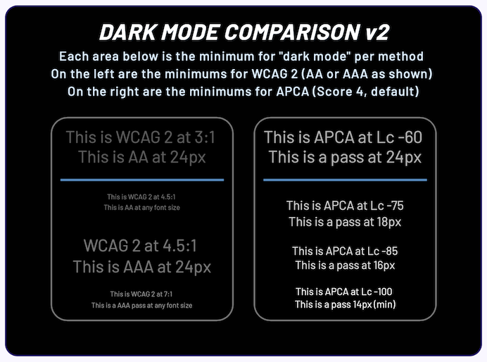
  • month11y issue 34

    We’re fast approaching Christmas, and I have a gift for you. You can shape the future direction of this newsletter by filling in my survey! It would really help me to understand what you like or don’t like, which subjects you’d like to read more about, all that lovely stuff. All I Want for Christmas is You(r) thoughts on my newsletter – please fill it in! 🎄 Now on with the show…

    What Does X% of Issues Mean?

    Adrian Roselli ponders what tools mean when they claim to find up to X% of issues. What do “issues” mean in this context?

    He ran a Twitter poll with a few options; most people interpreted “issues” to mean ‘issues validating against the 78 Success Criteria from WCAG 2.1’. But this was closely followed by people who thought it meant “against the tool’s own list of items”, i.e. tests unique to the tool. Finally, a small minority thought it might be against Techniques for WCAG 2.1, which “provides 90 different ways of failing assorted Success Criteria”.

    Not a hugely informative post, but an interesting thought piece. Adrian recommends asking vendors to clarify exactly what they mean by “issues”.


    4 Required Tests Before Shipping New Features

    Stephanie Eckles shares 4 quick checks you should make before pushing to production.

    1. Almost 85% of homepages have text contrast issues – so check your colour contrast. Stephanie lists some automated tools that can detect these issues.
      • Use ButtonBuddy to choose accessible colours for your buttons and their focus states. For the text, background colour, and transition between focus states, there are five con trast considerations you’ll need to make!
    2. Next consider keyboard interaction – here’s a handy set of rules, which I’ve copied directly from the article:
      • If it opens something, it may need to close with Escape.
      • If it’s scrollable, it needs to respond to Up/Down arrow keys.
      • If it’s a group of related options (like autocomplete or tabs), it may need to respond to Up/Down or Left/Right arrow keys (search phrase: roving tabindex).
      • If it opens a dialog/modal, it needs to prevent tab access with elements outside of that experience (search phrases: “trapping focus” and “inert”).
      • If it’s interactive at all, it needs to be able to gain keyboard focus, and that focus needs to have a visible style.
      • If a sighted mouse user can explore and make independent selections (like in an autocomplete), a keyboard user needs to be able to as well. This likely means allowing a combination of tab, arrow keys, and Enter to explore and then make a selection.
      • If a :hover triggers content, then so should :focus (ex. menus). You will also need a way to close this content, whether that’s a tap/click outside or Escape key, and ensure that the method you choose is also accessible for touchscreen users.
    3. All focusable elements must have visible styles.
    4. WCAG SC 1.4.10 Reflow stipulates that your design should be able to accommodate a zoom of up to 400% on desktop. Watch out for sticky navigation, ‘contained scroll’ areas becoming cut-off, or overflows that cut off content.

    Why ‘dark mode’ causes more accessibility issues than it solves

    H Locke, a UX designer, talks about astigmatism, which affects around 47% of the UK population. Actually Locke points out it affects most of the population, but the 47% figure is those that require corrective treatment, such as lenses or glasses.

    The condition affects the shape of the eye, making it more ‘rugby ball’ shaped than football shaped. This leads to light being focused at more than one place in the eye, and can cause blurred vision, headaches and eye strain.

    Locke says that the ‘dark mode’ on certain websites can cause an effect called ‘halation’, for those with astigmatism. There’s a mocked up screenshot in the article, demonstrating the effect, but it essentially makes the area surrounding highlights blurry. In dark mode, there are a lot of highlights (e.g. white images are more pronounced), so the text around the images becomes blurred.

    Dark mode advocates often cite it as an accessibility feature – and it is an improvement for some people – but Locke reminds us of the importance of making such modes optional.


    Why you should never use px to set font-size in CSS

    Josh Collinsworth dispels the myth that it doesn’t matter whether you use px, em or rem for your font sizes.

    Whilst px stands for “pixels”, it no longer translates into physical pixels on the screen, as browsers scale up pixels on higher resolution screens. “Pixels on the iPhone 14 Pro are so microscopic that 16px, in literal device pixels, would be about the size of printed type at 2pt font size”.

    em once referred to the physical size of an “m” character, but now refers to “current font size”. rem stands for “root em“, and refers to the root font size. By default, 1 em and 1 rem are equal to 16px (the default font size of most browsers). But whilst 1 rem generally remains at a constant 16px, the ‘pixel size’ of 1 em changes based on its context.

    With the CSS .container { font-size: 200% } and .container p { font-size: 1em }, the 1em here will actually render as a 32px size, not 16px.

    Understanding how this works is the key to unlocking why defining font sizes in px is a bad idea. em and rem work with the user’s font size – the user can change the browser’s default font size and everything will scale accordingly. Defining font sizes in px overrides the user’s choices.

    The misconception most likely comes from this: developers zooming in to test their web page, and noting that fonts seem to scale up and down irrespective of the unit type used. However, not everything scales in the same way.

    If you set CSS of p { border-bottom: 2px solid black; margin-bottom: 20px }, and then change the default browser font size to 64px, you’ll see some large text, but the surrounding spacing and borders don’t scale with it. Setting these values with em or rem would mean they would scale with the text. Zooming in and out does scale the border and spacing, but it’s so undersized compared to the root font size that it looks terrible. See screenshots in the article.

    For similar reasons, it’s important not to use px in your media queries. If the user overrides their root font size, you may find that your breakpoint does not trigger at the width that you expect it to.

    Josh summarises with a recommendation to use rem by default, only using a smattering of em where it’s important to make something relative to the size of its container, and only using px for certain aesthetic elements that you would not want to scale with the user’s font size.


    https://randoma11y.com/

    A helpful utility for generating accessible color combinations. View the project on GitHub or follow it on Twitter.


    Why we need CSS Speech

    Léonie Watson describes how all modern browsers allow you to “listen to content”, either natively or through some plugin/extension, and how developers currently have very little control over how content gets read. “In the same way an organisation chooses a logo… it stands to reason that they may also [wish to] choose a particular voice that represents their brand”.

    Speech Synthesis Markup Language (SSML) is intended for this purpose, but involves mixing in special markup inside your HTML. Léonie argues that this returns us to the bad old days of having to mix styling into our HTML, before CSS allowed us to separate content from its presentation. (By the way, SSML isn’t supported in any browsers yet).

    Léonie points us to the CSS Speech Module. It is a W3C Candidate Recommendation, thus has not yet achieved the status of W3C Recommendation. In short, it proposes a set of CSS properties to let authors define the aural presentation of content, whether read out by someone’s screen reader, a browser’s read-aloud capability, or a platform Text To Speech (TTS).

    The speak: property would act like the display: property; the latter determines whether an element is visible, and the former would determine whether the element should be spoken. These would be linked; if an element is set to display: none, for example, then the element would also not be spoken, unless an override is provided. Other properties proposed include voice-family, voice-pitch, voice-rate and voice-volume.

    Léonie is hoping to edit the CSS Speech module, stripping it down to its bare minimum, as the current proposal is “too big, too wordy, and has too many features”.


    HTMHell Advent Calendar 2022

    Manuel Matuzović’s famous “HTMHell” site cites lots of examples of bad HTML practices, copied from real websites. See “button disguised as a link“.

    Last year, Manuel created an ‘advent calendar’ of links to other sites, linking to articles about HTML.

    This year, Manuel has enlisted the help of 24 authors from all over the world, to write and publish articles specifically for Manuel’s calendar.

    Visit the calendar link above to see the articles published so far, or follow along on Twitter.


    Should browsers offer site-specific user preference controls? (yes!)

    Stefan Judis dreams about what could be made possible in browsers in this short opinion-piece.

    Users can set an OS-level or browser-level preference for light or dark mode, but there’s currently little support for configuring this on a per-site basis. What if you simply prefer a particular mode on a specific site, even if it goes against your global settings?

    Stefan highlights Safari’s website-specific controls menu, which can only be accessed after enabling them via toolbar settings. Here, users can set preferences on page zoom, autoplay, and permissions including location and camera access, on a per-site basis. Stefan feels other preference should be configurable here too.

    Stefan would like to see ‘preference queries’ not only easily configurable globally, but easily overrideable on a per-site basis. These include:

    • prefers-reduced-motion
    • prefers-reduced-transparency
    • forced-colors
    • prefers-color-scheme
    • prefers-reduced-data

    Hopefully one brave browser will lead the way and this could become a reality one day.


    A Guide To Keyboard Accessibility: HTML And CSS (Part 1)

    This is a comprehensive run-through of a lot of the stuff you may already know: how different tabindex values affect keyboard behaviour, the new(ish) :focus-within CSS selector to be able to apply focus styles on a container element, the new (and not ready to use yet) inert attribute that promises to make modal dialogs much easier to implement, and so on.

    There are some nuggets of handy tips and links to resources that were new to me though. Did you know that Firefox allows you to tab to any area that is scrollable (i.e. even if it isn’t a form control or link)?

    There’s a reminder to not use outline: none in your CSS (to eliminate the element’s outline), as it is used by Windows High Contrast Mode. And, despite showing an example that demonstrates otherwise, we’re told to avoid wrapping <input> with <label> because it doesn’t work well with Dragon speech recognition software.

    We’re warned against the use of display: contents, which effectively makes the element’s children direct descendents of the element’s container (i.e. the childrens’ grandparent), but “without losing semantics”. It’s an interesting concept, but one that is quite buggy, and best avoided. There’s also a section about CSS grid and flexbox, and the care needed to ensure that tabbing continues to be in a predictable order.

    I liked the section about ‘skip links’ towards the end of the article. It reminds us that we can provide multiple skip links at the top of the page, e.g. to skip to main content, or to skip to a list of all articles. We can also apply skip links within content, e.g. if there is an embedded map in the page and it has lots of focussable elements, you may want to give the keyboard user an option of skipping over it.

    Further reading: MDN web docs page demonstrating lots of different input types, so that you can try interacting with each one of them using your keyboard.


    A Guide To Keyboard Accessibility: JavaScript (Part 2)

    In this second part of a two-part series, we move away from HTML and CSS and take a closer look at JavaScript.

    The click event listener listens for a mouse click, but is also triggered by the Enter key (on buttons and links) and the Space key on buttons only. For other keys, you’d need to use the keydown event. This is often used for things like enabling the Esc key to close a modal. You can use keycode.info to find out which key code corresponds to the key you’re listening for.

    Another important event is blur, which indicates that the element has lost focus. Combined with the keydown event, you can use this to add and remove a class on the given element, so that the state is wiped clean on each interaction and you can (for example) continually open and close a modal.

    Next, we learn about the focus() method, which allows you to bring the keyboard focus to a particular element. It can be used with the preventScroll argument to ensure the browser doesn’t scroll as part of the interaction. There’s also a new focusVisible argument, which would prevent the focussed element from displaying its focus styling, but this currently only works in Firefox.

    There’s a section on “roving tabindex which looks interesting – check out the demo. Sadly, the role="tab" and role="tabpanel" attributes are left unexplained, but there’s lots of detail about the actual JavaScript implementation.

    The inert attribute mentioned in dai11y 15/12/2022 (intended for things like modals) gets a second showing here: the author talks us through how we should implement a modal at the moment (with inert not yet supported). We give it a role="dialog" and aria-modal="true" for screen reader, and a tabindex="-1" to make it programmatically focussable. Then, we create a function to open the modal, but need to keep track of which element opened it, as we’ll need to return focus to that element when closing the modal. The code looks something like:

    let focusedElementBeforeModal;
    const modal = document.querySelector("[role='dialog']");
    
    const openModal = () => {
      focusedElementBeforeModal = document.activeElement;
      modal.hidden = false;
      modal.focus();
    };

    There’s some more detail about modals / focus traps and how to use the new inert attribute, towards the end of the article.


    Lefty dentists and inclusive design

    An article about the barriers faced by left-handed dentists, in what the article author, Robert Stribley, calls “a failure of inclusive design”. Robert’s dentist immediately “became a better dentist” after graduating dental school, as they were able to set up their working environment to best suit them.

    Barriers occur in everyday situations:

    The pen you have to sign things with at the bank is often positioned for right-handed people. The machines for swiping your subway card here in New York are exclusively positioned for right-handed people. And scissors? Ask left-handed people about scissors. When you’re left-handed, you realize how insensible it is for scissors to be designed exclusively for right-handed people. In fact, when I was living in Pusan, Korea in the mid-90s, I found that ambidextrous scissors were available everywhere, so I bought two pairs and still use them to this day.

    Going back a few decades, children were literally punished for being left-handed, and were forced to write right-handed. Between the early 1900’s and 1960’s, the rate of left-handedness appeared to “increase” as it gradually became more accepted – but the proportion has almost certainly been constant throughout, it’s just that a large number of left-handed people had to suppress their instincts and learn to live right-handed.

    Robert compares this to “the idea that transgender people have suddenly been materializing in our society, due to either being transgender becoming trendy or, worse, because (some critics posit) children being “groomed” by adults to be trans. Of course, the simpler answer is simply that transgender people are rising in numbers because they’re no longer being stigmatized to the degree that they once were”.

    Robert, a creative director & “UXer”, amongst other things, concludes with this:

    As we come to understand the diversity of our shared human experience then, we’re increasingly exposed to opportunities to develop more inclusive design practices. This applies across the whole spectrum of design, including the design of physical products and digital experiences.

    There are both noble and practical reasons to practice inclusive design. And no good reasons not to.


    When to use target=”_blank”

    An old CSS-Tricks article by Chris Coyier, worth reading as a refresher.

    The default value for the target attribute, if unspecified, is “_self”, meaning links open within the same window. Using “_blank” forces links to open in a new window or tab. Users can opt in to opening in new tabs by using CMD + Click when opening links, so they have the choice without being forced into any one decision.

    Chris points out some bad reasons that have been used in the past to justify forcing links to open in new tabs:

    • For branding, metrics and engagement. Opening new tabs means people still have your website on their original tab, keeping them on your site.
    • Because internal and external links are different. Quite a few sites only open ‘external’ in a new tab.
    • Because the link is to a PDF. Users can still use the back button, so why a new tab? (PS if you’re trying to make it easier to download, use a download attribute on the link instead).
    • Because your client wants it that way. Chris suggests educating them about not frustrating their users.
    • Because it’s an infinite scroll page (to avoid the issue of handling ‘back’ behaviour after a long scroll).

    Chris then lists some good reasons for opening in new tabs:

    • Because there is user-initiated media playing.
    • Because the user is working on something that would be lost if the current page changed.
    • Because there is a technologically obscure reason. Chris cites “building an email where people in Outlook Kangaroo 2009 Enterprise Edition need to open it but links need to have target=”blank” on them otherwise they open in the sidebar viewing panel”…!

    Last but not least, don’t forget to add the rel="noopener" attribute when opening in new tabs, for security reasons. This is less relevant now we’re approaching 2023, but the article hasn’t been updated to remove that advice yet, so I’d err on the side of caution and keep doing it.


    Linux Accessibility: an unmaintained Mess

    Devin Prater shares his experiences of trying to use Linux as a blind person.

    He reminisces about the days of Gnome 2 on Vinux, which was “accessible and easy to use” when used with Orca, the Linux GUI screen reader. Around 2015, Sonar came along, based on Antergos (Arch Linux). Both projects “are no more”, due to infighting when the two planned to merge.

    With Vinux and Sonar abandoned, many blind Linux users moved to mainstream distributions, which vary in their accessibility. Devin shares tale after tale of the barriers he faces and overcomes, only to be faced with another barrier. I won’t reproduce it all here, but safe to say that even when doing everything right, Devin would need to enable settings on a per-app basis, find things were incompatible and that key processes would crash. If someone as technically competent as Devin faces these issues, other users have no hope.

    Devin ends with a call to action, for the open source community to care enough about accessibility to “clean up the mess they started”. He was forced to reinstall Windows, and highlights how not being able to use Linux is impacting his ability to get a skilled, well-paid job. Devin points out that the blind community are the very people that stand to benefit most from gaining system administrator skills and so on, if the accessibility barriers can be overcome.


    Setting up an Accessibility Book Club

    Beverley Newing, Accessibility Lead at the Ministry of Justice Digital and Technology, describes how they set up an ‘Accessibility Book Club’.

    The club helped Beverley to create accountability, to ensure they were setting aside time to read and hear about the experiences of disabled people. The club can read books, or watch films/documentaries/TV series, but the item has to be about (or written by) someone disabled, or be on the topic of disability.

    Beverley suggests using an online location as a meeting point, e.g. Google Meet. Create a calendar placeholder and a series of questions to serve as discussion prompts. Finally, create a Slack poll (or similar) so that the next media item can be voted upon.

    The author has open-sourced a “collection of resources to help run an accessibility book club”. The linked app is down at time of writing, but you can access the resources on GitHub.


    Whew, that was a long newsletter! Did you know that you can subscribe to smaller, more frequent updates? The dai11y, week11y and fortnight11y newsletters get exactly the same content. The choice is entirely up to you! Curated with ♥ by developer @ChrisBAshton.

  • month11y issue 33

    Welcome to your monthly frequent11y newsletter, brought to you by @ChrisBAshton. I hope you enjoy these a11y articles I’ve collated and summarised for you. (Psst – if you find these emails too long, consider switching to shorter, more frequent updates). Now on with the show!

    Abbreviations can be problematic

    Martin Underhill writes about the problems of using abbreviations such as NGL (“not gonna lie”) and how inaccessible these cultural shortcuts can be.

    There is an official ‘fix’ for this in HTML: <abbr title="Not gonna lie">NGL</abbr>, but it doesn’t show a tooltip when a touchscreen user touches it, nor is it necessarily exposed in things like RSS feeds. It isn’t always announced to screen reader users, and it isn’t included in the browser’s tab index.

    The best solution is simple: don’t abbreviate, and use the words. Or, if you must use an acronym multiple times, define the first appearance with brackets.


    Website Slammed for Not Allowing Users To Send Emails if They’re Colorblind

    Someone in America who tried sending an email to their township (district/council) was unable to, because the anti-spam measures used on the site was not accessible to colour-blind people.

    It showed a little square box filled with a green colour, and asked the user to select the right colour from a dropdown list. As RealLaurenBoebert wrote: “If you wanted to intentionally design a captcha that would let bots through, and keep colorblind people out, it would look exactly like this.”

    The name of the township is not mentioned, nor is there a link to the web page that contains (or contained) the issue. I imagine the measure would also have been impossible for screen reader users to pass. Let’s hope it’s been replaced with an accessible alternative now.

    This story highlights the risks of rolling out your own anti-spam measures, which require careful consideration to be accessible.


    Designing Better Inline Validation UX

    Vitaly Friedman writes a lengthy analysis of the different approaches to inline validation.

    There are places where it is useful and non-controversial, e.g. a password strength indicator, where a live feedback mechanism lets you know whether or not your password is strong or weak as you fill in the field.

    Other places are full of nuance. It is difficult to know whether a user has deliberately or accidentally skipped a field, and whether or not they intend to go back to it. At what point do you intervene?

    You could validate on page load, which is a poor experience for users: all error messages by default, until they fill in the form. This is more distracting than helpful.

    Or you could validate on form submit, which is a clear message of intent from the user: “I think I’m finished”. But then the resulting errors can be overwhelming, especially if there are several things the user has to go back and fix.

    Vitaly gives many snippets of general guidance to follow, such as:

    1. Never disabling copy and paste
    2. Validating early when the format is predictable (e.g. if an input must begin with a particular sequence of characters, like a country code at the beginning of an IBAN)
    3. Use the ‘reward early, punish late’ mechanism (don’t show errors by default, but do show an error when leaving the field, if the input is wrong. When the user goes back to fix it, remove the error as soon as the input looks good – NOT waiting until the user leaves the field again).

    Definitely worth a skim!


    Brief Note on Super- and Subscript text

    Adrian Roselli explores how different screen readers deal with superscript and supscript text.

    Firstly, it’s useful to note that there are multiple different positions of super/sub script, set using the vertical-align CSS property:

    • baseline is used for representing the lower character in fractions and abbreviations, alongside super for the upper character
    • text-top is used for going above the ascender line, such as to represent footnotes
    • sub is used for going below the baseline, such as to represent the numbers in chemical compounds

    This is hard to describe textually, and difficult to represent visually due to the limitations of WordPress, so I suggest you check out the examples on CodePen!

    But that’s all really more of an aside. Adrian’s focus here is on what screen readers do with the <sub> and <sup> elements. What isn’t hugely clear from Adrian’s article is what he actually hopes to hear from his screen reader. That can be deduced from one of his bug reports:

    I expect to hear the sub- and super-script text as marked up by <sub> and <sup>. Failing that, I expect there is at least a setting… to expose superscript and subscript text audibly to users.

    Adrian tests each screen reader in turn. Where the super/sub text is not ‘enabled’, it’s unclear whether the contents are simply not announced as <sub>/<sup> elements, or whether the contents of those elements are ignore completely, which would be far worse! In my experiment with VoiceOver, the elements’ contents were announced but not the markup. Anyhow, these are Adrian’s findings:

    • NVDA has a setting to enable them, but this only works if vertical-align has NOT been set to text-top or baseline.
    • VoiceOver has no such setting, but does have an option for exposing the contents to Braille readers. There is also an option to increase text verbosity to the level that it exposes sub/super text, but this also announces the typeface and font size, for everything, so is completely impractical.
    • JAWS has no settings, and “ignores them completely”.

    accessguide.io

    A handy resource for learning about accessibility guidelines for the web. It covers common design patterns such as saving data after session timeout. It covers how to prevent interesting buggy edge cases such as accidentally hitting a button when trying to scroll past it. And it covers common accessibility problems such as identifying and describing form error messages to users.


    Two new bots can help newsrooms prioritize accessibility and alt text

    An interview with Patrick Garvin, former worker of Boston Globe.

    Patrick noticed that a lot of newsrooms tended to omit alt text on their social media, excluding a lot of people from reading that content. So he built an @AltAwareness Twitter bot, which listens for tweets that contain journalism-related hashtags and, essentially, calls them out when they include images but no alt text.

    He was inspired by an earlier bot by Matt Eason, which performs a similar service for people who use the #accessibility hashtag but fail to provide alt text. He’s also built a similar one that scans tweets from the UK government.

    Patrick found that his bot would get blocked a lot, and not have the effect he was hoping. So he built an @A11yAwareness bot which is more advisory in tone. “It doesn’t retweet anyone, it doesn’t call anyone out” – it tells people “Here is stuff that you might not know”. This has had a much more effective response from people who had been tweeting inaccessibly.


    A First Look at the Websites and Software Applications Accessibility Act Bill

    The “Websites and Software Applications Accessibility Act” (or #A11yAct) has been put forward to the United States Congress. If it succeeds, it will build on the Americans with Disabilities Act (ADA).

    Its aim is to lead to clearer regulations for digital accessibility requirements in the US. Here, Ben Myers looks at it from a web developer’s perspective. He opens with a disclaimer that he’s not a lawyer. For a legal perspective, read “Proposed web and software accessibility legislation introduced in United States Congress“.

    Ben summarises the bottom line for us:

    • Websites and apps will need to be accessible, period – no longer any need to demonstrate a link to a physical, bricks-and-mortar place (an idea called “nexus”).
    • Regulations would be updated every three years.
    • It’s not a silver bullet, but it will give disabled users more recourse against inaccessible products.

    Ben then gives a short history of the ADA and why new legislation is necessary. One issue is the idea of ‘nexus’, and another is that it did not keep up with the times, but the main issue is ambiguity. The lack of published regulations means individual courts are left to interpret the act, leading to inconsistent outcomes in accessibility lawsuits.


    Are you sure that’s a number input?

    Kilian Valkhof highlights how <input type="number"> is often used incorrectly, despite it being available in browsers for around 8 years now.

    Number inputs display a ‘spinbox’ (up and down buttons) to make it easier to increment or decrement the input. This kind of indicates the type of thing this input type should be used for: non-identifying numbers.

    Instead, a lot of sites use number inputs for things like 2FA codes, social security numbers and credit card numbers. These are identifiers, where if you’re off by just 1 digit it’s much the same as being off in ALL the digits. Having a spinbox for this provides no value.

    If your input is a set of digits that is used to identify someone or something, it’s not a number type, even if the input itself is entirely made of numbers. What you want in those cases is <input type="numeric">.


    Perceived affordances and the functionality mismatch

    Léonie Watson shares a design problem she encountered on Twitter. When you have ‘buttons’ grouped together in a row, and only one can be ‘active’ at any one time, how should it be marked up?

    This fits quite nicely with a standard radio button form control, where you can only select one radio input. Choosing any other radio input automatically de-selects the previously chosen one. Exactly what we’re trying to achieve in this design problem.

    However, whilst that might work well enough for sighted users who use a mouse, it creates a UX issue for keyboard users and screen reader users. This is because, whilst the inputs may look like buttons – which can be tabbed between – they are marked up as radio buttons, which require a different key input to navigate between the options. Once on a radio control, hitting ‘tab’ simply skips to the next interactable element after the radio control (with the exception of Firefox).

    Léonie explains quite a bit about ‘affordance’: designing things in such a way that users can use their past experiences to already have a good idea about how something is supposed to work. She argues that whilst this concept works in the real world, it hasn’t translated to the digital world very well.

    Lea Verou, the person who asked the original question on Twitter, ended up creating a custom component and accompanying article.


    ‘Accessibility at the Edge’ W3C CG Is an Overlay Smoke Screen

    Adrian Roselli brings attention to the Accessibility at the Edge community group, hosted on W3.org. People would be forgiven for assuming that such groups are supported by the World Wide Web Consortium (W3C), but Adrian talks us through the process, which requires just five people to show their support for a proposed group in order for it to be created.

    This group started off as the “Overlay Community Group”, founded by the Chief Operating Officer at UserWay – an overlay company. Adrian argues that the renaming of the group was an attempt to distance the founders from the original purpose of the group, which would have been quite easy to argue a self-serving interest in.

    What follows is seemingly a long history of careful censorship, with difficult questions and critical comments never getting past the ‘approval’ stage on the group, thus never being seen. Adrian worries that the group could now be used to “provide a veneer of credibility”, by “using the W3C brand [in] their own ongoing marketing efforts”.

    Definitely food for thought, and something to keep an eye on.


    Are Captions More Accessible on the Top of the Screen?

    An interesting article about the placement of closed captions, which so often is put at the bottom of the screen by default.

    The author describes how they were seated in an auditorium, which tall people sat in front of them, making it difficult to read the captions at the bottom of the screen (“I lean to the left. I lean to the right”).

    On Zoom, the captions window can be moved anywhere on the screen by dragging it. It’s also possible to reposition the captions on YouTube videos.

    No solid conclusions here, unfortunately, but some more interesting experiences in the comments, e.g. captions covering the name of the speaker in news bulletins.


    For Blind Internet Users, the Fix Can Be Worse Than the Flaws

    A (paywalled) New York Times article, offering a rare mainstream insight into the use of overlays that claim to fix accessibility problems and defend companies from litigation.

    It tells the story of Patrick Perdue, who had been happily using a radio equipment shop website for some time, before the shop started using an automated accessibility overlay from accessiBe. Patrick found that the site was suddenly unusable, hiding checkout and shopping cart buttons from his screen reader, as well as hiding the site’s search box and headers.

    “I’ve not yet found a single [overlay] that makes my life better”, says Patrick. And the litigation promise doesn’t appear to be holding water either, with over 400 companies sued over accessibility last year, despite having an accessibility widget or overlay on their website.

    The three major overlay providers, AudioEye, UserWay and accessiBe all claim their products will get better over time and acknowledge that their current offerings “aren’t perfect”. Accessibility experts would prefer companies not to use such overlays, believing that hiring and training employees to build their websites to be more accessible is the answer. Mr Moradi of AudioEye advocates a hybrid approach that combines automation and manual fixes, with the expectation that automation abilities will gradually improve.


    aria-label is a code smell

    Eric Bailey highlights a snippet from the WebAIM Million report:

    Increased ARIA usage on pages correlated to higher detected errors. The more ARIA attributes that were present, the more detected accessibility errors could be expected.

    He references the increased complexity of ‘support’ in the context of ARIA, which is determined by:

    • Operating system being used,
    • Operating system’s version,
    • Browser being used,
    • Browser’s version,
    • Assistive technology being used,
    • Assistive technology’s version, and
    • Complexity of the underlying code.

    When aria-label is used on a non-interactive element – which is not what it is intended for – assistive technology handles it in different ways. It will either not be announced at all, or will be announced in strange ways.

    Even when declared on an interactive element, there are known issues. It only has partial support in Edge with Narrator, and, if you think of a play/pause toggle, in many cases it does not convey name changes when focused.

    Eric also cites examples of people using aria-label to override an otherwise visible name. Users who use their voice to navigate, such as “Click ‘snapshot’”, may be surprised when their voice command does not work, as the underlying accessible name is different (and not visible to them).

    Some browsers do not translate aria-label content, so things like Google translated pages won’t work properly. Finally, aria-label content is not very robust to things like stylesheets failing to load. An alternative – visually hidden text – will at least still be visible if the styles fail to load.

    Worth reading the Hacker News comments on this too.


    Whew, that was a long newsletter! Did you know that you can subscribe to smaller, more frequent updates? The dai11y, week11y and fortnight11y newsletters get exactly the same content. The choice is entirely up to you! Curated with ♥ by developer @ChrisBAshton.

  • month11y issue 32

    Welcome to your monthly frequent11y newsletter, brought to you by @ChrisBAshton. I hope you enjoy these a11y articles I’ve collated and summarised for you. (Psst – if you find these emails too long, consider switching to shorter, more frequent updates). Now on with the show!

    My War On Animation

    Article on The Verge, as part of July’s Accessibility Week.

    The author writes about their experiences navigating the web as someone who finds any animation a stimulatory overload. They acknowledge that there are documented standards for the ‘limits’ of animation on the web, such as keeping gifs to five seconds maximum. However, the documented standards don’t go far enough for the author, who finds it difficult to deal with any animations.

    There’s a really succinct paragraph describing the workarounds that people resort to, and the negative knock-on effects that can have:

    I can block anything ending in .gif, but it usually renders buttons nonoperative. I can load a site without styles, but usually, the result is not very enjoyable to use. I can block ads, but then it deprives the nice websites I like to read (and write for) of revenue.

    They point out some technological implementations that work for all users:

    There is, of course, a way to bridge this divide, and bizarrely, one of my allies is Twitter, which struck a decisive blow when it allowed users to freeze autoplay on all moving content, including GIFs. Users who love them can post them; users who don’t simply see a still frame. What’s good for reducing server load is also good for the case exceptions such as mine.

    The article ends with a call to action for developers, to give users control to shape their own experience. Give people toggles to opt in and out of animations and other potential accessibility barriers.


    It’s Mid-2022 and Browsers (Mostly Safari) Still Break Accessibility via Display Properties

    Adrian Roselli does some manual testing of the display CSS property – with a particular focus on display: contents – across different browsers, meticulously recording the results here.

    For the uninitiated, there’s a CSS Tricks article about display: contents. You can apply this to ‘wrappers’ around content, and it makes the container ‘disappear’, making the child elements appear as siblings. This allows for such elements to appear in the same CSS grid or flexbox together, and prevents the need to forego HTML semantics for the benefit of layout.

    However, as the CSS Display draft points out, “this is not implemented correctly in major browsers, so using this feature on the Web must be done with care as it can prevent accessibility tools from accessing the element’s semantics”. Adrian substantiates this, confirming that, for VoiceOver, Safari in particular will fail to correctly parse tables, announce lists or make buttons easily actionable when display: contents is applied.

    It’s no wonder developers are calling Safari “the new Internet Explorer”.


    How to write user stories for accessibility

    Not a particularly long article, but I may as well cut straight to the chase with some examples:

    As a keyboard-only user, I want to know where I am on the screen so that I can perform an action or navigate to other areas of the site.

    Or

    As a screen reader user, I want to hear the text equivalent for each image button so that I will know what function it performs.

    Accessibility user stories are just like any other user story: they start with a persona, identify the desired goal, and define the benefit to the user.

    The article links to some further reading, including this GOV.UK blog post from 2018.


    Am I disabled?

    “With my pen hovering over a form, there is no easy answer: better to provoke stigma with support, or resist classification?”

    Joanne Limburg writes about the dilemma she faces when filling in forms that ask “Do you consider yourself to be a disabled person?”

    Joanne was diagnosed with autistic spectrum disorder (ASD) around the age of 42. Until then, she’d considered herself non-disabled. Even now, when she pictures disability, she pictures stock images of wheelchair icons, guide dogs, other more visible disabilities.

    “Inside every Yes box is a flat, painted wheelchair stick-figure, asking me what I’m doing in their parking space”. Joanne considers ticking the No box, as her disability is invisible, and she can “sneak out in an able-bodied disguise”. Then there’s Prefer not to say – when that’s an option on the form.

    Joanna says she tries to pick the option based on her best guess about what the asker thinks disability is. Does the asker think in terms of the social model of disability, for example?

    “I’ve come to understand that when I pass as non-disabled, when I say No, the best that I can hope to be is an inferior version of an ideal of normality that allows only for the narrowest range of body types, cognitive styles and life trajectories, that equates the worth of a person with her economic productivity, that fetishes independence and disavows our connections to each other, and that seeks to discriminate arbitrarily between those who are allowed their full humanity and those who are denied it.”

    Joanna shares her default answer to the question at the end of the essay. I won’t spoil it here!


    Next up, we have a bit of a “VR special”!


    Resident Evil 4 VR update adds accessibility options for comfort

    Resident Evil 4 on the Oculus Quest 2 – which I own, and think is brilliant! – has just had an update, concentrating primarily on accessibility options.

    Your waist and chest height parameters are now configurable, making it easier to grab your weapon etc. Someone in the comments said they used to have to duck to walk through doors, despite not being particularly tall!

    The colour of the laser sight can now be adjusted according to your preferences.

    Finally, the protagonist can now be “steered using hand movements, which can be assigned to either the left or right controller”.


    Accessibility Virtual Reality Meetup: What Is It Like in Spatial?

    Meryl Evans documents her experience of using Spatial, a virtual reality environments for events, to host the Accessibility Virtual Reality (A11yVR) Meetup.

    Spatial offers multiple ways to participate, including using a VR headset, a mobile app, or joining via the browser. Joining from the latter, you can navigate the environment using WASD keys.

    Spatial supports automatic captions, but it is a ‘pro’ feature and costs extra to enable. The company are apparently passing on costs from Microsoft, who charge for Azure captioning technology. Meryl hopes that the two companies can reach an agreement without burdening users with extra costs, as accessibility should be built in, not a paid extra.

    The captions themselves have quirks: when Meryl enabled them, they were captioning what she was saying, not just what other people are saying. The captions can also be hard to see, with sometimes poor contrast and no way of customising them. And one of the speakers could not get their captions to work, at all – down to some unspecified macOS issue.

    Some things worked quite well. For users who found movement from other peoples’ avatars distracting from the main presentation, they were able to switch to ‘object view’ to see only the presentation and nothing else.

    Auto avatar creation, from a user’s photo, worked well, and avatars were recognisable representations of their real world counterparts. Users could also stream their webcams above their avatars’ heads, which helped show they were paying attention.

    Meryl felt the lack of chat box functionality was a real barrier for people, who had to resort to posting virtual ‘sticky notes’ to communicate. These were buggy and hard to read.


    How Virtual Reality Makes It Possible to Experience Different Vision Conditions

    VoxelKei, a Japanese “VR world developer”, has created NearSighted Classroom (VRChat) to allow other people to see what it’s like to have short-sightedness.

    After sharing the world on Twitter (where you can see a video of the world in action), the developer received positive feedback and requests from many people to have him simulate other eye conditions such as astigmatism, presbyopia and colour blindness. He added those features within a month of the first release.

    You can tune the settings to match your own vision, and any friends who have joined the world with you will be able to see how you see the world!


    How Can a Blind Person Use Virtual Reality?

    Jesse Anderson, who runs IllegallySighted on YouTube, shares advice for creating accessible virtual reality experiences. He reviews games from his perspective as a blind person. There are games designed specifically for screen reader users, but these tend to be more simplistic and don’t hold his attention for long. Jesse mainly reviews mainstream games, which are becoming increasingly accessible. Third-party mods make other games accessible, such as Stardew Access for Stardew Valley.

    One title Jesse is particularly impressed with is The Last of Us Part II, for its 60+ accessibility options, making it fully playable end to end by a blind person, even on higher difficulty settings. Highlights include menu narration, high contrast mode toggle, a built-in magnifier, and the navigation system.

    Jesse spends most of this interview talking about challenges in VR. There are currently no commercially available accessibility tools for adding things like screen magnifier, screen reader, or high contrast to a VR dashboard or game interface. Jesse notes that “there was an amazing accessibility suite called SeeingVR, developed as a research project by Microsoft, but it never left the research stage”.

    It’s these text and user interfaces that present the biggest trouble for Jesse, more so than the ‘game’ elements such as aiming and shooting a weapon. Even accessing the accessibility settings to make games more playable can be an impossible task because the menus themselves are inaccessible.

    Jesse joined XR Access in 2020. It is an organisation “devoted to improving the accessibility of both virtual and augmented reality”, with several working groups dedicated to different accessibility requirements. One group focusses on the business case for XR, while another concentrates on development standards. It is in the process of developing resources and prototypes that developers can use when they are trying to figure out how to make their apps more accessible.

    The top things Jesse recommends developers include in their VR experiences are: different text size options, magnification and menu narration features, and most importantly, offering all 6 degrees of tracking, so that if a user needs to get closer to something in the environment to see it properly, they can simply lean in or move closer to it.

    Like the web, Jesse suggests that the platform itself needs to provide a standard base level of accessibility, such as a system wide screen reader. Unfortunately, existing screen readers aren’t compatible with the games themselves, which are powered by Unreal and Unity.

    Further reading/watching: Virtual Reality in the Dark: VR Development for People Who Are Blind.


    Virtual Reality Accessibility: The Importance of Comfort Ratings and Reducing Motion

    Meryl Evans talks about ‘comfort ratings’ for VR experiences. These are like content ratings for films and games, e.g. “PG” for “Parental Guidance”.

    Meta’s comfort ratings (for headsets such as Oculus) are as follows:

    • Comfortable – appropriate for most people. Generally no camera movement or player motion.
    • Moderate – appropriate for many. Might incorporate some camera movement or player motion.
    • Intense – not appropriate for many. Incorporates significant camera movement, player motion or disorientating content and effects.
    • Unrated – the developer hasn’t set a rating.

    The Oculus app store lacks a filter facility, so you can’t search by comfort rating. Worse, Steam’s VR app store does not yet have a concept of comfort ratings.

    Meryl calls for a standardised system across all VR platforms, moderated by a neutral third party such as Entertainment Software Rating Board (ESRB). It should not be left to developers to decide; their motivation to broaden the potential audience and sales by falsely marketing their experience as ‘Comfortable’ is a conflict of interest.

    Meryl finishes with a call to action for several organisations, including a request for headset platforms to build in a “reduced motion” mode.


    OK, now back to your normal varied a11y content!


    Candidate recommendation version of WCAG 2.2 published

    September 6th 2022 marks the first update since May 2021. According to w3.org:

    A Candidate Recommendation is a document that satisfies the technical requirements of the Working Group that produced it and their dependencies, and has already received wide review. W3C publishes a Candidate Recommendation to signal to the wider community that it is time to do a final review [and to] gather implementation experience.

    The document is considered complete and fit for purpose… No further refinement to the text is expected without additional implementation experience and testing; additional features in a later revision may however be expected.

    You can see the announcement on Twitter, which links to a page summarising what’s new in WCAG 2.2. One of the interesting ones is Success Criterion 3.2.6 Consistent Help, which has an example of a site’s ‘help chatbot’ feature that should be accessed in a consistent way, e.g. from a button on the bottom right corner of the page.

    SC 3.3.7 Accessible Authentication suggests giving users ways of logging into services via an email link, for those that don’t use password managers and find it difficult to remember their passwords. And a niche one, SC 3.3.9 Redundant Entry, requires that if users have to enter the same information again in the same process, the app should auto-fill the information rather than make the user re-type it.

    Thanks to David Cox for bringing news of the WCAG update to my attention.


    Preparing for the physical world through the digital

    Two articles caught my eye recently.

    In Ipswich station gets virtual tour to help passengers with accessibility requirements, we learn how Greater Anglia has launched an online tour of Ipswich rail station. It uses 360 degree photography to allow people to explore the platforms, the waiting room, and the toilets. There’s also an ‘autopilot’ tool allowing customers to select their destination location within the station and be automatically guided to it.

    The aim is to reduce anxiety about getting around, to help people to plan their journey in advance, and to help people confirm whether or not the station facilities are accessible to them. It’s been developed with technology from The Virtual Tour company and with the help of feedback from Greater Anglia’s Accessibility Panel.

    A dozen of Greater Anglia’s busiest stations are now covered by the technology, including Cambridge, Harlow Town, Stansted Airport and Norwich.

    The next article is Lanarkshire charity shop launches new tool WelcoMe to improve accessibility for disabled customers.

    WelcoMe is a website where customers can share with venues their access needs, anticipated arrival time and reason for visiting, for the best possible chance of an accessible and welcoming experience. The site also gives the shop team training in how to best meet the needs of the customer.


    Improving accessibility with accessibility acceptance criteria

    A GOV.UK blog post from 2018, describing GDS’s use of ‘acceptance criteria’ for accessibility testing.

    These criteria are more specific than general WCAG guidance, and concentrate on specific checks to make at the component level for specific components. For example, GDS’ accessible autocomplete component must:

    • be focusable with a keyboard
    • enable the user to navigate the available matches using touch or keyboard
    • inform the user when a match is selected
    • inform the user which number the currently selected match is – for example, 1 of 3 (optional)
    • inform the user if a match is pre-selected
    • …and so on

    These criteria are a way of recording decisions made early on in development, and provide a sense check against making breaking changes when iterating the component in future. They also serve to raise awareness of accessibility issues from the start.

    To write criteria such as these, start with accessibility needs by identifying where there is a high risk of introducing an accessibility barrier, and documenting how to prevent it. The hard work has often already been done in the WCAG guidelines, so extract rules pertaining to what you’re building, and link back to the guidelines for context.

    Criteria are most useful when they’re specific and testable. Don’t be too generic. Also avoid defining the solution; describe an outcome instead.

    Continue to refine your criteria over time, e.g. when encountering bugs, add further criteria and treat them like a failing unit test.


    Are you enjoying my newsletters so far? It would really mean a lot to me if you could share it with any colleagues or friends who may be interested! They can subscribe in a few seconds by visiting https://ashton.codes/subscribe-to-frequent11y/.


    Mac VoiceOver Testing the Simple Way

    Scott Vandehey writes about a familiar problem: getting comfortable testing with VoiceOver. It’s an experience that can make new users feel, as he puts it, “overwhelmed”.

    The first issue is with enabling VoiceOver; Scott could never remember the CMD + F5 keyboard shortcut. On newer MacBooks, Scott recommends triple-clicking the TouchID button instead, which is the shortcut for opening the Accessibility Shortcuts panel, from which you can enable VoiceOver.

    To avoid having to go via the panel, you can also go to System Preferences -> Accessibility -> Shortcut and uncheck everything except VoiceOver. This means triple-clicking the TouchID button will immediately enable VoiceOver.

    As Scott only uses VoiceOver for testing, he uses the visual caption panel instead of listening to the speech, which he has muted by opening the VoiceOver Utility -> Speech -> Mute speech.

    With VoiceOver configured, Scott’s approach to testing is to TAB through all the content on the page, which doubles up as a test that all appropriate elements are reachable and have focus styles. This approach commonly reveals issues with lack of context around interactive elements, e.g. a button that simply says “Menu”.

    Next, Scott uses the Rotor to show a list of particular items in the page, such as headings and links. This is a useful way to check page structure and to ensure that all links have enough description.

    Finally, using VO + →, Scott reads the entire content of the page. He acknowledges most screen reader users won’t do this, but it often brings up some little surprises.


    Visit for a surprise

    Eric Bailey raises the interesting dilemma of what link text you should provide on an ‘easter egg’ link to Rick Astley’s “Never Gonna Give You Up” YouTube video.

    WCAG SC 2.4.4: Link Purpose (In Context) might indicate that you should let the user know exactly what’s at the end of that link. “YouTube: Rick Astley – Never Gonna Give You Up (Official Music Video), contains auto-playing media”, or such like.

    Alternatively, you could go the other way and just have alt text of “Cryptic icon” and provide no clue at all, like sighted users would experience.

    Eric picks out an example from the WCAG docs and emphasises the last sentence:

    The word guava in the following sentence “One of the notable exports is guava” is a link. The link could lead to a definition of guava, a chart listing the quantity of guava exported or a photograph of people harvesting guava. Until the link is activated, all readers are unsure and the person with a disability is not at any disadvantage.

    The goal is to preserve the author’s intentional act, which is to create a sense of curiousity.

    Eric eventually lands on “Visit for a surprise, contains autoplaying media”, arguing that “Cryptic icon” does not provide the enticement, and that it is important to at least flag that there’s autoplaying media. Ideally, he says, sighted users should be warned of this too.


    Better accessible names

    Hidde de Vries shares some great tips for naming your labels and aria-labels:

    • Describe what the thing does, rather than what it looks like, e.g. “Next slide” vs “Arrow right”
    • Frontload the most unique part of the thing, e.g. in a list of albums, use “Midnight Marauders – Album” over “Album – Midnight Marauders”
    • Be concise: 1-3 words is ideal
    • Avoid roles, e.g. use “Close” instead of “Close button”, as the role will be announced by screen readers anyway
    • Keep names unique, e.g. “See also: [name of page]” vs “Click here”
    • Start names with a capital letter, and don’t end with a period – names aren’t sentences. This should lead to better pronunciation by screen readers.

    Which fonts to use for your charts and tables

    At first glance, this blog post looks like an advert for the website it’s hosted on: Datawrapper. But it’s packed with informative and useful content, and written by Lisa Charlotte Muth – so let’s dive in. Of course, due to the subject area, some of this will be quite subjective. Your mileage may vary.

    The first recommendation is to use sans-serif typefaces as a general rule, as opposed to serif ones which are most useful for long texts such as articles. Sans-serif looks cleaner and is easier to skim. You can still use serif sparingly, such as for the chart title or labels.

    Next, your font choice should have lining and tabular numbers. Lining numbers all have the same height, whereas ‘old style’ numbers go above/below the line (e.g. the ‘tail’ in the number 9). The picture in the article demonstrates this much more easily than I can describe! Similarly, tabular numbers all have the same width.

    Going one step further, choose a multiplexed font: one where the height and width of each character is the same regardless of whether the weight of the font is bold. This can be useful for bolding a particular row in a table, whilst still making the table look neat. Bold, by the way, should be used sparingly, to emphasise things.

    There’s a warning about ensuring your chosen font supports all the glyphs you need, such as characters for specific languages (ü ß é). And also a suggestion to choose a font that is not too wide nor too thin, though it then links to some well-known exceptions to the rule, so don’t take that as gospel.

    Only at the halfway point is WCAG mentioned, followed by advice about ensuring your text is big enough and has a high enough contrast. Some specific sizes and ratios are given, if you’re unfamiliar.

    Finally, there’s a note about using UPPERCASE text sparingly, and the often unwanted side-effect of said text becoming much wider than before. This can be corrected through a three step process: spacing out the letters more (called ‘tracking’ or ‘letter-spacing’), decreasing the font size to make it shorter, and then making the text bolder to aim for the same letter stroke width as the original text.


    Giving your future self a little credit with progressive enhancement

    This article alludes to the concept of technical credit, which is the antithesis of tech debt. It is the idea that putting in some effort now will make things easier on ourselves in future.

    The article describes the difference between progressive enhancement and graceful degradation, and cites some useful statistics. Around 0.2% of users ‘opt out’ of the modern web by disabling JavaScript. But at least around an extra 0.9% face pages where JavaScript simply fails to load, for whatever reason. These figures are based on a 2013 study run by Government Digital Service. The author re-ran GDS’s experiment and put the figure closer to 3% of users for whom JavaScript doesn’t load.

    The author underlines the fact that these are 3% of visits, not users – so the real figure of ‘how many users fail to get some of your JavaScript?’ is probably much higher. He visualises this with an animated gif of emoji faces, representing users on their journey on your site.

    The article is full of thought provoking soundbites like “An escalator can never break… it can only become stairs”. Worth a read!


    Whew, that was a long newsletter! Did you know that you can subscribe to smaller, more frequent updates? The dai11y, week11y and fortnight11y newsletters get exactly the same content. The choice is entirely up to you! Curated with ♥ by developer @ChrisBAshton.

  • month11y issue 31

    Welcome to your monthly frequent11y newsletter, brought to you by @ChrisBAshton. I hope you enjoy these a11y articles I’ve collated and summarised for you. (Psst – if you find these emails too long, consider switching to shorter, more frequent updates). Now on with the show!

    The negative impact of stylised captions on TikTok and Instagram

    It used to be that there was not enough captioned content on social media. People were posting videos but not captioning them, either because it wasn’t possible on the platform at the time or because they couldn’t be bothered.

    Auto captioning has become more and more popular, and it’s now quite simple to enable closed captions on your social media videos. As Courtney Craven puts it on their LinkedIn post, the resulting accuracy of caption can be “useless”.

    But another problem is how the captions are displayed: there’s an increasing trend for captions to display

    one

    or two

    words at

    a time.

    Courtney touches on some of the issues with that, as does accessibility consultant, Meryl Evans. This style of caption can be really hard to follow, and detract from the video itself, as one is so focussed on trying to keep up with the text. You understand language ‘as a unit’, not as one word at a time.

    I don’t think we can blame the content creators; they’ve been given a tool, and they’re using it. But social media companies need to work harder to not build inaccessibility into the tools they provide people.

    I’d be interested to know what kind of impact this has on screen reader users – send me an email if you have any insights!


    Tech Journalism’s Accessibility Problem

    Monica Chin, computing reporter at The Verge, writes about the lack of accessibility content in tech magazines. She notes that most accessibility content is written by freelance journalists, or by staff journalists whose primary focus is something else.

    The lack of mainstream content makes it hard for disabled consumers to know whether the latest game, mobile phone or software will work for them. “I’ll often have to research reviews and watch like, six or seven so I can find all the information”, says Chris Reardon.

    Some journalists feel that the solution is to hire an accessibility reporter, to provide dedicated accessibility coverage, such as accessibility reviews that sit alongside standard product reviews. Others feel that every tech reporter should have accessibility in mind when writing content.

    Monica also highlights the risk of perpetuating harmful tropes and stereotypes. The solution isn’t to flood magazines with stories about ‘inspirational’ disabled people (a phenomenon disabled journalists have been protesting for years).

    There’s also the risk that exclusively allocating accessibility articles to disabled journalists has them become the ‘token person’ to represent specific topics. That said, journalists with a related disability should be given the first opportunity to cover an article, if they wish. John Loeffler writes “it’s one thing for me to talk about the Microsoft Surface Adaptive Kit. It’s another for someone who’s like, when this review is done, I’m going to be using this on my own personal device”.

    An example of where mainstream opinion differs from accessibility focussed views is the ‘touch bar’ integrated with MacBook Pros. CNET, The Verge and Engadget have all derided it as a useless piece of hardware that nobody asked for. (I happen to agree. They’re also prone to hardware failure; my sister has had no ends of issues with this aspect of her relatively new MacBook, just outside the warranty period!).

    But Steven Aquino writes about how useful he finds the accessibility features of the touch bar. It makes shortcuts easier to trigger for those who lack the fine motor skills required for keyboard shortcuts. It allows the sending of emails or adding of emojis with a single tap, instead of multiple interactions.

    Steven often felt in a minority, reporting on this. The mainstream sites just don’t touch on this stuff. Monica’s article is a call to action for tech reporting to do better.


    Microsoft and Peel school board collaborate to launch Minecraft world focused on accessibility

    For those who don’t know, Minecraft has an education edition. (I wish I had this while I was in school!).

    That edition now has a new world, called BuildAbility. In partnership with America’s Peel District School Board (PDSB), it was launched on May 10th worldwide.

    BuildAbility is designed to “help students understand, identify, and work to eliminate accessibility barriers in their school and community”. Students learn about physical and technological barriers, as well as organisational attitudes and communication issues. They’re then encouraged to create solutions to those problems, in an open play area, trying to create the most accessible and inclusive experience.

    In the world, students will encounter physical barriers that disable wheelchair users, high noise levels in populous areas like the mall, etc. They can then rebuild parts of the world in an accessible way. Watch this brief video demonstrating the world (39s).


    Best Practices for Overlays

    Ken Nakata writes a thought-provoking article about controversial accessibility overlays.

    Ken was once opposed to overlays, but has come around to the idea, on the basis that they can work harmoniously with other accessibility initiatives. He concedes that the damage has already been done by inaccurate marketing of overlay companies, who falsely claim they can make websites fully accessible with a single line of code. But if we can allow overlays to mature and have these companies taper their claims, Ken envisages a future where overlays are widely used and useful.

    For example, a customer might hire an accessibility consultant, who spots a WCAG violation with a tab panel on their website. The developers fix that panel, but in the meantime, an overlay is programmed to spot and fix similar matches that don’t exactly match the original. As users come across these panels in the wild, the overlay does its best to fix the issue, and also automatically notifies the developers about the bug.

    Ken thinks overlays are an inevitability because:

    1. There is simply too much inaccessible content out there, and it won’t ever be fixed.
    2. Not all users are experts – more traditional assistive technology can be difficult to use.
    3. Technology gets better all the time.

    Ken finishes with a list of rules he believes all overlay producers should follow, containing good guidelines such as not automatically applying settings, and giving all users the option to quickly dismiss the panel.

    Definitely worth a read.


    GAConf

    This game accessibility conference is happening on October 24th and 25th. But there is plenty of archive footage from previous conferences.

    It covers a really interesting range of topics, such as accessibility in first person games, gaming with a muscle disease, bringing accessibility to storefront descriptions and audio-based games mechanics. Looks like one to watch, even if you’re not in the games development sector.


    The Hidden History of Screen Readers

    This lengthy but approachable article by The Verge covers the history of JAWS and NVDA.

    Ted Henter lost his sight in a car accident in 1978. Losing his job as a racing driver and mechanical engineer, he studied computer science, having to get volunteers to read programming books and terminal outputs to him.

    In his first computing job, Ted got his first “talking computer” (software created by Maryland Computer Services), which read one character at a time. This meant Ted could finally work without assistance. In the next version, it could read one word at a time, and Ted became the most known user, regularly calling the company for tech support.

    Ted was sent on a business trip to Chicago to train a businessman, Bill Joyce, in using the software. The two became friends and in 1987 created “Henter-Joyce”, releasing their own DOS screen reader called JAWS (Job Access With Speech). It had Braille support, dual cursors and a scripting language for users.

    As companies moved from DOS to Windows, a graphical interface, screen reader development became more challenging. Henter-Joyce released JAWS for Windows in 1995. Microsoft ended up buying the source code and created its own native version, but that eventually went nowhere, and JAWS retained the majority of the market share all the way through to 2019.

    The price of JAWS – $1000 for a home license – was prohibitive, especially to the 89% of people with vision loss from low and middle income countries. In 2019, NVDA (NonVisual Desktop Access) overtook JAWS in popularity. It is free and open source, developed by two friends from Australia: Michael Curran and Jamie Teh.

    Michael started it as a prototype in 2006. Within a year, Mozilla funded Michael to attend the CSUN Assistive Technology Conference, where Michael met like-minded enthusiasts. Michael and Jamie then set up the NV Access nonprofit to govern the project long-term. Initially viewed as ‘fine for home use, but not professional use’, NVDA has come a long way, with contributors from all over the world.

    The article contains lots of useful statistics. For example, in 2020, the estimated number of blind people worldwide was 49.1 million, comparable to the population of Spain or South Korea. An additional 255 million people have moderate to severe visual impairment. And in a recent Stackoverflow survey of developers, 1,142 people – approximately 1.7% of total participants – replied, “I am blind / have difficulty seeing.”


    How to get the best out of Accessibility features in Windows 11

    This is a useful overview of native accessibility features in Windows 11. I think it’s useful to occasionally remind ourselves what is available and think about how we should build our sites and apps to not get in the way of such features.

    All of the features are viewable in one place (accessed via WINDOWS AND I and heading to the Accessibility section).

    There’s a slider to change the system text size, as well as options to change your cursor style. You can opt in to having scrollbars visible the whole time – the disappearing scrollbar is something that catches me out a far bit on my Mac! (Though macOS also has options to configure this).

    The WINDOWS AND + shortcut toggles the screen magnifier, and activating it twice switches to greater magnification. There are colour filters, configured for different kinds of colour blindness.

    Windows Narrator is a built-in screen reader. You can also enable on-screen notifications to accompany audio notifications. Finally, there is speech recognition and voice typing.

    All of the above accessibility features are accompanied by screenshots in the linked article.


    The Guide To Windows High Contrast Mode

    In this Smashing Magazine article, Cristian Díaz covers everything you need to know about this accessibility setting, which we’ll abbreviate as WHCM below. This is a Windows feature that users can enable to replace the colours on websites and applications, in order to increase readability and reduce noise.

    WHCM is used by around 30% of Windows users with low vision, and around 4% of all active Windows devices. WHCM is misleadingly named, as many of its users actually opt for a colour palette that has a lower contrast than the default.

    Cristian points out that semantics are incredibly important in WHCM. Take this example of three different elements with the same class:

    <div role="button" class="button" tabindex=0>
      Not a button
    </div>
    <button class="button">
      Definitely a button
    </button>
    <a href="#" class="button">
      This is a link
    </a>

    They’re given the same styling, so would usually look the same. But in WHCM, they all appear different, as WHCM only looks at which underlying HTML element is being used.

    Another area to pay close attention to is the use of background styling. A common pattern is to give ‘primary’ and ‘secondary’ buttons different background colours, but in WHCM, the background colours are removed, and it can be hard to distinguish between the button types (or even to know that it is a button at all, if you’ve set a border/outline of zero!). A workaround is to set a transparent border instead, which will still hide the border visually in normal mode, but ensure that there is a button-identifying border in WHCM mode. As a rule of thumb, Cristian says:

    outline remains as the only reliable way to apply a focus state on an element in WHCM.

    If you’re going to use something different to highlight a focus state in an element, add the property outline-color: transparent as a fallback [for WHCM].

    WHCM will remove gradients applied using background-image, but will respect background images that use the url() value (something that I think has changed since my frontend developer days at the BBC!). The exception is background image in the body element, in Firefox, which apparently won’t render.

    Cristian only briefly touches on currentColor, which can be used to set things like SVG colours to the same colour as whatever WHCM is using for link text. He caveats this though, saying it won’t work in Chromium based browsers, due to the default colour value of SVGs being none. Luckily there is a new forced-color-adjust property which can be set to get WHCM to obey it.

    There’s also a forced-colors media query, so that you can target your WHCM overrides only for when WHCM is enabled. Within the media query, we can access system colors and can use them to ensure we style a consistent UI, whatever our markup. For example:

    @media screen and (forced-colors: active) {
      .link {
        background-color: LinkText;
      }
      
      .link:visited {
        background-color: VisitedText;
      }
      
      .link:focus span {
        outline-color: Highlight;
      }
    }

    There is a useful set of resources to read at the end of the article.


    We finish with a ‘social media special’, where I cover recent social media stories centered around accessibility.

    Misuse of Twitter’s Alt Text Feature Draws Criticism From Accessibility Advocates

    Since 2016, when Twitter first made it possible to write alt text, the text was only really retrievable by screen reader users. The result was that only a small fraction of images ever had alt text written for them.

    In April, Twitter made it easier for all users to view alt text. The increased visibility has led to a rise in misuse. Instead of describing images, some accounts use the alt text field to “add hyperlinks, caption credits and source citations”, or “as a place to hide jokes, supplementary information or alternative captions from the main timeline”.

    Critics say that Twitter bungled the roll-out, by not properly explaining the purpose of the alt text feature. It has started testing a new setting: a pop-up that gives more information and reminds people to add descriptions to their images. Some users would like to see Twitter go further, by detecting alt text misuse and flagging it to the author, by extending the 1000 character alt text limit, and by allowing people to retrospectively add alt text to images.


    TikTok’s new captions and translation features are all about accessibility

    This Digital Trends article covers a TikTok announcement about new accessibility tools coming to the social media platform. It is currently on a gradual roll-out and is only available on select videos.

    Viewers will now have the option to turn on auto-generated captions for videos – something that only creators have been able to do until now.

    TikTok will also be supporting translations for captions and for ‘stickers’ that creators embed in their videos. The following languages will be supported initially, with more to come: English, Portuguese, German, Indonesian, Italian, Korean, Mandarin, Spanish, and Turkish.


    On the subject of social media, have you considered sharing this frequent11y newsletter with your friends and colleagues? Please consider writing a quick tweet and pointing people to https://ashton.codes/subscribe-to-frequent11y/ – it would really help me out and give me even more reason to keep writing!


    This Toronto TikToker has gained a big following by reviewing restaurants. But her focus is on more than the food

    Taylor Lindsay-Noel has over 17,000 followers and half a million views on her videos on TikTok. She reviews restaurants, but with a focus on the accessibility of the venue.

    Taylor is quadriplegic and uses a 350 pound power chair, so even a single step stair at the entrance can be a big accessibility issue. Taylor researches restaurants online before visiting them, and calls ahead of time to double check that the venue is accessible, so is not afraid to give critical reviews when that turns out not to be the case!

    People have been reaching out to Taylor to thank her, as it can be difficult to get the true picture of a place online, and it can be hard to find accessible eateries. Whilst her reviews are largely limited to Toronto establishments, Taylor is succeeding in raising awareness more widely, noting that a lot of “able-bodied people who want to do their part” will now spot accessibility issues and complain about them, after seeing her videos.


    NASA’s alt text

    This tweet from NASA’s official Twitter account has been heralded as a great example of alt text. According to an article I covered earlier: “Accessibility advocates were delighted. NASA’s alt text was thoughtful and evocative, but most important did its job of capturing an image fully with words to make it accessible to all.”

    The background of space is black. Thousands of galaxies appear all across the view. Their shapes and colors vary. Some are various shades of orange, others are white. Most stars appear blue, and are sometimes as large as more distant galaxies that appear next to them. A very bright star is just above and left of center. It has eight bright blue, long diffraction spikes. Between 4 o’clock and 6 o’clock in its spikes are several very bright galaxies. A group of three are in the middle, and two are closer to 4 o’clock. These galaxies are part of the galaxy cluster SMACS 0723, and they are warping the appearances of galaxies seen around them. Long orange arcs appear at left and right toward the center.


    Whew, that was a long newsletter! Did you know that you can subscribe to smaller, more frequent updates? The dai11y, week11y and fortnight11y newsletters get exactly the same content. The choice is entirely up to you! Curated with ♥ by developer @ChrisBAshton.

  • month11y issue 30

    I’m back, having got married, been on honeymoon, and perhaps inevitably, caught COVID. So, a little later than planned, please enjoy the latest issue of frequent11y!

    Designing for Web Accessibility in 60 Seconds

    UX Designer David Kennedy writes a short article with some useful quick wins for accessibility, focussed around asking questions.

    • Is the content specific enough in important areas?
      • People skim when they read. Make sure your link text describes the content of the target link, and use concise headings to form the outline of the page.
    • Where does the visual hierarchy put pressure on font sizes and colours?
      • Avoid small font sizes, low colour contrast, relying on colour alone to communicate state.
      • Also avoid confusing alignment, and excessive motion.
    • What components are doing too much?
      • Consider avoiding autocomplete and tooltip components, in favour of simpler ones.
    • Are all states communicated in an accessible way?
      • Pay careful attention to designs for your error states, disabled states, focus states, etc.

    Accessibility: The Biggest Scam in UX

    Dot Tomczak draws us in with a clickbaity headline, and rants about designers that claim their work is accessible without being able to back it up.

    Dot says that following a WCAG checklist isn’t enough – how many designers have actually included at least one person with a disability in their initial user research?

    A nice looking, minimalist, high-contrast design isn’t necessarily an accessible one. As Dot points out, there is such a thing as too much contrast. Designs may break horribly when zoomed in, or may make no sense with assistive technologies. Fonts may be at least 16 pixels in size (good) but the font itself may not be very readable (bad).

    Dot implores designers to start including people with impairments, in their user testing. To start using your favourite apps and websites with accessibility settings turned on, to get a feel of how things should work. To test their products with accessibility tools. And above all, to “stop bullshitting that you mastered it – no one did”.

    The comments on the article are largely in full support and agreement – including a number of famous faces from the world of accessibility (whose own articles I’ve covered in previous issues of frequent11y!).

    Default focus outlines: Don’t remove them!

    So many good tips in this article – though don’t be fooled by the title. This isn’t about the native browser focus styles; the participants in this podcast do advocate that it’s fine to provide your own custom focus styles. This is about removing any focus styles whatsoever, and why that’s a bad thing.

    Many of us have come across this before: a designer insisting we remove the outline provided by browsers, but not providing their own focus style to replace it with. The analogies in this article are great:

    • Focus styles are like streetlights. Even if you think they’re ugly – they’re extremely useful.
    • Want to remove focus styles? How about removing all handles from your doors and windows, to avoid breaking the smooth flow of the design.

    And some tips:

    • Ask designers to try to navigate their own designs via keyboard only.
    • Ask what the alternative for the native focus state should be. If the answer is that there shouldn’t be a focus state at all, then this discussion isn’t about the outline.

    The article contains a podcast recording and a transcript. Worth a read/listen.

    Whisper’s hearing aids use AI to boost speech and reduce noise

    Whisper is a startup that is developing hearing aids that self-tune over time, using AI. Traditional hearing aids require frequent adjustments, which can put people off wearing them. The CEO was inspired when his father asked to sit in a quiet corner of the café so that he could hear him properly, and he realised that he could make a difference in helping people connect better with their loved ones.

    Two earpieces that take in and transmit sound are paired with a pocket-sized hub called Whisper Brain that wirelessly drives a sound separation engine. The engine’s algorithms, which were trained on a proprietary dataset, separate speech from noise in real time. Unlike traditional hearing aids, which amplify everything in a room, the engine hones in on particular sources

    The system costs $139 per month at time of writing, which is less than the $179 originally quoted in the article (which was published in October 2020). Other companies are available – there are similar offerings from MicroTech, Widex and Starkey.

    New sensor technology helps blind and visually impaired pedestrians avoid hazards

    Intelligent Material Solutions, Inc. have patented an “intelligent material” of rare earth crystals embedded in paint or thermoplastics. The crystals can be grown to any shape or size and exhibit unique emission and absorption spectra and tuneable energy conversions.

    Paired with sensors mounted or integrated with a cane, users can use a smart device to gather geolocation feedback and receive enhanced situational awareness that is far more accurate than existing technologies such as GPS.

    The technology is in its early stages but could be used to guide users to public transportation, retail entrances, pavement exits and other locations.

    This 3D printed controller allows you to game with one hand

    This Facebook video (3 minutes) demonstrates an attachment for a standard PlayStation controller, allowing you to access all of the buttons on the device using just one hand.

    The attachment was designed and 3D-printed by Akaki Kuumeri and is quite fascinating to see in action! Designs are free to download and print, but Akaki also offers fully printed and assembled versions in their Etsy store. Both left-handed and right-handed versions are available. Akaki also designs attachments for other consoles such as Xbox Series X.

    Whilst it’s disappointing not to see officially supported adapters from the console manufacturers themselves, I’m pleased to see creative solutions being devised in the community.

    Man Who Is Paralyzed Communicates By Imagining Handwriting

    A man left quadriplegic after a freak accident has taken part in a study of a system called BrainGate2, developed at Stanford. The system relies on electrodes surgically implanted near the part of the brain that controls movement.

    The man imagines writing individual characters by hand, and the computer learned to decode the distinct patterns with 95% accuracy. He can now type at a rate of 90 characters per minute.

    I first covered this technology 2.5 years ago, in dai11y 25/11/2019. That system was developed at Chicago, and had a rate of around 66 characters per minute. So the technology is improving – which is fantastic. I just hope the surgically implanted hardware doesn’t go the way of the Second Sight implants and become unsupported.

    Robles v. Domino’s Settles After Six Years of Litigation

    This case concerns Guillermo Robles, a blind customer of Domino’s who was unable to order a custom pizza from their website or app, so sued them under the Americans with Disabilities Act (ADA).

    I wrote about this case in my first ever issue of week11y, in October 2019. At the time, the US Supreme Court had just declined Domino’s appeal of a Ninth Circuit decision to overturn a district court’s decision to dismiss the lawsuit. (American law is complicated. Also, disclaimer: I’m no law expert).

    Since then, in June 2021, the district court ruled in Robles’ favour, concluding that the website was not fully accessible and that a 45 minute wait on a telephone line was not a reasonable substitute. There’s lots of interesting information in the ADA Title III analysis of that ruling, such as Domino’s own expert not being able to place an order using a screen reader. There is also some distinction between Domino’s website and their mobile app, which are treated differently in law – the case was only allowed to continue regarding the app, rather than the website.

    In what is believed to be a final end to the case, the parties have now settled out of court. The terms of that resolution are not (and may never be) known.

    Please Stop Using Grey Text

    “W3 AGWG Invited Expert” and Readability and Color Science Researcher, Andrew Somers, argues that the WCAG 2 contrast specifications have been harmful to accessibility, as they don’t factor in how colours are perceived. Some colour combinations that shouldn’t pass, do, and some that should, don’t.

    Since the introduction of WCAG 2, Andrew argues there’s been a shift to using grey text instead of black. This breaks a 1000 year precedent of printed texts worldwide. Andrew acknowledges the irony in making this point on his article, which is hosted on Medium.com and which uses grey text.

    Andrew also highlights issues with dark mode, where WCAG 2 contrast math “is not capable of providing useful contrast values”. The screenshot he uses to demonstrate the issue is pretty scathing.

    There is often a counter-argument to the use of black text: that it causes too much contrast and can be uncomfortable to read. Andrew’s counter-argument is that it is better to slightly darken the background behind the text, rather than lighten the text itself.

    Over 96% of Government Websites Hide Disabled Men and Women on Their Site

    This article raises an important point about how photos of people are sourced and used.

    Sites such as Shutterstock are used to find stock photos of people to use on websites. Searching for “happy person”, “person smiling” or “happy face” rarely surfaces any pictures of visibly disabled individuals. However, “a quick search of ‘person in wheelchair’ revealed that plenty of images of happy disabled people do exist”.

    The article investigates an example image and concludes that this happens due to the way the images are tagged. The image in question is tagged with keywords centred around the person’s disability and age. The image therefore won’t show up in general searches and is “unlikely to be used on non-medical web pages”.

    According to the article, just 24 out of 502 government websites showed any photos of disabled people on non medical pages. However, this figure includes blog posts about a specific organisation or person, as well as articles about the Paralympics. It is extremely rare to see a stock photo including a visibly disabled person, for a general page.

    A few reasons are cited for this trend. Most countries have a ‘social norm’; a “stereotyped idea of how the average citizen looks”. When creating content designed to resonate with a wide audience, photos of the social norm are used to cater for the majority. It is hypothesised that not using pictures of the social norm might lead to fewer ‘conversions’ (clicks), reducing the perceived success of the web page.

    The article concludes with an appeal for government sites: to “normalise the use of diverse photographs, including individuals from all walks of life”. [This] is the only way to create an expectation for inclusion”.

    Purchasing Power Parity

    Accessibility of content based on price and economics is not something I’ve covered often, so I’m glad to have come across this really interesting article.

    Sophia Lucero writes about a trend she’s noticed in online courses and magazines: websites are beginning to charge different prices based on where in the world you’re visiting from. They generally charge less if you’re in, say, the Philippines, versus if you visit from the USA, on the basis that it’s a lot more difficult for someone from the former to raise the same amount of disposable income as someone from the latter. This is well explained by the Big Mac index.

    Many independent creators that are big names in the frontend world are offering this, from Wes Bos and Kent Dodds to Sara Vieira and Julia Evans. Sophia notes that they all seem to have rolled out their own implementations, based on their own “specific, personal reasoning that differed from one another”. There’s a certain amount of secrecy into the underlying methodologies used by some, as they (understandably) want to avoid being pulled into an economics fight. As a guide, you could use the calculator by Jack McDade, or for a (paid) automated implementation, you could use Parity Bar.

    The decision to roll out PPP is, for many, an altruistic decision, and relies on honesty, since it is fairly simple to spoof one’s location. However, it has actually increased revenue for the creators (50% in the case of Chris Ferdinandi), as the fact more people can afford it means there are higher sales.

    WordPress Accessibility Day Returns November 2-3, 2022

    Deborah Edwards-Oñoro tells us about a virtual, accessibility focussed conference in November. Full details over at wpaccessibility.day.

    For a taste of what to expect from the day, check out the talks from 2020. It looks to be a good mix of beginner and advanced accessibility concepts, as well as technical and non-technical. There are some CMS/WordPress focussed talks, but a lot look quite generic, so this looks open and applicable to all.

    You can sign up for email updates on the website. For now, pencil November 2nd and 3rd in your diary!

    ScreenReader app

    A project I came across recently was the ScreenReader app, which is a learning aid to help you to use VoiceOver on iOS and TalkBack on Android. It contains exercises to navigate by headings and links, and to select, copy and paste text.

    The app is an initiative of the Appt Foundation. Its source code is available on GitHub under screenreader-android and screenreader-ios repositories.

    Divs are bad!

    An article by Manuel Matuzović, which he openly admits is a clickbait title! Manuel concedes that the <div> is useful for additional elements for styling, for structuring content when no other suitable element exists, and for when you need custom landmarks. He then lists the issues with using <div> incorrectly.

    Using a <div> inside a <details> element, for example, can break how the element is supposed to render in browsers, and might cause screen readers to not recognise the <summary> element properly:

    <details>
      <div>
        <summary>Show info</summary>
        Hi, I'm the info!
      </div>
    </details>

    Manuel works through plenty of other common examples (such as <ul><li> markup) which should not have a <div> nested in between the elements. It’s quicker to say where it can be used, and that’s in definition lists. The following example is fine:

    <dl>
      <div>
        <dt>Key:</dt>
        <dd>Value</dd>
      </div>
      <div>
        <dt>Key:</dt>
        <dd>Value</dd>
      </div>
    </dl>

    Manuel recommends installing Deque’s HTML validator bookmarklet to validate your web pages. It works on both server-rendered and client-rendered pages.


    Whew, that was a long newsletter! Did you know that you can subscribe to smaller, more frequent updates? The dai11y, week11y and fortnight11y newsletters get exactly the same content. The choice is entirely up to you! Curated with ♥ by developer @ChrisBAshton.