Welcome to the first month11y of 2023! I’ve had a nice little break from the newsletter, but am looking forward to getting going again.
But first: a big thank you to everyone who completed my survey. It’s really useful knowing what’s most important to you (so much so that I’ll leave it open, in case anyone else wants to fill it in). Developments in a11y specifications, as well as tools/resources to help with a11y testing/design, are the subject areas that were most requested, and I have an example of each in this issue!
I will also continue writing my summary for each resource, as most of you said you find this useful. Another idea pitched was to start ‘collections’ of bookmarks, so that these links aren’t lost into the ether after they’re published. Whilst these newsletters are posted to my website, they’re not organised beyond date, so I’ll definitely give that some consideration. Now, on with the issue!
Giphy is adding alt text to make GIFs more accessible
Giphy is working with Scribely (a “content accessibility solutions provider”) to add descriptive text to its most popular animated gifs. It will be professionally hand written, not auto-generated.
Giphy is also planning to expose the alt text through its APIs, so that third party platforms can benefit from the alt text too. Twitter, for example, has a partnership with Giphy, so any Giphy content shared to Twitter might soon be more accessible.
It does seem a bit sad that we’re celebrating a major company beginning to recognise the importance of alt text as we’re entering into 2023. But a step in the right direction nevertheless.
The 411 on 4.1.1
Adrian Roselli writes about WCAG SC 4.1.1: a 13.5 years old rule that first came out in WCAG 2.0. Roughly, it stipulates that content should have proper markup (elements only nested as per specifications, no duplicate attributes or IDs, etc).
One of the authors recently-ish filed a proposal to clarify the language, claiming that the original intent of the criterion was narrower than the current interpretation reflects. Moreover, it’s been argued that 4.1.1 as a whole should be deprecated now that browsers more predictably handle nesting, closing elements and duplicate attributes. It may disappear as early as WCAG 2.2.
Adrian goes into technical detail on why each thing covered by 4.1.1 is either no longer relevant, or considers where that thing might be better covered by other Success Criteria. He anticipates that the W3C will “come out with a clearer and better considered mapping for former 4.1.1 issues”.
Swearing and automatic captions
Eric Bailey highlights the issue of how automatic captions deal with swearing. A number of providers automatically censor certain words, displaying a string of asterisks instead. There are lots of problems with this:
- It’s nannying what a Deaf person should be hearing, creating a lack of equivalency in experience.
- It undoes the speaker’s agency, “diluting the message they’re trying to communicate”. People get passionate, people swear, it is a deliberate act.
- It wrongly assumes that captioning is only ever used in a professional or ‘business’ context.
- It also asserts that all professional or business contexts should be swear free – why?
- It creates confusion: the audience is left trying to figure out what the word is, and may even imagine a far ruder word than the captioning software was trying to save them from!
- It falls victim to inaccuracy. Non-swear words get accidentally censored, whereas actual swear words get imaginatively interpreted (Eric cites “Titz”, a municipality in Germany).
Eric experiments with speaking specific swear words into a number of different applications that provide automatic captioning, e.g. Zoom, Google Meet and TikTok. The results were mixed – you can watch videos of each in the article. I particularly enjoyed the summary for Skype: “many swears were initially displayed and then replaced with asterisks, making the entire point moot.”
We then move onto ‘voice control’ technologies, such as voice access (a native Windows 11 feature). It censors (with asterisks) the swear words you’re transcribing – a disappointing outcome for inclusivity. Apple’s equivalent, Voice Control, doesn’t censor. Dragon Home censors by mishearing words, e.g. “shipped”.
Censoring swear words is kind of a default approach built into a lot of software. It’s often implemented with little thought, on the reasonable enough assumption that this is the correct, ‘safe’ approach, to avoid the risk of abuse of your product and/or reputational damage to your company. But there’s a serious accessibility issue at the heart of this, and Eric hits the nail on the head. Well worth a read.
colorandcontrast.com
This is a very deep dive into colour, contrast, and how people differ in how they see things. It has interactive examples throughout, which really help to illustrate the concepts. Definitely one worth a bookmark.
It begins with the biology of the eye, before going into colour vision and visual impairments, and different vision effects. It then covers properties of colour (lightness and hue, but also chromaticity and chroma), the relationships between colour, the different colour models used in technology (RGB vs CMYK etc) and different ways of measuring contrast.
It ends with a chapter on light vs dark mode, and a chapter on user interfaces and data visualisations, which will be perhaps the most relevant sections to skim through.
EA shares more accessibility patents
Electronic Arts – the games developer – unveiled its “accessibility patent pledge” in August 2021. Its purpose is to “create a collective” among games developers, to improve accessibility for disabled players. It originally shared 5 patents through the pledge:
- “Contextually Aware Communications Systems in Video Games”
- “Systems and Methods for Automated Image Processing for Images with Similar Luminosities”, which helps address colour vision deficiencies
- “Contrast Ratio Detection and Rendering System”: a system that automatically detects and updates subpart contrast rations
- “Personalised Real-Time Audio Generation Based on User Physiological Response”: technology that plays personalised music based on a user’s hearing issues.
In late 2022 they added 6 more:
- A “machine learning system for improving a player’s experience and performance by automatically recommending and applying (if approved by the player) controller configuration settings based on the player’s specific gameplay style, skill and tendencies”
- “Haptic feedback sequences to communicate to a player both the content displayed on a screen and how to select each item”
- Two patents related to improving voice-controlled features
- Tech providing a virtual joystick “that moves based on the position of the player’s thumb on a touchscreen”
- A smart colour-blindness patent that adjusts gameplay depending on the player’s condition
Finally, EA has open-sourced Fonttik, a tool which “automatically identifies text in video content and determines whether it meets specified size and contrast ratio criteria, making it easier to ensure that the text can be read by players with varying vision conditions.”
Do we need an Interop for assistive technologies?
Hidde de Vries writes about Interop 2022: a collaborative initiative shared by the major browser vendors to solve the 15 top browser compatibility issues. These include areas like cascade layers, CSS color spaces, scrolling behaviour, and so on.
Hidde would like to see an equivalent of this but focussed on accessibility. He asked on Twitter what the top bugs in assistive technology are. Responses included: display properties (still) break default semantics, the HTML video player has accessibility issues in various browsers, aria-controls is not properly supported by screenreaders, the expanded state of details/summary is not communicated to users of screenreaders in Firefox if the arrow is hidden, and aria-owns is not supported in Safari.
Developers often try to ‘use the platform’ and assume their work will be accessible as a result. The result is that their work is either not accessible like they think it is, or they end up having to add some hacks and workarounds to fix pre-existing accessibility issues.
Hidde hopes the W3C’s ARIA-AT Community Group might be a suitable equivalent to Interop. It works on interoperability by writing tests (ensuring alignment between how assistive technologies behave and what users expect), running the tests across different assistive technologies, building consensus in the industry and enabling scalable automated testing.
How to Create an Accessible Progress Bar With React
I always find it interesting to read tutorials on how to write a commonly needed component, in an accessible way. This tutorial doesn’t do a great job of explaining the purpose of each line of code, but it’s fairly straightforward to follow.
The progress bar <div> is given a role="progressbar" (see the MDN page on the progressbar role), with additional attributes of aria-valuenow={progress}, aria-valuemin={0} and aria-value-max={100}. The <div> contains a <span> which also outputs the progress in text form.
A bit of React syntax crept into the above paragraph ({} as opposed to "" for the attribute value interpolation). The tutorial goes on to show how to use styled components to render the progress bar width.
The final result can be rendered like <ProgressBar progress={50}/>. The article doesn’t go into detail on how you should define the ‘progress’ value – that’s an implementation detail that presumably varies too much between use cases.
5 takeaways from screen reader usability interviews
Frontend developer Jess Budd shares five things they’ve learned from user testing with screen reader users.
- “None” of the users interviewed used the tab key as their primary means of navigation – perhaps unlike the way many of us do manual testing! They’d typically bring up a list of all links or headings instead, and jump straight to the interesting bit.
- When asked to navigate to the homepage, none of the interviewees used the company logo in the top left corner, as most sighted users would. Instead, they searched for a link announced as “Home”. Side note: the alt text for the company logo should describe the functionality of the link, rather than the image itself, i.e. “Home” instead of “YourCompany”.
- Many of the users, upon bringing up a list of links, would type a letter to narrow the list down, e.g. “c”, looking for the contact page. So if your company has gone for more informal language, e.g. “Get in Touch!”, it will make it harder for screen reader users to find what they’re looking for.
- None of the interviewees made their browser window full screen. By default, the browser window only took up a portion of monitor space, giving the mobile styling and behaviour. We can’t assume people are experiencing our desktop layouts just because they’re not on a mobile.
- None of the interviewees use skip links. They have other, more efficient means at their disposal, and they say that skip links often don’t work well because it doesn’t always change the keyboard focus. This is one of those cases where skip links are often more useful for sighted users, even if we might be tempted to think otherwise.
Google’s ‘Guided Frame’ helps visually impaired users shoot better pictures
This article has been in my bookmarks since the Pixel 7 launch event on October 6th, 2022. Google announced “a number of features” including:
- Guided Frame, which is a “voice coach that will tell users where to hold their phones in order to, for instance, take a selfie”. It directs you to move the phone up, down, or to the side, and automatically triggers the shutter when the AI believes you’re in shot.
- True Tone, which is the result of Google teaming up with photographers and artists of color “to help ensure that photos are accurate and representative of everyone’s skin tone”.
What we learned from our first accessibility conformance review
Hidde de Vries writes about reviewing ‘Sanity Studio‘, a headless CMS, for accessibility. Hidde, who works for the studio, started by comparing the different accessibility guidelines, such as WCAG.
There is actually a different standard for authoring apps: the Authoring Tool Accessibility Guidelines (ATAG). This “seemed like the obvious choice”, but the tool doesn’t create “web content” as defined by the WCAG. WCAG defines web content as HTML or PDF or similar, whereas Sanity stores the content as data.
ATAG also doesn’t come with an evaluation methodology like the WCAG Evaluation Method (WCAG-EM), and doesn’t map to VPAT (“a format used to compare accessibility in the US and Europe”). Therefore, they decided to evaluate against WCAG Level A + AA, following WCAG-EM.
We created the WCAG conformance audit with Eleventy WCAG Reporter and, once we had that, used the OpenACR Editor to create a VPAT(-like) report in HTML.
Other complications included deciding the scope of the audit. For a highly customisable application that can accept lots of plugins, how far do you evaluate? They opted for a minimally customised and representative site that they use for client demonstrations.
The end result was an audit covering 50 Success Criteria, of which 36 were satisfied. The remaining had issues identified, which is a “list of opportunities to improve accessibility in the Studio”.
The article ends with a link to Collaboration Tool Accessibility User Requirements, which is a W3C working draft of guidelines for making real time collaboration more accessible.
Top 10 Accessibility News of 2022
This is a round-up of last year’s “most talked about” accessibility news stories, brought to you by Equal Entry (who also have a newsletter you should subscribe to!).
I won’t regurgitate the whole list, which is quite US-centric, but there are some interesting items that were actually completely new to me. It’s amazing how these passed me by, even while I put a fair chunk of my life into writing these newsletters!
- Meetup.com added an accessibility overlay, receiving a lot of negative feedback from the WordPress and accessibility communities. It later removed the overlay.
- Apple added Door Detection to iOS, to “help those who are blind or have low vision locate a door, know how far they are from it, and hear the door attributes. The user will know if the door is open or closed and whether they can open it by pulling, pushing, or turning a knob”.
- Microsoft created Adaptive Accessories; a large range of mix and match inputs to replace or complement the traditional mouse and keyboard. Follow the link to see pictures of the accessories.
- The Speech Accessibility Project was launched to improve speech technology for people with speech impediments and different speech patterns. It is being led by the University of Illinois Urbana-Champaign with support from industry heavyweights Amazon, Apple, Google, Meta and Microsoft.
Spoiler alert: the top news story was Elon Musk’s takeover of Twitter and the subsequent firing of Twitter’s accessibility team.
Comparing Manual and Free Automated WCAG Reviews
Adrian Roselli looks at the homepage for a “popular site” and performs a manual review against the WCAG 2.1 A and AA standard, using “bookmarklets, assorted contrast checkers, dev tools, and assistive technology”, including “screen reader pairings of Chrome/JAWS, NVDA/Firefox, and VoiceOver/Safari on desktop”. He then runs the page through the following automated checkers:
- axe DevTools v4.47.0 browser extension (using axe-core v4.6.2) for Chrome and Firefox
- ARC Toolkit v5.4.2 browser extension for Chrome
- WAVE Evaluation Tool v3.2.2.0 browser extension for Chrome and Firefox
- Equal Access Accessibility Checker (EAAC) v3.1.42.9999 browser extension for Chrome and Firefox
- NB, Adrian did not include Microsoft Accessibility Insights or Google Chrome Lighthouse because they use axe-core, the same engine as axe DevTools.
He compares the results in detail, but the result is clear:
In my manual review I found almost seven-and-a-half times (7½×) more issues than the tool with the next highest set of found issues across three times (3×) as many Success Criteria.
Adrian is clear to say that using automated checkers isn’t a bad thing. Using them as a ‘first pass’ against your site can help flag some of the basics and allow you to then concentrate on more nuanced issues. But his concern is that “too many managers, bosses, stakeholders, and even testers, may do no more than run a free automated tool against a site or page and consider that sufficient”.
For further reading, check out this GOV.UK blog post from 2017 that performed a similar experiment.
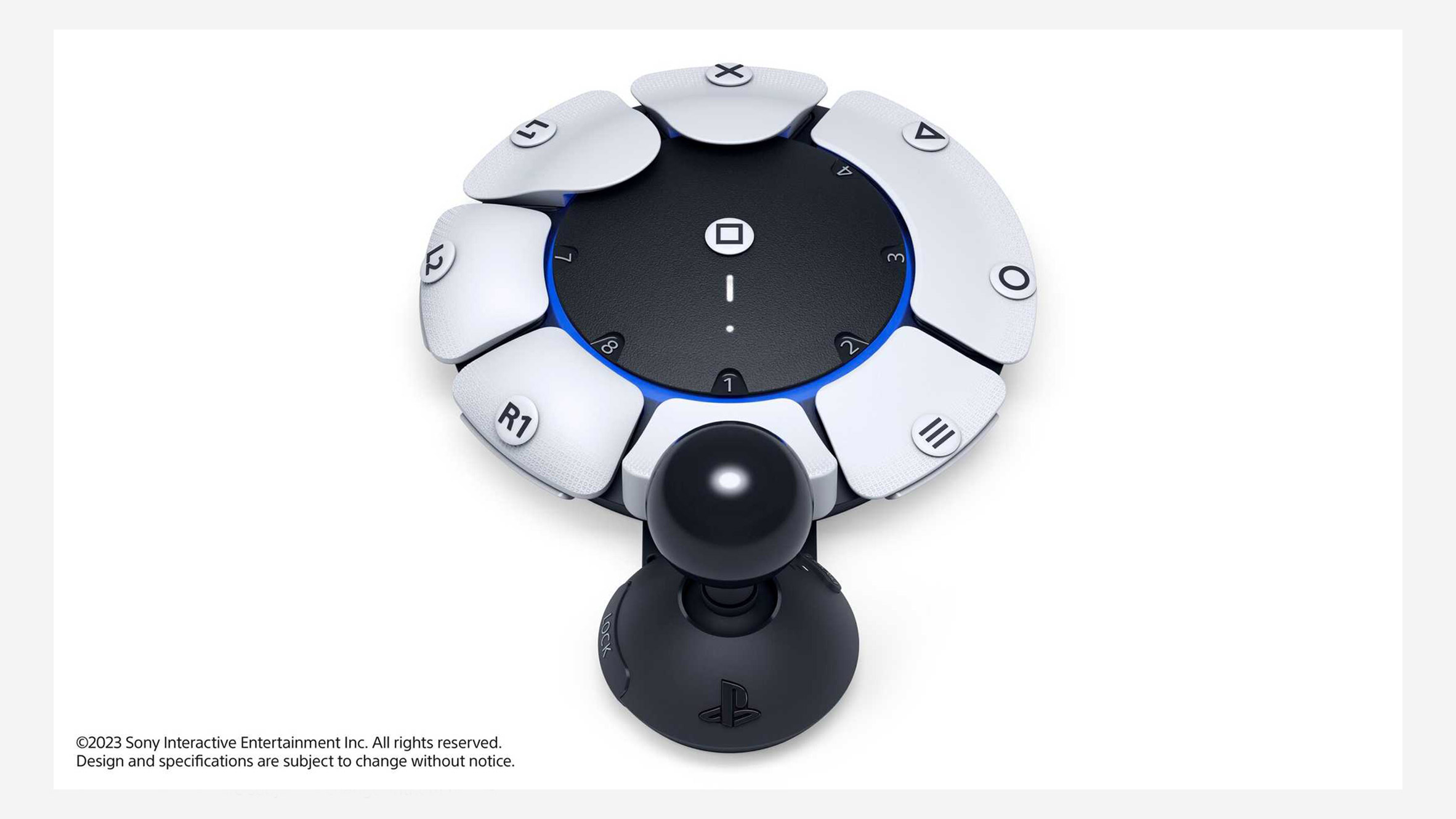
PlayStation debuts highly customisable controller for gamers with disabilities at CES
Sony has unveiled an adaptable PlayStation controller, dubbed “Project Leonardo”. It is designed for gamers with limited motor control, who may not be able to hold the traditional controller.
The article does a great job at summarising what’s unique about the controller:
The controller consists of a circular gamepad that was designed to lay flat on a table or wheelchair tray, which is equipped with eight interchangeable buttons plus a joystick that can be rotated around this central module.
The controller also comes with a kit of swappable components, allowing the shape, size and positioning of both the buttons and the joystick to be adapted to the personal needs and preferences of the user.
The controller’s software is equally adaptable, allowing gamers to program multiple buttons with the same function, the same button with multiple functions or their preferred north orientation for the joystick.
These settings can be stored in distinct button control profiles, with users able to switch between up to three profiles per console.
It can also be used with a second Project Leonardo controller and one of the PS5’s wireless DualSense controllers, with all three able to act together as a single device.
PlayStation is currently gathering feedback on the controller, meaning no release date or price has been set to date. The company’s announcement comes nearly five years after Microsoft released the Adaptive Controller for its Xbox console.
Whew, that was a long newsletter! Did you know that you can subscribe to smaller, more frequent updates? The dai11y, week11y and fortnight11y newsletters get exactly the same content. The choice is entirely up to you! Curated with ♥ by developer @ChrisBAshton.