I’m back, having got married, been on honeymoon, and perhaps inevitably, caught COVID. So, a little later than planned, please enjoy the latest issue of frequent11y!
Designing for Web Accessibility in 60 Seconds
UX Designer David Kennedy writes a short article with some useful quick wins for accessibility, focussed around asking questions.
- Is the content specific enough in important areas?
- People skim when they read. Make sure your link text describes the content of the target link, and use concise headings to form the outline of the page.
- Where does the visual hierarchy put pressure on font sizes and colours?
- Avoid small font sizes, low colour contrast, relying on colour alone to communicate state.
- Also avoid confusing alignment, and excessive motion.
- What components are doing too much?
- Consider avoiding autocomplete and tooltip components, in favour of simpler ones.
- Are all states communicated in an accessible way?
- Pay careful attention to designs for your error states, disabled states, focus states, etc.
Accessibility: The Biggest Scam in UX
Dot Tomczak draws us in with a clickbaity headline, and rants about designers that claim their work is accessible without being able to back it up.
Dot says that following a WCAG checklist isn’t enough – how many designers have actually included at least one person with a disability in their initial user research?
A nice looking, minimalist, high-contrast design isn’t necessarily an accessible one. As Dot points out, there is such a thing as too much contrast. Designs may break horribly when zoomed in, or may make no sense with assistive technologies. Fonts may be at least 16 pixels in size (good) but the font itself may not be very readable (bad).
Dot implores designers to start including people with impairments, in their user testing. To start using your favourite apps and websites with accessibility settings turned on, to get a feel of how things should work. To test their products with accessibility tools. And above all, to “stop bullshitting that you mastered it – no one did”.
The comments on the article are largely in full support and agreement – including a number of famous faces from the world of accessibility (whose own articles I’ve covered in previous issues of frequent11y!).
Default focus outlines: Don’t remove them!
So many good tips in this article – though don’t be fooled by the title. This isn’t about the native browser focus styles; the participants in this podcast do advocate that it’s fine to provide your own custom focus styles. This is about removing any focus styles whatsoever, and why that’s a bad thing.
Many of us have come across this before: a designer insisting we remove the outline provided by browsers, but not providing their own focus style to replace it with. The analogies in this article are great:
- Focus styles are like streetlights. Even if you think they’re ugly – they’re extremely useful.
- Want to remove focus styles? How about removing all handles from your doors and windows, to avoid breaking the smooth flow of the design.
And some tips:
- Ask designers to try to navigate their own designs via keyboard only.
- Ask what the alternative for the native focus state should be. If the answer is that there shouldn’t be a focus state at all, then this discussion isn’t about the outline.
The article contains a podcast recording and a transcript. Worth a read/listen.
Whisper’s hearing aids use AI to boost speech and reduce noise
Whisper is a startup that is developing hearing aids that self-tune over time, using AI. Traditional hearing aids require frequent adjustments, which can put people off wearing them. The CEO was inspired when his father asked to sit in a quiet corner of the café so that he could hear him properly, and he realised that he could make a difference in helping people connect better with their loved ones.
Two earpieces that take in and transmit sound are paired with a pocket-sized hub called Whisper Brain that wirelessly drives a sound separation engine. The engine’s algorithms, which were trained on a proprietary dataset, separate speech from noise in real time. Unlike traditional hearing aids, which amplify everything in a room, the engine hones in on particular sources
The system costs $139 per month at time of writing, which is less than the $179 originally quoted in the article (which was published in October 2020). Other companies are available – there are similar offerings from MicroTech, Widex and Starkey.
New sensor technology helps blind and visually impaired pedestrians avoid hazards
Intelligent Material Solutions, Inc. have patented an “intelligent material” of rare earth crystals embedded in paint or thermoplastics. The crystals can be grown to any shape or size and exhibit unique emission and absorption spectra and tuneable energy conversions.
Paired with sensors mounted or integrated with a cane, users can use a smart device to gather geolocation feedback and receive enhanced situational awareness that is far more accurate than existing technologies such as GPS.
The technology is in its early stages but could be used to guide users to public transportation, retail entrances, pavement exits and other locations.
This 3D printed controller allows you to game with one hand
This Facebook video (3 minutes) demonstrates an attachment for a standard PlayStation controller, allowing you to access all of the buttons on the device using just one hand.
The attachment was designed and 3D-printed by Akaki Kuumeri and is quite fascinating to see in action! Designs are free to download and print, but Akaki also offers fully printed and assembled versions in their Etsy store. Both left-handed and right-handed versions are available. Akaki also designs attachments for other consoles such as Xbox Series X.
Whilst it’s disappointing not to see officially supported adapters from the console manufacturers themselves, I’m pleased to see creative solutions being devised in the community.
Man Who Is Paralyzed Communicates By Imagining Handwriting
A man left quadriplegic after a freak accident has taken part in a study of a system called BrainGate2, developed at Stanford. The system relies on electrodes surgically implanted near the part of the brain that controls movement.
The man imagines writing individual characters by hand, and the computer learned to decode the distinct patterns with 95% accuracy. He can now type at a rate of 90 characters per minute.
I first covered this technology 2.5 years ago, in dai11y 25/11/2019. That system was developed at Chicago, and had a rate of around 66 characters per minute. So the technology is improving – which is fantastic. I just hope the surgically implanted hardware doesn’t go the way of the Second Sight implants and become unsupported.
Robles v. Domino’s Settles After Six Years of Litigation
This case concerns Guillermo Robles, a blind customer of Domino’s who was unable to order a custom pizza from their website or app, so sued them under the Americans with Disabilities Act (ADA).
I wrote about this case in my first ever issue of week11y, in October 2019. At the time, the US Supreme Court had just declined Domino’s appeal of a Ninth Circuit decision to overturn a district court’s decision to dismiss the lawsuit. (American law is complicated. Also, disclaimer: I’m no law expert).
Since then, in June 2021, the district court ruled in Robles’ favour, concluding that the website was not fully accessible and that a 45 minute wait on a telephone line was not a reasonable substitute. There’s lots of interesting information in the ADA Title III analysis of that ruling, such as Domino’s own expert not being able to place an order using a screen reader. There is also some distinction between Domino’s website and their mobile app, which are treated differently in law – the case was only allowed to continue regarding the app, rather than the website.
In what is believed to be a final end to the case, the parties have now settled out of court. The terms of that resolution are not (and may never be) known.
Please Stop Using Grey Text
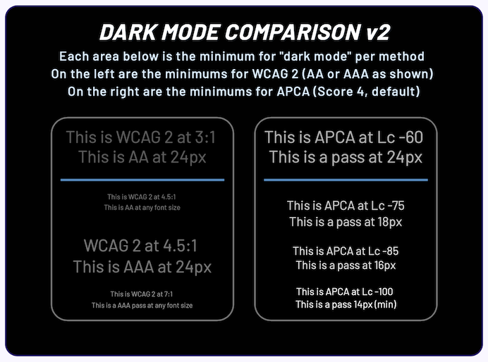
“W3 AGWG Invited Expert” and Readability and Color Science Researcher, Andrew Somers, argues that the WCAG 2 contrast specifications have been harmful to accessibility, as they don’t factor in how colours are perceived. Some colour combinations that shouldn’t pass, do, and some that should, don’t.
Since the introduction of WCAG 2, Andrew argues there’s been a shift to using grey text instead of black. This breaks a 1000 year precedent of printed texts worldwide. Andrew acknowledges the irony in making this point on his article, which is hosted on Medium.com and which uses grey text.
Andrew also highlights issues with dark mode, where WCAG 2 contrast math “is not capable of providing useful contrast values”. The screenshot he uses to demonstrate the issue is pretty scathing.
There is often a counter-argument to the use of black text: that it causes too much contrast and can be uncomfortable to read. Andrew’s counter-argument is that it is better to slightly darken the background behind the text, rather than lighten the text itself.
Over 96% of Government Websites Hide Disabled Men and Women on Their Site
This article raises an important point about how photos of people are sourced and used.
Sites such as Shutterstock are used to find stock photos of people to use on websites. Searching for “happy person”, “person smiling” or “happy face” rarely surfaces any pictures of visibly disabled individuals. However, “a quick search of ‘person in wheelchair’ revealed that plenty of images of happy disabled people do exist”.
The article investigates an example image and concludes that this happens due to the way the images are tagged. The image in question is tagged with keywords centred around the person’s disability and age. The image therefore won’t show up in general searches and is “unlikely to be used on non-medical web pages”.
According to the article, just 24 out of 502 government websites showed any photos of disabled people on non medical pages. However, this figure includes blog posts about a specific organisation or person, as well as articles about the Paralympics. It is extremely rare to see a stock photo including a visibly disabled person, for a general page.
A few reasons are cited for this trend. Most countries have a ‘social norm’; a “stereotyped idea of how the average citizen looks”. When creating content designed to resonate with a wide audience, photos of the social norm are used to cater for the majority. It is hypothesised that not using pictures of the social norm might lead to fewer ‘conversions’ (clicks), reducing the perceived success of the web page.
The article concludes with an appeal for government sites: to “normalise the use of diverse photographs, including individuals from all walks of life”. [This] is the only way to create an expectation for inclusion”.
Purchasing Power Parity
Accessibility of content based on price and economics is not something I’ve covered often, so I’m glad to have come across this really interesting article.
Sophia Lucero writes about a trend she’s noticed in online courses and magazines: websites are beginning to charge different prices based on where in the world you’re visiting from. They generally charge less if you’re in, say, the Philippines, versus if you visit from the USA, on the basis that it’s a lot more difficult for someone from the former to raise the same amount of disposable income as someone from the latter. This is well explained by the Big Mac index.
Many independent creators that are big names in the frontend world are offering this, from Wes Bos and Kent Dodds to Sara Vieira and Julia Evans. Sophia notes that they all seem to have rolled out their own implementations, based on their own “specific, personal reasoning that differed from one another”. There’s a certain amount of secrecy into the underlying methodologies used by some, as they (understandably) want to avoid being pulled into an economics fight. As a guide, you could use the calculator by Jack McDade, or for a (paid) automated implementation, you could use Parity Bar.
The decision to roll out PPP is, for many, an altruistic decision, and relies on honesty, since it is fairly simple to spoof one’s location. However, it has actually increased revenue for the creators (50% in the case of Chris Ferdinandi), as the fact more people can afford it means there are higher sales.
WordPress Accessibility Day Returns November 2-3, 2022
Deborah Edwards-Oñoro tells us about a virtual, accessibility focussed conference in November. Full details over at wpaccessibility.day.
For a taste of what to expect from the day, check out the talks from 2020. It looks to be a good mix of beginner and advanced accessibility concepts, as well as technical and non-technical. There are some CMS/WordPress focussed talks, but a lot look quite generic, so this looks open and applicable to all.
You can sign up for email updates on the website. For now, pencil November 2nd and 3rd in your diary!
ScreenReader app
A project I came across recently was the ScreenReader app, which is a learning aid to help you to use VoiceOver on iOS and TalkBack on Android. It contains exercises to navigate by headings and links, and to select, copy and paste text.
The app is an initiative of the Appt Foundation. Its source code is available on GitHub under screenreader-android and screenreader-ios repositories.
Divs are bad!
An article by Manuel Matuzović, which he openly admits is a clickbait title! Manuel concedes that the <div> is useful for additional elements for styling, for structuring content when no other suitable element exists, and for when you need custom landmarks. He then lists the issues with using <div> incorrectly.
Using a <div> inside a <details> element, for example, can break how the element is supposed to render in browsers, and might cause screen readers to not recognise the <summary> element properly:
<details>
  <div>
    <summary>Show info</summary>
    Hi, I'm the info!
  </div>
</details>
Manuel works through plenty of other common examples (such as <ul><li> markup) which should not have a <div> nested in between the elements. It’s quicker to say where it can be used, and that’s in definition lists. The following example is fine:
<dl>
  <div>
    <dt>Key:</dt>
    <dd>Value</dd>
  </div>
  <div>
    <dt>Key:</dt>
    <dd>Value</dd>
  </div>
</dl>
Manuel recommends installing Deque’s HTML validator bookmarklet to validate your web pages. It works on both server-rendered and client-rendered pages.
Whew, that was a long newsletter! Did you know that you can subscribe to smaller, more frequent updates? The dai11y, week11y and fortnight11y newsletters get exactly the same content. The choice is entirely up to you! Curated with ♥ by developer @ChrisBAshton.