Category: fortnight11y

Accessibility themed newsletter released every fortnight.

  • fortnight11y issue 8

    Your fortnightly frequent11y newsletter, brought to you by @ChrisBAshton:


    The Click-Away Pound Survey 2019

    • This 32 page report (ironically only available as Word/PDF documents) of last year’s survey has some highlights. There are 7.15 million internet users in the UK that have access needs (an increase of 1 million since 2016), with a spending power of £24.8 billion. Around 70% will click away from an inaccessible site, meaning businesses are losing out on £17.1 billion per year. The survey was last run in 2016 and things haven’t improved measurably since then. I’ve attached a graphic from the report that helps show the scale of the problem.
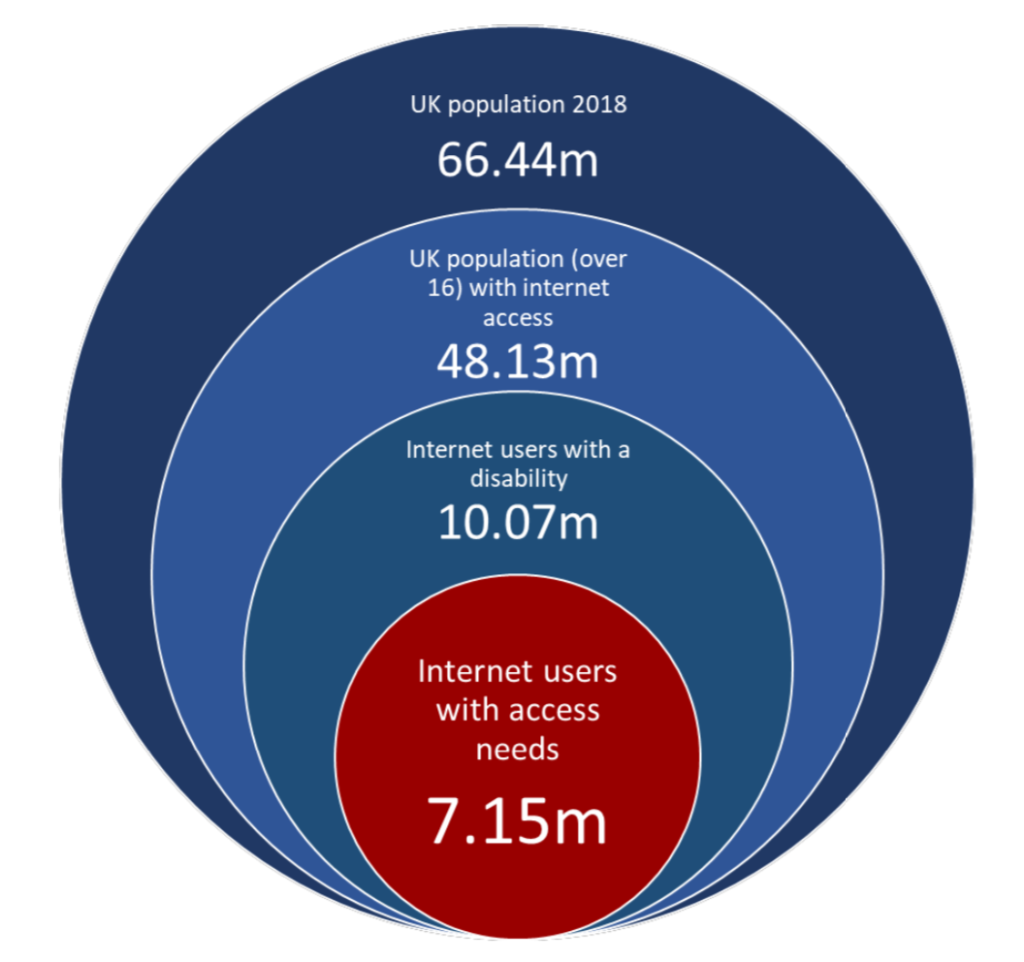
    UK population 2018: 66.44m
UK population (over 16) with internet access: 48.13m
Internet users with a disability: 10.07m
Internet users with access needs: 7.15m
    Source: The Click-Away Pound survey report 2019

    Disproportionate Burden Thoughts

    • A blog post by accessibility consultant George Rhodes, with their views on public organisations’ use of “disproportionate burden” as an excuse to (temporarily) avoid full compliance with the regulations. 60 public sector bodies have claimed disproportionate burden and been asked to provide evidence via Freedom of Information requests. Many of their responses were unsatisfactory.
    • Background: UK public bodies have until September 2020 to ensure compliance with the Public Sector Bodies (Websites and Mobile Applications) (No. 2) Accessibility Regulations 2018. Exemptions will be made for those for whom it would be a ‘disproportionate burden’ on the grounds of organisation size, and cost of fixing vs benefit to users.

    An Accessible Digital BBC – 2019 in review

    Bonjour! ¡Bienvenidos! Seeing AI expands to 5 new languages

    • If you’ve not heard of the “Seeing AI” app from Microsoft, it’s an all-encompassing app that uses your phone’s camera for many things, including reading text, scanning product barcodes for info, recognising faces, and describing the scene in front of you. I hadn’t heard of it prior to this article, which describes its expansion to 5 different languages, and describes the ways real people use it, sometimes in unexpected ways. Download it from the app store and give it a try today!

    Apple debuts ‘head pointer’ accessibility feature in macOS beta, a cursor that follows your eyes

    Make your PowerPoint presentations accessible to people with disabilities

    • A Microsoft guide to ensuring your PowerPoint is accessible. A lot of the guidance is the same as it would be for the web: use descriptive links, don’t use colour alone to convey information, use a decent size text, provide alt text for images. Some more specialist advice includes ensuring the reading order of your slide is correct (screen readers will hear content in the order it was added, rather than the position it appears in the slide), and give each slide a unique title.

    These are the standards for new government websites

    • A look at the United States Web Design System (USWDS) released in January, designed to improve the usability and accessibility of federal websites. It encourages focusing on user needs, following user experience guidance and using USWDS components, as per its maturity model. The system meets WCAG 2.0 AA guidelines and follows the 2% rule pioneered by GDS, supporting all major browsers and IE11. The codebase looks very similar to the GOV.UK Design System, with both using Nunjucks and BEM.

    https://whocanuse.com

    • A little look at the “Who Can Use” tool, which takes a text color and background color and shows the accessibility of that combination for various vision types. For example, a #CF0000 red against a white background has AA compliance for regular vision, but AAA compliance for those with achromatomaly (partial colour blindness). What’s particularly useful is the “Simulation” next to each vision types/events, such as showing how your combination might look when viewed in direct sunlight. A worthy tool to have in your arsenal!

    Did you know that you can subscribe to dai11y, week11y, fortnight11y or month11y updates! Every newsletter gets the same content; it is your choice to have short, regular emails or longer, less frequent ones. Curated with ♥ by developer @ChrisBAshton.
  • fortnight11y issue 7

    Due to a scheduling error, this is coming out almost two weeks late – apologies!

    Your fortnightly frequent11y newsletter, brought to you by @ChrisBAshton:


    Progressive React

    • A surprisingly quick read despite its length: Houssein Djirdeh details several techniques for improving performance and accessibility of React applications. Use pre-rendered or server-side rendered (SSR) React, ideally hydrated in Node ‘streams’ rather than en-masse. Use streams for extracting critical CSS too. Various DevTools profilers help identify unnecessary component re-renders: override shouldComponentUpdate or inherit from PureComponent to mitigate. Split components with React.lazy (or with a library like loadable-components if SSR’d). A worthy read if you ever dabble with React.

    Why GOV.UK content should be published in HTML and not PDF

    • A GOV.UK article from 2018 that is still relevant today. It highlights the problems with PDFs (not designed for screens – particularly on mobile, hard to track and to update, and often inaccessible to assistive technology) whilst acknowledging their advantages (control over design, easy to create from many applications, predictable printing behaviour). The comments are worth reading too: some argue that static PDFs are better than dynamic HTML for archival reasons, as well as easier offline access that doesn’t require “Print to PDF” technical knowledge. These are areas GOV.UK could do better at while still advocating for a HTML-first approach.

    aria-label Does Not Translate

    • Interesting post by Adrian Roselli, highlighting that for users who rely on built-in translation services in their browser, aria-label markup often isn’t translated. For this reason he recommends tweaking your design to use native HTML (label, etc), or otherwise using visually hidden text or aria-labelledby which do not have the same issues with auto-translating. He also highlights a new aria-description property that is coming to ARIA, which solves the messiness of aria-labelledby requiring additional nodes in the DOM that could be accidentally read out twice. However, it will have the same translation issue as aria-label until auto-translators get better.

    How Glasgow’s clubs try to be accessible for everyone

    • Not necessarily what you’re expecting to read from the title (it’s not all “installing a lift for wheelchair users”, writes Kamila Rymajdo). Kamila highlights the efforts a number of clubs are making to become more inclusive spaces for the LGBTQ community, such as briefing clubbers at the door about what the night celebrates (including financial assistance for travel and reduced entry fees for some), and a representative present throughout the night for people to talk to if they are encounter any problems. Others are taking steps to not dim lights to an uncomfortable degree, to have visuals that are suitable for epileptic individuals, and to always have somewhere to sit and water visibly available.

    Memes Are Still Inaccessible to the Blind

    • Time article sharing the impact of memes being unreadable to the blind. Accessibility is often about providing the bare essentials – making the workplace or transportation accessible – whereas leisure or silly activities are overlooked. The result is a lack of inclusivity, with many unable to join in the conversation. Researchers are experimenting with using AI to identify memes via templates, and rendering these memes in less deadpan ways than your typical screen reader. For instance, “success kid” would have the beginning of the meme, then upbeat dance music speeding up to a triumphant finish.

    The Universal Page

    • An article about the history of braille, and its early competitors (Boston Line Type). By the 1860s there were a number of competing standards – leading to the “War of the Dots” in 1909, where braille was the standard of choice for the New York Board of Education for its blind schools. Other attempts at enabling blind access to books is the optophone; a scanner that looks at text and converts it into tones representing the shapes of the letters. In theory, mastering the optophone enables the reading of any book; in practice, it’s incredibly difficult to interpret. It’s well worth seeing it in practice.

    When to Open Links in a New Tab

    • A short article by Jens Oliver Meiert, with one simple summary: “Always open links in the same tab unless doing so 1) could disrupt a process, 2) could risk data loss, or 3) could confuse the user.” He gives examples of opening PDFs (which should be opened in a new tab, after warning the user), as they are in a non-native environment. He also cites Jakob’s Law: “users spend most of their time on other sites; they prefer your site to work the same way as the sites they already know.” Opening external links in new tabs to increase likelihood of ‘conversion’ is misguided advice and provides a poor UX.

    Money in my account, but still can’t pay: Winner of ‘best accessible website’

    • Nidhi Goyal‘s website, Rising Flame, won India’s “Best Accessible Website 2019” award. This article by The Indian Express doesn’t talk about the site (though I highly recommend visiting it and trying its accessibility features) – instead, it talks about how Goyal’s success still does not allow her to fully participate in society. Goyal, who is blind, may have money but she can’t use certain payment platforms to pay for things as they provide a broken screen reader experience. She flies long distance as part of her work, but is unable to use a call bell on flights because they’re on touch screen panels. Goyal says the reason the world lacks universal design is that people don’t yet see the disabled as customers or decision-makers.

    Did you know that you can subscribe to dai11y, week11y, fortnight11y or month11y updates! Every newsletter gets the same content; it is your choice to have short, regular emails or longer, less frequent ones. Curated with ♥ by developer @ChrisBAshton.
  • fortnight11y issue 6

    Your fortnightly frequent11y newsletter, brought to you by @ChrisBAshton:

    Gaming Needs Some Basic Accessibility Improvements in 2020

    • Article by Laura Dale, explaining some of the most commonly requested accessibility features for console gaming (controls remapping, colour blindness support and the ability to adjust text size). A cautionary note about the new PS5 controller, which will have a “resistive trigger” (become harder to press under certain conditions), which allows game creators to mimic pulling harder against a bow string to shoot arrows further, for example. This feature could be a great immersive tool, but does risk alienating some players who may find it painful to use – watch this space. Finally, a note about VR, which is currently inherently inaccessible to many; a situation that is unlikely to improve much in 2020.

    How to Use AirPods as Hearing Aids

    • Step by step instructions from OSXDaily, walking through adding the ‘Hearing’ control to your iPhone’s control centre and connecting it to your AirPods. Once connected, you can use the ‘Live Listen’ feature to amplify your surroundings directly into your ears, positioning your iPhone near whatever it is you’re having trouble hearing. Apple is quick to point out that this is no replacement for hearing aids, but the technology is certainly improving and there are people in the comments hoping that AirPods could prove to be a high quality, low-cost solution in the long term.

    Training people to do accessibility reviews

    • GOV.UK blog post by Beverly Newing, describing how she led accessibility testing training at the Ministry of Justice. She created a fake government service and made it deliberately inaccessible, with an accompanying worksheet and answers that can be covered in a one hour session. Interestingly, Beverly has added some impeding issues that wouldn’t be considered WCAG failures, to hit home that WCAG compliance does not guarantee an accessible service.

    What’s more expensive than getting sued over inaccessibility?

    • The answer: “getting sued twice”. This US-focused article by Sheri Byrne-Haber follows a report showing that 21-40% of accessibility lawsuits are against companies which have been previously sued. The author suggests that this is because companies may fix problems but then don’t build accessibility testing into their ongoing process, so problems inevitably creep back in. It’s also down to the “Hooters effect”; a decision in Haynes vs Hooters shows that other individuals can sue your organisation even while the first lawsuit is being investigated or the fixes are in the process of being implemented.

    How I’m making Maps better for wheelchair users like me

    • Article by Google employee Sasha Blair-Goldensohn, talking about the role he’s played in making the world more accessible to the 65 million wheelchair users worldwide. In his “20% time”, Sasha and other colleagues launched ‘wheelchair-friendly transit directions’ for Google Maps, and worked with the 120 million-strong Local Guides community to crowdsource answers about the accessibility of venues. This initial work has led to a full time team dedicated to accessibility on Maps. He also talks about the curb-cut effect, or ‘universal design’, whereby wheelchair-accessible exits from pavements benefit others such as parents pushing strollers, or tourists pulling suitcases.

    How to Create Printer-friendly Pages with CSS

    • Article by Craig Buckler, packed with tips on how to improve your website’s print styles; something often overlooked even by a11y-aware devs. I guarantee you’ll learn something new: there are various techniques for avoiding wasting ink. You can automatically add supplementary content such as URLs after links using pure CSS, or print-only content such as copyright messages. You can define page breaks using break-before, break-after or break-inside. You can limit the number of lines of text that carry over to the next page with widows and orphans properties, and control how an element’s border renders when it’s split across multiple pages (box-decoration-break) . Finally, @page selectors and targets allow you to adjust margins on a per-page basis.

    Facts & Figures: Disabilities in developing countries

    • An estimated 1 billion people in the world (15% of the population) live with a disability. 80% of these are in developing countries. 3 percent experience ‘severe disability’ and cannot manage daily life without assistance. Defining & measuring disability is difficult worldwide, with mental health conditions particularly under-reported. Under-reporting is driven by stigma; for example, just 2.2% of Indian residents claim to have a disability whereas the World Health Survey estimates it to be 25%. Disability figures are rising worldwide as a result of aging populations and an increase in chronic health conditions.

    Deaf man sues Pornhub over lack of closed captions

    • Yaroslav Suris, from New York, is suing Pornhub, RedTube and YouPorn for allegedly violating the 1990 Americans with Disabilities Act (ADA) by not providing closed captions on its videos, on either its free or premium access. Pornhub responds that it has had closed captioning on some of its videos since 2018, and offers a closed caption ‘category’, however concedes that it is not available for the majority of its content.

    Did you know that you can subscribe to dai11y, week11y, fortnight11y or month11y updates! Every newsletter gets the same content; it is your choice to have short, regular emails or longer, less frequent ones. Curated with ♥ by developer @ChrisBAshton.
  • fortnight11y issue 5

    Your fortnightly frequent11y newsletter, brought to you by @ChrisBAshton:

    7 Predictions for Accessibility in 2020 and Beyond

    • A UsableNet article that is full of optimism for the future: Jason Taylor predicts that a rise in a11y-related lawsuits will drive a more proactive approach to building accessible websites. Companies will no longer settle for agency-built sites or CMS templates that are inaccessible, and many will hire a11y experts to ensure compliance. E-commerce sites and the web in general will become more accessible in 2020 as a result.

    Responsive Type and Zoom

    • Article by Adrian Roselli, warning about a responsive typography implementation which cleverly resizes font size according to viewport width, but does not take into account browser zoom (which is an issue for a11y). Adrian compares it with his own CodePen, which does not resize based on viewport width but does cope with browser zooming. He implies that both might be accomplished by using %, em or rem instead of px in the first example, but doesn’t provide a solution. One thing I learned/re-remembered was that we should use pt units for print styles.

    New Library Is a $41.5 Million Masterpiece. But About Those Stairs.

    • A New York Times piece by Sharon Otterman. The newly built Hunters Point Library in Long Island City, New York, is a purpose-built open-plan building with ampitheatre-like seating throughout. But it has only one elevator, which is a bottleneck at peak times: parents and minders struggle to get their prams upstairs in time for “toddler story time”. Stair-based child seating areas were also deemed unsafe and have since been blocked off, to be reopened again after a refit. Disabled adults were encouraged to ask staff to fetch specific books rather than be able to freely browse the aisles accessible only by staircase. A physical embodiment of what can happen if we design for visual splendor over function.

    Scientist regrow ear hairs in discovery which paves the way for a deafness cure

    • A research team at Harvard University have successfully ‘reprogrammed’ the inner ear cells of mice to divide and become hair cells, which are used for hearing. Previous research had already accomplished cell regeneration, but this was the first time in ‘fully mature’ ears. Whilst a cure for deafness is a long way off, this is a promising foundation for further research that could also serve as a model to regenerate “other tissues such as in the retina and central nervous system” – perhaps curing many other conditions!
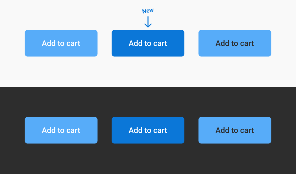
    New button has slightly darker blue and works better on both white and black backgrounds, compared to the original two buttons.
    Geoffrey’s proposed color contrast scored highly with users and has a AA rating for contrast

    There is no “Myths of Color Contrast Accessibility”

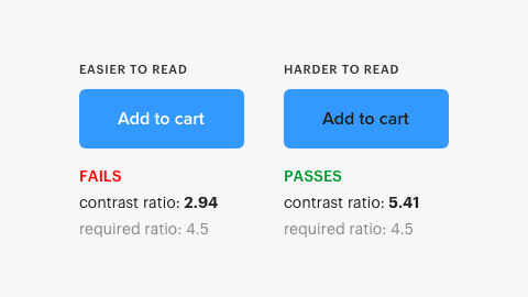
    • A UX Movement article (covered in November) argued that text/background color combinations that fail the WCAG AA contrast threshold can actually be easier to read than those that pass. Geoffrey Crofte has written a counter-article arguing that the methodology of the original article was flawed, proposing his own combo (via useful tool color.review) that is both AA-compliant and is easier to read than the original. It’s worth noting the new contrast rating (4.5) is still lower than the ‘hard to read, but compliant’ original (5.41), but Geoffrey puts this down to context: a black background reverses the perception biases of the original article. Finally, Geoffrey disagrees that color alone can be used to denote state (see myth 6 in the original article), arguing that the toggle token example is difficult to read if no tokens are toggled by default.

    Leonardo: an open source contrast-based color generator

    • An in-depth article about leonardocolor.io, a tool that helps you to find colour palettes that conform to the WCAG AA contrast guidelines. It explains the different interpolation algorithms in more detail than I was able to digest, but the really intriguing idea is one of using the NPM module to generate accessible palettes in real time, dynamically in your web app, allowing users to adjust the brightness and contrast of your site’s theme colours to suit their vision. See the demo.

    This advocate redesigned the disability royal commission website so people with a disability can actually use it

    • The Australian Disability Royal Commission website leaves a lot to be desired: overly long, with legal jargon, and a 35-page submission form that required installing Adobe Acrobat before getting started, it was ironically quite inaccessible. Campaigner Sam Connor stayed up one night to build an unofficial, accessible alternative to the government site, signalling their frustration and showing how simple it can be made. A redesign of the official site – and streamlining of the submission process – is purportedly in the works.

    If you ARIA label something, give it a role

    • Article by Marco Zehe, advising that any time you use an aria-label or aria-labelledby attribute, you must also give the thing a role. He suggests that a label without a role is harder to understand: “a div with an aria-label is much more meaningful if it is clear that it groups some elements together [by also adding role=’group’]”. What’s interesting is his prediction that the spec will change in future to disallow any aria-label that does not also have a role, forcing developers to mark up their pages correctly.

    Access all areas – inside GDS’s accessibility empathy lab

    • A Civil Service World article about the GDS empathy lab comprised of laptops, tablets and phones running assistive technology (and simulated ‘personas’ covered in another GOV.UK blog post), that is available for use by developers at GDS and in the Civil Service. The lab has had around 500 visitors since September 2018, and Head of Accessibility Richard Morton has given introductions to accessibility to 400 people in that time. The next step will be to have a “mini empathy lab” by GDS reception to raise awareness even more prominently.

    Did you know that you can subscribe to dai11y, week11y, fortnight11y or month11y updates! Every newsletter gets the same content; it is your choice to have short, regular emails or longer, less frequent ones. Curated with ♥ by developer @ChrisBAshton.
  • fortnight11y issue 4

    Your fortnightly frequent11y newsletter, brought to you by @ChrisBAshton:

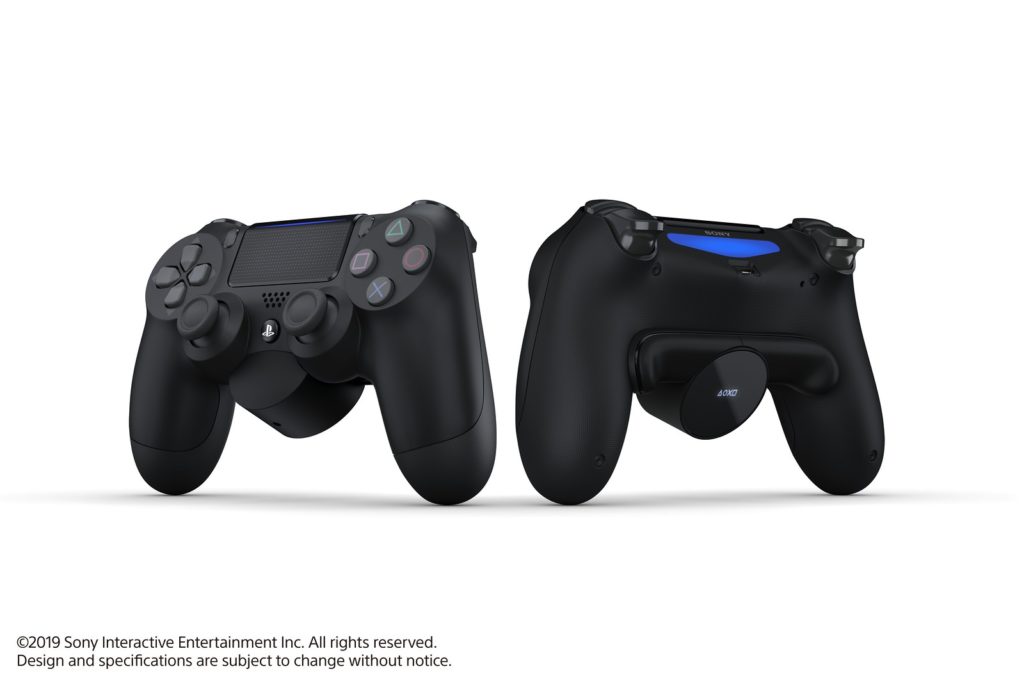
    Image of the new attachment for the DualShock controller. Copyright Sony Interactive Entertainment Inc. All rights reserved. Design and specifications are subject to change without notice.

    Sony’s new Back Button Attachment brings customizable paddles to the DualShock 4

    • Sony are releasing a $30 attachment for the DualShock 4 controller which slots into the back and provides two extra large buttons. These can be mapped to any of the other buttons on the controller, and could be a (literal) game changer for disabled users who may struggle to use the controller standalone. It’s not being marketed as an accessibility aid, but as a tool for power users to level up their gameplay. Indeed, non-disabled users could find the tactile buttons improve their gaming performance.
    • Aside: It’s highly unusual for Sony to release something like this so late in the PS4 lifecycle, which suggests these might work with the DualShock 5 when it comes out.

    Epilepsy Foundation Bombarded with Seizure-Triggering Twitter Posts

    • The Epilepsy Foundation has filed a criminal complaint with the U.S. Attorney and the Office of the State’s Attorney in Maryland, against a number of Twitter uses who maliciously posted seizure-inducing content on its feed. This happened during November: National Epilepsy Awareness month. A similar attack happened in 2016 against journalist Kurt Eichenwald, which purportedly triggered a seizure.
    • Aside: around 3% of people with epilepsy can be triggered by exposure to flashing lights or certain visual patterns.

    Accessibility Testing by People with Disabilities

    • An article of two halves, by a11y expert Becky Gibson. The first half gives guidance for performing your own a11y audit. It recommends WAVE as a starting point, followed by the Web Developer extension for validating document structure and numerous bookmarklets for additional automated tests. This is followed by manual keyboard and screen reader testing – checking for WCAG 2.1 AA violations (as opposed to WCAG 2.0, which was released in 2008 and has little guidance for mobile) – and finally, testing responsive design and zoom/magnification. The second half highlights Vision Aid for specialising in training blind individuals as testers, and argues the business case for this (‘native’ screen reader users will spot problems more quickly and catch some issues that other testers might not).

    What to Do If You Think Your Child Is Color Blind

    • Around 1 in 10 males have some form of colour blindness – a much higher rate than that in women. It’s a genetic trait typically passed down from the mother. You can conduct Ishihara tests at home (online) to determine colour blindness. There is no cure but there are ways you can manage the condition, e.g. by labeling things rather than relying on colour alone.

    Mattel releases first deck of UNO in Braille

    • The first official braille UNO deck is going to the Idaho School for the Deaf and the Blind. Some students have played it before but have needed to have teachers adapt existing sets by hand braille-ing them. The braille deck looks identical to the non-braille deck, but has some non-intrusive dots in the corner of each card. It makes you question why games companies don’t make their products braille-friendly by default.

    ‘No captions no vote’: why deaf voters are calling for more accessible campaigning this general election

    • Article by Liam O’Dell, highlighting that a lot of political campaign videos lack captions, making them inaccessible to the 11 million people in the UK (1/6 of the population) with deafness or hearing loss (not to mention that 85% of all videos on Facebook are watched without the sound on). This has triggered the #NoCaptionsNoVote campaign, where deaf people threaten not to vote for parties who don’t provide captions. Liam draws attention to the closure of the Access to Elected Office Fund, which affects deaf candidates standing to become MPs, who now have to fund their own costs such as interpreters. Finally, some but not all parties have published their policies in British Sign Language.
    • Bonus article: read How Philly is making all voting locations accessible for the first time ever (November 5th 2019). TDLR: all venues have been ‘accidentally’ made wheelchair accessible so that there was enough room for workers to erect the new (large) touchscreen voting machines.

    Screen reader bug fixed in Firefox

    • In September 2018, GDS Accessibility Expert Anika Henke filed a bug report with Mozilla, suggesting that words are incorrectly merged together in screen readers when using word-wrap: break-word with a small width. For example, “posted on” is pronounced “postedon” if its container is so small that each letter is on its own line. The root cause was actually a 4 year old bug to do with trimming whitespace, which Firefox has fixed in its latest version (Firefox 71). You may be interested in alphagov/reported-bugs to see all bugs GDS has reported in browsers, operating systems and assistive tech. Meanwhile, well done all who take the time to report, debug and fix these far-reaching issues!

    Did you know that you can subscribe to dai11y, week11y, fortnight11y or month11y updates! Every newsletter gets the same content; it is your choice to have short, regular emails or longer, less frequent ones. Curated with ♥ by developer @ChrisBAshton.
  • fortnight11y issue 3

    Your fortnightly frequent11y newsletter, brought to you by @ChrisBAshton:


    Playing with state

    • Article by Sarah Higley, exploring how best to denote the state of a Play/Pause video button for screen reader users. Most ‘toggle buttons’ for a binary state should have an aria-pressed attribute with value “on” or “off”; screen readers communicate this ‘state change’ more quickly than a change in property (such as aria-label). Sarah argues that the play/pause button, however, is the exception to the rule and should only change the aria-label (from “Play” to “Pause”), as changes in state don’t make sense in this context (“play button off”). Most importantly, avoid changing both or you’ll confuse your users (“play button, on” vs “pause button, off”).

    When Things Go Wrong for Blind Users on Facebook, They Go Really Wrong

    • An article highlighting the regularity of bugs and missing features encountered by screen reader users on the Facebook apps and site, with a strong message that there is an under-investment in accessibility development on Facebook and Instagram. A feature for adding colourful backgrounds to posts meant all posts were read out as “Awesome Text Status” for a week. Facebook’s attempt at automating alt text has met a muted response; “image may contain child” doesn’t allow screen reader users to participate. There are options to provide alt text on uploaded images, and forms for flagging accessibility issues, but both are criticised as being too hard to find. Some users have created Facebook groups to share images of text they want transcribing by sighted volunteers. There’s something to be said about the ‘move fast and break things’ ethos and what that means for disabled users.

    If it has audio, now it can have captions

    • Google have created functionality for the Pixel 4 phone, which they’ve dubbed Live Caption. Like the auto caption feature on YouTube videos, this overlays text on your phone screen – when enabled – showing Google’s interpretation of the audio. The text overlay can be moved independently as demonstrated in this gif, and the captioning works independently of the audio source, so you can watch any video or audio in your browser or apps and be able to get captions. It works entirely locally, so doesn’t use any cell data and stays private on your phone. Google are hoping to roll this out to other Android manufacturers “in the coming year”.

    Creating Online Environments That Work Well For Older Users

    • An opinion piece by Barry Rueger, who for context is “well past sixty”. He makes several suggestions that are widely recognised as universally good practices, such as improving website load speed and ensuring good grammar and spelling. Others are more subjective: that older people prefer text and ignore videos in search results, or that they hold onto old, slow machines for longer. Barry makes the case for black text on white backgrounds; a controversial subject as several user groups find this harder to read (there are some comments below the article to that effect). Finally, an interesting point about the success of Amazon being down to its website’s consistency; “we know the site, and we know that we can do our shopping quickly and painlessly”. He suggests resisting the urge to reinvent your website unnecessarily.

    Accessibility drives aesthetics

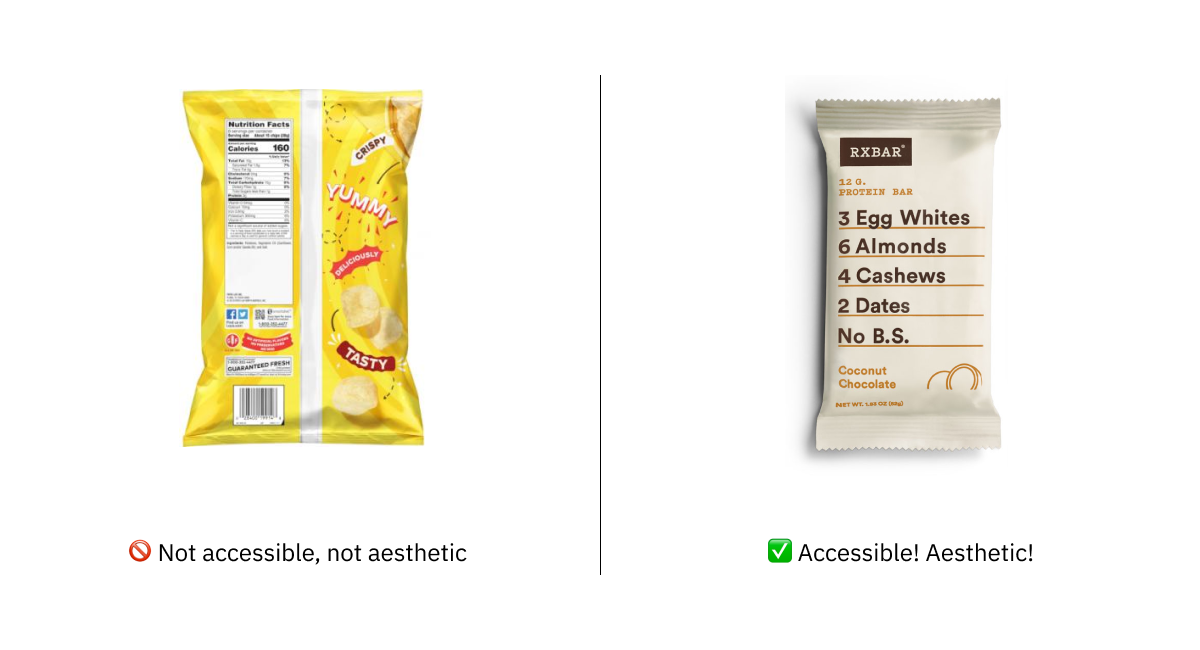
    • A recent article by UX designer, Alex Chen. It debunks the myth that accessible designs have to be ugly designs, giving real-world examples of websites (GOV.UK gets a mention here) and products (RX protein bar packaging) that are both accessible and aesthetically pleasing. That aside, Alex asserts that the two are not of equal importance; an interface change may not look quite as visually pleasing to one person, but another person is now able to use it. Some people concentrate their efforts on the ‘normal’ use case, neglecting designing the ‘edge cases’ for disabled people, but that is an ableist practice; “edge cases [should] refer to scenarios, not humans”. There’s a final point about disabilities disproportionately affecting people of a certain race or class, and that we have an opportunity to start to level the playing field for all.

    We Analyzed 10,000,000 Pages and Here’s Where Most Fail with ADA and WCAG 2.1 Compliance

    • Article by accessiBe, analysing mostly small US websites. They used automated tooling with AI to avoid false positives, e.g. avoid failing a non-compliant form if it’s never actually in view. 98% of sites failed WCAG 2.1 AA compliance with their menus alone (there are quite stringent requirements around using ESC and arrow keys to navigate the menu, which requires JavaScript rather than just good HTML markup). The next big fail was popups (89%), where most have no accessibility built in whatsoever, breaking the experience for keyboard users. 83% failed on buttons, mostly for not using <button> or role="button" markup. 76% failed on icons (often social media icons with no off-screen text). 71% failed on forms; most that passed were from ready-made systems such as Shopify.
    • Aside: I chose this article to coincide with the International Day of People with Disabilities. This is an occasion “to educate the public on issues of concern, to mobilize political will and resources to address global problems, and to celebrate and reinforce achievements of humanity.” It’s also a good opportunity to remind teams in the UK public sector of their responsibility to make sites conform to WCAG 2.1 by September 2020.

    Walking On Egg Shells: Why Bosses Are Scared To Talk About Neurodiversity

    • Article by psychologist Dr Nancy Doyle, highlighting that companies are increasingly attempting to improve their inclusivity, but are nervous about using the wrong language. “People with disabilities” vs “disabled people” represent two different models – the first being ‘people-first’ (we are people, not conditions) and the latter being the ‘social model’ (we are disabled by a non-inclusive society). Nancy advises following a consensus where there is one: for example, the term “autistic person” is commonly used as they see it as their identity, not something they have. Where there there isn’t a consensus, we should use multiple terms interchangeably, ideally with a brief explanatory footnote at the end of written communication so that people can see that you have thought about your choices.

    18 WAI-ARIA attributes that every web developer should know

    • Use aria-label when you can’t use generic <label>, and aria-describedby for supplementary info, such as to associate error messages with their corresponding inputs. Use role="heading" and aria-level="2" instead of <h2> if you can’t use the element (for SEO reasons, etc). Whenever there is a visible status message on the page, it must be announced to users, e.g. with role="status" or role="alert". Use role="search" for landmarking a region responsible for search – there is no HTML5 element for it.
    • Aside: this article links to the incredibly useful aria practices document, which shows recommended implementations for common components like breadcrumbs and carousels.

    Making a Better Custom Select Element

    • A ‘how-to’ guide from accessibility expert Julie Grundy. It describes the drawbacks of the native <select> element – the lack of autocomplete, the inflexibility around what can appear inside each <option>. Julie talks us through building a custom select, avoiding the accessibility pitfalls that many custom select components fall down at. She starts from a baseline of <input type="text">, with progressive enhancement layered on to turn it into an autocomplete dropdown with keyboard functionality and total screen reader support. It links off to the ARIA 1.1 Combobox with Listbox Popup Example, which is also a good dev resource for this.

    The Physics (and Economics, and Politics) of Wheelchairs on Planes

    • A detailed article highlighting the stress of flying as a wheelchair-user, involving being picked up and strapped into an ill-fitting seat while your wheelchair is put in the hold (and subsequently lost or damaged in transit, as happens in a lot of cases). The principle reason cited is one of safety, but a lot of research has been done to show that wheelchair tests are actually more stringent and can withstand more G-force than the airline seats themselves. A new aircraft design is proposed where wheelchairs can be securely fastened into the floor, or an airline seat fitted at the last minute if there are no wheelchair-using passengers. It could be two years before the American Transportation Research Board releases its initial findings to “the feasibility of the restraint system”, bearing in mind the myriad of different wheelchair types and sizes. The final fight would be persuading each airline to adapt and get on board.

    Did you know that you can subscribe to dai11y, week11y, fortnight11y or month11y updates! Every newsletter gets the same content; it is your choice to have short, regular emails or longer, less frequent ones. Curated with ♥ by developer @ChrisBAshton.

  • fortnight11y issue 2

    Your fortnightly frequent11y newsletter, brought to you by @ChrisBAshton:

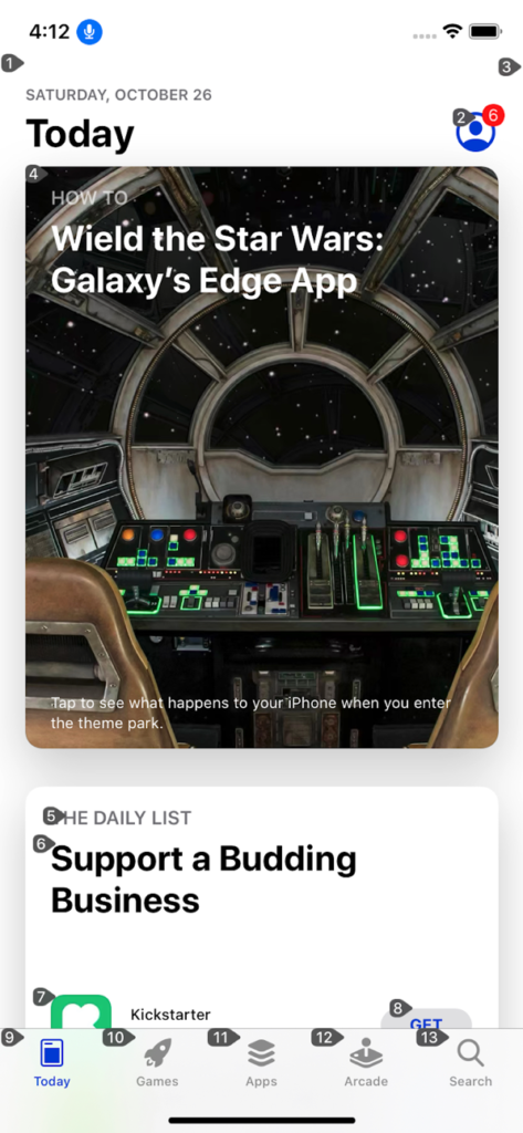
    Screenshot of an app on iOS and numbers associated with clickable elements in the app
    Numbers associated with elements on screen
    • New in iOS 13 Accessibility – Voice Control and More
      • Voice Control is a brand new feature on iOS that lets you interact with on-screen elements using your voice (like Dragon NaturallySpeaking for Windows). It overlays numbers or labels on clickable elements – users can then say things like “Tap 1” to click the first control on the screen. These overlays have a useful side effect: they make it easy to test the focus order of elements in the page. Other changes include a new system-wide standard for enabling or disabling autoplay video in apps. Finally, iOS 13.2 comes with a number of VoiceOver bug fixes, but introduces some bugs too.
    • Accessible Breadcrumb Navigation Pattern
      • This article advises a list of links surrounded by a <nav aria-label="Breadcrumb">. The last link has an aria-current attribute with a value of either “page” or “location” (both appear to be valid). Interestingly, the last link is indeed a link and not just a span of text as is so often implemented in the breadcrumb pattern; this is so that screen reader users are able to see what the current page is and get the same experience as sighted users.
    • Do I have to add a dark mode now?
      • Article by Koos Looijesteijn providing reasons why you may want to consider creating a dark mode for your website. There’s a lot of hype around dark mode since its addition to MacOS Mojave and iOS 13, and it should help support the sizeable proportion of users who can find white backgrounds quite glaring to read against. He links to Charles Reynolds-Talbot’s article that talks about this in more technical detail, as it highlights the new @media (prefers-color-scheme: dark) media query you can start using to deliver dark mode CSS to users who have indicated a preference. At time of writing this is now supported in Safari, Firefox, Chrome, Opera and Android Browser.
    • How to create content that works well with screen readers
      • GOV.UK blog post by Léonie Watson, 2017. Screen readers read things in different ways: some will read out all punctuation, whereas others omit common punctuation and insert human-like pauses instead. Some words require different pronunciations depending on context (tying a “bow” vs taking a “bow”); screen readers vary in their effectiveness at handling these. Acronyms such as DLA (Disability Living Allowance) are sometimes read out like a word, being pronounced as “dlah”. You could work around the issue by inserting full stops or spaces, or off screen text with the preferred phonetics (e.g. “Dee El Eh”) but these “fixes” cause issues for other users. It is better to use correct punctuation, spelling and grammar, and standard conventions for abbreviations. Screen reader users are used to making allowances for the quirks of their screen reading software.
      • Aside: we recently had a bug report that “GOV.UK” was being read out as “Governor UK” in JAWS. We’d seen it in VoiceOver before, though that was fixed as of iOS 12.2. There’s not much we can do except report it to the screen reader maintainers.
    • Accessibility Statements Show Commitment to all Site Users
      • (Article from 2013, updated this month). Describes an “Accessibility Statement” (formerly “Accessibility Information Page”) as being a place to list an active phone number & email address, linked to from all pages, and with “details about the organization’s web accessibility policy”. The article links to the Accessibility Statements of some big companies, such as eBay’s, which describes its “skip link” feature and suggested screen reader commands (though I’d imagine users who need to do that know how to do it already). It also links to a list of companies’ accessibility Twitter accounts, most of which are worth a follow.
      • Aside: it’s not linked in this article, but the GOV.UK accessibility statement is the best I’ve seen (I may be biased!). It sets expectations like “[you should be able to] zoom in up to 300% without problems”, as well as outlining some of the accessibility issues we haven’t fixed yet and how people can request an accessible format. (In practice, I think most sites seem to use their Accessibility Statement as a fluffy PR page along the lines of “accessibility is important to us” with little extra substance).
    • Travelers with disabilities learn what it feels like to fly – without leaving LAX
      • Alaska Airlines and Los Angeles International Airport teamed up in June to allow families to board a ‘fake flight’. The event, dubbed ‘Ability to Fly’, was an opportunity for families with children who struggle with sensory processing and noise, to give them a trial run of air travel without the pressure of a real, busy flight. Families went through the entire check-in, security screening and the boarding process, before the plane taxied to LAX’s remote gates and then returned to the gate. It’s given several families the confidence to come back and do it for real.
    • Consistently Inconsistent: When the Most Accessible Experience is Different for Each User
      • A client requested that their ‘select menu’ should sound identical in every screen reader. Author @ericwbailey points out that, counter-intuitively, implementing a bespoke solution would break ‘external consistency’ and worsen the experience for everyone, as users would no longer have the learned predictability of how to interact with your page. The result was to push back on the request and highlight that screen reader differences are intentional, and also that using native elements requires much less testing. Worth checking this out just to hear how differently VoiceOver, NVDA and JAWS read out the contents of a <select> element (the article contains audio samples of each, conveniently listed next to each other).
    • The Front-End Tooling Survey 2019 – Results (specifically question 25)
      • Take these results with a pinch of salt – only 3005 developers filled in the survey, sourced from places like Twitter and LinkedIn. Asked ‘Which of these accessibility tools do you use to test your sites/applications?’ and presented with options, 63% of participants said they don’t use any (the next most popular option was colour contrast checker, at 22%, then screen reader at 15%). This doesn’t look great; for comparison, when asked which tools they use to test their performance, 52% said they use Lighthouse, vs 32% who don’t use any. But we’re missing context. It’s possible these devs work at companies who have testers that do the screen reader testing, whereas something like performance might be considered the developer’s remit. Or that Lighthouse is built into their CI process, but they don’t really ‘use’ it themselves. I’d like to see a bigger sample size with reworded questions that give us a better idea of developers’ situations.
    • Website Accessibility and Buying Power of Persons with Disabilities
      • A slightly controversial article from 2011, part of a business case for web accessibility series of blog posts by Karl Groves. Accessibility advocates say that making your site accessible makes it more profitable, as it opens it up to people who would otherwise be unable to purchase from you. This is true, but its impact can be exaggerated by including people whose disabilities don’t affect their ability to use the web, or who would never be able to use the web. Discarding these groups, Karl estimates that 7-10% of the US population truly rely on websites being accessible. He goes on to say that this group is “almost twice as likely to live in poverty”, and that without “heavy marketing” they are not going to know that your site is any more accessible than that of your competitors. In conclusion, accessibility for the sake of the “buying power of persons with disabilities” is not a very strong business case as it is unlikely to generate much income for your site. It’s worth reading the rest of his series which highlights stronger business cases for building accessible sites.
    • AI allows paralyzed person to ‘handwrite’ with his mind
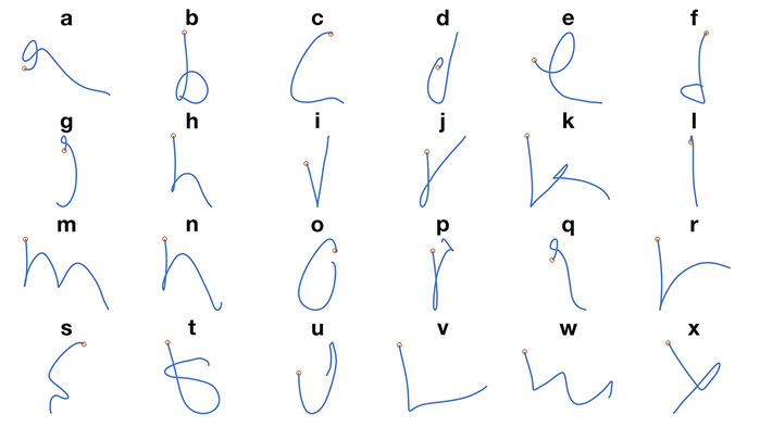
      • People who are ‘locked in’ with severe paralysis, unable to communicate physically, are slowly being able to communicate via technology. “Electrodes implanted in a part of the brain involved in motion” have enabled some paralysed patients to move a cursor and select onscreen letters using just their thoughts, at a rate of 39 characters per minute. Researchers in Chicago have since taken this further; a volunteer imagined moving their arm to hand write each letter of the alphabet. Their brain activity helped to train a neural network to interpret the commands with 95% accuracy, allowing them to write at a faster 66 characters per minute. This speed is expected to improve and is not far off the speed of natural handwriting.
    Letters of the alphabet next to their representations in the neural network

    Did you know that you can subscribe to dai11y, week11y, fortnight11y or month11y updates! Every newsletter gets the same content; it is your choice to have short, regular emails or longer, less frequent ones. Curated with ♥ by developer @ChrisBAshton.
  • fortnight11y issue 1

    Your fortnightly frequent11y newsletter, brought to you by @ChrisBAshton:


    Blue button with white text fails WCAG with contrast ratio 2.94, whereas version with black text passes with contrast ratio 5.41 despite being anecdotally harder to read.
    • The Myths of Color Contrast Accessibility
      • This article refutes some common accessibility guidance, such as the need to use more than just color to denote information (it argues that contrast alone can be sufficient if denoting toggle state. But for something like error state, an additional cue such as icon is required). There’s a really interesting screenshot early in the article showing the contrast ratios of two buttons: one comfortably passes WCAG guidelines and the other doesn’t, despite being easier to read. Well worth reading in full.
    • U.S. Supreme Court Passes on Domino’s Case: Commenters Misunderstand
      • Disability rights lawyer Lainey Feingold discusses the aftermath of the Supreme Court’s decision not to hear the appeal case from Domino’s accessibility lawsuit ruling. She predicts Domino’s next step will be to argue that providing a phone line to customers fulfills its ADA obligations. She goes on to dismiss some kneejerk reactions to the ruling; for example, someone’s suggestion that “[next they’ll sue Domino’s for] not hiring blind delivery drivers” would, ironically, contravene the ADA for being a “direct threat to the health or safety of others”.
      • Background: Blind person in the USA sues Domino’s after being unable to order a custom pizza from its website or app. The Ninth Circuit Court ruled that the “alleged inaccessibility [of the website and app] impedes access to the goods and services of its physical pizza franchises” and thus violates the Americans with Disabilities Act (ADA). Domino’s petitioned to the Supreme Court, who on the 7th October declined to hear the case, leaving the ruling in place. Domino’s now intends to present their case to the trial court.
    • Making GOV.UK Pay more accessible
      • The GOV.UK Pay team upgraded to the latest version of GOV.UK Frontend to be fully compliant with the WCAG 2.1 AA standards, which includes a new accessible colour scheme.
    • P&G’s Herbal Essences unveils Alexa skill for vision-impaired people
      • Herbal Essences have built a voice-powered Alexa app that can help people find product recommendations for their hair type. Even more impressive is their funding of in-house experts to the Be My Eyes app; a free service that connects vision-impaired people with sighted volunteers through a live video call, to receive guidance while shopping or grooming. Finally, thanks to Herbal Essences‘ accessibility leader Sumaira Latif, tactile packaging will be introduced from January 2020 to help vision-impaired people distinguish between shampoos and conditioners.
    • Designing accessible color systems
      • Engineers at Stripe examine the WCAG 2.0 minimum contrast ratio for text and how they arrived at their new accessible colour palette. It goes into great detail on how colour is represented on computer screens and how humans perceive colour, before describing the tool they’ve built to visualise perceptual contrast to help them to arrive at the right choice. Unfortunately there’s no link to the tool itself, nor to its code.
    • Better Link Labels: 4Ss for Encouraging Clicks
      • Avoid vague links like ‘Learn more’. Users scan pages and will often read links without the surrounding context. Links must set expectations that can be instantly met, and ideally should be terse in nature. They should be Specific, Sincere, Substantial and Succinct.
    • Samsung Good Vibes (video, 3 minutes)
      • An advert for Samsung Good Vibes; a messaging app that allows deafblind people to send Morse code – translated into text or voice for recipients – and receive responses as Morse code vibrations. The video shows a family struggling to care for and communicate with their deafblind daughter, forced to send her to a special school. By the end, she gains the skills and independence necessary to use the app to message her parents for the first time, who are also able to communicate back. I’m normally cynical about adverts designed to tug on the heartstrings, but this was quite beautiful and serves as a powerful reminder of the impact technology can have, and its ability to immeasurably improve lives.
    • What I’ve learned about accessibility in SPAs
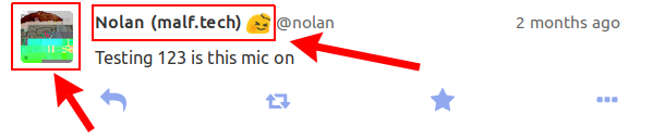
      • SPAs need you to manage “back button” behaviour yourself: scrolling to the previous scroll position and focussing on the previous element that was clicked (something browser navigation normally does for free). The article doesn’t describe how you can achieve this and mostly isn’t SPA-related at all. The author extols the virtues of accessibility for improving readability of tests (by querying aria attributes for state). I also learned that not all clickable elements necessarily need to be focusable; if you have multiple links to the same destination, you should apply tabindex="-1" to some of them to avoid unnecessary tabbing.
      • Background: Single Page Applications (SPAs) use JavaScript to handle navigation between pages by modifying the DOM and History API.
    Screenshot of Mastodon UI with clickable areas highlighted
    These links link to the same place, so one of them can be legitimately removed from the tab index.

    Did you know that you can subscribe to dai11y, week11y, fortnight11y or month11y updates! Every newsletter gets the same content; it is your choice to have short, regular emails or longer, less frequent ones. Curated with ♥ by developer @ChrisBAshton.