Your fortnightly frequent11y newsletter, brought to you by @ChrisBAshton:
- New in iOS 13 Accessibility – Voice Control and More
- Voice Control is a brand new feature on iOS that lets you interact with on-screen elements using your voice (like Dragon NaturallySpeaking for Windows). It overlays numbers or labels on clickable elements – users can then say things like “Tap 1” to click the first control on the screen. These overlays have a useful side effect: they make it easy to test the focus order of elements in the page. Other changes include a new system-wide standard for enabling or disabling autoplay video in apps. Finally, iOS 13.2 comes with a number of VoiceOver bug fixes, but introduces some bugs too.
- Accessible Breadcrumb Navigation Pattern
- This article advises a list of links surrounded by a
<nav aria-label="Breadcrumb">. The last link has anaria-currentattribute with a value of either “page” or “location” (both appear to be valid). Interestingly, the last link is indeed a link and not just a span of text as is so often implemented in the breadcrumb pattern; this is so that screen reader users are able to see what the current page is and get the same experience as sighted users.
- This article advises a list of links surrounded by a
- Do I have to add a dark mode now?
- Article by Koos Looijesteijn providing reasons why you may want to consider creating a dark mode for your website. There’s a lot of hype around dark mode since its addition to MacOS Mojave and iOS 13, and it should help support the sizeable proportion of users who can find white backgrounds quite glaring to read against. He links to Charles Reynolds-Talbot’s article that talks about this in more technical detail, as it highlights the new
@media (prefers-color-scheme: dark)media query you can start using to deliver dark mode CSS to users who have indicated a preference. At time of writing this is now supported in Safari, Firefox, Chrome, Opera and Android Browser.
- Article by Koos Looijesteijn providing reasons why you may want to consider creating a dark mode for your website. There’s a lot of hype around dark mode since its addition to MacOS Mojave and iOS 13, and it should help support the sizeable proportion of users who can find white backgrounds quite glaring to read against. He links to Charles Reynolds-Talbot’s article that talks about this in more technical detail, as it highlights the new
- How to create content that works well with screen readers
- GOV.UK blog post by Léonie Watson, 2017. Screen readers read things in different ways: some will read out all punctuation, whereas others omit common punctuation and insert human-like pauses instead. Some words require different pronunciations depending on context (tying a “bow” vs taking a “bow”); screen readers vary in their effectiveness at handling these. Acronyms such as DLA (Disability Living Allowance) are sometimes read out like a word, being pronounced as “dlah”. You could work around the issue by inserting full stops or spaces, or off screen text with the preferred phonetics (e.g. “Dee El Eh”) but these “fixes” cause issues for other users. It is better to use correct punctuation, spelling and grammar, and standard conventions for abbreviations. Screen reader users are used to making allowances for the quirks of their screen reading software.
- Aside: we recently had a bug report that “GOV.UK” was being read out as “Governor UK” in JAWS. We’d seen it in VoiceOver before, though that was fixed as of iOS 12.2. There’s not much we can do except report it to the screen reader maintainers.
- Accessibility Statements Show Commitment to all Site Users
- (Article from 2013, updated this month). Describes an “Accessibility Statement” (formerly “Accessibility Information Page”) as being a place to list an active phone number & email address, linked to from all pages, and with “details about the organization’s web accessibility policy”. The article links to the Accessibility Statements of some big companies, such as eBay’s, which describes its “skip link” feature and suggested screen reader commands (though I’d imagine users who need to do that know how to do it already). It also links to a list of companies’ accessibility Twitter accounts, most of which are worth a follow.
- Aside: it’s not linked in this article, but the GOV.UK accessibility statement is the best I’ve seen (I may be biased!). It sets expectations like “[you should be able to] zoom in up to 300% without problems”, as well as outlining some of the accessibility issues we haven’t fixed yet and how people can request an accessible format. (In practice, I think most sites seem to use their Accessibility Statement as a fluffy PR page along the lines of “accessibility is important to us” with little extra substance).
- Travelers with disabilities learn what it feels like to fly – without leaving LAX
- Alaska Airlines and Los Angeles International Airport teamed up in June to allow families to board a ‘fake flight’. The event, dubbed ‘Ability to Fly’, was an opportunity for families with children who struggle with sensory processing and noise, to give them a trial run of air travel without the pressure of a real, busy flight. Families went through the entire check-in, security screening and the boarding process, before the plane taxied to LAX’s remote gates and then returned to the gate. It’s given several families the confidence to come back and do it for real.
- Consistently Inconsistent: When the Most Accessible Experience is Different for Each User
- A client requested that their ‘select menu’ should sound identical in every screen reader. Author @ericwbailey points out that, counter-intuitively, implementing a bespoke solution would break ‘external consistency’ and worsen the experience for everyone, as users would no longer have the learned predictability of how to interact with your page. The result was to push back on the request and highlight that screen reader differences are intentional, and also that using native elements requires much less testing. Worth checking this out just to hear how differently VoiceOver, NVDA and JAWS read out the contents of a
<select>element (the article contains audio samples of each, conveniently listed next to each other).
- A client requested that their ‘select menu’ should sound identical in every screen reader. Author @ericwbailey points out that, counter-intuitively, implementing a bespoke solution would break ‘external consistency’ and worsen the experience for everyone, as users would no longer have the learned predictability of how to interact with your page. The result was to push back on the request and highlight that screen reader differences are intentional, and also that using native elements requires much less testing. Worth checking this out just to hear how differently VoiceOver, NVDA and JAWS read out the contents of a
- The Front-End Tooling Survey 2019 – Results (specifically question 25)
- Take these results with a pinch of salt – only 3005 developers filled in the survey, sourced from places like Twitter and LinkedIn. Asked ‘Which of these accessibility tools do you use to test your sites/applications?’ and presented with options, 63% of participants said they don’t use any (the next most popular option was colour contrast checker, at 22%, then screen reader at 15%). This doesn’t look great; for comparison, when asked which tools they use to test their performance, 52% said they use Lighthouse, vs 32% who don’t use any. But we’re missing context. It’s possible these devs work at companies who have testers that do the screen reader testing, whereas something like performance might be considered the developer’s remit. Or that Lighthouse is built into their CI process, but they don’t really ‘use’ it themselves. I’d like to see a bigger sample size with reworded questions that give us a better idea of developers’ situations.
- Website Accessibility and Buying Power of Persons with Disabilities
- A slightly controversial article from 2011, part of a business case for web accessibility series of blog posts by Karl Groves. Accessibility advocates say that making your site accessible makes it more profitable, as it opens it up to people who would otherwise be unable to purchase from you. This is true, but its impact can be exaggerated by including people whose disabilities don’t affect their ability to use the web, or who would never be able to use the web. Discarding these groups, Karl estimates that 7-10% of the US population truly rely on websites being accessible. He goes on to say that this group is “almost twice as likely to live in poverty”, and that without “heavy marketing” they are not going to know that your site is any more accessible than that of your competitors. In conclusion, accessibility for the sake of the “buying power of persons with disabilities” is not a very strong business case as it is unlikely to generate much income for your site. It’s worth reading the rest of his series which highlights stronger business cases for building accessible sites.
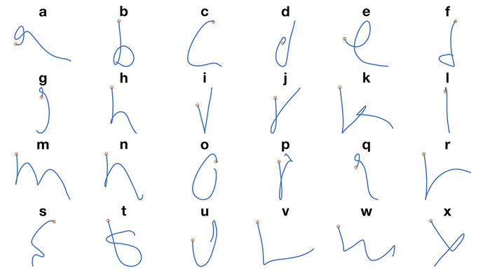
- AI allows paralyzed person to ‘handwrite’ with his mind
- People who are ‘locked in’ with severe paralysis, unable to communicate physically, are slowly being able to communicate via technology. “Electrodes implanted in a part of the brain involved in motion” have enabled some paralysed patients to move a cursor and select onscreen letters using just their thoughts, at a rate of 39 characters per minute. Researchers in Chicago have since taken this further; a volunteer imagined moving their arm to hand write each letter of the alphabet. Their brain activity helped to train a neural network to interpret the commands with 95% accuracy, allowing them to write at a faster 66 characters per minute. This speed is expected to improve and is not far off the speed of natural handwriting.
Did you know that you can subscribe to dai11y, week11y, fortnight11y or month11y updates! Every newsletter gets the same content; it is your choice to have short, regular emails or longer, less frequent ones. Curated with ♥ by developer @ChrisBAshton.