Your fortnightly frequent11y newsletter, brought to you by @ChrisBAshton:
- Article by Sarah Higley, exploring how best to denote the state of a Play/Pause video button for screen reader users. Most ‘toggle buttons’ for a binary state should have an
aria-pressedattribute with value “on” or “off”; screen readers communicate this ‘state change’ more quickly than a change in property (such asaria-label). Sarah argues that the play/pause button, however, is the exception to the rule and should only change thearia-label(from “Play” to “Pause”), as changes in state don’t make sense in this context (“play button off”). Most importantly, avoid changing both or you’ll confuse your users (“play button, on” vs “pause button, off”).
When Things Go Wrong for Blind Users on Facebook, They Go Really Wrong
- An article highlighting the regularity of bugs and missing features encountered by screen reader users on the Facebook apps and site, with a strong message that there is an under-investment in accessibility development on Facebook and Instagram. A feature for adding colourful backgrounds to posts meant all posts were read out as “Awesome Text Status” for a week. Facebook’s attempt at automating alt text has met a muted response; “image may contain child” doesn’t allow screen reader users to participate. There are options to provide alt text on uploaded images, and forms for flagging accessibility issues, but both are criticised as being too hard to find. Some users have created Facebook groups to share images of text they want transcribing by sighted volunteers. There’s something to be said about the ‘move fast and break things’ ethos and what that means for disabled users.
If it has audio, now it can have captions
- Google have created functionality for the Pixel 4 phone, which they’ve dubbed Live Caption. Like the auto caption feature on YouTube videos, this overlays text on your phone screen – when enabled – showing Google’s interpretation of the audio. The text overlay can be moved independently as demonstrated in this gif, and the captioning works independently of the audio source, so you can watch any video or audio in your browser or apps and be able to get captions. It works entirely locally, so doesn’t use any cell data and stays private on your phone. Google are hoping to roll this out to other Android manufacturers “in the coming year”.
Creating Online Environments That Work Well For Older Users
- An opinion piece by Barry Rueger, who for context is “well past sixty”. He makes several suggestions that are widely recognised as universally good practices, such as improving website load speed and ensuring good grammar and spelling. Others are more subjective: that older people prefer text and ignore videos in search results, or that they hold onto old, slow machines for longer. Barry makes the case for black text on white backgrounds; a controversial subject as several user groups find this harder to read (there are some comments below the article to that effect). Finally, an interesting point about the success of Amazon being down to its website’s consistency; “we know the site, and we know that we can do our shopping quickly and painlessly”. He suggests resisting the urge to reinvent your website unnecessarily.
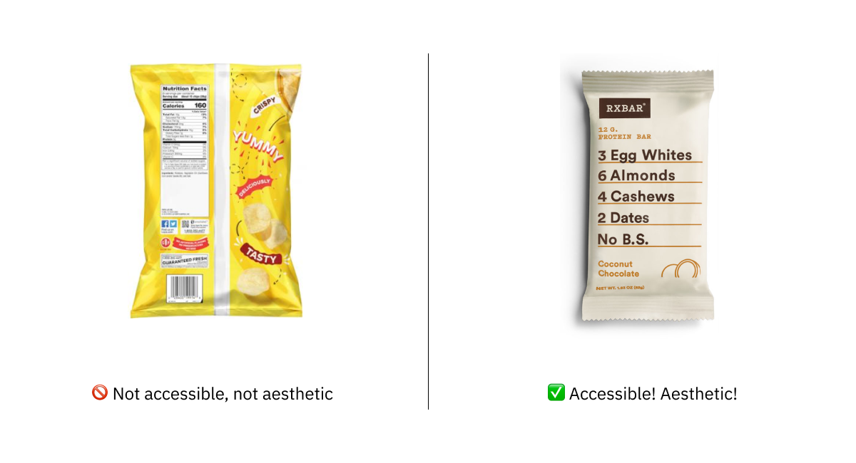
Accessibility drives aesthetics
- A recent article by UX designer, Alex Chen. It debunks the myth that accessible designs have to be ugly designs, giving real-world examples of websites (GOV.UK gets a mention here) and products (RX protein bar packaging) that are both accessible and aesthetically pleasing. That aside, Alex asserts that the two are not of equal importance; an interface change may not look quite as visually pleasing to one person, but another person is now able to use it. Some people concentrate their efforts on the ‘normal’ use case, neglecting designing the ‘edge cases’ for disabled people, but that is an ableist practice; “edge cases [should] refer to scenarios, not humans”. There’s a final point about disabilities disproportionately affecting people of a certain race or class, and that we have an opportunity to start to level the playing field for all.
We Analyzed 10,000,000 Pages and Here’s Where Most Fail with ADA and WCAG 2.1 Compliance
- Article by accessiBe, analysing mostly small US websites. They used automated tooling with AI to avoid false positives, e.g. avoid failing a non-compliant form if it’s never actually in view. 98% of sites failed WCAG 2.1 AA compliance with their menus alone (there are quite stringent requirements around using ESC and arrow keys to navigate the menu, which requires JavaScript rather than just good HTML markup). The next big fail was popups (89%), where most have no accessibility built in whatsoever, breaking the experience for keyboard users. 83% failed on buttons, mostly for not using
<button>orrole="button"markup. 76% failed on icons (often social media icons with no off-screen text). 71% failed on forms; most that passed were from ready-made systems such as Shopify. - Aside: I chose this article to coincide with the International Day of People with Disabilities. This is an occasion “to educate the public on issues of concern, to mobilize political will and resources to address global problems, and to celebrate and reinforce achievements of humanity.” It’s also a good opportunity to remind teams in the UK public sector of their responsibility to make sites conform to WCAG 2.1 by September 2020.
Walking On Egg Shells: Why Bosses Are Scared To Talk About Neurodiversity
- Article by psychologist Dr Nancy Doyle, highlighting that companies are increasingly attempting to improve their inclusivity, but are nervous about using the wrong language. “People with disabilities” vs “disabled people” represent two different models – the first being ‘people-first’ (we are people, not conditions) and the latter being the ‘social model’ (we are disabled by a non-inclusive society). Nancy advises following a consensus where there is one: for example, the term “autistic person” is commonly used as they see it as their identity, not something they have. Where there there isn’t a consensus, we should use multiple terms interchangeably, ideally with a brief explanatory footnote at the end of written communication so that people can see that you have thought about your choices.
18 WAI-ARIA attributes that every web developer should know
- Use
aria-labelwhen you can’t use generic<label>, andaria-describedbyfor supplementary info, such as to associate error messages with their corresponding inputs. Userole="heading"andaria-level="2"instead of<h2>if you can’t use the element (for SEO reasons, etc). Whenever there is a visible status message on the page, it must be announced to users, e.g. withrole="status"orrole="alert". Userole="search"for landmarking a region responsible for search – there is no HTML5 element for it. - Aside: this article links to the incredibly useful aria practices document, which shows recommended implementations for common components like breadcrumbs and carousels.
Making a Better Custom Select Element
- A ‘how-to’ guide from accessibility expert Julie Grundy. It describes the drawbacks of the native
<select>element – the lack of autocomplete, the inflexibility around what can appear inside each<option>. Julie talks us through building a custom select, avoiding the accessibility pitfalls that many custom select components fall down at. She starts from a baseline of<input type="text">, with progressive enhancement layered on to turn it into an autocomplete dropdown with keyboard functionality and total screen reader support. It links off to the ARIA 1.1 Combobox with Listbox Popup Example, which is also a good dev resource for this.
The Physics (and Economics, and Politics) of Wheelchairs on Planes
- A detailed article highlighting the stress of flying as a wheelchair-user, involving being picked up and strapped into an ill-fitting seat while your wheelchair is put in the hold (and subsequently lost or damaged in transit, as happens in a lot of cases). The principle reason cited is one of safety, but a lot of research has been done to show that wheelchair tests are actually more stringent and can withstand more G-force than the airline seats themselves. A new aircraft design is proposed where wheelchairs can be securely fastened into the floor, or an airline seat fitted at the last minute if there are no wheelchair-using passengers. It could be two years before the American Transportation Research Board releases its initial findings to “the feasibility of the restraint system”, bearing in mind the myriad of different wheelchair types and sizes. The final fight would be persuading each airline to adapt and get on board.
Did you know that you can subscribe to dai11y, week11y, fortnight11y or month11y updates! Every newsletter gets the same content; it is your choice to have short, regular emails or longer, less frequent ones. Curated with ♥ by developer @ChrisBAshton.