Your fortnightly frequent11y newsletter, brought to you by @ChrisBAshton:
- The Myths of Color Contrast Accessibility
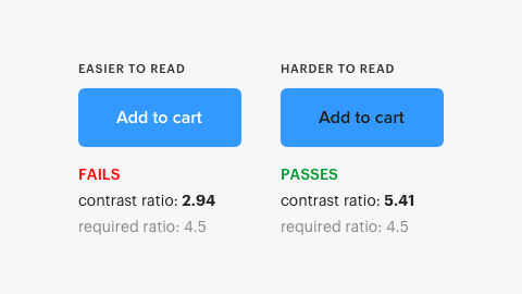
- This article refutes some common accessibility guidance, such as the need to use more than just color to denote information (it argues that contrast alone can be sufficient if denoting toggle state. But for something like error state, an additional cue such as icon is required). There’s a really interesting screenshot early in the article showing the contrast ratios of two buttons: one comfortably passes WCAG guidelines and the other doesn’t, despite being easier to read. Well worth reading in full.
- U.S. Supreme Court Passes on Domino’s Case: Commenters Misunderstand
- Disability rights lawyer Lainey Feingold discusses the aftermath of the Supreme Court’s decision not to hear the appeal case from Domino’s accessibility lawsuit ruling. She predicts Domino’s next step will be to argue that providing a phone line to customers fulfills its ADA obligations. She goes on to dismiss some kneejerk reactions to the ruling; for example, someone’s suggestion that “[next they’ll sue Domino’s for] not hiring blind delivery drivers” would, ironically, contravene the ADA for being a “direct threat to the health or safety of others”.
- Background: Blind person in the USA sues Domino’s after being unable to order a custom pizza from its website or app. The Ninth Circuit Court ruled that the “alleged inaccessibility [of the website and app] impedes access to the goods and services of its physical pizza franchises” and thus violates the Americans with Disabilities Act (ADA). Domino’s petitioned to the Supreme Court, who on the 7th October declined to hear the case, leaving the ruling in place. Domino’s now intends to present their case to the trial court.
- Making GOV.UK Pay more accessible
- The GOV.UK Pay team upgraded to the latest version of GOV.UK Frontend to be fully compliant with the WCAG 2.1 AA standards, which includes a new accessible colour scheme.
- P&G’s Herbal Essences unveils Alexa skill for vision-impaired people
- Herbal Essences have built a voice-powered Alexa app that can help people find product recommendations for their hair type. Even more impressive is their funding of in-house experts to the Be My Eyes app; a free service that connects vision-impaired people with sighted volunteers through a live video call, to receive guidance while shopping or grooming. Finally, thanks to Herbal Essences‘ accessibility leader Sumaira Latif, tactile packaging will be introduced from January 2020 to help vision-impaired people distinguish between shampoos and conditioners.
- Designing accessible color systems
- Engineers at Stripe examine the WCAG 2.0 minimum contrast ratio for text and how they arrived at their new accessible colour palette. It goes into great detail on how colour is represented on computer screens and how humans perceive colour, before describing the tool they’ve built to visualise perceptual contrast to help them to arrive at the right choice. Unfortunately there’s no link to the tool itself, nor to its code.
- Better Link Labels: 4Ss for Encouraging Clicks
- Avoid vague links like ‘Learn more’. Users scan pages and will often read links without the surrounding context. Links must set expectations that can be instantly met, and ideally should be terse in nature. They should be Specific, Sincere, Substantial and Succinct.
- Samsung Good Vibes (video, 3 minutes)
- An advert for Samsung Good Vibes; a messaging app that allows deafblind people to send Morse code – translated into text or voice for recipients – and receive responses as Morse code vibrations. The video shows a family struggling to care for and communicate with their deafblind daughter, forced to send her to a special school. By the end, she gains the skills and independence necessary to use the app to message her parents for the first time, who are also able to communicate back. I’m normally cynical about adverts designed to tug on the heartstrings, but this was quite beautiful and serves as a powerful reminder of the impact technology can have, and its ability to immeasurably improve lives.
- What I’ve learned about accessibility in SPAs
- SPAs need you to manage “back button” behaviour yourself: scrolling to the previous scroll position and focussing on the previous element that was clicked (something browser navigation normally does for free). The article doesn’t describe how you can achieve this and mostly isn’t SPA-related at all. The author extols the virtues of accessibility for improving readability of tests (by querying aria attributes for state). I also learned that not all clickable elements necessarily need to be focusable; if you have multiple links to the same destination, you should apply
tabindex="-1"to some of them to avoid unnecessary tabbing. - Background: Single Page Applications (SPAs) use JavaScript to handle navigation between pages by modifying the DOM and History API.
- SPAs need you to manage “back button” behaviour yourself: scrolling to the previous scroll position and focussing on the previous element that was clicked (something browser navigation normally does for free). The article doesn’t describe how you can achieve this and mostly isn’t SPA-related at all. The author extols the virtues of accessibility for improving readability of tests (by querying aria attributes for state). I also learned that not all clickable elements necessarily need to be focusable; if you have multiple links to the same destination, you should apply
Did you know that you can subscribe to dai11y, week11y, fortnight11y or month11y updates! Every newsletter gets the same content; it is your choice to have short, regular emails or longer, less frequent ones. Curated with ♥ by developer @ChrisBAshton.