Your daily frequent11y newsletter, brought to you by @ChrisBAshton:
The Myths of Color Contrast Accessibility
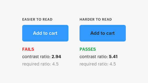
- TLDR: this article refutes some common accessibility guidance, such as the need to use more than just color to denote information (it argues that contrast alone can be sufficient if denoting toggle state. But for something like error state, an additional cue such as icon is required). There’s a really interesting screenshot early in the article showing the contrast ratios of two buttons: one comfortably passes WCAG guidelines and the other doesn’t, despite being easier to read. Well worth reading in full.
Prefer longer newsletters? You can subscribe to week11y, fortnight11y or even month11y updates! Every newsletter gets the same content; it is your choice to have short, regular emails or longer, less frequent ones. Curated with ♥ by developer @ChrisBAshton.