18 Nov

dai11y 18/11/2019

Your daily frequent11y newsletter, brought to you by @ChrisBAshton:

Website Accessibility and Buying Power of Persons with Disabilities

  • A slightly controversial article from 2011, part of a business case for web accessibility series of blog posts by Karl Groves. Accessibility advocates say that making your site accessible makes it more profitable, as it opens it up to people who would otherwise be unable to purchase from you. This is true, but its impact can be exaggerated by including people whose disabilities don’t affect their ability to use the web, or who would never be able to use the web. Discarding these groups, Karl estimates that 7-10% of the US population truly rely on websites being accessible. He goes on to say that this group is “almost twice as likely to live in poverty”, and that without “heavy marketing” they are not going to know that your site is any more accessible than that of your competitors. In conclusion, accessibility for the sake of the “buying power of persons with disabilities” is not a very strong business case as it is unlikely to generate much income for your site. It’s worth reading the rest of his series which highlights stronger business cases for building accessible sites.

Prefer longer newsletters? You can subscribe to week11y, fortnight11y or even month11y updates! Every newsletter gets the same content; it is your choice to have short, regular emails or longer, less frequent ones. Curated with ♥ by developer @ChrisBAshton.
15 Nov

dai11y 15/11/2019

Your daily frequent11y newsletter, brought to you by @ChrisBAshton:

The Front-End Tooling Survey 2019 – Results (specifically question 25)

  • Take these results with a pinch of salt – only 3005 developers filled in the survey, sourced from places like Twitter and LinkedIn. Asked ‘Which of these accessibility tools do you use to test your sites/applications?’ and presented with options, 63% of participants said they don’t use any (the next most popular option was colour contrast checker, at 22%, then screen reader at 15%). This doesn’t look great; for comparison, when asked which tools they use to test their performance, 52% said they use Lighthouse, vs 32% who don’t use any. But we’re missing context. It’s possible these devs work at companies who have testers that do the screen reader testing, whereas something like performance might be considered the developer’s remit. Or that Lighthouse is built into their CI process, but they don’t really ‘use’ it themselves. I’d like to see a bigger sample size with reworded questions that give us a better idea of developers’ situations.

Prefer longer newsletters? You can subscribe to week11y, fortnight11y or even month11y updates! Every newsletter gets the same content; it is your choice to have short, regular emails or longer, less frequent ones. Curated with ♥ by developer @ChrisBAshton.

14 Nov

dai11y 14/11/2019

Your daily frequent11y newsletter, brought to you by @ChrisBAshton:

Consistently Inconsistent: When the Most Accessible Experience is Different for Each User

  • A client requested that their ‘select menu’ should sound identical in every screen reader. Author @ericwbailey points out that, counter-intuitively, implementing a bespoke solution would break ‘external consistency’ and worsen the experience for everyone, as users would no longer have the learned predictability of how to interact with your page. The result was to push back on the request and highlight that screen reader differences are intentional, and also that using native elements requires much less testing. Worth checking this out just to hear how differently VoiceOver, NVDA and JAWS read out the contents of a <select> element (the article contains audio samples of each, conveniently listed next to each other).

Prefer longer newsletters? You can subscribe to week11y, fortnight11y or even month11y updates! Every newsletter gets the same content; it is your choice to have short, regular emails or longer, less frequent ones. Curated with ♥ by developer @ChrisBAshton.

13 Nov

dai11y 13/11/2019

Your daily frequent11y newsletter, brought to you by @ChrisBAshton:

Travelers with disabilities learn what it feels like to fly – without leaving LAX

  • Alaska Airlines and Los Angeles International Airport teamed up in June to allow families to board a ‘fake flight’. The event, dubbed ‘Ability to Fly’, was an opportunity for families with children who struggle with sensory processing and noise, to give them a trial run of air travel without the pressure of a real, busy flight. Families went through the entire check-in, security screening and the boarding process, before the plane taxied to LAX’s remote gates and then returned to the gate. It’s given several families the confidence to come back and do it for real.

Prefer longer newsletters? You can subscribe to week11y, fortnight11y or even month11y updates! Every newsletter gets the same content; it is your choice to have short, regular emails or longer, less frequent ones. Curated with ♥ by developer @ChrisBAshton.

12 Nov

dai11y 12/11/2019

Your daily frequent11y newsletter, brought to you by @ChrisBAshton:

Accessibility Statements Show Commitment to all Site Users

  • (Article from 2013, updated this month). Describes an “Accessibility Statement” (formerly “Accessibility Information Page”) as being a place to list an active phone number & email address, linked to from all pages, and with “details about the organization’s web accessibility policy”. The article links to the Accessibility Statements of some big companies, such as eBay’s, which describes its “skip link” feature and suggested screen reader commands (though I’d imagine users who need to do that know how to do it already). It also links to a list of companies’ accessibility Twitter accounts, most of which are worth a follow.
  • Aside: it’s not linked in this article, but the GOV.UK accessibility statement is the best I’ve seen (I may be biased!). It sets expectations like “[you should be able to] zoom in up to 300% without problems”, as well as outlining some of the accessibility issues we haven’t fixed yet and how people can request an accessible format. (In practice, I think most sites seem to use their Accessibility Statement as a fluffy PR page along the lines of “accessibility is important to us” with little extra substance).

Prefer longer newsletters? You can subscribe to week11y, fortnight11y or even month11y updates! Every newsletter gets the same content; it is your choice to have short, regular emails or longer, less frequent ones. Curated with ♥ by developer @ChrisBAshton.

11 Nov

fortnight11y issue 1

Your fortnightly frequent11y newsletter, brought to you by @ChrisBAshton:


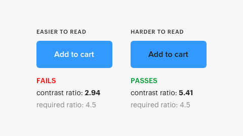
Blue button with white text fails WCAG with contrast ratio 2.94, whereas version with black text passes with contrast ratio 5.41 despite being anecdotally harder to read.
  • The Myths of Color Contrast Accessibility
    • This article refutes some common accessibility guidance, such as the need to use more than just color to denote information (it argues that contrast alone can be sufficient if denoting toggle state. But for something like error state, an additional cue such as icon is required). There’s a really interesting screenshot early in the article showing the contrast ratios of two buttons: one comfortably passes WCAG guidelines and the other doesn’t, despite being easier to read. Well worth reading in full.
  • U.S. Supreme Court Passes on Domino’s Case: Commenters Misunderstand
    • Disability rights lawyer Lainey Feingold discusses the aftermath of the Supreme Court’s decision not to hear the appeal case from Domino’s accessibility lawsuit ruling. She predicts Domino’s next step will be to argue that providing a phone line to customers fulfills its ADA obligations. She goes on to dismiss some kneejerk reactions to the ruling; for example, someone’s suggestion that “[next they’ll sue Domino’s for] not hiring blind delivery drivers” would, ironically, contravene the ADA for being a “direct threat to the health or safety of others”.
    • Background: Blind person in the USA sues Domino’s after being unable to order a custom pizza from its website or app. The Ninth Circuit Court ruled that the “alleged inaccessibility [of the website and app] impedes access to the goods and services of its physical pizza franchises” and thus violates the Americans with Disabilities Act (ADA). Domino’s petitioned to the Supreme Court, who on the 7th October declined to hear the case, leaving the ruling in place. Domino’s now intends to present their case to the trial court.
  • Making GOV.UK Pay more accessible
    • The GOV.UK Pay team upgraded to the latest version of GOV.UK Frontend to be fully compliant with the WCAG 2.1 AA standards, which includes a new accessible colour scheme.
  • P&G’s Herbal Essences unveils Alexa skill for vision-impaired people
    • Herbal Essences have built a voice-powered Alexa app that can help people find product recommendations for their hair type. Even more impressive is their funding of in-house experts to the Be My Eyes app; a free service that connects vision-impaired people with sighted volunteers through a live video call, to receive guidance while shopping or grooming. Finally, thanks to Herbal Essences‘ accessibility leader Sumaira Latif, tactile packaging will be introduced from January 2020 to help vision-impaired people distinguish between shampoos and conditioners.
  • Designing accessible color systems
    • Engineers at Stripe examine the WCAG 2.0 minimum contrast ratio for text and how they arrived at their new accessible colour palette. It goes into great detail on how colour is represented on computer screens and how humans perceive colour, before describing the tool they’ve built to visualise perceptual contrast to help them to arrive at the right choice. Unfortunately there’s no link to the tool itself, nor to its code.
  • Better Link Labels: 4Ss for Encouraging Clicks
    • Avoid vague links like ‘Learn more’. Users scan pages and will often read links without the surrounding context. Links must set expectations that can be instantly met, and ideally should be terse in nature. They should be Specific, Sincere, Substantial and Succinct.
  • Samsung Good Vibes (video, 3 minutes)
    • An advert for Samsung Good Vibes; a messaging app that allows deafblind people to send Morse code – translated into text or voice for recipients – and receive responses as Morse code vibrations. The video shows a family struggling to care for and communicate with their deafblind daughter, forced to send her to a special school. By the end, she gains the skills and independence necessary to use the app to message her parents for the first time, who are also able to communicate back. I’m normally cynical about adverts designed to tug on the heartstrings, but this was quite beautiful and serves as a powerful reminder of the impact technology can have, and its ability to immeasurably improve lives.
  • What I’ve learned about accessibility in SPAs
    • SPAs need you to manage “back button” behaviour yourself: scrolling to the previous scroll position and focussing on the previous element that was clicked (something browser navigation normally does for free). The article doesn’t describe how you can achieve this and mostly isn’t SPA-related at all. The author extols the virtues of accessibility for improving readability of tests (by querying aria attributes for state). I also learned that not all clickable elements necessarily need to be focusable; if you have multiple links to the same destination, you should apply tabindex="-1" to some of them to avoid unnecessary tabbing.
    • Background: Single Page Applications (SPAs) use JavaScript to handle navigation between pages by modifying the DOM and History API.
Screenshot of Mastodon UI with clickable areas highlighted
These links link to the same place, so one of them can be legitimately removed from the tab index.

Did you know that you can subscribe to dai11y, week11y, fortnight11y or month11y updates! Every newsletter gets the same content; it is your choice to have short, regular emails or longer, less frequent ones. Curated with ♥ by developer @ChrisBAshton.

11 Nov

week11y issue 2

Your weekly frequent11y newsletter, brought to you by @ChrisBAshton:

Blue button with white text fails WCAG with contrast ratio 2.94, whereas version with black text passes with contrast ratio 5.41 despite being anecdotally harder to read.
  • The Myths of Color Contrast Accessibility
    • This article refutes some common accessibility guidance, such as the need to use more than just color to denote information (it argues that contrast alone can be sufficient if denoting toggle state. But for something like error state, an additional cue such as icon is required). There’s a really interesting screenshot early in the article showing the contrast ratios of two buttons: one comfortably passes WCAG guidelines and the other doesn’t, despite being easier to read. Well worth reading in full.
  • Samsung Good Vibes (video, 3 minutes)
    • An advert for Samsung Good Vibes; a messaging app that allows deafblind people to send Morse code – translated into text or voice for recipients – and receive responses as Morse code vibrations. The video shows a family struggling to care for and communicate with their deafblind daughter, forced to send her to a special school. By the end, she gains the skills and independence necessary to use the app to message her parents for the first time, who are also able to communicate back. I’m normally cynical about adverts designed to tug on the heartstrings, but this was quite beautiful and serves as a powerful reminder of the impact technology can have, and its ability to immeasurably improve lives.
  • What I’ve learned about accessibility in SPAs
    • SPAs need you to manage “back button” behaviour yourself: scrolling to the previous scroll position and focussing on the previous element that was clicked (something browser navigation normally does for free). The article doesn’t describe how you can achieve this and mostly isn’t SPA-related at all. The author extols the virtues of accessibility for improving readability of tests (by querying aria attributes for state). I also learned that not all clickable elements necessarily need to be focusable; if you have multiple links to the same destination, you should apply tabindex="-1" to some of them to avoid unnecessary tabbing.
    • Background: Single Page Applications (SPAs) use JavaScript to handle navigation between pages by modifying the DOM and History API.
Screenshot of Mastodon UI with clickable areas highlighted
These links link to the same place, so one of them can be legitimately removed from the tab index.

Did you know that you can subscribe to dai11y, week11y, fortnight11y or month11y updates! Every newsletter gets the same content; it is your choice to have short, regular emails or longer, less frequent ones. Curated with ♥ by developer @ChrisBAshton.

11 Nov

dai11y 11/11/2019

Your daily frequent11y newsletter, brought to you by @ChrisBAshton:

Samsung Good Vibes (video, 3 minutes)

  • An advert for Samsung Good Vibes; a messaging app that allows deafblind people to send Morse code – translated into text or voice for recipients – and receive responses as Morse code vibrations. The video shows a family struggling to care for and communicate with their deafblind daughter, forced to send her to a special school. By the end, she gains the skills and independence necessary to use the app to message her parents for the first time, who are also able to communicate back. I’m normally cynical about adverts designed to tug on the heartstrings, but this was quite beautiful and serves as a powerful reminder of the impact technology can have, and its ability to immeasurably improve lives.

Prefer longer newsletters? You can subscribe to week11y, fortnight11y or even month11y updates! Every newsletter gets the same content; it is your choice to have short, regular emails or longer, less frequent ones. Curated with ♥ by developer @ChrisBAshton.

07 Nov

dai11y 07/11/2019

Your daily frequent11y newsletter, brought to you by @ChrisBAshton:

What I’ve learned about accessibility in SPAs

  • SPAs need you to manage “back button” behaviour yourself: scrolling to the previous scroll position and focussing on the previous element that was clicked (something browser navigation normally does for free). The article doesn’t describe how you can achieve this and mostly isn’t SPA-related at all. The author extols the virtues of accessibility for improving readability of tests (by querying aria attributes for state). I also learned that not all clickable elements necessarily need to be focusable; if you have multiple links to the same destination, you should apply tabindex="-1" to some of them to avoid unnecessary tabbing.
  • Background: Single Page Applications (SPAs) use JavaScript to handle navigation between pages by modifying the DOM and History API.
Screenshot of Mastodon UI with clickable areas highlighted
These links link to the same place, so one of them can be legitimately removed from the tab index.

04 Nov

dai11y 04/11/2019

Your daily frequent11y newsletter, brought to you by @ChrisBAshton:

The Myths of Color Contrast Accessibility

  • TLDR: this article refutes some common accessibility guidance, such as the need to use more than just color to denote information (it argues that contrast alone can be sufficient if denoting toggle state. But for something like error state, an additional cue such as icon is required). There’s a really interesting screenshot early in the article showing the contrast ratios of two buttons: one comfortably passes WCAG guidelines and the other doesn’t, despite being easier to read. Well worth reading in full.
Blue button with white text fails WCAG with contrast ratio 2.94, whereas version with black text passes with contrast ratio 5.41 despite being anecdotally harder to read.

Prefer longer newsletters? You can subscribe to week11y, fortnight11y or even month11y updates! Every newsletter gets the same content; it is your choice to have short, regular emails or longer, less frequent ones. Curated with ♥ by developer @ChrisBAshton.

Loading...