A listicle by Twan Mulder, which I wasn’t expecting to learn anything from – but then I learned something from the very first point! It was this:
You often need to denote the ‘current’ page in navigation, and you see this in the wild with class="active" or similar in the markup. Instead, it should use aria-current="page", to tell screen readers this is a link to the same page they’re already on.
The other tips are to use aria-hidden to hide decorative separators between links; add visually hidden text to your icon links; apply ARIA markup to your <div> if you insist on not using a <button>; and, somewhat obviously, provide alt text for your images.
Prefer longer newsletters? You can subscribe to week11y, fortnight11y or even month11y updates! Every newsletter gets the same content; it is your choice to have short, regular emails or longer, less frequent ones. Curated with ♥ by developer @ChrisBAshton.
Article by Yakim van Zuijlen, describing how to use VoiceOver on a Mac to test your website. It’s aimed at beginners, but goes into quite a lot of detail, including how to find items by type (e.g. blockquote). There are some beautiful, clear illustrations throughout the article, showing which keys to press to trigger shortcuts, or how elements in the browser are grouped together by VoiceOver.
Prefer longer newsletters? You can subscribe to week11y, fortnight11y or even month11y updates! Every newsletter gets the same content; it is your choice to have short, regular emails or longer, less frequent ones. Curated with ♥ by developer @ChrisBAshton.
Some of these seem fairly obvious, but others less so. With respect to autism, “high or low functioning” is an ableist term I hadn’t considered. ‘Differently abled’ and ‘special needs’ are also poor euphemisms for the term ‘disabled’. ‘Tone deaf’ and ‘blind spot’ are also terms in common usage, but which harmfully link deafness/blindness with ignorance.
The other phrases this article considers ableist are ‘imbecile’, ‘crippled’, ‘spastic’, ‘lame’, ‘suffering’ (as in “suffering from [disability]”), ‘wheelchair bound’ (in reality, many wheelchair users find their wheelchairs liberating) and finally, a saying I hadn’t heard before: “See the Able, Not the Label”.
Prefer longer newsletters? You can subscribe to week11y, fortnight11y or even month11y updates! Every newsletter gets the same content; it is your choice to have short, regular emails or longer, less frequent ones. Curated with ♥ by developer @ChrisBAshton.
News organisation ProPublica ‘translated’ one of their articles into plain language, in an effort to be more accessible to people with intellectual/developmental disabilities.
It’s fascinating to read the articles side by side and see how they compare. The plain language version simplifies sentences, writes in active voice, and uses bullet points for lists.
Prefer longer newsletters? You can subscribe to week11y, fortnight11y or even month11y updates! Every newsletter gets the same content; it is your choice to have short, regular emails or longer, less frequent ones. Curated with ♥ by developer @ChrisBAshton.
A very popular article among a11y newsletters at the moment. Eric Bailey reminds us that WCAG is a standard, that sets “objective criteria for what is and is not accessible”. In other words, you might hate the design of a website, but it might conform to all WCAG criteria. Don’t creatively reinterpret what a Service Criterion says to fit your agenda.
As a designer, you can appeal to a product’s usability, giving subjective feedback grounded in objective origins. But in an auditing context, you have to kill your ego and only point out failures that map to WCAG rules.
Eric says you should think like a lawyer: every call you make might have to be defended in a court of law [it’s worth noting that this article is written from an American point of view]. That is to say, “stay in your lane”, by sticking to established, legally accepted parameters, i.e. WCAG.
Prefer longer newsletters? You can subscribe to week11y, fortnight11y or even month11y updates! Every newsletter gets the same content; it is your choice to have short, regular emails or longer, less frequent ones. Curated with ♥ by developer @ChrisBAshton.
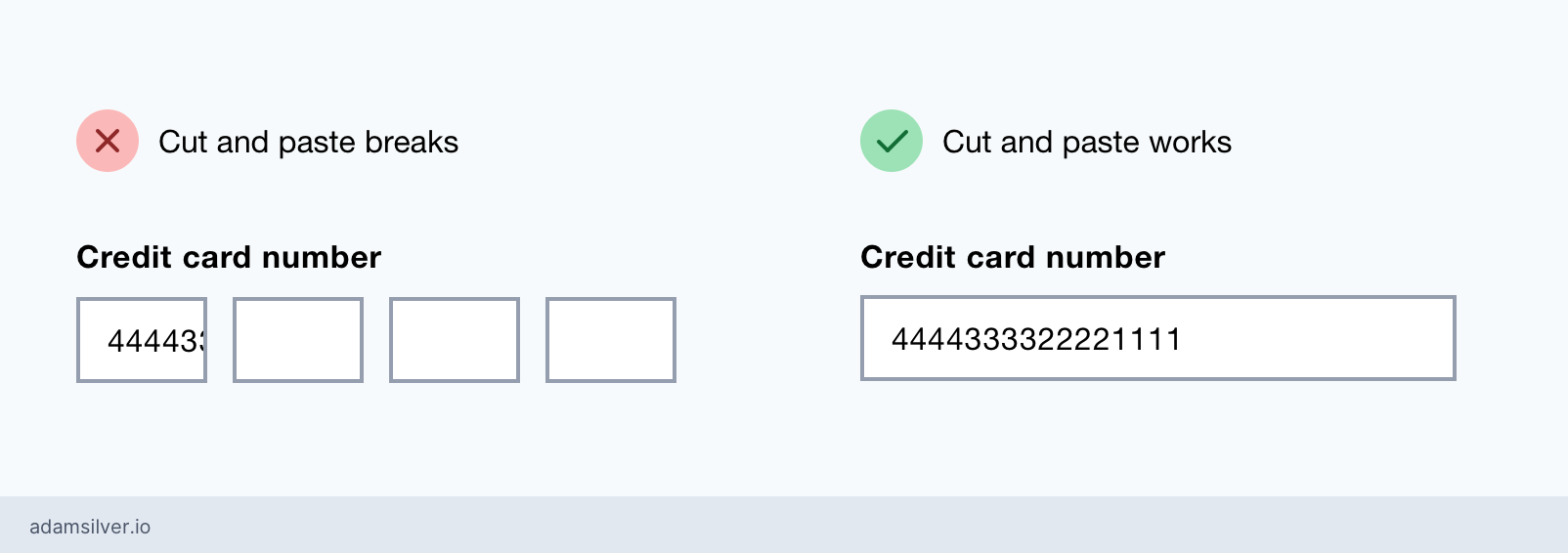
Blog post by Adam Silver, explaining why splitting inputs can be problematic. A technique often used for credit card numbers and bank sort-codes, I’ve often found such forms quite slick, but hadn’t considered some of their accessibility downsides:
Multiple inputs mean users can’t easily paste information in, unless JavaScript has been written to allow it (which may not be obvious to the user).
It can be difficult to correct mistakes if the form auto-focuses the next input in the sequence.
Each input is difficult to label meaningfully. The label is often hidden from sighted users, if provided at all, and makes for a noisy screen reader experience.
Instead, Adam encourages us to allow free-form text and to be forgiving of extra spaces and dashes in inputs. The exception is dates, where multiple inputs should be used, to clarify which portion of the date is the month and which is the day (as this varies around the world).
A Daily Express article from last summer. Bioengineers at the University of California have developed a glove that can translate sign language into speech in real-time, using an accompanying smartphone app.
The glove has thin sensors running to the fingertips, which can detect motions. The smartphone app uses a custom machine learning algorithm to convert the gestures into letters, numbers and words, and can recognise 660 signs. It translates at a speed of one word per second, with an accuracy rate of 98.63%.
The glove has its critics. Gabrielle Hodge, a deaf researcher at University College London, says: “there is nothing wrong with [sign language as a] form of communication” and that the technology is “redundant”, due to deaf signers already making extensive use of text-to-speech software.
The Readability Group is a collection of experts in design and accessibility. Their mission is to “optimise typographic accessibility by providing expert advice based on data, not anecdote”. Essentially, they want to gather real user feedback on the readability of typography.
Please take around twenty minutes of time to contribute to the “Readability survey”, which has been nearly 2 years in development!
Article exploring the pros and cons of infinite scroll. The pros were simply “seamless mobile scrolling” and “serendipitous browsing”. The cons were numerous:
Could contribute to social media addiction.
Might make sidebars and other content inaccessible to assistive technology users.
Makes footers impossible to reach.
Causes users to lose their place (especially when hitting the ‘Back’ button).
Slows down users who have specific goals (e.g. wanting to jump to a letter midway through the alphabet).
Tips to improve infinite scroll implementations:
Don’t place content below the infinite scroll.
Code in some logic to allow ‘Back’ interactions to keep their place.
A very popular article among a11y newsletters at the moment. Eric Bailey reminds us that WCAG is a standard, that sets “objective criteria for what is and is not accessible”. In other words, you might hate the design of a website, but it might conform to all WCAG criteria. Don’t creatively reinterpret what a Service Criterion says to fit your agenda.
As a designer, you can appeal to a product’s usability, giving subjective feedback grounded in objective origins. But in an auditing context, you have to kill your ego and only point out failures that map to WCAG rules.
Eric says you should think like a lawyer: every call you make might have to be defended in a court of law [it’s worth noting that this article is written from an American point of view]. That is to say, “stay in your lane”, by sticking to established, legally accepted parameters, i.e. WCAG.
Did you know that you can subscribe to dai11y, week11y, fortnight11y or month11y updates! Every newsletter gets the same content; it is your choice to have short, regular emails or longer, less frequent ones. Curated with ♥ by developer @ChrisBAshton.
Article exploring the pros and cons of infinite scroll. The pros were simply “seamless mobile scrolling” and “serendipitous browsing”. The cons were numerous:
Could contribute to social media addiction.
Might make sidebars and other content inaccessible to assistive technology users.
Makes footers impossible to reach.
Causes users to lose their place (especially when hitting the ‘Back’ button).
Slows down users who have specific goals (e.g. wanting to jump to a letter midway through the alphabet).
Tips to improve infinite scroll implementations:
Don’t place content below the infinite scroll.
Code in some logic to allow ‘Back’ interactions to keep their place.
Let user skip to particular numbers/letters.
Ensure it works for keyboard users.
Prefer longer newsletters? You can subscribe to week11y, fortnight11y or even month11y updates! Every newsletter gets the same content; it is your choice to have short, regular emails or longer, less frequent ones. Curated with ♥ by developer @ChrisBAshton.
The Readability Group is a collection of experts in design and accessibility. Their mission is to “optimise typographic accessibility by providing expert advice based on data, not anecdote”. Essentially, they want to gather real user feedback on the readability of typography.
Please take around twenty minutes of time to contribute to the “Readability survey”, which has been nearly 2 years in development!
Prefer longer newsletters? You can subscribe to week11y, fortnight11y or even month11y updates! Every newsletter gets the same content; it is your choice to have short, regular emails or longer, less frequent ones. Curated with ♥ by developer @ChrisBAshton.
A Daily Express article from last summer. Bioengineers at the University of California have developed a glove that can translate sign language into speech in real-time, using an accompanying smartphone app.
The glove has thin sensors running to the fingertips, which can detect motions. The smartphone app uses a custom machine learning algorithm to convert the gestures into letters, numbers and words, and can recognise 660 signs. It translates at a speed of one word per second, with an accuracy rate of 98.63%.
The glove has its critics. Gabrielle Hodge, a deaf researcher at University College London, says: “there is nothing wrong with [sign language as a] form of communication” and that the technology is “redundant”, due to deaf signers already making extensive use of text-to-speech software.
Prefer longer newsletters? You can subscribe to week11y, fortnight11y or even month11y updates! Every newsletter gets the same content; it is your choice to have short, regular emails or longer, less frequent ones. Curated with ♥ by developer @ChrisBAshton.
Blog post by Adam Silver, explaining why splitting inputs can be problematic. A technique often used for credit card numbers and bank sort-codes, I’ve often found such forms quite slick, but hadn’t considered some of their accessibility downsides:
Multiple inputs mean users can’t easily paste information in, unless JavaScript has been written to allow it (which may not be obvious to the user).
It can be difficult to correct mistakes if the form auto-focuses the next input in the sequence.
Each input is difficult to label meaningfully. The label is often hidden from sighted users, if provided at all, and makes for a noisy screen reader experience.
Instead, Adam encourages us to allow free-form text and to be forgiving of extra spaces and dashes in inputs. The exception is dates, where multiple inputs should be used, to clarify which portion of the date is the month and which is the day (as this varies around the world).
Prefer longer newsletters? You can subscribe to week11y, fortnight11y or even month11y updates! Every newsletter gets the same content; it is your choice to have short, regular emails or longer, less frequent ones. Curated with ♥ by developer @ChrisBAshton.