Welcome to your monthly frequent11y newsletter, brought to you by @ChrisBAshton. I hope you enjoy these a11y articles I’ve collated and summarised for you. (Psst – if you find these emails too long, consider switching to shorter, more frequent updates). Now on with the show!
We start off with a Twitter special! I’ve already recently written about how Twitter’s new design has been giving users headaches. But there have been a flurry of other articles about Twitter, so I thought I’d round them up for you.
- What’s Really Wrong With the New Twitter Font
- An interview with Frederick Brennan, who designs open source fonts, though is better known for founding and then trying to shut down the imageboard site 8chan.
- “[Twitter’s newly commissioned font] Chirp is extremely similar to GT America, which is itself based on Franklin Gothic. They changed the spacing ever so slightly and changed the square dots over i and j, and then the period and comma to be circular”
- Frederick says that typeface readability is cultural; “in the Middle Ages, people found Gothic lettering to be extremely readable”. Given enough time, people would get used to the new font.
- There’s a problem with the hinting, causing some letters to look one pixel too tall or short on particular screen sizes. “This is something really fundamental and basic to type design. This definitely points to [Twitter] cheaping out.”
- Twitter’s web redesign isn’t as accessible as it should be, experts say
- This TechCrunch article explains that the new high-contrast design, whilst generally making things more legible for those with low vision, is causing ‘strain’ for some users.
- In September last year, Twitter introduced two dedicated accessibility teams, after previously relying on employees to volunteer to do accessibility work on top of their regular jobs. Whilst this was a positive move, some experts suggest that Twitter did not include disabled people in the design decisions early enough; Twitter disputes this.
- Twitter has made a11y improvements in other areas, including SRT subtitle file support for videos, and live captioning.
- The article calls out a saturation slider that Discord added to its desktop app accessibility settings.
- “Web accessibility isn’t one-size fits all — while some users may need a high-contrast display, others who suffer from chronic migraines might require a more muted experience”. It’s odd that Twitter did not offer an option to reduce contrast or change font, as it already has customisation options for dark/light modes, font size and link colours.
- Twitter’s new font and Last of Us 2: an accessibility lesson to be learned
- Continuing the customisation theme, this UX Collective article suggests Twitter should give users more choice over their UI settings, taking inspiration from Last of Us 2, which has over 60 different accessibility settings. It is possible to play the game entirely by sound, or one-handed.
- The game’s designers initially broke the settings down into ‘accessibility modes’ for hearing impaired gamers, or for those with motor control issues. But users wanted to really be able to fine tune their settings, so the designers had to “give up their nice, tidy menus in favour of something a little messier”.
In other news…
How to use the Accessibility Checker in Microsoft Office
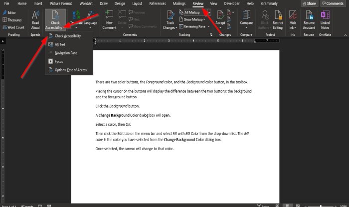
- Perhaps obvious if you know how, but as someone who has used Office tools a fair bit over the years, I don’t think I’d ever known about the Accessibility Checker!
- To use in Microsoft Word, Excel, OneNote, or PowerPoint:
- click on the “Review” tab
- then the “Check Accessibility” menu trigger
- then the “Check Accessibility” option
- It will display accessibility information in a panel on the right
- The article is very light on detail, but I imagine this tool captures issues like text being too small or obscured, and colour contrast issues.
HTMHell Issue #12 – crossed out content
- The good person behind HTMHell describes the two ways to represent crossed out text in HTML:
<del></del>, and<s></s>. They clarify in the article that “crossed out” has semantic meaning that doesn’t necessarily have to manifest itself as crossed out text. - The
<s>element should be used for highlighting contents that are no longer accurate or relevant. Think “Original price: £10, Special offer: £8″. - The
<del>element should be used for highlighting a removal from the document, to retain an edit history. Example:The man's name was <del datetime="2021-09-03T17:42:36">Mrak</del> <ins datetime="2021-09-03T17:42:40">Mark</ins>.
- Different screen readers announce the deletions/insertions in different ways. The article goes into some detail around how to use CSS pseudo elements to add your own textual prefixes/suffixes.
Google Announces Seismic Change to Docs
- A WebAIM article talking about the May announcement by Google that it would switch to canvas-based rendering for Google Docs. The “current HTML-based rendering approach” has inconsistencies across platforms, and performance issues, which can be addressed by switching to canvas.
- Google claims “compatibility for supported assistive technologies such as screen readers, braille devices, and screen magnification features, will not be impacted by the canvas-based rendering change”. No technical approach is outlined in the announcement, but there have been discussions of leveraging a “hidden” DOM through the Accessibility Object Model (AOM).
- The WebAIM article has a section on “Accessibility Community Feedback” which highlights concerns from the community. An interesting point is that developers look up to Google and try to emulate how they do things, so this change could cause third party sites to switch to canvas based rendering with little regard for the screen reader experience.
- As of mid August, there is no update on a timeline for when the changes will be rolled out. The proof of concept released by Google has only “rudimentary assistive technology support” and “significant improvements” will be needed before it is up to par.
FlickType gives up on accessible iPhone keyboard after ‘abuse’ from Apple
- “FlickType, maker of the accessible iPhone keyboard that has become popular among those with vision impairment, has confirmed it is discontinuing its app after years of obstacles and “abuse” from Apple’s App Store approval team.”
- “The announcement comes after FlickType submitted an update to fix bugs related to iOS 15 and got “incorrectly” rejected by Apple. The team says Apple has ignored repeated requests for clarification and support.”
- “FlickType was designed to make iPhone easier to operate for blind users — and it worked. A 2018 report from the American Foundation for the Blind found the keyboard greatly increased typing accuracy and speed, and was significantly easier to use than Apple’s for those with vision impairment.”
- A useful reference of a11y fails, describing at a glance whether or not each failure can be linted, tested, or manually tested.
- For example “Autoplaying media” has a “Linting status” of “Could Exist”, a “Testing status” of “Exists”, and a “Manual testing status” of “Should Exist”.
Doctor’s orders: ‘Nature prescriptions’ see rise amid pandemic
- A really interesting article about how a growing number of doctors – particularly pediatricians – in the USA are prescribing walks in the park. The prescriptions are “specific, just like an antibiotic”, with patients told how often they should go, and where.
- One doctor gave their patient “a one-year pass to Washington’s state park system”, telling her to “go for walks, go camping, do what you need to do”. Patients see weight loss and decreased anxiety. “More than half of my patients who receive a ‘prescription’ for time in nature go ahead and do so successfully,” said one doctor.
- The prescriptions do face issues of access, where parks in low-income neighbourhoods tend to be smaller and more crowded.
Don’t Believe the Type! (video, 50m)
- I discovered this axe-con 2021 video via Richard Morton’s tweet. I thought it would be good to follow-up on the piece I wrote about the Hyperlegible font.
- The presentation, by Gareth Ford Williams, David Bailey and Bruno Maag, talks through the data they’ve gathered from around 7,000 hours of user research. They conclude that some so-called ‘accessible’ fonts such as “Open Dyslexic” actually perform worse than standard fonts like Helvetica. However, some accessible fonts perform better, including Atkinson Hyperlegible and BBC Reith Sans.
- That said, the poor performing fonts “may have fallen into the ‘I hate Comic Sans’ trap”, as they all look quite exaggerated. The top performers were all sans serif fonts.
- The presenters admit that the survey raises lots of questions, rather than giving lots of answers! But TLDR: that ‘accessible’ font you’re using may not be as accessible as you think.
- An interesting article talking about the progression from, pre-pandemic, video-calls happening once or twice a week, to mid-pandemic, where video calls happen for several hours per day. The video fatigue has led to an explosion in popularity for audio-based apps, such as Clubhouse, where users can drop into chatrooms and participate in discussions with strangers.
- They’re able to “recreate serendipitous moments like chance encounters and coffee machine conversations”, in a way that Zoom doesn’t. But they are ableist by nature, offering poor or zero experience for the Deaf community.
- The article touches on an interesting point: that this “levels the playing field”; insofar as many blind people “have little interest” in social media apps such as Instagram. The implication is that by the nature of these apps, they’re not going to offer much to certain segments of the disabled community, and there are usually other options to cater to everyone.
- That’s a difficult line to take, in my opinion. But it does make me wonder how everyone’s needs can be met without fundamentally changing the offering of these apps.
Some questions on accessibility in email — answered
- Some interesting nuggets of information here, resulting from a survey of 162 respondents (yes, the sample size is too small to have a lot of confidence in these results).
- 98% of people find a font size of 16px easy to read, compared to 70% for 14px (a font size that is “often cited as being accessible”). Participants generally did not find 12px easy to read.
- 88% of participants found a line height of 1.5em easy to read; it was the best performing line height out of the options available (various options from 1em to 2em).
- There was a clear preference for “accessible text links” (links using border-bottom for their underline), rather than the standard
text-decoration: underlinelinks. This approach is to “benefit people living with dyslexia, for whom underlining can cause text to run together, or collide”. I don’t remember coming across this before, so the Accessible Text Links article is worth a read too.
- Sara Souedian gives her thoughts on why we need a native
<search>HTML element. This would be syntactic sugar for<div role="search">, like we already have for<main>/<div role="main">. - The first rule of ARIA is to not use it if there is a native HTML element with the semantics of the required behaviour already built in. It could be argued that ARIA should be phased out, “with HTML replacing ARIA bit by bit until its services are no longer required”.
- Search is such a common feature on websites that making it easier to apply accessible semantics can only be a plus. With it, it should be even easier for users of assistive technologies to jump to the search section of the page.
- There is a related GitHub issue on the whatwg/html repository, calling for a HTML search element.
Axe-core vs PA11Y: Which one should you choose?
- GitLab now offers Pa11y as part of its CI pipeline, with no configuration needed. Craig Abbott compares it to axe-core, which is used by Deque for its acceptance tests. Out of 142 issues tested:
- axe-core found 39 issues in total, or 27%. 36 were violations and 3 were potential issues which required a user to check manually.
- pa11y found 29 issues in total, or 20%.
- 19 issues (13%) were found by both tools.
- 20 issues (14%) were found by axe-core but not Pa11y.
- 10 issues (7%) were found by Pa11Y but not axe-core.
- Combined, 49 issues (35%) were found.
- Craig recommends using both tools. He also notes that axe-core isn’t necessarily ‘better’ than pa11y; the issues in the set that Craig tested with might just happen to play to axe-core’s strengths.

An update on the accessibility of conditionally revealed questions
- A GOV.UK blog about the ‘conditional reveal’ option in the GDS Design System’s radio and checkbox components.
- The GOV.UK Accessibility Team discovered that the implementation failed WCAG 2.1 Success Criterion 4.1.2: Name, Role, Value, as the act of conditionally revealing content would not notify some screen reader users.
- This came down to the use of
aria-expanded, which the team later realised was “not supported for the role of a radio button or checkbox in the ARIA specification.” - Further user research found that some users were in fact notified of changes, despite it not being supported. Additionally, the notification did help users; so they brought their findings to the ARIA Working Group for consideration.
- The team then prototyped a few different ways of improving the relationship between the question and the revealed content. The conclusion was to avoid using “multiple fields or text content (like warning text) within reveals”. Simple questions with a single input were fine.
Facebook Rolls Out News Feed Change That Blocks Watchdogs from Gathering Data
- An update to Facebook, which has not yet been rolled out to all users, obfuscates the page content in the markup of the HTML DOM, potentially excluding disabled users. It adds “superfluous text to news feed posts in the form of ARIA tags” (“junk code”) to make it more difficult for people and bots to “scrape” the content, which this article says includes legitimate users such as researchers and journalists.
- These junk characters have made similar moves in the past to reduce the efficiency of ad-blocking software.
- Facebook claims that its new update has been designed not to reduce accessibility. However, the article contains a video demonstrating that the Microsoft Narrator screen reader reads aloud a string of junk characters on at least one occasion.
- There is a dissonance between making content accessible and building in anti-scraping / anti-ad-blocking measures. It’s difficult, impossible even, to do a good job at both.
Improving The Accessibility Of Your Markdown
Another excellent Smashing Magazine article by Eric Bailey. Despite the title, there aren’t many Markdown-specific accessibility tips here, but it is packed with information and I challenge you not to learn something new from it!
- Markdown is a text to HTML conversion language, created in 2004. It has no editor and therefore no Clippy-esque experience to warn you if you’re introducing anything inaccessible.
- The main advice is to use headings to structure your content, as this is by far the most popular method assistive technology users use to navigate your page. Eric doesn’t use assistive tech, but he also navigates by headings via the headingsMap browser add-on.
- Write good alt text for your images, using the W3C alt decision tree if in doubt. And make sure you use punctuation!
- When linking to SVG images, add the “img” role to it, to prevent assistive tech from skipping it or announcing it as a group. E.g.
<img src="foo.svg" role="img" alt="Sunflower" />. - Whilst it is possible to write Markdown for opening links in new tabs (
(url){:target="_blank"}), avoid it, as it can be a WCAG failure and a security risk. - Skip links aren’t limited to the main site navigation; you can also use skip links to skip over, say, your Table of Contents, or to avoid keyboard traps.
- Beware libraries which automatically turn your headings into anchor links, as the markup is tricky to make accessible. I’ve covered this already in dai11y 23/12/2020.
Whew, that was a long newsletter! Did you know that you can subscribe to smaller, more frequent updates? The dai11y, week11y and fortnight11y newsletters get exactly the same content. The choice is entirely up to you! Curated with ♥ by developer @ChrisBAshton.