Two new features are coming to Android smartphones: “Camera Switches“, and “Project Activate”. These features will allow users to use gestures like smiling, raising eyebrows, or looking in a particular direction, to issue a command such as returning to the homescreen or opening notifications.
The gestures are configurable: users can set how long to hold the gesture for, or how big the gesture must be, to issue the command.
“The updates are aimed at people with motor and speech disabilities, Google said, and the new tools were developed with feedback from people who rely on alternative communication technology.”
Apple is prototyping to see motion sensors inside AirPods can be used to tell users if they’re slouching. They’re also experimenting with measuring core body temperature, and perhaps most excitingly, whether or not AirPods can be used as “proper hearing aids” (they already come with a ‘conversation boost‘ feature).
Under US federal law, devices marketed as hearing aids must “be sold through licensed specialists, who adjust them to the specific user”. However, “in July, President Biden signed an executive order directing the Department of Health and Human Services to allow hearing aids to be sold over the counter and be adjusted by consumers”; promising news for Apple.
Prefer longer newsletters? You can subscribe to week11y, fortnight11y or even month11y updates! Every newsletter gets the same content; it is your choice to have short, regular emails or longer, less frequent ones. Curated with ♥ by developer @ChrisBAshton.
This is a Mischa Andrews talk from #ID24 in November 2017. I’ve had it in my bookmarks for a while, and am so pleased I’ve finally managed to watch it.
Mischa talks openly and candidly about how you can effect accessibility change in your organisation, whilst overcoming the inevitable office politics that come with the territory.
I liked the idea of creating a “decoy audience”. Let’s say you have a colleague who feels they have nothing to learn about accessibility – they “know it all already” – but they consistently make accessibility mistakes. You can teach them how to do things properly, without bruising their ego, by arranging a talk or workshop about accessibility, and inviting them to present part of it. The theory is that they can continue to feel good about their own knowledge, whilst also opening up to learning from your side of the talk.
A common tactic used by organisations is to have a ‘gatekeeper’ for accessibility, e.g. someone doing accessibility testing as part of the acceptance tests at the end of a project. Mischa warns that you have to tread carefully here, as it’s often too late or difficult to do much about accessibility issues if they’re left until the end of the process. You may also find people try to work around you, such as go to your manager or try to argue that their project shouldn’t go through the normal process. It is best to only use this ‘gatekeeper’ tactic if your organisation is already practising good accessibility.
Make it as easy as possible to do the right thing, e.g. by adding accessibility information directly as code comments, or embedded in Word templates, rather than expecting people to seek out and find the guidance independently.
Practice what you preach. You may be seen as the a11y expert in the organisation, and people will reuse your resources, such as colour choices, etc, on the assumption that they’ve already been accessibility tested.
It is useful to memorise a handful of things that can be used as opportunities to motivate people – and to convince people to listen to you. If you know statistics around how many people have particular kinds of disabilities, or how much money the organisation loses through being inaccessible, or what accessibility laws your country has to abide by, or the difference between different versions of WCAG, you’ll look knowledgeable enough for your words to carry more weight. You can also slip these facts into conversations, which can help to inspire the next generation of accessibility advocates in your organisation.
Prefer longer newsletters? You can subscribe to week11y, fortnight11y or even month11y updates! Every newsletter gets the same content; it is your choice to have short, regular emails or longer, less frequent ones. Curated with ♥ by developer @ChrisBAshton.
Welcome to your monthly frequent11y newsletter, brought to you by @ChrisBAshton. I hope you enjoy these a11y articles I’ve collated and summarised for you. (Psst – if you find these emails too long, consider switching to shorter, more frequent updates). Now on with the show!
This article is a quick reminder on HTML list markup.
First of all, decide whether you actually need a list; sometimes it is better to format your content as paragraphs with headings instead. This way, assistive technology users can easily skip to the heading that they want to read.
If you do use a list, decide whether it should be unordered (<ul>), ordered (<ol>) or a description list (<dl>). The latter is useful for glossaries or recipes, e.g. <dl><dt>Chicken</dt><dd>A small bird that lays eggs</dd>...</dl>.
There are some really interesting accessibility options in the games in this article:
Uncharted and The Last Of Us Part II are famously accessible, and are called out here.
A Blind Legend is a game that “can be played entirely through sound and only asks for touch screen or mouse input”. It does not incorporate visuals.
Grounded has the player shrunk to the size of an insect and having to find their way home across their back yard. The developers have considered arachnophobia – the intense fear of spiders – and thus offer an Arachnophobia Safe Mode Slider, allowing players to edit in-game spiders to have no legs, no eyes, or even no textures or sounds at all, without sacrificing the enemies’ difficulty.
Hyperdot is a game “where the player avoids incoming attacks by darting around the screen”. The game can be played on any controller, including eye trackers.
As someone who has recently bought an Oculus Quest 2, this is really exciting technology that has come a long way in a very short time. It’s crucial that we address accessibility needs as this technology matures.
Thomas Logan writes about his experiment with ARIA and Web XR (“Web Extended Reality”, or VR).
He uses aframe-gui, a GUI component framework for A-Frame, which is a web framework for making 3D experiences. Here is Thomas’s demo.
Using ARIA to add the necessary role and aria-label to elements, as well as tabindex and onfocus handlers, Thomas has made an XR experience that is navigable via keyboard and by some assistive technology (AT) such as voice assisted navigation and screen readers. The full list of tested AT is in the article, which describes the usability issues encountered. For example, “Voice Control” on iOS/Safari does not detect the link or button in the demo.
Pianist João Carlos Martins lost the use of his right hand in a mugging in Bulgaria in 1995.
Industrial designer Ubiratan Bizarro invented the “Bionic Extender Gloves”, which have rods that make the fingers spring back up after they depress the piano keys, allowing the pianist to continue playing.
The first pair of these gloves for Martins cost less than $100 to make, and are made by a 3D printer.
It has meant that Martins has been able to play his favorite Bach sonatas once more.
There used to be a problem with too many lists for assistive tech users: “all I hear when reading news sites is ‘list, two items … end of list, list 4 items…’ and I don’t care about all the lists.”
This was caused by developers marking too much content up as lists, even when not appropriate.
Therefore, WebKit now applies some heuristics to these lists, to decide whether or not to expose the list semantics to the accessibility tree.
It considers whether the list has any bullet points. After all, if a sighted user doesn’t need to know it’s a list, then why should a screen reader user?
Similar principles are applied to table markup, which was regularly used for layouts in the early web.
“Many people think it’s only display: none; and visibility: hidden; but dozens, if not hundreds, of style characteristics contribute [to computing the accessibility tree].”
False positives are extremely rare. That said, developers can force the list semantics to be obeyed by applying role="list" to the <ul>/<ol>.
Eric Eggert disputes five claims that companies [such as accessiBe] make about their products:
“Accessibility can be fully automated”. Human judgement is required to determine what kind of alt text is appropriate in a given context.
“AI solutions are effortless”. For you maybe, but the effort is simply shifted to the user, i.e. they now have to use the screen reader widget on your site rather than the native screen reader they’re used to.
“It’s cheap”. These services cost $1,500 to $5,000 over a three year period of coverage. If you don’t renew, you lose those ‘benefits’, whereas if you pay an accessibility consultant to fix the problem at the source, the fix is permanent.
“WCAG conformance. AA! 100%!”. Eric cites numerous examples of websites using these widgets, and still having accessibility violations. He summarises “I cannot fathom how they claim WCAG 2.1 AA accessibility.”
colorblindaccessibilitymanifesto.com lists 10 rules developers/designers should follow to not exclude the 350 million colourblind people in the world; nearly 8% of men and 0.4% of women.
Start with “Why?” [you are making the change in the first place]
This got shared around the work chat recently. A blog post by Álvaro Montoro that busts 10 myths about accessibility:
Accessibility is difficult – “Accessibility is not difficult. Do you know what’s difficult? Running at an Olympic level. A Web Developer can learn at least the basics of Web Accessibility within hours”.
Accessibility is expensive – “Something that they could have avoided if they had implemented accessibility at the start”.
HTML is accessible by default – “elements like <video> or <audio> have controls that are not fully keyboard-accessible and that differ considerably from browser to browser and cause frustration. ‘Mostly accessible’ looks much better.”
No ARIA > Bad ARIA – the equation should be “Good ARIA > No ARIA > Bad ARIA”. Otherwise we “perpetuate a false dichotomy. We can learn ARIA, practice ARIA, improve ARIA”.
Prefers reduced motion means no motion – “We don’t need to cancel every motion on a website. Instead, we need to think through them, check what’s appropriate and not”.
It will be buggy. Expectations of the web are broken, e.g. CMD + Click should open links in new tabs, but often won’t work in SPAs.
Accessibility issues: focus management, scroll management, navigation announcements, etc.
Less resilience. Rich shares a webpage he often points people to when they assume that everyone has JavaScript. It is a long flowchart of all of the reasons why JS may not load for someone. Rich also points out that these users are underrepresented in analytics, because analytics typically require JS to run.
But then he highlights the benefits:
SPAs allow you to do things you can’t do ‘natively’, e.g. transitions between pages.
Only need to load third party scripts once, whereas multi-page apps (i.e. the traditional server-rendered sites) have to at least evaluate the JS on each page load, even if the scripts themselves are already cached.
Single codebase of JS (rather than 1 for client, and 1 for server, which may be, for example, PHP).
Rich proposes a new direction for the web, and coins the term “transitional apps” (from “transitional design” in the interior design industry), which are apps that take the best of both worlds. There is a lot happening in this space, including:
Stark is a suite of tools for the world’s most popular design apps. “Companies can upload their design files, which then identifies accessibility issues and suggests changes.”
It “offers checks and suggestions to make sure that visual materials meet accessibility standards for visually impaired people”. More than 500,000 people have used Stark’s integrated plug-ins for apps like Adobe XD, Figma, Sketch and Google Chrome.
Stark have now released Stark for Mac, a standalone app that works with Sketch and will soon work with Figma and Adobe XD. It allows you to detect accessibility issues at scale, rather than on a per-file basis as is the case with the plugins.
Stark has a limited free plan, after which it costs $60 per year for the current suite of tools. The private beta version of Stark for Mac is currently free, with pricing yet to be announced.
This is a GOV.UK blog from the Inclusive Design team at UK Health Security Agency.
It is about the “easy read” format – something I’d never actually come across before.
The format, intended for people with learning difficulties, has a very specific template and definition:
wide margins
images on the left (to help convey meaning to the text on the right)
large text (14 to 16pt)
bigger spaces between lines (1.5 spacing)
1 idea per image
The nature of these requirements mean that ‘easy read’ content is often published as a PDF. This comes with its own accessibility issues, described in the article.
The intended audience often has a ‘support person’ that they share this kind of content with, so it is important that they are easily able to print off the information and keep it together.
Some users preferred text-only versions of the content, as they found the use and choice of images patronising.
A clickbait headline, no doubt, but an interesting announcement: Xbox are introducing a classification system to their stores (Xbox.com, PC, Game Pass), ‘tagging’ games with information related to their accessibility. This is to make it easier for disabled gamers to know whether a game supports their needs.
“Testing of the feature is currently underway in the public Xbox Accessibility Insider League (XAIL) branch on all modern Xbox consoles. XAIL is free for all Xbox owners to join and is a group specifically designed for testing accessibility features in games and the Xbox operating system. It currently has around 60,000 enrolled members.”
Microsoft has made this system quite strict. For example, for a game to be tagged as having accessible “subtitle options”, the game needs to do more than just ‘have subtitles’, as it must allow the subtitles to be customised and resizable to a minimum of 200% of their original size.
Accessibility overlays are a hot topic in the a11y world, so it’s worth keeping on top of all legal proceedings in this space. In her blog post below, accessibility consultant Julie Moynat writes a cautionary tale of how an accessibility overlay company have started legal proceedings against her, off the back of a single tweet.
In November 2020, the French Secretary of State to Digital Transition and Electronic Communications tweeted positively about the use of FACIL’iti to make sites accessible. (You can see the accessibility overlay in action on https://www.facil-iti.com/).
Julie responded to the tweet, “expressing disapproval”. Her response ended up getting 9 retweets and 32 likes.
At the end of December 2020, FACIL’iti sent a formal notice to Julie’s employer, demanding that the tweet be deleted. NB, Julie had tweeted from her personal account, outside of working hours.
Julie deleted the tweet within two days of being informed of the letter, on 28th December.
On 21st May 2021, a subpoena letter was served to Julie’s home address, intending to press charges to the tune of €10,500.
Julie reached out for help via the blog post above, asking the community to donate to cover her legal fees. She raised almost €6,000, which has fulfilled her target.
There is, apparently, a trend going around on Twitter (example tweet): to state something that raises red flags for you, followed by a number of ‘red flag emojis’, i.e. “🚩”.
Except that this isn’t a red flag emoji, other than by coincidence. It could just as easily have been yellow or green. What screen readers actually announce when they reach that emoji is “triangular flag on post”. So the meaning is lost on screen reader users.
The great Adrian Roselli gives a detailed write-up of the problem – and plenty of places where it’s cropped up in the past – in this blog post. He’s heard a number of responses from people along the lines of “the screen reader is the problem”; Adrian argues otherwise, stating that screen readers don’t use natural language processing and do not ‘see what you see’. Nor can screen readers be updated overnight, to suddenly understand these short-lived trends and memes.
The onus is on us to write our content in an accessible way. The blog post summary is frustratingly vague on answers: “Techniques to make your content accessible abound. They are no more than a quick search away should you care to try”, which doesn’t explain what you should do if you want to participate in a trend but the trend is inherently inaccessible. My personal recommendation would be to write an ‘alt text’ “reply” to your tweet, to clarify the original tweet for screen reader users.
And finally… a spooky-themed game for you, just in time for Halloween!
A game that highlights issues caused by missing focus styles, unexpected tab orders, and so on.
I completed the game in 1 minute and 16 seconds. Can you beat my time?
Whew, that was a long newsletter! Did you know that you can subscribe to smaller, more frequent updates? The dai11y, week11y and fortnight11y newsletters get exactly the same content. The choice is entirely up to you! Curated with ♥ by developer @ChrisBAshton.
This got shared around the work chat recently. A blog post by Álvaro Montoro that busts 10 myths about accessibility:
Accessibility is difficult – “Accessibility is not difficult. Do you know what’s difficult? Running at an Olympic level. A Web Developer can learn at least the basics of Web Accessibility within hours”.
Accessibility is expensive – “Something that they could have avoided if they had implemented accessibility at the start”.
HTML is accessible by default – “elements like <video> or <audio> have controls that are not fully keyboard-accessible and that differ considerably from browser to browser and cause frustration. ‘Mostly accessible’ looks much better.”
No ARIA > Bad ARIA – the equation should be “Good ARIA > No ARIA > Bad ARIA”. Otherwise we “perpetuate a false dichotomy. We can learn ARIA, practice ARIA, improve ARIA”.
Prefers reduced motion means no motion – “We don’t need to cancel every motion on a website. Instead, we need to think through them, check what’s appropriate and not”.
It will be buggy. Expectations of the web are broken, e.g. CMD + Click should open links in new tabs, but often won’t work in SPAs.
Accessibility issues: focus management, scroll management, navigation announcements, etc.
Less resilience. Rich shares a webpage he often points people to when they assume that everyone has JavaScript. It is a long flowchart of all of the reasons why JS may not load for someone. Rich also points out that these users are underrepresented in analytics, because analytics typically require JS to run.
But then he highlights the benefits:
SPAs allow you to do things you can’t do ‘natively’, e.g. transitions between pages.
Only need to load third party scripts once, whereas multi-page apps (i.e. the traditional server-rendered sites) have to at least evaluate the JS on each page load, even if the scripts themselves are already cached.
Single codebase of JS (rather than 1 for client, and 1 for server, which may be, for example, PHP).
Rich proposes a new direction for the web, and coins the term “transitional apps” (from “transitional design” in the interior design industry), which are apps that take the best of both worlds. There is a lot happening in this space, including:
Stark is a suite of tools for the world’s most popular design apps. “Companies can upload their design files, which then identifies accessibility issues and suggests changes.”
It “offers checks and suggestions to make sure that visual materials meet accessibility standards for visually impaired people”. More than 500,000 people have used Stark’s integrated plug-ins for apps like Adobe XD, Figma, Sketch and Google Chrome.
Stark have now released Stark for Mac, a standalone app that works with Sketch and will soon work with Figma and Adobe XD. It allows you to detect accessibility issues at scale, rather than on a per-file basis as is the case with the plugins.
Stark has a limited free plan, after which it costs $60 per year for the current suite of tools. The private beta version of Stark for Mac is currently free, with pricing yet to be announced.
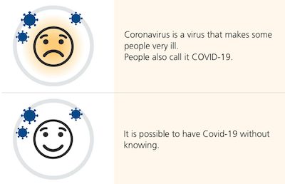
This is a GOV.UK blog from the Inclusive Design team at UK Health Security Agency.
It is about the “easy read” format – something I’d never actually come across before.
The format, intended for people with learning difficulties, has a very specific template and definition:
wide margins
images on the left (to help convey meaning to the text on the right)
large text (14 to 16pt)
bigger spaces between lines (1.5 spacing)
1 idea per image
The nature of these requirements mean that ‘easy read’ content is often published as a PDF. This comes with its own accessibility issues, described in the article.
The intended audience often has a ‘support person’ that they share this kind of content with, so it is important that they are easily able to print off the information and keep it together.
Some users preferred text-only versions of the content, as they found the use and choice of images patronising.
A clickbait headline, no doubt, but an interesting announcement: Xbox are introducing a classification system to their stores (Xbox.com, PC, Game Pass), ‘tagging’ games with information related to their accessibility. This is to make it easier for disabled gamers to know whether a game supports their needs.
“Testing of the feature is currently underway in the public Xbox Accessibility Insider League (XAIL) branch on all modern Xbox consoles. XAIL is free for all Xbox owners to join and is a group specifically designed for testing accessibility features in games and the Xbox operating system. It currently has around 60,000 enrolled members.”
Microsoft has made this system quite strict. For example, for a game to be tagged as having accessible “subtitle options”, the game needs to do more than just ‘have subtitles’, as it must allow the subtitles to be customised and resizable to a minimum of 200% of their original size.
Accessibility overlays are a hot topic in the a11y world, so it’s worth keeping on top of all legal proceedings in this space. In her blog post below, accessibility consultant Julie Moynat writes a cautionary tale of how an accessibility overlay company have started legal proceedings against her, off the back of a single tweet.
In November 2020, the French Secretary of State to Digital Transition and Electronic Communications tweeted positively about the use of FACIL’iti to make sites accessible. (You can see the accessibility overlay in action on https://www.facil-iti.com/).
Julie responded to the tweet, “expressing disapproval”. Her response ended up getting 9 retweets and 32 likes.
At the end of December 2020, FACIL’iti sent a formal notice to Julie’s employer, demanding that the tweet be deleted. NB, Julie had tweeted from her personal account, outside of working hours.
Julie deleted the tweet within two days of being informed of the letter, on 28th December.
On 21st May 2021, a subpoena letter was served to Julie’s home address, intending to press charges to the tune of €10,500.
Julie reached out for help via the blog post above, asking the community to donate to cover her legal fees. She raised almost €6,000, which has fulfilled her target.
There is, apparently, a trend going around on Twitter (example tweet): to state something that raises red flags for you, followed by a number of ‘red flag emojis’, i.e. “🚩”.
Except that this isn’t a red flag emoji, other than by coincidence. It could just as easily have been yellow or green. What screen readers actually announce when they reach that emoji is “triangular flag on post”. So the meaning is lost on screen reader users.
The great Adrian Roselli gives a detailed write-up of the problem – and plenty of places where it’s cropped up in the past – in this blog post. He’s heard a number of responses from people along the lines of “the screen reader is the problem”; Adrian argues otherwise, stating that screen readers don’t use natural language processing and do not ‘see what you see’. Nor can screen readers be updated overnight, to suddenly understand these short-lived trends and memes.
The onus is on us to write our content in an accessible way. The blog post summary is frustratingly vague on answers: “Techniques to make your content accessible abound. They are no more than a quick search away should you care to try”, which doesn’t explain what you should do if you want to participate in a trend but the trend is inherently inaccessible. My personal recommendation would be to write an ‘alt text’ “reply” to your tweet, to clarify the original tweet for screen reader users.
And finally… a spooky-themed game for you, just in time for Halloween!
A game that highlights issues caused by missing focus styles, unexpected tab orders, and so on.
I completed the game in 1 minute and 16 seconds. Can you beat my time?
Did you know that you can subscribe to dai11y, week11y, fortnight11y or month11y updates! Every newsletter gets the same content; it is your choice to have short, regular emails or longer, less frequent ones. Curated with ♥ by developer @ChrisBAshton.
A game that highlights issues caused by missing focus styles, unexpected tab orders, and so on.
I completed the game in 1 minute and 16 seconds. Can you beat my time?
Prefer longer newsletters? You can subscribe to week11y, fortnight11y or even month11y updates! Every newsletter gets the same content; it is your choice to have short, regular emails or longer, less frequent ones. Curated with ♥ by developer @ChrisBAshton.
There is, apparently, a trend going around on Twitter (example tweet): to state something that raises red flags for you, followed by a number of ‘red flag emojis’, i.e. “🚩”.
Except that this isn’t a red flag emoji, other than by coincidence. It could just as easily have been yellow or green. What screen readers actually announce when they reach that emoji is “triangular flag on post”. So the meaning is lost on screen reader users.
The great Adrian Roselli gives a detailed write-up of the problem – and plenty of places where it’s cropped up in the past – in this blog post. He’s heard a number of responses from people along the lines of “the screen reader is the problem”; Adrian argues otherwise, stating that screen readers don’t use natural language processing and do not ‘see what you see’. Nor can screen readers be updated overnight, to suddenly understand these short-lived trends and memes.
The onus is on us to write our content in an accessible way. The blog post summary is frustratingly vague on answers: “Techniques to make your content accessible abound. They are no more than a quick search away should you care to try”, which doesn’t explain what you should do if you want to participate in a trend but the trend is inherently inaccessible. My personal recommendation would be to write an ‘alt text’ “reply” to your tweet, to clarify the original tweet for screen reader users.
Prefer longer newsletters? You can subscribe to week11y, fortnight11y or even month11y updates! Every newsletter gets the same content; it is your choice to have short, regular emails or longer, less frequent ones. Curated with ♥ by developer @ChrisBAshton.
Accessibility overlays are a hot topic in the a11y world, so it’s worth keeping on top of all legal proceedings in this space. In her blog post below, accessibility consultant Julie Moynat writes a cautionary tale of how an accessibility overlay company have started legal proceedings against her, off the back of a single tweet.
In November 2020, the French Secretary of State to Digital Transition and Electronic Communications tweeted positively about the use of FACIL’iti to make sites accessible. (You can see the accessibility overlay in action on https://www.facil-iti.com/).
Julie responded to the tweet, “expressing disapproval”. Her response ended up getting 9 retweets and 32 likes.
At the end of December 2020, FACIL’iti sent a formal notice to Julie’s employer, demanding that the tweet be deleted. NB, Julie had tweeted from her personal account, outside of working hours.
Julie deleted the tweet within two days of being informed of the letter, on 28th December.
On 21st May 2021, a subpoena letter was served to Julie’s home address, intending to press charges to the tune of €10,500.
Julie reached out for help via the blog post above, asking the community to donate to cover her legal fees. She raised almost €6,000, which has fulfilled her target.
Prefer longer newsletters? You can subscribe to week11y, fortnight11y or even month11y updates! Every newsletter gets the same content; it is your choice to have short, regular emails or longer, less frequent ones. Curated with ♥ by developer @ChrisBAshton.
This is a GOV.UK blog from the Inclusive Design team at UK Health Security Agency.
It is about the “easy read” format – something I’d never actually come across before.
The format, intended for people with learning difficulties, has a very specific template and definition:
wide margins
images on the left (to help convey meaning to the text on the right)
large text (14 to 16pt)
bigger spaces between lines (1.5 spacing)
1 idea per image
The nature of these requirements mean that ‘easy read’ content is often published as a PDF. This comes with its own accessibility issues, described in the article.
The intended audience often has a ‘support person’ that they share this kind of content with, so it is important that they are easily able to print off the information and keep it together.
Some users preferred text-only versions of the content, as they found the use and choice of images patronising.
Prefer longer newsletters? You can subscribe to week11y, fortnight11y or even month11y updates! Every newsletter gets the same content; it is your choice to have short, regular emails or longer, less frequent ones. Curated with ♥ by developer @ChrisBAshton.
A clickbait headline, no doubt, but an interesting announcement: Xbox are introducing a classification system to their stores (Xbox.com, PC, Game Pass), ‘tagging’ games with information related to their accessibility. This is to make it easier for disabled gamers to know whether a game supports their needs.
“Testing of the feature is currently underway in the public Xbox Accessibility Insider League (XAIL) branch on all modern Xbox consoles. XAIL is free for all Xbox owners to join and is a group specifically designed for testing accessibility features in games and the Xbox operating system. It currently has around 60,000 enrolled members.”
Microsoft has made this system quite strict. For example, for a game to be tagged as having accessible “subtitle options”, the game needs to do more than just ‘have subtitles’, as it must allow the subtitles to be customised and resizable to a minimum of 200% of their original size.
Prefer longer newsletters? You can subscribe to week11y, fortnight11y or even month11y updates! Every newsletter gets the same content; it is your choice to have short, regular emails or longer, less frequent ones. Curated with ♥ by developer @ChrisBAshton.