Your daily frequent11y newsletter, brought to you by @ChrisBAshton:
There is no “Myths of Color Contrast Accessibility”
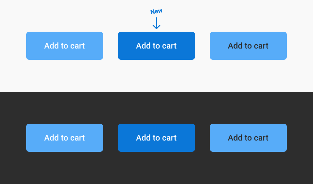
- A UX Movement article (covered in November) argued that text/background color combinations that fail the WCAG AA contrast threshold can actually be easier to read than those that pass. Geoffrey Crofte has written a counter-article arguing that the methodology of the original article was flawed, proposing his own combo (via useful tool color.review) that is both AA-compliant and is easier to read than the original. It’s worth noting the new contrast rating (4.5) is still lower than the ‘hard to read, but compliant’ original (5.41), but Geoffrey puts this down to context: a black background reverses the perception biases of the original article. Finally, Geoffrey disagrees that color alone can be used to denote state (see myth 6 in the original article), arguing that the toggle token example is difficult to read if no tokens are toggled by default.
Prefer longer newsletters? You can subscribe to week11y, fortnight11y or even month11y updates! Every newsletter gets the same content; it is your choice to have short, regular emails or longer, less frequent ones. Curated with ♥ by developer @ChrisBAshton.