Your weekly frequent11y newsletter, brought to you by @ChrisBAshton:

Easy read is hard to get right
- This is a GOV.UK blog from the Inclusive Design team at UK Health Security Agency.
- It is about the “easy read” format – something I’d never actually come across before.
- The format, intended for people with learning difficulties, has a very specific template and definition:
- wide margins
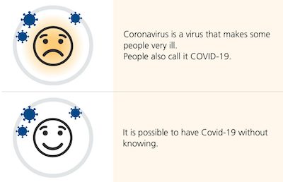
- images on the left (to help convey meaning to the text on the right)
- large text (14 to 16pt)
- bigger spaces between lines (1.5 spacing)
- 1 idea per image
- The nature of these requirements mean that ‘easy read’ content is often published as a PDF. This comes with its own accessibility issues, described in the article.
- The intended audience often has a ‘support person’ that they share this kind of content with, so it is important that they are easily able to print off the information and keep it together.
- Some users preferred text-only versions of the content, as they found the use and choice of images patronising.
Xbox reveals a huge new accessibility feature that puts Sony and Nintendo to shame
- A clickbait headline, no doubt, but an interesting announcement: Xbox are introducing a classification system to their stores (Xbox.com, PC, Game Pass), ‘tagging’ games with information related to their accessibility. This is to make it easier for disabled gamers to know whether a game supports their needs.
- “Testing of the feature is currently underway in the public Xbox Accessibility Insider League (XAIL) branch on all modern Xbox consoles. XAIL is free for all Xbox owners to join and is a group specifically designed for testing accessibility features in games and the Xbox operating system. It currently has around 60,000 enrolled members.”
- Microsoft has made this system quite strict. For example, for a game to be tagged as having accessible “subtitle options”, the game needs to do more than just ‘have subtitles’, as it must allow the subtitles to be customised and resizable to a minimum of 200% of their original size.
Accessibility overlays are a hot topic in the a11y world, so it’s worth keeping on top of all legal proceedings in this space. In her blog post below, accessibility consultant Julie Moynat writes a cautionary tale of how an accessibility overlay company have started legal proceedings against her, off the back of a single tweet.
Help for my lawyer’s fees in the FACIL’iti lawsuit against me
- In November 2020, the French Secretary of State to Digital Transition and Electronic Communications tweeted positively about the use of FACIL’iti to make sites accessible. (You can see the accessibility overlay in action on https://www.facil-iti.com/).
- Julie responded to the tweet, “expressing disapproval”. Her response ended up getting 9 retweets and 32 likes.
- At the end of December 2020, FACIL’iti sent a formal notice to Julie’s employer, demanding that the tweet be deleted. NB, Julie had tweeted from her personal account, outside of working hours.
- Julie deleted the tweet within two days of being informed of the letter, on 28th December.
- On 21st May 2021, a subpoena letter was served to Julie’s home address, intending to press charges to the tune of €10,500.
- Julie reached out for help via the blog post above, asking the community to donate to cover her legal fees. She raised almost €6,000, which has fulfilled her target.
- She updated her blog post on 12th October: the proceedings are still ongoing, and no trial date has yet been set.
- There is, apparently, a trend going around on Twitter (example tweet): to state something that raises red flags for you, followed by a number of ‘red flag emojis’, i.e. “🚩”.
- Except that this isn’t a red flag emoji, other than by coincidence. It could just as easily have been yellow or green. What screen readers actually announce when they reach that emoji is “triangular flag on post”. So the meaning is lost on screen reader users.
- The great Adrian Roselli gives a detailed write-up of the problem – and plenty of places where it’s cropped up in the past – in this blog post. He’s heard a number of responses from people along the lines of “the screen reader is the problem”; Adrian argues otherwise, stating that screen readers don’t use natural language processing and do not ‘see what you see’. Nor can screen readers be updated overnight, to suddenly understand these short-lived trends and memes.
- The onus is on us to write our content in an accessible way. The blog post summary is frustratingly vague on answers: “Techniques to make your content accessible abound. They are no more than a quick search away should you care to try”, which doesn’t explain what you should do if you want to participate in a trend but the trend is inherently inaccessible. My personal recommendation would be to write an ‘alt text’ “reply” to your tweet, to clarify the original tweet for screen reader users.
And finally… a spooky-themed game for you, just in time for Halloween!
HOCUS :FOCUS – A keyboard accessibility horror game.
- A game that highlights issues caused by missing focus styles, unexpected tab orders, and so on.
- I completed the game in 1 minute and 16 seconds. Can you beat my time?
Did you know that you can subscribe to dai11y, week11y, fortnight11y or month11y updates! Every newsletter gets the same content; it is your choice to have short, regular emails or longer, less frequent ones. Curated with ♥ by developer @ChrisBAshton.