Welcome to your monthly frequent11y newsletter, brought to you by @ChrisBAshton. I hope you enjoy these a11y articles I’ve collated and summarised for you. (Psst – if you find these emails too long, consider switching to shorter, more frequent updates). Now on with the show!
- A surprisingly quick read despite its length: Houssein Djirdeh details several techniques for improving performance and accessibility of React applications. Use pre-rendered or server-side rendered (SSR) React, ideally hydrated in Node ‘streams’ rather than en-masse. Use streams for extracting critical CSS too. Various DevTools profilers help identify unnecessary component re-renders: override
shouldComponentUpdateor inherit fromPureComponentto mitigate. Split components withReact.lazy(or with a library likeloadable-componentsif SSR’d). A worthy read if you ever dabble with React.
Why GOV.UK content should be published in HTML and not PDF
- A GOV.UK article from 2018 that is still relevant today. It highlights the problems with PDFs (not designed for screens – particularly on mobile, hard to track and to update, and often inaccessible to assistive technology) whilst acknowledging their advantages (control over design, easy to create from many applications, predictable printing behaviour). The comments are worth reading too: some argue that static PDFs are better than dynamic HTML for archival reasons, as well as easier offline access that doesn’t require “Print to PDF” technical knowledge. These are areas GOV.UK could do better at while still advocating for a HTML-first approach.
- Interesting post by Adrian Roselli, highlighting that for users who rely on built-in translation services in their browser,
aria-labelmarkup often isn’t translated. For this reason he recommends tweaking your design to use native HTML (label, etc), or otherwise using visually hidden text oraria-labelledbywhich do not have the same issues with auto-translating. He also highlights a newaria-descriptionproperty that is coming to ARIA, which solves the messiness ofaria-labelledbyrequiring additional nodes in the DOM that could be accidentally read out twice. However, it will have the same translation issue asaria-labeluntil auto-translators get better.
How Glasgow’s clubs try to be accessible for everyone
- Not necessarily what you’re expecting to read from the title (it’s not all “installing a lift for wheelchair users”, writes Kamila Rymajdo). Kamila highlights the efforts a number of clubs are making to become more inclusive spaces for the LGBTQ community, such as briefing clubbers at the door about what the night celebrates (including financial assistance for travel and reduced entry fees for some), and a representative present throughout the night for people to talk to if they are encounter any problems. Others are taking steps to not dim lights to an uncomfortable degree, to have visuals that are suitable for epileptic individuals, and to always have somewhere to sit and water visibly available.
Memes Are Still Inaccessible to the Blind
- Time article sharing the impact of memes being unreadable to the blind. Accessibility is often about providing the bare essentials – making the workplace or transportation accessible – whereas leisure or silly activities are overlooked. The result is a lack of inclusivity, with many unable to join in the conversation. Researchers are experimenting with using AI to identify memes via templates, and rendering these memes in less deadpan ways than your typical screen reader. For instance, “success kid” would have the beginning of the meme, then upbeat dance music speeding up to a triumphant finish.
- An article about the history of braille, and its early competitors (Boston Line Type). By the 1860s there were a number of competing standards – leading to the “War of the Dots” in 1909, where braille was the standard of choice for the New York Board of Education for its blind schools. Other attempts at enabling blind access to books is the optophone; a scanner that looks at text and converts it into tones representing the shapes of the letters. In theory, mastering the optophone enables the reading of any book; in practice, it’s incredibly difficult to interpret. It’s well worth seeing it in practice.
When to Open Links in a New Tab
- A short article by Jens Oliver Meiert, with one simple summary: “Always open links in the same tab unless doing so 1) could disrupt a process, 2) could risk data loss, or 3) could confuse the user.” He gives examples of opening PDFs (which should be opened in a new tab, after warning the user), as they are in a non-native environment. He also cites Jakob’s Law: “users spend most of their time on other sites; they prefer your site to work the same way as the sites they already know.” Opening external links in new tabs to increase likelihood of ‘conversion’ is misguided advice and provides a poor UX.
Money in my account, but still can’t pay: Winner of ‘best accessible website’
- Nidhi Goyal‘s website, Rising Flame, won India’s “Best Accessible Website 2019” award. This article by The Indian Express doesn’t talk about the site (though I highly recommend visiting it and trying its accessibility features) – instead, it talks about how Goyal’s success still does not allow her to fully participate in society. Goyal, who is blind, may have money but she can’t use certain payment platforms to pay for things as they provide a broken screen reader experience. She flies long distance as part of her work, but is unable to use a call bell on flights because they’re on touch screen panels. Goyal says the reason the world lacks universal design is that people don’t yet see the disabled as customers or decision-makers.
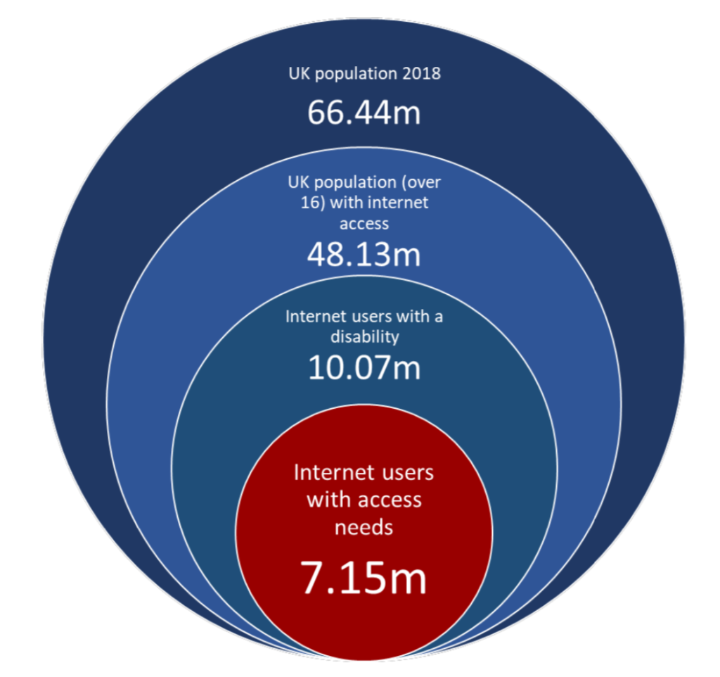
The Click-Away Pound Survey 2019
- This 32 page report (ironically only available as Word/PDF documents) of last year’s survey has some highlights. There are 7.15 million internet users in the UK that have access needs (an increase of 1 million since 2016), with a spending power of £24.8 billion. Around 70% will click away from an inaccessible site, meaning businesses are losing out on £17.1 billion per year. The survey was last run in 2016 and things haven’t improved measurably since then. I’ve attached a graphic from the report that helps show the scale of the problem.
Disproportionate Burden Thoughts
- A blog post by accessibility consultant George Rhodes, with their views on public organisations’ use of “disproportionate burden” as an excuse to (temporarily) avoid full compliance with the regulations. 60 public sector bodies have claimed disproportionate burden and been asked to provide evidence via Freedom of Information requests. Many of their responses were unsatisfactory.
- Background: UK public bodies have until September 2020 to ensure compliance with the Public Sector Bodies (Websites and Mobile Applications) (No. 2) Accessibility Regulations 2018. Exemptions will be made for those for whom it would be a ‘disproportionate burden’ on the grounds of organisation size, and cost of fixing vs benefit to users.
An Accessible Digital BBC – 2019 in review
- Blog post by Emma Pratt Richens, exploring the top BBC accessibility improvements of 2019. iPlayer introduced subtitle size controls, and attempts to deliver fewer animations where people have asked for “reduced motion”. Bitesize Primary improved keyboard a11y across its games. News introduced the BBC Reith font, designed to be easy to read on small screens. A developer built taba11y Chrome plugin in their spare time. Several teams built accessibility more prominently into their workflow.
Bonjour! ¡Bienvenidos! Seeing AI expands to 5 new languages
- If you’ve not heard of the “Seeing AI” app from Microsoft, it’s an all-encompassing app that uses your phone’s camera for many things, including reading text, scanning product barcodes for info, recognising faces, and describing the scene in front of you. I hadn’t heard of it prior to this article, which describes its expansion to 5 different languages, and describes the ways real people use it, sometimes in unexpected ways. Download it from the app store and give it a try today!
Apple debuts ‘head pointer’ accessibility feature in macOS beta, a cursor that follows your eyes
- Apple have released a feature in macOS Catalina beta, which uses the webcam to follow your head movement, enabling you to move the cursor hands-free. Guilherme Rambo demonstrates it in this tweet.
Make your PowerPoint presentations accessible to people with disabilities
- A Microsoft guide to ensuring your PowerPoint is accessible. A lot of the guidance is the same as it would be for the web: use descriptive links, don’t use colour alone to convey information, use a decent size text, provide alt text for images. Some more specialist advice includes ensuring the reading order of your slide is correct (screen readers will hear content in the order it was added, rather than the position it appears in the slide), and give each slide a unique title.
These are the standards for new government websites
- A look at the United States Web Design System (USWDS) released in January, designed to improve the usability and accessibility of federal websites. It encourages focusing on user needs, following user experience guidance and using USWDS components, as per its maturity model. The system meets WCAG 2.0 AA guidelines and follows the 2% rule pioneered by GDS, supporting all major browsers and IE11. The codebase looks very similar to the GOV.UK Design System, with both using Nunjucks and BEM.
- A little look at the “Who Can Use” tool, which takes a text color and background color and shows the accessibility of that combination for various vision types. For example, a #CF0000 red against a white background has AA compliance for regular vision, but AAA compliance for those with achromatomaly (partial colour blindness). What’s particularly useful is the “Simulation” next to each vision types/events, such as showing how your combination might look when viewed in direct sunlight. A worthy tool to have in your arsenal!
Whew, that was a long newsletter! Did you know that you can subscribe to smaller, more frequent updates? The dai11y, week11y and fortnight11y newsletters get exactly the same content. The choice is entirely up to you! Curated with ♥ by developer @ChrisBAshton.