Your fortnightly frequent11y newsletter, brought to you by @ChrisBAshton:
Five 2022 accessibility trends
A UX Collective article outlining predicted trends for 2022:
- The web will become more accessible – particularly the websites of larger companies.
- The SOAR report found that 62% of the Alexa 100 websites were accessible to screen readers, up from 40% in 2020.
- The WebAIM Million project found a very slight improvement in the accessibility of homepages across the web (from 2020 to 2021), but it will take until “the 2070s or 2080s” at this rate for the entire web to be accessible.
- Digital accessibility lawsuits will continue to increase
- More than 4000 accessibility lawsuits (based on the Americans with Disabilities Act) were filed in the USA in 2021.
- The Hooters case found that companies can be sued even if they already have remediation efforts underway and if they’ve already entered into a settlement agreement with another party.
- We’ll see less usage of accessibility overlays
- Over 200 overlay customers were sued in 2021 for lack of accessibility on their website.
- There could well be counterclaims against overlay companies from these customers.
- One overlay company, AudioEye, had a stock value of $42 in February 2021, but recently fell to less than $7.
- WCAG 2.2 will be the new standard most companies use to determine accessibility
- The standard is expected to be finalised by the end of March 2022. WCAG 2.1 took just 4 months from being finalised to being referenced in its first settlement agreement; WCAG 2.2 is likely to follow a similar trend.
- The article suggests that the most difficult of the new WCAG 2.2 criteria to implement will be SC 3.3.7: Accessible Authentication.
- Large companies will want to get a head start on WCAG 3.0
WordleBot is a shortcut that brings accessibility to your Wordle results
Unless you’ve been living under a rock in 2022, you’ll no doubt have come across Wordle, the viral word guessing game that has people sharing their results in a grid on social media, like so:
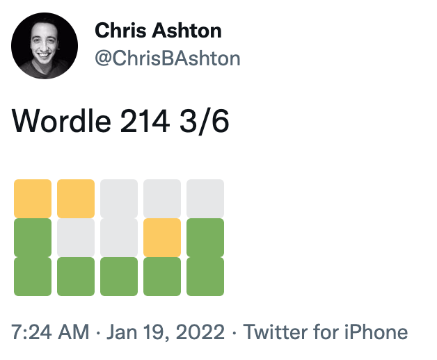
The resulting grid of coloured squares represents how many letters of each guess was correct, and ultimately how many guesses were needed before the correct word was arrived at. But it’s something of an accessibility nightmare for screen reader users.
Federico Viticci has attempted to fix the issue, by building WordleBot. This is a shortcut for iOS and macOS which edits the text in your clipboard to have a more accessible output, like so:
Wordle 207 5/6
⬜🟨🟨⬜⬜ (2 partial)
🟨🟨⬜⬜⬜ (2 partial)
⬜🟩🟨🟩⬜ (1 partial, 2 perfect)
⬜🟩⬜🟩🟩 (3 perfect)
🟩🟩🟩🟩🟩 (Wordle done on Line 5)— Federico Viticci (@viticci) January 12, 2022
It’s a nice idea, and a valiant effort by Federico, but is a manual workaround that only works for Apple customers. I’d like to see somebody build a Twitter bot that automatically responds to inaccessible Wordle tweets and provides alt text responses – or better yet, the creator of Wordle could change the share text directly.
PS: Wordle has inspired all sorts of creative endeavours, including a Wordle-to-music generator, Wordle-to-Townscaper and Wordle cross-stitching!
a11ymyths.com
(Accessibility Myths, shared by Smashing Magazine)
Sergei Kriger debunks 22 myths about accessibility on the web, such as accessibility only being for blind users. I’ve not heard of all of these myths, so some items were added just in keeping with the format, I think, but it’s worth a quick read nonetheless, and as prompted at the end of the page, you’re encouraged to “show this website to your manager”.
Also see its sister website, a11yfacts.com, for a list of statistics on disabilities (e.g. 15% of the world’s population has a disability) and how certain demographics use the web (e.g. 67.7% of screen reader users use headings for navigating).
Game Demos Need to Come Back For Many Reasons, Especially for Accessibility
Thought-provoking article by Ben Bayliss, describing how game demos were a great vehicle for testing a game’s accessibility before purchasing the game. Demos used to come on a disc bundled with PlayStation Official Magazine (and others), but in the digital era are increasingly hard to find.
Without demos, disabled gamers are forced to watch YouTube videos of other people reviewing the games, to figure out whether or not it will be accessible to them. “Major game outlets rarely touch on accessibility in our reviews or editorials that go live around launch”.
Some companies are beginning to make an effort in this area. “Ubisoft have been more proactive in inviting disabled content creators and journalists to events such as Ubisoft Forward, allowing them to spend time with the game and inform their audience specifically about accessibility”. It also “shares its efforts through blog posts and has a dedicated team“.
“Some studios such as SMG Studio and Team 17 released videos showing accessibility features available at launch. This is vital information to be sharing, but there’s a huge difference between a blog post or a short clip on accessibility features and how these actually feel in play. And that goes for both accessibility and the game as a whole in general.”
Building The Most Inaccessible Site Possible
In this 35m video from Smashing Meets (December 2021), Manuel Matuzović starts off with a simple HTML site that is considered 100% accessible by Lighthouse. He then deliberately breaks its accessibility as much as possible, without Lighthouse noticing. He calls this process “Progressive Degradation”.
He wraps all content in a <div aria-hidden="true">, which lowers the score because the wrapped content contained focusable descendents. Manuel then made these non-focussable (swapping the input button for a <div>, and changing the href of a link to an onclick). This then raised the accessibility score back to 100%.
It was quite fun seeing how Manuel disables keyboard zoom shortcuts (by adding a listener to the onkeydown event). He also overrides the cursor with a custom image that is offset 100 pixels from the actual click area, making it very difficult to click accurately! Manuel finishes by applying a filter to the text so that it is visually faded out (having already set himself the goal of not using display: none, visibility: hidden or opacity: 0, which would be too easy). As a bonus, he translates all text to HTML entities, so that people can’t even ‘view source’ to read the content.
The aim of the talk is not to make fun of Lighthouse, but to point out that automated accessibility testing can only be used as a guide. It is not a reliable summary of how accessible your site actually is. Indeed, Manuel runs his website through a few more automated tools at the end of the talk, none of which detects all of the issues that he’s introduced.
Standardizing Focus Styles With CSS Custom Properties
Stephanie Eckles shares a useful snippet for setting your focus styles consistently:
:is(a, button, input, textarea, summary) {
  --outline-size: max(2px, 0.08em);
  --outline-style: solid;
  --outline-color: currentColor;
}

:is(a, button, input, textarea, summary):focus {
  outline: var(--outline-size) var(--outline-style) var(--outline-color);
  outline-offset: var(--outline-offset, var(--outline-size));
}
This applies focus styles to all standard interactable elements, and provides hooks for you to customise parts of the outline style where needed, e.g.
summary {
  --outline-color: lightskyblue;
}
Some designers like to only apply focus styles when an interactable element is tabbed to via keyboard (as opposed to clicked on with a mouse). Stephanie explains how to use the :focus-visible selector to achieve this. The :focus rule above can be swapped± for :focus-visible, and then an outline: none applied when the focussed element is not :focus-visible.
:is(a, button, input, textarea, summary):focus-visible {
  outline: var(--outline-size) var(--outline-style) var(--outline-color);
  outline-offset: var(--outline-offset, var(--outline-size));
}
:is(a, button, input, textarea, summary):focus:not(:focus-visible) {
  outline: none;
}
± whilst browser support for the :focus-visible selector is still gaining traction, Stephanie advises not replacing the :focus rule, but duplicating it instead. Browsers throw out selectors they don’t understand, so we can’t simply join the selectors with a comma (i.e. :is(...), :is(...):focus-visible {}). By maintaining both a :focus and a :focus-visible block, we ensure that browsers that don’t support :focus-visible – but do support CSS custom properties – have visible focus styles. At time of writing, those browsers are Safari and ‘UC Browser for Android’.
Web Almanac 2021, Chapter 9: Accessibility
The Web Almanac is “HTTP Archive’s annual state of the web report”, which started in 2019. It is split into 24 chapters concerning all sorts of topics, such as security, CDNs, SEO, Jamstack, and Ecommerce. We’re going to concentrate on chapter 9 – Accessibility – which in itself is a long read.
Depressing statistics:
- Just 22% of sites have sufficient colour contrast; roughly unchanged from 2019 and 2020.
- 24% of desktop homepages, and 29% of mobile homepages, disable user zooming/scaling. This includes many of the top 1,000 sites globally.
- Around 69% of font sizes are set with
px, as opposed to more scalable/accessible alternatives such asem. - There’s a mixture of usage of HTML5 elements. Just 28% of sites have a
<main>element, but around 62% have<header>and<nav>elements. - Surprisingly, more than half of sites make use of
tabindexattributes. - Just 58% of sites have properly ordered headings, i.e. no levels skipped.
- We’re generally poor at creating accessible tables. Just 5% of sites which make use of tables provide a corresponding
<caption>element. - Almost a third of form inputs have no accessible name (i.e. no label). Around 58% of sites use a
placeholderattribute, which is not very accessible to assistive technologies, and of these sites, nearly 65% had nolabel, implying that theplaceholderis being improperly used as a label. - Videos were found on 5% of sites. Of these, a corresponding
<track>element – designed to have the same benefits asalttext for images – was found on less than 1% of videos. That said, “this figure may not account for video content loaded by a third party<iframe>, such as an embedded YouTube video”.
Positive statistics:
- 80.5% of sites have a
langattribute, with 99.7% of these being valid values. - Surprisingly, almost 32% of sites use the
prefers-reduced-motionmedia query; a relatively recent CSS addition. - Less than 1% of pages make use of an accessibility overlay.
Interesting tidbits:
- 91% of desktop pages have
:focus { outline: 0; }declared. “In some cases, it is removed so that a more effective custom style can be applied. In many cases it is simply removed and never replaced, which can render a page unusable for keyboard users”. The almanac doesn’t dig deeper on numbers though. - Around 20% of sites are estimated to have a skip link (there’s no reliable automated test for this).
- CAPTCHAs were found on around 10% of sites. These are notoriously inaccessible.
- 18-19% of pages contain at least one anchor element with
role="button". “A native<button>element would be a better choice, per the first rule of ARIA.” - The most popular ARIA attribute is
aria-hidden(used by 53% of sites), followed byaria-label(52%). - 14.3% of pages have the class
sr-onlyorvisually-hiddenon some elements, implying that they are providing text that is only visible to screen reader users.
The chapter concludes:
As an industry it is time that we acknowledge the story told by the numbers in this chapter; we are failing people with disabilities. The numbers from 2021 have not moved substantially from 2020. We need to do better, and this has to come from a combination of top-down leadership and investment (including the ongoing participation from browsers) and bottom-up effort to push our practices forward and advocate for the needs, safety and inclusion of people with disabilities using the web.
University Students Create Cutting-edge Wearable Navigation Devices

An article from July 2020 that’s been in my bookmarks for… well, you do the math.
A group of students from Harvard University have launched a startup called Foresight, a “wearable navigation aid for people with vision impairments”. It connects to the user’s camera, worn in a placeholder around the neck, which detects nearby objects and triggers tacticle ‘soft textile units’ on the body. These ‘inflate’ to provide haptic feedback as objects approach and pass, with the pressure increasing as objects get closer.
Did you know that you can subscribe to dai11y, week11y, fortnight11y or month11y updates! Every newsletter gets the same content; it is your choice to have short, regular emails or longer, less frequent ones. Curated with ♥ by developer @ChrisBAshton.