Your fortnightly frequent11y newsletter, brought to you by @ChrisBAshton:
The Automated Accessibility Coverage Report (PDF)
- Thanks to GDS colleague Anika Henke, who discovered this report via the “Accessibility Testing Coverage: Automation and Intelligent Guided Testing” talk at axe-con. According to the report, Deque’s accessibility testing engine axe-core finds 57.38% of accessibility issues, rather than the “widely accepted belief that automated accessibility testing only provides 20-30% of accessibility testing coverage”.
- The discrepancy comes from theory vs practice. The 20-30% figure is the proportion of all possible accessibility issues that can be detected with tools, whereas the 57% figure comes from issues actually found on these sample websites.
- In addition, the 20-30% figure only counts unique issue types, whereas the 57% figure takes into account the number of times each issue occurs. In other words, if an issue that can be detected with automated tools accounts for a large proportion of all accessibility issues in the wild, then it’s reasonable to conclude that automated tools do in fact detect a larger proportion of accessibility issues than theorised. Deque hopes that this report will “remove the stigma attached to automated testing”.
- It’s worth noting that Deque analysed new client sites in getting the statistics for this report, which is based on the analysis of over 13,000 pages.
- A proposal by Kitty Giraudel that is so brilliant, it’s a wonder it hasn’t been thought of and implemented already: native skip links.
- Every website ought to have a “Skip link” link as the first thing a keyboard user tabs to in the page. This is important for keyboard users and screen reader users, so that they can jump directly to the main content of the page (usually the
<main>element or the first<h1>), skipping over all of the menus and header content that is duplicated on every page. - Building these “skip links” isn’t difficult, but many sites fail to implement them, or do so incorrectly. So why not make it the responsibility of the browser?
- Kitty is clear that a native skip link should have as little customisability as possible, from the website’s perspective. All we should be able to set is the destination of the link, via a
<meta>or<link>tag such as<meta name="skip-link" value="#content" />, wherevalueis a CSS selector referencing a node in the DOM. - Kitty even proposes a polyfill that sites might run to decide whether or not to include their bespoke skip link (in the event that the browser doesn’t have one natively). Not that this matters hugely in practice, as Kitty points out that a native skip link would not interfere with a bespoke one in any way, since the focus would have shifted over the bespoke skip link by the time it would have been reached.
- If you like the idea, be sure to +1 it on the WebWeWant GitHub discussion!
- A useful resource for testing: a complete list of form controls, and a table of how their associated labels/legends are announced by screen readers. For example, check out
input type="url"– the page describes what is announced on VoiceOver, NVDA and JAWS in Chrome, Firefox, Safari and Edge. Each page has an example of the form control for you to test your screen reader on too. Worth bookmarking!
Disabled buttons don’t have to suck
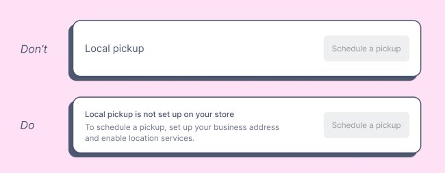
- Product designer Justine Win describes three alternatives to using disabled buttons, which can otherwise lead to a confusing experience (“Why can’t I click this?”):
- Only show what’s actionable (i.e. don’t show the button in the first place)
- Provide context (i.e. show the disabled button, but pairing it with additional information – see screenshot above)
- Enable the button by default, then show error as needed. For example, a login form where the login button is enabled, but if you don’t fill in the username or password field, a validation error is shown.
Building an Accessibility Library
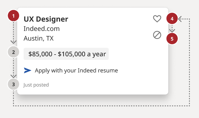
- Stephanie Hagadorn, UX Design Lead at Indeed, writes about the creation of the “A11y Annotation Kit“. This is a Figma-based ‘accessibility library’, designed to improve the handover from designer to developer and prevent both roles from making the same old accessibility mistakes around things like colour contrast issues.
- See the screenshot above: designers can, for example, use grey and red numbered dots to indicate the desired reading and tab order of a component. In addition, the kit gives designers a constant refresher and summary of a11y guidelines, which have been translated from the more “verbose” WCAG specifications.
- Stephanie says: “All components are prefilled with the correct CSS or HTML elements so designers don’t have to remember things like the autocomplete value for a street field (it’s “address-level1”) or the correct landmark role for a footer (that’s “contentinfo.”). This helps developers use the right values as well.”
How to make “Read more” links accessible
- “Read more” links are a poor experience for screen reader users, who often browse the web by navigating lists of every link in the page. Therefore, each link should make sense when read out of context; “read more” doesn’t.
- This article lists six different ways to improve your “read more” links:
- Change the link text to be more descriptive, which has the benefit of benefiting sighted users too.
- Hidden text within the link, e.g.
Read more <span class="sr-only"> about what Digital Access do</span> - Remove the “read more” link – it often repeats a link slightly further up in the DOM, so has no real purpose.
- Nest the “read more” link in a contextual element. This was a new one for me: WCAG actually allows links that don’t make sense out of context, provided it is nested in an element that does provide the context, which might be a paragraph, list item, table cell, whatever. Screen readers can be made to “read the current sentence” relatively easily, so screen reader users can get context this way, though it is less intuitive.
- Use
aria-labelon the link, to replace the link text. - Use
aria-labelledbyto reference other text on the page (such as the heading).<h2 id="heading">Digital Access</h2><a id="read-more" aria-labelledby="read-more heading">Read more</a>would be read out as something like “Read more Digital Access, link”.
- Note that “read more” links make for a poor user experience, but many implementations are not inherently inaccessible. There’s a dedicated “Read more” example on Success Criterion 2.4.4: Link Purpose (In Context) which confirms that these links don’t fail that SC, provided that the context can be derived from the surrounding paragraph (solution number 4 in the article above).
This Free App Reads Money for People Who Are Blind or Visually Impaired
- EyeNote is a free app for iOS, which can recognise US bank notes using your device’s camera. Only half the note needs to be visible for it to be recognised, but the app can’t detect whether or not notes are counterfeit.
- There is a privacy mode which, when activated, uses vibrations or audible beeps (‘pulses’) rather than announcing the value of notes with a voice. For example, one dollar is one pulse, two dollars is two pulses, and five dollars is three pulses.
Beautiful accessibility with Floating Focus
- Dutch tech agency Q42 have published an NPM package – @q42/floating-focus-a11y – which embodies a new approach to styling the
:focusstate of form controls and links. Their solution animates the outline from one tabbed control to the next, making it easier to keep track of where the focus is at all times, particularly if your focusable elements aren’t very close together. - You can see this in action on the Rijksmuseum website. I actually really like the effect, although it is quite complex under the hood and doesn’t work without JavaScript, so you’d still want to provide some fallback focus styles for when JS isn’t available, somewhat defeating the purpose of the project. And of course, there is a whole school of thought around not disabling native browser focus styles. But it is an interesting UX nonetheless, and attempts have been made to consider accessibility, such as not rendering any animation when prefers-reduced-motion is set.
Show/hide password accessibility and password hints tutorial
- Nicolas Steenhout describes how he implemented a standard show/hide feature for password inputs, with accessibility in mind. Show/hide is useful for those with memory issues, or essential tremors, or anybody who wants to double-check what they typed in. Nicolas’ tutorial is for a registration form rather than a sign in form, but much of the advice applies to both.
- Password constraints (e.g. “Minimum 8 characters”) should be visible up front, not only shown after a failed form submission. These constraints should be in a list that is
aria-hidden, alongside the same information in a paragraph that is visible to screen readers only (class="sr-only"), as the paragraph is less verbose than the list. - The input should go after the hint, and should have an
aria-describedbyassociated with the hint. It should havearia-required="true", rather than HTML’s nativerequired, as the latter announces the input is “invalid” the first time it receives focus (and thus still empty). Finally, it needs anautocompletewith a value ofnew-password, in this example, orcurrent-passwordfor a sign-in form. (This attribute is used by password managers). - Now for the show/hide functionality: this should be a
<button role="switch" aria-pressed="false">. When it is pressed, you should change the value of the input frompasswordtotext, and update thearia-pressedvalue on the button.
Did you know that you can subscribe to dai11y, week11y, fortnight11y or month11y updates! Every newsletter gets the same content; it is your choice to have short, regular emails or longer, less frequent ones. Curated with ♥ by developer @ChrisBAshton.