Your daily frequent11y newsletter, brought to you by @ChrisBAshton:
Which fonts to use for your charts and tables
At first glance, this blog post looks like an advert for the website it’s hosted on: Datawrapper. But it’s packed with informative and useful content, and written by Lisa Charlotte Muth – so let’s dive in. Of course, due to the subject area, some of this will be quite subjective. Your mileage may vary.
The first recommendation is to use sans-serif typefaces as a general rule, as opposed to serif ones which are most useful for long texts such as articles. Sans-serif looks cleaner and is easier to skim. You can still use serif sparingly, such as for the chart title or labels.
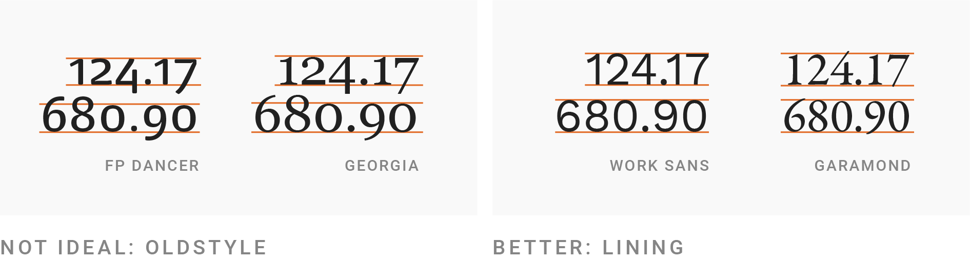
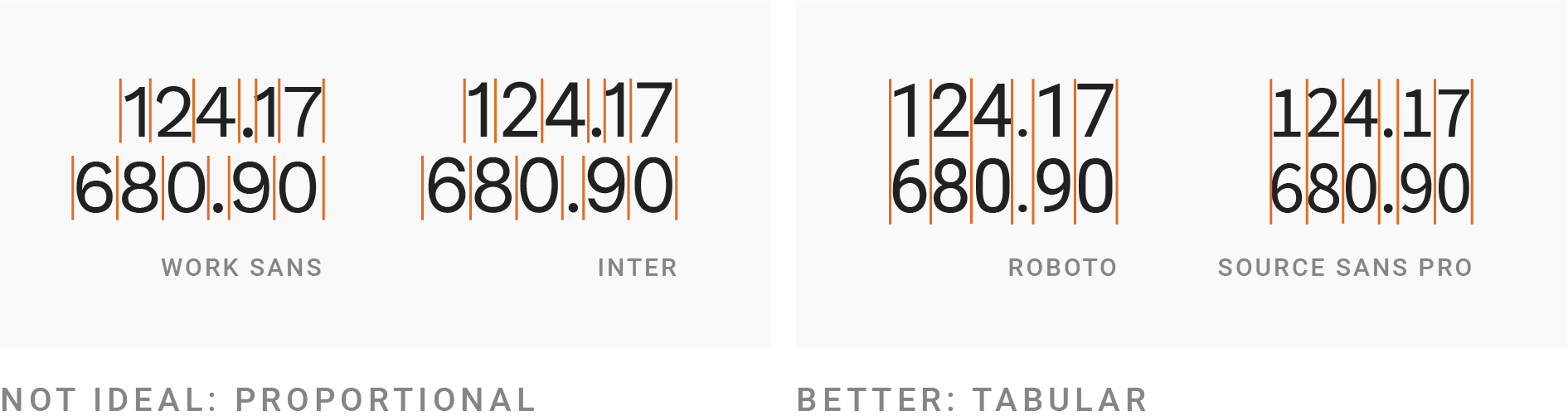
Next, your font choice should have lining and tabular numbers. Lining numbers all have the same height, whereas ‘old style’ numbers go above/below the line (e.g. the ‘tail’ in the number 9). The picture in the article demonstrates this much more easily than I can describe! Similarly, tabular numbers all have the same width.
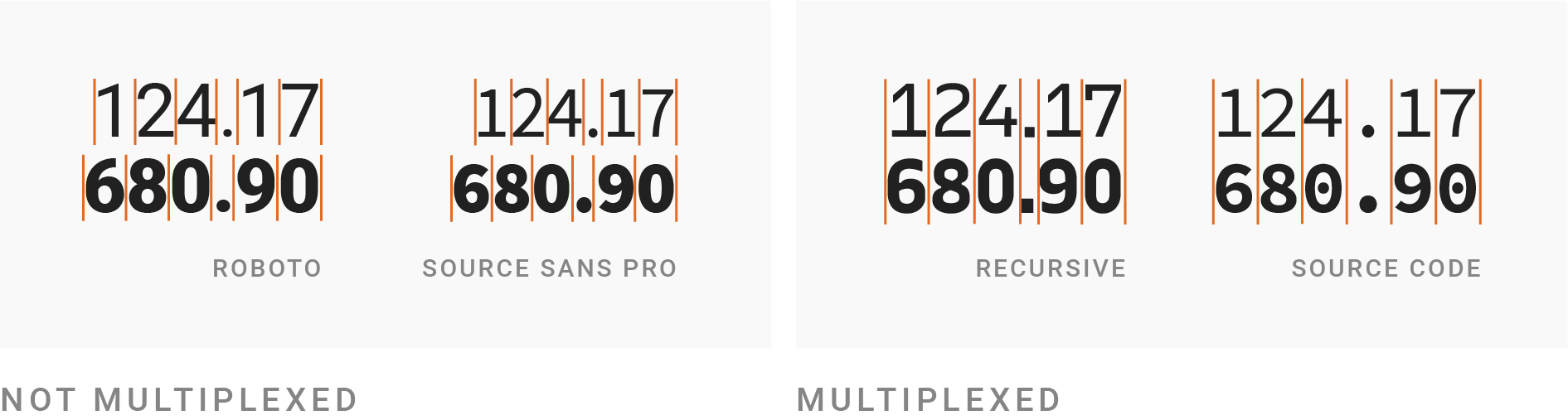
Going one step further, choose a multiplexed font: one where the height and width of each character is the same regardless of whether the weight of the font is bold. This can be useful for bolding a particular row in a table, whilst still making the table look neat. Bold, by the way, should be used sparingly, to emphasise things.
There’s a warning about ensuring your chosen font supports all the glyphs you need, such as characters for specific languages (ü ß é). And also a suggestion to choose a font that is not too wide nor too thin, though it then links to some well-known exceptions to the rule, so don’t take that as gospel.
Only at the halfway point is WCAG mentioned, followed by advice about ensuring your text is big enough and has a high enough contrast. Some specific sizes and ratios are given, if you’re unfamiliar.
Finally, there’s a note about using UPPERCASE text sparingly, and the often unwanted side-effect of said text becoming much wider than before. This can be corrected through a three step process: spacing out the letters more (called ‘tracking’ or ‘letter-spacing’), decreasing the font size to make it shorter, and then making the text bolder to aim for the same letter stroke width as the original text.
Prefer longer newsletters? You can subscribe to week11y, fortnight11y or even month11y updates! Every newsletter gets the same content; it is your choice to have short, regular emails or longer, less frequent ones. Curated with ♥ by developer @ChrisBAshton.