Your daily frequent11y newsletter, brought to you by @ChrisBAshton:
We asked an expert to redesign Wikipedia – here’s what they came up with
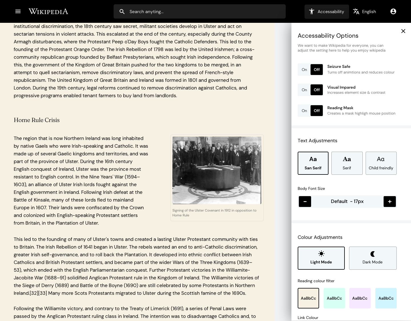
- TechRadar Pro asked UK-based designer Kevinsdesign to improve the design of Wikipedia. The screenshots in the article are fun to look through, showcasing a useful ‘table of contents’ side panel, a homepage of discovery options, and accessibility and language options brought to the forefront.
- Kevinsdesign interviewed four users to discover their friction points with the existing website, before mocking up the designs. He spent most of his time thinking through the accessibility options. He said:
- “Wikipedia is accessed by billions worldwide with the common goal of consuming written articles, however reading isn’t a given for everyone, between 5-10% of the population are dyslexic (myself included), even more have visual impairments and so on. Things like colour contrast, font size, and even black text on white backgrounds can make content very hard to consume.”
- “I asked the question: could I bake in accessibility options to the new design that would break down these barriers and make Wikipedia more accessible to people? The new accessibility option in the menu allows the user to customize the setting to their needs, be it making the font size bigger, making the content seizure safe, changing the font to child friendly and even adding a color overlay to the article which for many dyslexics massively helps them read.”
- These options are captured in the screenshot above.
Prefer longer newsletters? You can subscribe to week11y, fortnight11y or even month11y updates! Every newsletter gets the same content; it is your choice to have short, regular emails or longer, less frequent ones. Curated with ♥ by developer @ChrisBAshton.