Your daily frequent11y newsletter, brought to you by @ChrisBAshton:
Please Stop Using Grey Text
“W3 AGWG Invited Expert” and Readability and Color Science Researcher, Andrew Somers, argues that the WCAG 2 contrast specifications have been harmful to accessibility, as they don’t factor in how colours are perceived. Some colour combinations that shouldn’t pass, do, and some that should, don’t.
Since the introduction of WCAG 2, Andrew argues there’s been a shift to using grey text instead of black. This breaks a 1000 year precedent of printed texts worldwide. Andrew acknowledges the irony in making this point on his article, which is hosted on Medium.com and which uses grey text.
Andrew also highlights issues with dark mode, where WCAG 2 contrast math “is not capable of providing useful contrast values”. The screenshot he uses to demonstrate the issue is pretty scathing.
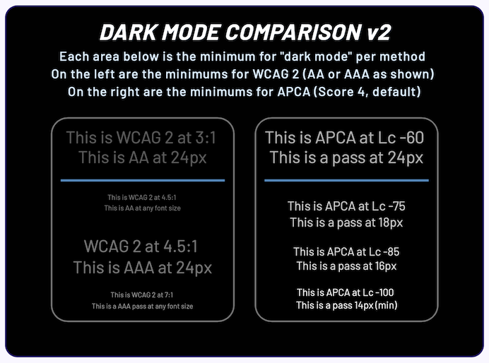
There is often a counter-argument to the use of black text: that it causes too much contrast and can be uncomfortable to read. Andrew’s counter-argument is that it is better to slightly darken the background behind the text, rather than lighten the text itself.
Prefer longer newsletters? You can subscribe to week11y, fortnight11y or even month11y updates! Every newsletter gets the same content; it is your choice to have short, regular emails or longer, less frequent ones. Curated with ♥ by developer @ChrisBAshton.