Category: week11y

Accessibility themed newsletter released every week.

  • week11y issue 57

    Your weekly frequent11y newsletter, brought to you by @ChrisBAshton:

    Lists

    • A Jeremy Keith entry from his journal. Lists are helpfully announced to screen readers when they are navigated to (e.g. “List: six items”). However, Webkit browsers such as Safari don’t announce lists if the lists’ bullets have been removed using CSS (just like it doesn’t announce content that has been visually hidden with display: none). There’s a Twitter thread explaining why, but it boils down to this: “If a sighted user doesn’t need to know it’s a list, why would a screen reader user?”
    • If you’ve removed bullets but your content is a list (you may have used some visual replacement for bullets, e.g. image markers), you can force screen readers to treat your content as a list by adding role="list".
    • There’s an interesting point about “pixel perfection” across browsers, too. It’s widely considered to be an unattainable or undesirable goal nowadays; why should we demand the aural equivalent? Websites don’t need to sound identical in every screen reader.

    VoiceOver Preview for macOS Firefox

    • Mozilla have worked hard over the past year to deliver VoiceOver support for Firefox on macOS – something that had been lacking for 15 years. It’s now ready to try in the Firefox 85 Beta and Mozilla are calling on volunteers to try it out and report any bugs they encounter. Other than a few known issues, it is hoped to be fairly stable.

    Equal Entry Guidelines for Describing 360-Degree Video

    • An interesting set of guidelines describing the challenges of audio-describing a 360 degree video (which will become more prevalent as VR grows). You should divide the video into scenes, write a brief introductory description for each scene, then write audio descriptions for each direction a viewer could face during the scene. Consider ‘forward’, ‘left’, ‘right’, ‘backward’, ‘up’ and ‘down’ views. See the demo on YouTube.

    Finally, below I summarise not one, not two, but three articles. It’s my attempt to clarify what seems quite a contradictory issue: whether you should ‘try on’ a disability to build empathy, and/or build better products and services. As someone who has written a series of articles on using the web under various constraints, it’s a subject close to my heart and an important conversation to have.

    Article 1: Why I won’t “try on” disability to build empathy in the design process (and you should think twice about it.)

    • Amelia Abreu describes how accessibility workshops that, for example, have able-bodied participants trying to navigate a high street with wheelchairs to gain awareness of shortage of ramps, can be counter-productive. A research paper concluded that short-term mimicking of the effects of a disability can a) result in fear, apprehension and pity, b) fail to account for diverse coping mechanisms people develop over time, and therefore, c) cause participants to underestimate the true capabilities of persons with disabilities.
    • Instead, Amelia suggests we build relationships with real people with disabilities. Get to know their diverse interests and accessibility concerns, and ask how you can be an ally for disability rights. Also, to draw upon your own experiences. In the wheelchair example, Amelia developed an awareness of the inaccessibility of infrastructure when she had to take her daughter around in a stroller.

    Article 2: Going Colorblind: An Experiment in Empathy and Accessibility

    • This article appeared a month before the first, and on the same website! Sara Novak describes her colleague Peter’s deuteranomalous colour blindness, affecting 5% of men. It means he has a hard time differentiating greens from other colours. Sara admits she was sympathetic, rather than empathetic, so talked to Peter and decided to see what it’s like to be colourblind for three days, using Chrome extension See.
    • Sara realised she’d been colour-coding her responses in emails, and that this was difficult to decipher. She realised why Peter bolded important info in emails rather than rely on colour, and she started to do the same. She also encountered inaccessible web forms which used colour alone to convey error state.

    Article 3: Get the Funkify Out: A Neat Accessibility Tool/Disability Simulator

    • Michael Larsen writes about the “Funkify Disability Simulator” Chrome extension, which attempts to simulate what it’s like to browse the web with dyslexia, astigmatism, jittery hands and high distraction (much like GDS’s own accessibility personas). With it, Michael was able to create a custom profile that makes a page look “very much like it would without my reading glasses”.

    In conclusion, I’m not convinced I have a definitive answer. These were all useful articles and I learned something from each, but this is still a topic on which I’m uneasy and am keen to keep learning about.

    Can I use a screen reader and know exactly what it’s like to be a blind person? No, of course not – there are all manner of lived differences.

    Can I use a screen reader to test my product? Yes, of course – without testing, we’ve no hope of finding and fixing accessibility issues.

    Can I use a screen reader to build empathy? This is more complex. In Sara’s case, it seems she did build empathy for her colourblind colleague through use of a simulator. Perhaps the key is that she didn’t empathise in isolation; she was engaged with Peter and able to ask questions and compare her simulated world view with his. In contrast, I can see how a first time screen reader user with no point of reference could be overwhelmed and unable to navigate, and in turn develop a misguided view of what a blind person is capable of doing.

    These articles were hand-picked from various accessibility newsletters I’m subscribed to. If there are other articles that you recommend, please do send them my way!


    Did you know that you can subscribe to dai11y, week11y, fortnight11y or month11y updates! Every newsletter gets the same content; it is your choice to have short, regular emails or longer, less frequent ones. Curated with ♥ by developer @ChrisBAshton.

  • week11y issue 56

    Your weekly frequent11y newsletter, brought to you by @ChrisBAshton:

    iPhones can now automatically recognize and label buttons and UI features for blind users

    • iOS 14 has a new feature, “Screen Recognition”, which is built into VoiceOver. It uses AI to detect interactable elements on the screen, even when such elements aren’t properly labelled / exposed to assistive technology. It has the potential to allow blind users to use apps that are otherwise inaccessible.
    • I highly recommend this GadgetHacks article which goes into more detail on the feature and includes screenshots demonstrating how to enable it.
    • I haven’t had a chance to try out the feature myself yet, but it looks as though you first enable the feature, then ‘opt in’ to the feature on individual apps. I don’t yet know whether that means it would work on browsers such as Safari and Chrome. If it does, this could be a game changer, as it might allow the user to navigate previously inaccessible websites.

    Are your Anchor Links Accessible?

    • Amber Wilson describes the HTML structure she came up with for turning headings into ‘linkable headings’, whose links can be used as anchor links to that specific part of the page. It can be tricky to implement these without making it a noisy or confusing experience for screen reader users. Here is the markup she ended up with:
    • <h2 id="introduction">Introduction</h2><a href="#introduction"><span aria-hidden="true">#</span><span class="hidden">Section titled introduction</span></a>
    • You could also wrap your link inside your heading, which is simpler but arguably has usability issues (e.g. makes it harder to select heading text):
    • <h2 id="introduction"><a href="#introduction">Introduction</a></h2>

    A placeholder is not a label

    • This is your regular reminder from HTMHell that <input type="text" placeholder="First name"> is not accessible and requires an associated <label>. Some screen readers will fall back to using the placeholder if a label is missing, but it can’t be relied upon.
    • There are various UI issues with a placeholder-only approach. Contrast is often too low to read the text easily (though this can be tweaked by styling with the ::placeholder rule, at the risk of making the user think the input is already filled in). Placeholders get cut off if the input is too small, and get removed as soon as you start typing, straining your short term memory.

    Alexa Makes Shopping Lists Sharable as Accessibility Feature

    • Alexa allows you to create lists such as shopping lists and todo lists, adding and removing items with your voice. And now, users can ask Alexa to send a given list to a specific contact. Once Alexa confirms it has identified the right person, the recipient gets a message on their Alexa account through the app. This feature is designed to help those with limited access to a grocery store connect with those who can help get them supplies in the ongoing COVID-19 situation.

    Did you know that you can subscribe to dai11y, week11y, fortnight11y or month11y updates! Every newsletter gets the same content; it is your choice to have short, regular emails or longer, less frequent ones. Curated with ♥ by developer @ChrisBAshton.
  • week11y issue 55

    Apologies for the silence last week – I was having an early Christmas with my family! Your weekly frequent11y newsletter returns below:

    A plan for accessible maps

    • Benjy Stanton describes how he would design a map service from the ground up, considering the needs of all users. Maps are inherently inaccessible – they require digital and geographic literacy as well as visual methods of communication, so they should always be seen as an enhancement. Benjy’s tips can be largely summed up as follows:
    • The core content should be available outside of the map, e.g. as a data table or downloadable spreadsheet. Design your map in black and white first, to help prevent you relying on colour alone to convey meaning. Avoid pan & zoom interactivity unless they’re required. Ensure all interactive features (rivers, roads etc) are high contrast enough to see. Turn off background layers you don’t need. Test the map works on mobile and with a keyboard.

    Here’s What It’s Like To Live With A Tracheostomy

    • Ginny Butcher describes her experience of living with a tracheostomy (or ‘trache’): a tube in her neck, connected to a ventilator to enable her to breathe.
    • She’s completed a master’s degree to become a lawyer, and has done many impressive things such as rock climbing, abseiling, canoeing and zip lining, all with a ventilator strapped to her body. She’s also flown a plane and completed a half-marathon.
    • The practical aspects are that she needs to carry three bags of machines and some spare batteries at all times. One of the machines is to assist with coughing and secretions. The tube needs changing daily, which Ginny likens to something as boring as “clipping your toenails”.
    • It has its upsides too – Ginny doesn’t breathe through her nose or mouth, which makes her “the absolute best at downing pints”. Worth a read!

    Accessible Web Animation: The WCAG on Animation Explained

    • Val Head gives a detailed overview of WCAG animation recommendations. These include:
      • Pause, Stop, Hide“: provide a way of pausing, stopping or hiding any autoplaying animation that lasts more than 5 seconds.
      • Three flashes or below threshold“: avoid flashing more than 3 times in a one second period, to reduce chances of triggering seizures.
      • Animation from interactions“: any animation triggered by the user, which gives the illusion of motion (so not including things like colour or opacity change) should have an option to be disabled, as they can cause people with motion sensitivities to become ill. You can implement this with a ‘toggle’ on your site, and also pay attention to the prefers-reduced-motion media query.
    • These recommendations come under different WCAG conformance levels. for example, the first two rules are level A rules – the bare minimum standard to be met. The “animation from interactions” rule is AAA, which is the highest level of conformance. In general most people aim for the middle level: AA compliance.

    More Accessible Skeletons

    • Adrian Roselli describes – quite late on in his blog post – why he thinks skeletons (placeholder areas to display to the user while content is loading) are a bad idea. But he also describes how he would build one if he had to.
    • Some skeletons have aria-busy="true" markup, which is designed to be temporarily ignored by screen readers, though few screen readers support it. Adrian recommends pairing it with aria-hidden="true" for now at least. In practice, this means having two sibling nodes; one for the skeleton and one of the content.
      • When your content is loading, it should be hidden and have aria-busy="true", and the skeleton node should be visible. When it has loaded, it should be flipped to aria-busy="false" and the skeleton node should be set to aria-hidden="true".
      • You should have CSS which sets display: none on aria-hidden content, and on aria-busy="true" content.

    How we made GOV.UK more accessible

    • A team on GOV.UK analysed a small subset of representative pages to identify any violations of the WCAG 2.1 AA standard. They prioritised each issue by its regularity / likelihood of occurrence and its impact on the user’s ability to use GOV.UK. These were either technical issues, content issues or a mixture. They could generally be fixed in one central place (the Design System or components) or by an improvement in the guidance. There’s a great video on how differently marked up tables are experienced by screen readers.

    Did you know that you can subscribe to dai11y, week11y, fortnight11y or month11y updates! Every newsletter gets the same content; it is your choice to have short, regular emails or longer, less frequent ones. Curated with ♥ by developer @ChrisBAshton.

  • week11y issue 54

    Your weekly frequent11y newsletter, brought to you by @ChrisBAshton:

    Accessibility Testing is like Making Coffee

    • This article by Madalyn Parker was very popular back in August. Madalyn describes accessibility testing through different coffee brewing methods, with some nice illustrations. French Press is like automated testing: quick, easy, but doesn’t catch all of the grit. Aeropress, like semi-automated testing, is a step up from that, but requires more judgement. Pour Over is like manual testing, requiring the most time and attention but giving the smoothest brew. Going to a Café is like User Testing: you’ll learn things (either how to make coffee in new ways, or how users with disabilities use your site). a11y.coffee is kind of a sister site to this article and is also worth a look.

    Survey of Web Accessibility Practitioners #3

    • This WebAIM survey, which was previously conducted in 2014 and 2018, is aimed at “everyone that implements accessibility, whether casually or as a primary part of your job”. It is open until January 20th 2021 and its results will be published in the same month. Please take 5-15 minutes of your day to complete the 36 short questions and help inform the web accessibility field.

    Introducing the Accessibility VRCs

    Almost 50% Got This #a11y Question Wrong! — WCAG Explained (8m video)

    • Eric Eggert asked Twitter if the following code fails WCAG:
    • <button aria-level="2">Action</button>
    • 49% thought it failed WCAG, but Eric explains why it doesn’t. This all may seem a bit hypothetical, but it’s actually quite a useful exercise in how to judge code against the WCAG criteria.
    • Eric admits the code is invalid ARIA, as buttons can’t have levels (level doesn’t appear on the button role documentation, nor does button appear on the aria-level docs), but that does not constitute a WCAG failure.
    • It doesn’t fail SC 4.1.1 Parsing, as the HTML can still be parsed. SC 4.1.2 Name, Role, Value also passes; it says that “states, properties, values that can be set by the user can be programmatically set”, but as aria-level is unsupported on the button element, it cannot be set by the user.
    • Eric explains a couple more WCAG criteria that people cited, and why they don’t apply. Worth a watch.

    My watch told me I have a leak

    • An AbilityNet article describes how Google’s Live Transcribe app, which turns speech into text for live conversations, can also be trained with non-voice data. An update to the app can now identify environmental sounds such as “crying baby”, “door knocking”, “smoke alarm”, or as the title suggests, “running water”. The app can vibrate or flash for these noises, and Google announced in October 2020 that it will soon be able to notify your Android watch (Wear OS), though the ‘listening’ will still be done through a nearby phone. The next step will be to bring environmental noise detection natively to any devices that contain a microphone.

    Did you know that you can subscribe to dai11y, week11y, fortnight11y or month11y updates! Every newsletter gets the same content; it is your choice to have short, regular emails or longer, less frequent ones. Curated with ♥ by developer @ChrisBAshton.

  • week11y issue 53

    Your weekly frequent11y newsletter, brought to you by @ChrisBAshton:

    What would an ethical overlay look like?

    • Karl Groves writes about the ‘overlay widgets’ offered by companies such as accessiBe, and how their claim that including their product on your website will make it fully WCAG compliant is simply untrue. Many a11y issues, such as missing alt text, can only be fixed by a person. Moreover, the extra features an overlay often provides (e.g. screen magnification) are poor imitations of what’s already available to the user on their computer. The only ‘ethical’ overlay is a temporary one, Karl says: it should only be used as a discovery tool to find accessibility problems, which you should then spend time fixing the root cause of.

    Accessible Game Design / Accessible Player Experiences

    • I came across accessible.games while watching the 2020 Video Game Accessibility Awards. It lists the basic “access design patterns” to follow when developing your games. Examples include “second channel” (such as captioning that alerts you to incoming attacks; not just relying on sound) and “improved precision” (allowing gamers to adjust sensitivity of mouse/controller input). There are also “challenge design patterns”, which are patterns to follow once you’ve got the basics sorted, which go beyond core access into the realm of inclusion, so that people can fully enjoy your game. Examples include “slow it down“, allowing gamers to adjust game speed or reduce enemy damage so that they can successfully progress through the game.

    PlayStation 5: The Accessibility Review

    Pros:

    • The integrated screen reader is available across the PS5 system and comes in multiple languages, which can be adjusted for speed, volume, and choice of male or female voice.
    • There are a number of global settings to accommodate different types of colour blindness.
    • You can set a ‘game preset’ for game difficulty ranging from Easiest to Hardest, which should map to the standard options in most games. Similarly you can indicate a preference for subtitles, inverted controls, and audio language, which games should obey automatically.
    • There are options to increase text size, and to remap your controller.
    • 3D Audio, alongside supported headsets, give surround sound to the player, enabling blind players to pinpoint with accuracy where enemies are (as well as improving the experience for everybody).
    • The new DualSense controller has a built-in microphone, which can be used for voice-to-text. Haptic feedback in the controllers is designed to immerse the player, but can be disabled if uncomfortable.

    Cons:

    • The controller is larger and heavier than before, and the accessible ‘Back Button Attachment’ accessory for the PS4’s controller doesn’t fit on this one.
    • The ‘zoom’ option that allowed screen magnification on the PS4 has not yet been carried over.

    Under-Engineered Responsive Tables

    • Adrian Roselli describes how to create an accessible table that scrolls horizontally on mobile. You need to put your <table> element inside a <div role="region" aria-labelledby="mycaption" tabindex="0">, where “mycaption” references the <caption id="mycaption"> that should be inside the table. The tabindex satisfies WCAG Success Criteria 2.1.1 Keyboard, and the aria-labelledby satisfies 4.1.2 Name, Role, Value. For the CSS, apply overflow: auto to the table, and don’t forget to apply a focus style.

    Did you know that you can subscribe to dai11y, week11y, fortnight11y or month11y updates! Every newsletter gets the same content; it is your choice to have short, regular emails or longer, less frequent ones. Curated with ♥ by developer @ChrisBAshton.

  • week11y issue 52

    Your weekly frequent11y newsletter, brought to you by @ChrisBAshton:

    Sample of Atkinson Hyperlegible font characters, including how they look with low vision

    Atkinson Hyperlegible Font

    • A font has been designed to be read more easily by people with low vision. It differentiates commonly misinterpreted letters and numbers, such as capital I and lower-case l, using exaggerated forms including angled spurs and differentiated tails. It comes in four variants (regular, bold, italics, italics bold), supports 27 languages, and is available for free on Windows, Mac and the web.

    Accessible Fonts: Please, STOP Using PX For Screen!

    • A very ranty article that nevertheless explains quite well the reasons for using em (rather than px) for your font sizes, media queries, margins and padding. It dispels the myth that the ‘default’ font size is always 16px (the author’s default is 20px). rem is argued against as theme changes have to be applied in more places. pt, mm, cm and other ‘real-world’ metrics have their place only in your print styles.

    Soccer players’ head injury risk could be reduced with simple adjustments to the ball, study finds

    • Football governing bodies FIFA/NCAA govern the size, weight limit and inflated pressure of footballs. Purdue University engineers have concluded that when footballs get wet, they quickly breach the weight limit, so should be swapped out mid-game. Inflating balls to the lowest allowable pressure can reduce its force by 20%. Adopting these measures could reduce concussion risk, which account for 22% of all soccer injuries. A professional player heads the ball 12 times in a single game and 800 times in a season.
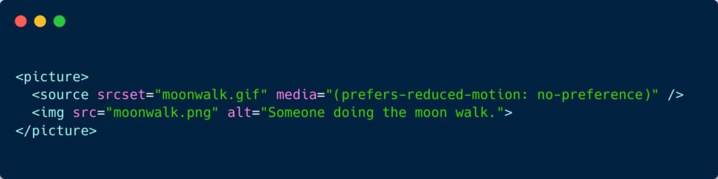
    <picture><source srcset="moonwalk.gif" media="(prefers-reduced-motion: no-preference)"><img fetchpriority=
    Snapshot of the code. Credit: Manuel Matuzović

    GIFS and prefers-reduced-motion

    • Some people find animations nausea-inducing or distracting. They might well configure their browser to indicate that they prefer reduced motion. This CSS Tricks article highlights a really neat trick from Manuel Matuzović: display a static image by default, or play an animated gif if users have no preference for reduced motion, using <picture> / <source> elements combined with a media query (see screenshot above). The article goes on to describe how you can use a <details> element to allow gifs to be ‘paused’ (see the demo).

    This $1 hearing aid could treat millions with hearing loss

    • Saad Bhamla, a bioengineer from India, wanted to buy his grandparents some hearing aids. He was shocked to find that they can cost $500 to $5000 per pair, so set out to build his own. He soldered a microphone to a circuit board, then added an amplifier, a frequency filter and a volume control, as well as on/off switch and audio jack. His makeshift product, LoCHAid, passes five out of six of the World Health Organization’s recommendations for hearing aids, and cost around $15 to build. This could be reduced to $1 if produced at scale. It needs clinically testing before it can be legally sold as a hearing aid in most countries.

    Did you know that you can subscribe to dai11y, week11y, fortnight11y or month11y updates! Every newsletter gets the same content; it is your choice to have short, regular emails or longer, less frequent ones. Curated with ♥ by developer @ChrisBAshton.

  • week11y issue 51

    Your weekly frequent11y newsletter, brought to you by @ChrisBAshton:

    Use feature flags to make your website more accessible

    • Interesting idea from Heidi Waterhouse: allow users of your app to set their preferences for things like font size, contrast, and font family, and persist these preferences in a database [or cookie]. Then, when rendering the page for the returning user, retrieve their preferences and give them a personalised, accessible display. Heidi recommends building in these flags for every new feature, even if you haven’t built the part that lets users configure it yet (just return the default value). When you do come to implement it, your UI will already be set up to give the personalised view.

    Sony Outlines PS5 And DualSense Accessibility Features

    • Sony has released a blog post describes the PS5’s new accessibility features, such as built-in screen reader, and voice dictation software. Gamers will be able to adjust colour contrast on subtitles/closed captions, and reduce or disable haptic feedback in the DualSense controllers. Well done to the lucky few who have managed to pre-order one so far (I haven’t, and it baffles me why it’s so difficult)! PS5 is released on November 19th in the UK.

    Accessible Routing in JavaScript Frameworks

    • A Deque article by Mark Steadman, describing how to handle transitions between page loads in Single Page Applications. Ideally the focus would go to a <h1>, or failing that, it should go to the body of the page. In either case, the focussed element needs a tabindex="-1" so that JavaScript can assign focus. As a last resort, you could instead shift focus to the “skip to main content” link if you have one, but should also use aria-live to announce to the screen reader that the page has changed.

    6 Ways Travel Has Become More Accessible During the Pandemic

    1. Flexible booking & cancellation policies (to encourage people to book flights etc; those who have bouts of debilitating medical symptoms have long requested more flexibility).
    2. More accessibility fixes on websites (due to suffering businesses trying to market to more customers).
    3. A move toward contact-free (e.g. more automatic doors, less paperwork, less face-to-face check-in).
    4. Public spaces easier to navigate (lack of crowds, increased spatial awareness).
    5. Increased local offerings (some hotels & tour operators are extending discounts to residents, in the absence of out-of-town visitors).
    6. Events with virtual access (business conferences, concerts etc, which prior to the pandemic would not have allowed participation from a distance)

    What is ARIA even for? (video, ~8 mins)

    • A quirky, almost NSFW video by Heydon Pickering, explaining when and why to add ARIA roles and attributes to your HTML. It is best used when there is no good native HTML solution to your problem. For example, a ‘toggle button’ could be achieved with checkboxes, but is difficult to style and would be announced as input to the screen reader: better to use <button aria-pressed="false">Toggle</button> and use JavaScript to change the aria-pressed value. And <button> already has an implicit role="button", so there is no need to add it here.

    Did you know that you can subscribe to dai11y, week11y, fortnight11y or month11y updates! Every newsletter gets the same content; it is your choice to have short, regular emails or longer, less frequent ones. Curated with ♥ by developer @ChrisBAshton.

  • week11y issue 50

    Your weekly frequent11y newsletter, brought to you by @ChrisBAshton:

    ARIA in CSS

    • Jeremy Keith writes about a technique (prompted by Sara Soueidan) that ‘forces’ you to create accessible experiences. You can use ARIA attributes as CSS hooks to ensure your component only looks/functions properly if said attributes are used in the HTML.
    • Consider this CSS: aria-hidden['true'] { display: none }. It ensures you’re properly hiding content from both sighted and screen-reader users; the aria-hidden hides from the screen readers, and the display: none hides from sighted users*.
    • *Jeremy seems to imply that display: none doesn’t hide content from screen reader users, which would indeed make this approach really clever. But display: none does hide from screen readers, so I think there’s been a misunderstanding somewhere. However, I still think the ARIA-in-CSS approach is more semantic, and could be marginally beneficial…
    • Imagine if your CSS fails to load for some reason. With ARIA-in-CSS, at least screen reader users will still ignore the content. If you’d used a class instead (.hide { display: none }), then a CSS load failure would be a broken experience for everybody.

    Math, schizophrenia and the story of a life saved by the Internet

    • A US podcast sent in by frequent11y subscriber Nick. It’s an anonymous interview with someone who has schizophrenia. Whilst studying to become a mathematician, they were faced with severe anxiety attending the face-to-face lectures, so asked if they could just do the assignments and skip the classroom parts. They were told “no”. After dropping out of school and reaching suicidal lows, they enrolled in an online-only degree, graduated, and now have a lucrative full-time job. They hope that the pandemic leads to academia becoming more remote-friendly and accommodating of mental health.
    • (The relevant portion is about 31 minutes into the podcast, or you can switch to the Transcript tab and search for “coming up, math” to find the relevant portion.)

    Developing Real-Time, Automatic Sign Language Detection for Video Conferencing

    • Google intern Amit Moryossef writes about a research paper on real-time sign language detection using human pose estimation. The model, called PoseNet, reduces input from a HD image to a small set of landmarks on the user’s body, which can be analysed frame-to-frame to predict whether a user is signing, to an accuracy of 83-92% – you can try this for yourself in the demo or watch the video.
    • As conferencing software tends to focus on someone who is speaking verbally, it is hoped sign detection could be used to move focus to someone communicating via sign language. The researchers found a clever way of triggering the focus: when the model determines that a user is signing, it passes an ultrasonic audio tone. The audio is transmitted at 20kHz, which is outside the hearing range for humans, but fools any video conferencing application into thinking the user is speaking. This research could be used to better include those who communicate via sign language.

    That Time I Tried Browsing the Web Without CSS

    • Jon Kantner describes his experience with some popular sites after turning off CSS. 12.5% of users with low vision (who use assistive technology) browse the web with custom stylesheets, so sites need to have good structural markup to build upon. The most common issues Jon encountered were: images/SVGs with no width/height attributes, so appeared massive on the screen; lack of whitespace between elements (sites rendering <a>Link 1</a><a>Link 2</a>, not marked up as a list); unlabelled buttons (which would also be a huge problem for voice input or screen reader users); and missing images (e.g. logos applied with CSS background-image).
    • Did you like this article? I’ve written a number of similar posts on Smashing Magazine.

    The Robot That Gives Humans a Job (video, 3 minutes)

    • At the “Avatar Robot Cafe” in Tokyo, all of the servers are robots – but this isn’t the typical story of automation taking peoples’ jobs. These robots are controlled by people outside of the cafe who would never be able to physically do the job otherwise. Massa – the avatar that serves Alice Levine in the clip – has severe physical disabilities that confine him to his bed. But he can control the robot waiters using sophisticated eye tracking technology, and can talk to customers to take their orders and have a conversation. The arrival of 5G could soon mean he can send his robot to any location, indoor or out. It provides Massa “a huge amount of hope”.
    • Watch the full episode of Kevin McCloud’s Rough Guide to the Future on Channel 4 (47 minutes).

    Did you know that you can subscribe to dai11y, week11y, fortnight11y or month11y updates! Every newsletter gets the same content; it is your choice to have short, regular emails or longer, less frequent ones. Curated with ♥ by developer @ChrisBAshton.

  • week11y issue 49

    frequent11y is now 1 year old! 🎉 Since the first issue of dai11y on 28th October 2019, I’ve published well over 200 posts covering design, technology, science and ethics in the world of accessibility. I’ve been really enjoying reading so many articles and sharing them with you, and I’ve really appreciated the nice comments and encouragement from you. Please continue to share the newsletter with your friends and colleagues.

    Looking to the future – would you like me to cover any topics I haven’t covered yet? Is there a way I can improve the format? Let me know your comments by emailing me at chris@ashton.codes or reaching out to me on Twitter. Thanks in advance! Without further ado…

    Your weekly frequent11y newsletter, brought to you by @ChrisBAshton:

    Intro to Web Accessibility (see video)

    • What could be a more appropriate 1-year anniversary post than this excellent presentation by Michele A. Williams? In just 16 minutes she explains accessibility in great detail, starting with no assumed knowledge, and bringing the audience up to a good level of understanding about WCAG, WAI, HTML standards, Assistive Technology and team responsibilities. I learned something too – that JAWS stands for Job Access With Speech. A highly recommended watch for anyone new to accessibility!

    Google Slides – Present slides with captions

    • When you present Google Slides, you can turn on automatic captions to display your words in real time as you speak them (this only works with Chrome devices set to U.S. English). After you click “Present”, click the “CC” button or use CTRL + SHIFT + C (use CMD instead of CTRL on Mac). As you speak, captions appear at the bottom of the screen (but they won’t include punctuation). To change text position or size, click the drop-down menu Down arrow next to the “CC” button.

    :focus-visible Is Here

    • Matthias Ott writes about the situation where clicking on an element activates its :focus styles – something that can be perceived as ugly. With this new property, you can style elements if they receive keyboard focus, while avoiding styling if they receive focus via mouse click. Example: :focus:not(:focus-visible) { outline: 0 } paired with :focus-visible { outline: 3px solid blue }.

    Games are being remastered with little thought to accessibility

    • This article came out in June in response to a slew of remastered games being released around May. Many of these games from circa 2010 lacked accessibility features at the time, and haven’t been given any accessibility love in the remaster, lacking basic things like controls mapping. The author shows lots of screenshots and provides a quick overview of games including Mafia 2 and Minecraft Dungeons. Worth a read to remind ourselves how generally terrible in-game subtitles are.

    How we recruited people with low/no digital skills on Carer’s Allowance

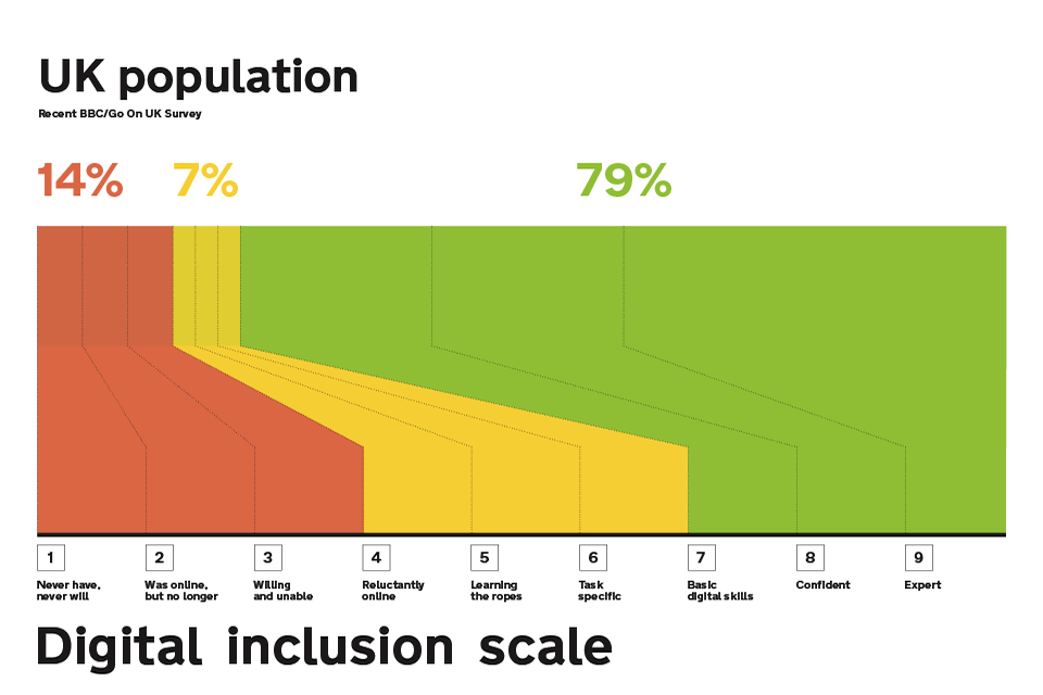
    • A GOV.UK blog from 2015. They wanted to find people on the lowest end of the digital inclusion scale for user research, to ensure a service they were building could be used by anybody. Asking people “How would you rate your computer skills?” wasn’t a reliable indicator of digital literacy as people tend to underestimate their skills and subsequently complete tasks with ease. Making people score themselves against explicit criteria, e.g. “How comfortable are you finding stuff using a search engine such as Google”, was a much better way of finding participants on the lower end of the scale.

    Did you know that you can subscribe to dai11y, week11y, fortnight11y or month11y updates! Every newsletter gets the same content; it is your choice to have short, regular emails or longer, less frequent ones. Curated with ♥ by developer @ChrisBAshton.

  • week11y issue 48

    Your weekly frequent11y newsletter, brought to you by @ChrisBAshton:

    Renting while disabled: ‘Being in a wheelchair means I pay double the rent’

    • 93% of the UK’s 8.5 million rental properties are inaccessible. It’s up to local authorities to set and enforce accessibility targets, but just 5% are requiring developers to construct wheelchair-suitable housing.
    • Finding an accessible home is difficult as property websites lack accessibility filters, and estate agents are often useless. Habinteg Housing Association are hoping to launch an ‘online accessible property directory’, but it’s unclear from the article what scope it will have. There’s certainly a business opportunity here for someone to build the Rightmove of accessible housing.
    • The Equality Act 2010 gives wheelchair users the right to make adaptations to their rented homes, but changes must be ‘reasonable’ (giving room to landlords to say no) and they must intend to live in the property for at least 5 years, making this unviable for many young renters.
    • These adaptations cost on average £9,000, with a means-tested Disabled Facilities Grant covering only some of that cost. Life costs £583 per month more on average if you are disabled.

    Alternative Text for CSS Generated Content

    • An Adrian Roselli post about the new “CSS generated content alternative text” syntax, which allows you to specify alt text for CSS background images. For example: .new::before { content: url("./star.png") / "New!"; }. Browser support is very patchy and this should not be relied on yet, but it is a promising step as currently background images are not accessible to screen readers nor to sighted users using Windows High Contrast mode. It’s worth noting that the alt text won’t display if the image fails to load, so it’s still generally best to use a normal <img>.

    The new normal — its something of a strain

    • David Banes writes some tips on looking after your eyes now that many of us work from home and don’t have an office-like environment to work in. Some are obvious but need stating: take eye breaks, limit screen time where possible, remember to blink, etc. Try to reduce glare on your screen by turning lights behind you off, but aim for a softly lit environment. Try to keep your screen at arm’s length from you, with the top of the screen roughly at eye level. Finally, consider installing f.lux (for desktop and mobile) – software that adds a tint to your screen, getting gradually darker as the evening draws in, reducing blue light. It helps reduce eye strain and can also have a positive impact on your sleep.

    The most useful accessibility testing tools and techniques

    • Artem Sapegin describes how he tests a11y as a frontend developer. FastPass mode in the Accessibility Insights browser extension highlights the two most common issues to fix. He also uses axe. For contrast checking, he uses Chrome DevTools’ built-in contrast checker and Spectrum. He manually tests navigating the site with a keyboard (focus states etc), using a screen reader, and attempting to zoom in 200%. Finally, he checks the site in ‘browser reading mode’ and in dark mode.

    Cursor Pro Mouse Highlighter

    • This popped up in my inbox and it looks like a useful tool for people with mild/moderate visual impairments. Through a global toggle in your Mac’s native menu bar, it can be turned on to provide a highlight ‘orb’ around your cursor so that it is easier to keep track of, and a built-in magnifier such that if you hold a particular key while hovered over something, you zoom in slightly. It’s a paid app ($7.99), so a free alternative would be to go to Settings -> Accessibility -> Display -> Cursor and increase the ‘Cursor Size’, though this doesn’t have the highlight orb or zoom functionality.

    Did you know that you can subscribe to dai11y, week11y, fortnight11y or month11y updates! Every newsletter gets the same content; it is your choice to have short, regular emails or longer, less frequent ones. Curated with ♥ by developer @ChrisBAshton.