Category: week11y

Accessibility themed newsletter released every week.

  • week11y issue 77

    After a few days off work, your weekly frequent11y newsletter has been resumed!

    How anyone can make Maps more accessible

    • Google relies on its community of Local Guides to update Google Maps information by, for example, inputting whether a restaurant has tables suitable for people who use wheelchairs. These guides share some actionable tips for crowd-sourcing information to benefit everyone, particularly people with disabilities:
      • An accessibility checklist can be useful when writing reviews. For example, having a template covering ramp access, wheelchair-accessible toilets, wheelchair-accessible parking etc, where you just have to provide ‘YES’ or ‘NO’ next to each item.
      • You can indicate accessibility features by answering questions about a business you visited, within the Google Maps app. If you’re the business owner, better yet – add these attributes yourself in your “Business Profile on Search and Maps”.
      • Create and share public lists of accessible places, e.g. accessible restaurants in your neighbourhood.

    How to open a budget Accessibility Simulation Lab

    • Andreea Vlad shares how the NHS Business Service Authority built its “budget” Accessibility Simulation Lab.
      • Whilst the article was published in May 2021, it’s not clear when the lab was actually put together. By its nature, it is very “hands on”, and Andreea also recommends having a fruit & candy bowl on site to encourage participation, so it certainly hearkens back to pre-Covid times…!
    • The lab is a single Chromebook, pre-configured with personas that simulate certain disabilities, alongside a mouse, keyboard and headphones. Someone bought several sets of cheap protective glasses, and then applied masking tape, nail polish and permanent markers to try to simulate visual conditions such as glaucoma, central field loss, and low vision. Finally, there are three very old phones, though no reference is made as to how these are used.
    • Andreea suggests that it’s hard to find lab session times that suit everybody; the implication is to let people use the lab in their own time. Try to get structured feedback from people, by asking them “I think we should…”, “I think we should not…”, and “[x]… stops me from caring about accessibility”. This encourages visitors to reflact, and increases their buy-in.

    7 Accessibility FAQ on the Winn-Dixie ADA Appeal Decision (2021)

    • I like to keep an eye on accessibility legislation in the USA, even when it can feel quite far removed from the UK/EU legal system. Here’s a useful write-up of one of the most important web accessibility cases in recent history:
    • In April 2021, a single U.S. Court of Appeals ruled that the Americans with Disabilities Act (ADA) did not apply to the website of supermarket Winn-Dixie, because at the time of filing it did not sell anything online and the plaintiff could access physical stores. In other words, the ADA could not be used to force Winn-Dixie to make their website accessible to blind users.
    • 3 judges were on the panel, and they were split 2-1 on the ruling. The decision only applies in 3 states: Alabama, Florida and Georgia. There have been 3 formal requests for a rehearing since the ruling was made, so a rehearing is quite possible and the ruling could change.
    • Since the case was filed, Winn-Dixie does now offer online shopping, which would likely have changed the ruling, were it not for court rules stopping new facts from being added to the case on appeal.

    Resident Evil Village Has An Accessibility Problem

    • I’ve had a number of bookmarks on the theme of Resident Evil Village, which has been a hot topic in a11y newsletters of late. This article berates Capcom for not providing any accessibility options in the menu of the game, meaning that:
      • The camera is stuck on a zoomed in view, which can lead to motion sickness. There are mods available to configure this.
      • Subtitles are small, and often have terrible contrast on the game background. There’s a Twitter thread with a screenshot. Subtitles don’t specify who is speaking, leaving hard of hearing players to guess. There’s also a lack of subtitles overall, as none of the ambient sounds are conveyed in text.
      • There are no controller remapping options.
      • Can I Play That wrote an accessibility-focused review of Resident Evil Village, rating it just 3/10.
    • This article makes a special call-out to Ratchet & Clank: Rift Apart for its advanced a11y options.

    Accessibility and outdoor socialising: ‘I feel unwelcome in my own city’

    • A BBC article from mid May. As the UK gradually opens up and people are able to dine outside, this must not happen at the expense of wheelchair users. Restaurants are filling pavements and roads with tables for customers, leaving very little (if any) room for wheelchair users to get past.
    • Some wheelchair users are reporting that they can’t use their old bus routes, as the roads to get to the bus stop are “covered with tables and chairs”. They now face arriving 20-30 minutes late, or many hours early.
    • The article references Katie Penick’s videos on Twitter, demonstrating how difficult it is for her to get through the available gaps in public spaces. This is despite the fact that hers is a 23-inches-wide ‘teenagers’ wheelchair, so smaller than most.
    • Holly Greader reflects: “I think the hope was that lockdown had given people an insight into what it can be like for disabled people – the isolation and everything else. I feel like now we’re coming out of the restrictions, we’re forgetting all these things that we’ve learned, and there is a lack of understanding.”

    Did you know that you can subscribe to dai11y, week11y, fortnight11y or month11y updates! Every newsletter gets the same content; it is your choice to have short, regular emails or longer, less frequent ones. Curated with ♥ by developer @ChrisBAshton.
  • week11y issue 76

    Your weekly frequent11y newsletter, brought to you by @ChrisBAshton:

    Shifting left: how introducing accessibility earlier helps the BBC’s design system

    • Sophie Beaumont writes about working on the BBC’s design system. A team had hoped to re-use one of the existing components in a new feature they were building, because it matched their visual design. However, on closer inspection, the underlying HTML semantics were unsuitable for the task, and they decided a new, separate component would be more appropriate. Sophie summarises: “Focus on what components achieve, rather than their appearance”.
    • They were able to catch the issue early because of a recent push for accessibility documentation during the design phase. In other words, designers talking to developers about what the structure of the content should be, including semantics such as headings, lists and landmarks. This is considered “shifting accessibility left”, i.e. embedding it earlier in the software development cycle, and in this case it exposed a requirements issue that would have been costly to fix later.

    These are my notes, which I wrote while attending the BBC’s “Monday 17th May: Hearing” event to mark Global Accessibility Awareness Day (which is Thursday 20th May). There were a range of speakers in the 1-hour session:

    • Keynote from Jenny Lay-Flurrie, Chief Accessibility Officer at Microsoft:
      • Unemployment rate is approximately double for people with disabilities.
      • People with disabilities have asked to work from home for decades – COVID has removed that barrier, but the unemployment gap actually increased.
      • Shout out to two great developments recently: Seeing AI app and Xbox adaptive controller.
      • Microsoft is working with universities to level up accessibility skills in its undergraduates.
    • Nigel Megitt, Executive Product Manager for AV Accessibility at BBC:
      • We saw a demo of changing the size of subtitle text on the iPlayer TV app. Note that this was already a feature on the web version.
      • iPlayer received mixed feedback on the default size of the subtitles. Realised that there was a preference for different default subtitle sizes based on device type and size.
      • There was some technical detail around the standard of subtitle files that the BBC exports.
    • Kay Ashton MBE, Accessibility Project Coordinator at BBC:
      • We watched ‘Sing’ – BSL SignSong (“Fletch@rettes Signing Choir”, participants from BBC Children in Need projects, BBC Ability, BBC Philharmonic and BBC Singers, recorded in lockdown to raise awareness of BSL for Deaf Awareness Week 2021).
    • Panel discussion including Esmail Patel (of Interpreting Solutions), Fletch@ (of Fletch BSL), and Lewis Vaughn Jones (of BBC Global News):
      • Platforms such as TikTok are driving better accessibility on social media (though probably down to better engagement, rather than ‘for accessibility’). And people are becoming proud to show off sign language on social media, both British Sign Language and International Sign Language.
      • Automated transcriptions are improving all the time. Also a shout out for the Text to Speech app.

    These are my notes, which I wrote while attending the BBC’s “Tuesday 18th May: Vision” event to mark Global Accessibility Awareness Day (which is Thursday 20th May). There were a range of speakers in the 1-hour session:

    • Talk by Molly Watt, founder of Molly Watt Trust:
      • Molly was born deaf. She had a good speaking voice and could lip read, so not many people even realised. In her teens, her vision started to deteriorate, and Molly was formally diagnosed with Usher Syndrome.
      • From the age of 3, Molly had analogue hearing aids, which were replaced with digital at the age of 9; Molly remembers hearing birds singing for the first time. Later on she was given a ‘smart’ hearing aid, where the quality of sound improved even further, and came with surround sound – essential for someone who is blind as well as deaf. It also has a smartphone app, where Molly can change the bass/treble/background noise levels.
      • Molly has an iPhone, which comes with lots of assistive technology built in. It has two screen readers – VoiceOver and SpeakScreen – and Molly uses mostly the latter. Molly also uses colour filters, rather than dark mode, to place a tint on the screen and reduce the glare. Finally, she uses Siri to send messages, meaning she doesn’t need to physically get her phone out in public. Molly now feels ready to move out of the family home, even during COVID, and says this is all down to technology.
      • Molly went to university but couldn’t access the intranet, due to its inaccessibility. She fought for change, but couldn’t get the university to make any changes, so left the uni in order to educate on a larger stage.
      • The Molly Watt Trust was founded to raise awareness of Usher Syndrome, and for people with Usher Syndrome to meet one another and boost morale and give the tech/tools needed to get by.
    • Talk by Natalie Curran, Assistive Technology Tester at BBC:
      • There has been a lot of movement on equality over the past few years, but disability equality seems to have been left behind.
      • Natalie has been an ATT for 8 months, and says she is still learning lots. She is looking forward to going into the office, where she’ll be able to use assistive technologies she hasn’t used before, such as ZoomText.
      • Natalie wants to help “bridge the gap”, saying “if only one person walks away and next time they [build] something, they think twice about [how to do it accessibly], then I’ve done my job”.
    • Talk by TV Platform Accessibility Guild at BBC:
      • Watched a presentation – ‘Screen Readers on TV’ – presented by “BBC Synthetic Voice”, which sounded very human. It’s challenging to build TV apps – older ‘smart’ TVs often don’t support new technology. The average person keeps their TV for 7-8 years – the equivalent of web developers having to support iPhone 5 today.
      • BBC Sounds was designed with basic screen reader support from the start, as it’s a relatively new app, but iPlayer has been slower going. It was, until recently, silent when using a screen reader, but new changes available in beta introduce support in some pages (though not all pages, notably the the sign-in screens).
      • The BBC are working with TV manufacturers, writing & providing automated tests to them so that they can identify issues prior to the device being released. The BBC are hoping this will improve the experience for ALL applications on the device, not just iPlayer.
    • Panel: Paul Smyth MBE of Barclays Accessibility, Robin Christopherson MBE of AbilityNet, Adi Latif of AbilityNet, Emma Tracey of BBC Journalism, and Sean Dilley of BBC News:
      • It was 2009 when Sean had his first accessible phone – the iPhone – which “opened up the world” to him. Prior to that he had some Nokia phones that spoke to him but weren’t particularly useful.
      • [What do you use for work every day?]
        • Paul uses ZoomText to avoid eye strain, and to reduce the reliance on (and noise of) his screen reader.
        • Robin uses a Bluetooth headset, joining with audio only, listening to the meeting but also having other earphones for their computer so that he can multitask.
        • Emma uses a Perkins Brailler – a metal braille typewriter for labelling her kids’ books, kitchen spices etc.
        • Adi loves his PenFriend – a pen shaped device to record voice notes associated with labels you can stick to things, such as food in the kitchen, and then wave the pen over it to play the voice note. It allows him to easily identify spices etc.
        • Sean has a barcode scanner app on his iPhone to tell him what tins he’s looking at, and also apps where he can ask a person what’s in front of the camera, which is very useful sometimes.

    These are my notes, which I wrote while attending the BBC’s “Wednesday 19th May: Motion” event to mark Global Accessibility Awareness Day (which is Thursday 20th May):

    • Vivek Gohil, is a gaming accessibility consultant:
      • Vivek has muscular dystrophy. He started gaming at age 10 with a gameboy: “it helps to escape reality” and is “very important for mental health”.
      • At 15, Vivek first experienced accessibility issues with holding a controller. He managed to overcome it with a table and sponges for support.
      • The SpecialEffect charity uses technology to help people with physical disabilities to play games to the best of their abilities, using technology such as modified joypads.
      • Vivek started a YouTube channel to create accessibility reviews of new games.
      • The Last of Us: Part II is critically acclaimed for its accessibility options. It has slow-motion aiming, makes you invisible while prone, has an aiming toggle, and has full control remapping support.
      • Vivek would like to see these accessibility options as standard in future: alternate sprinting option, slow motion aiming, remap different actions to either button tap or hold.
    • Christopher Hills, video editor and founder of HandsOptional:
      • Christopher has cerebral palsy, and self-confessed technology geek. In 2012, Christopher studied information technology. He made a video showing how he uses technology to consume his lectures, which he sent to his lecturers and also uploaded to YouTube. It got shared by Chris Pirillo and overnight gained 50,000 views. Christopher now has a sizeable following on his channel.
      • It was at this moment Christopher realised “I had something valuable to share with the world, and the technology at my disposal is infinitely more powerful than I’d thought.” After studying film at university, Christopher became Apple-certified in Final Cut Pro, started a consulting business and co-wrote a book.
      • Christopher uses a lot of Apple technology, which supports a wide range of a11y features, including Switch Control. He uses Siri Shortcuts to configure his office to shut blinds, close the door, etc, all from one click interaction, and is comfortable completely redesigning his on-screen keyboard layout when it doesn’t suit him.
      • Christopher closes by sharing a video of how he flies drones to capture cinematic shots. It goes into detail on his assistive technology setup. Christopher created the music accompanying the video, using apps on his machine. It’s incredibly powerful and moving, and well worth watching.
      • “With today’s technology, it is not my body that limits me – it is my imagination.”
    • Panellists: Brannon Zahand of Microsoft XBox Accessibility, Andrew Bromilow of EveryoneCan, animation student Nu McAdam, and Allan MacKillop of BBC Diversity & Inclusion:
      • Nu: keen for us to return to the office – there’s a lot of loneliness in the disabled community that is being amplified by us all being remote.
      • Brannon: there is an increasing recognition that “we are not our user”, seen in things like customisation, e.g. allowing you to set your colour preference.
      • Andrew: when stuck on an a11y problem, reach out to the disabled community – they are experts. And be prepared to pay them for their time.
      • Allan: the current generation of elderly people need support with technology. But he expects the elderly people of the future will be much more tech savvy, playing video games, etc.
      • There’s also a shout out to Xbox for maintaining backwards compatibility between its consoles and controllers: good for sustainability, and less of a barrier to those with accessibility needs who have a particular setup.

    And then, finally, it was Global Accessibility Awareness Day! There were lots of events all over the web, and it was hard to choose what to attend. Aside from a couple of internal work events, I mostly attended sessions at the very well run Festival of Accessibility:

    • Digital by Default: Baby Boomers and the impact of COVID-19:
      • “Over the past year the digital world has quickly evolved. This change has impacted older web users more than most.”
      • My takeaways from this session: of people who are over 50 years old, around 23% find an ‘increase font size’ option useful (according to, I think, YouGov). And the UK has an average reading age of 9, so it’s very important to use simple language. This became something of a theme in many of the talks I saw today.
    • Writing in Plain English – the inclusion challenge:
      • “Did you know that as many as 1 in 4 UK adults have very low literacy skills? And 10% have dyslexia, which can cause reading challenges?”
      • Think about your target audience before you write. Imagine how you would talk to your target reader if they were in front of you, and write that down – it won’t be quite right, but it’ll be a great starting point that likely sums up the most important things you have to say.
      • Use signposts throughout your content: headings, bullet lists, and frontloading of content (i.e. put the important content towards the beginning of your sentence). Personal, conversational language tends to read better, e.g. “your heart may beat faster” vs “the heart may beat faster”.
      • The Flesch Reading Ease scale looks at sentence and syllable length and arrives at a score of complexity from 0 to 100, where the lower the score, the more confusing the content. GOV.UK aims for a minimum of 70.
    • Digital Literacy & Accessibility in the Public Sector:
      • “Up to 1 million people in the UK cannot speak English well or at all.”
      • 50% of the population are below primary school numeracy level.
      • The Patient Information Forum has a charter that organisations can sign up to. It encourages:
        • Using clear communication (verbal, written, digital)
        • Creating easy-to-use digital tools/websites, printed information and premises
        • Involving users in the development of information as routine and inviting feedback
        • Training staff in health literacy
        • Commit to consider digital exclusion and the equalities impact when introducing new resources.
    • The Future of A11Y:
      • This panel session ended the day of events. It touched on lots of interesting topics.
      • There was talk of Public Sector Accessibility Regulations being a useful ‘stick’ to encourage compliance, where the ‘carrot’ of inclusivity doesn’t always work.
      • Advocating for accessibility at the highest levels requires different tactics: the threat of litigation (see above), the cost to the business (someone mentioned that accessibility costs 200 times more to retro-fit into an established product than to build in from the start). But empathy can work too: invite a disabled person into your board room to demonstrate the challenges they face using your product.
      • There was a shout-out to DIVERSish on YouTube, a skit which points out that whilst 90% of companies claim to “prioritise diversity”, it usually means focusing on LGBTQ, BAME and women, whereas disability regularly gets overlooked (“only 4% prioritise disability”).

    Did you know that you can subscribe to dai11y, week11y, fortnight11y or month11y updates! Every newsletter gets the same content; it is your choice to have short, regular emails or longer, less frequent ones. Curated with ♥ by developer @ChrisBAshton.

  • week11y issue 75

    Your weekly frequent11y newsletter, brought to you by @ChrisBAshton:

    Should you use an <h1> in email code?

    • A thorough investigation by Mark Robbins, looking at the state of webmail across a dozen different providers.
    • 60% of screen reader users prefer pages containing just one <h1> with the document title, whereas 33.3% prefer two <h1> headings, for the site name and the title.
    • Given a preference for one <h1> tag per page, the question is: should you include a <h1> in the emails you send people, or would that conflict with a <h1> that already exists in the webmail client? In other words, when viewing an email on gmail.com, how many <h1> tags are there?
    • Mark found that most webmail clients don’t add a <h1> to the page when viewing an email. I verified this by opening an email on gmail.com and inspecting the subject line, which is marked up as a <h2>. A couple of webmail providers do include a <h1> in the page, but their market share is low, and leaving out <h1> tags would do more harm to the many users of the other webmail clients.
    • Mark’s advice is to therefore include a <h1> tag in your emails. That’s easier said than done, of course – it only really works for email designers using professional services such as Mailchimp. For one person sending an email to another person, it’s not so easy.
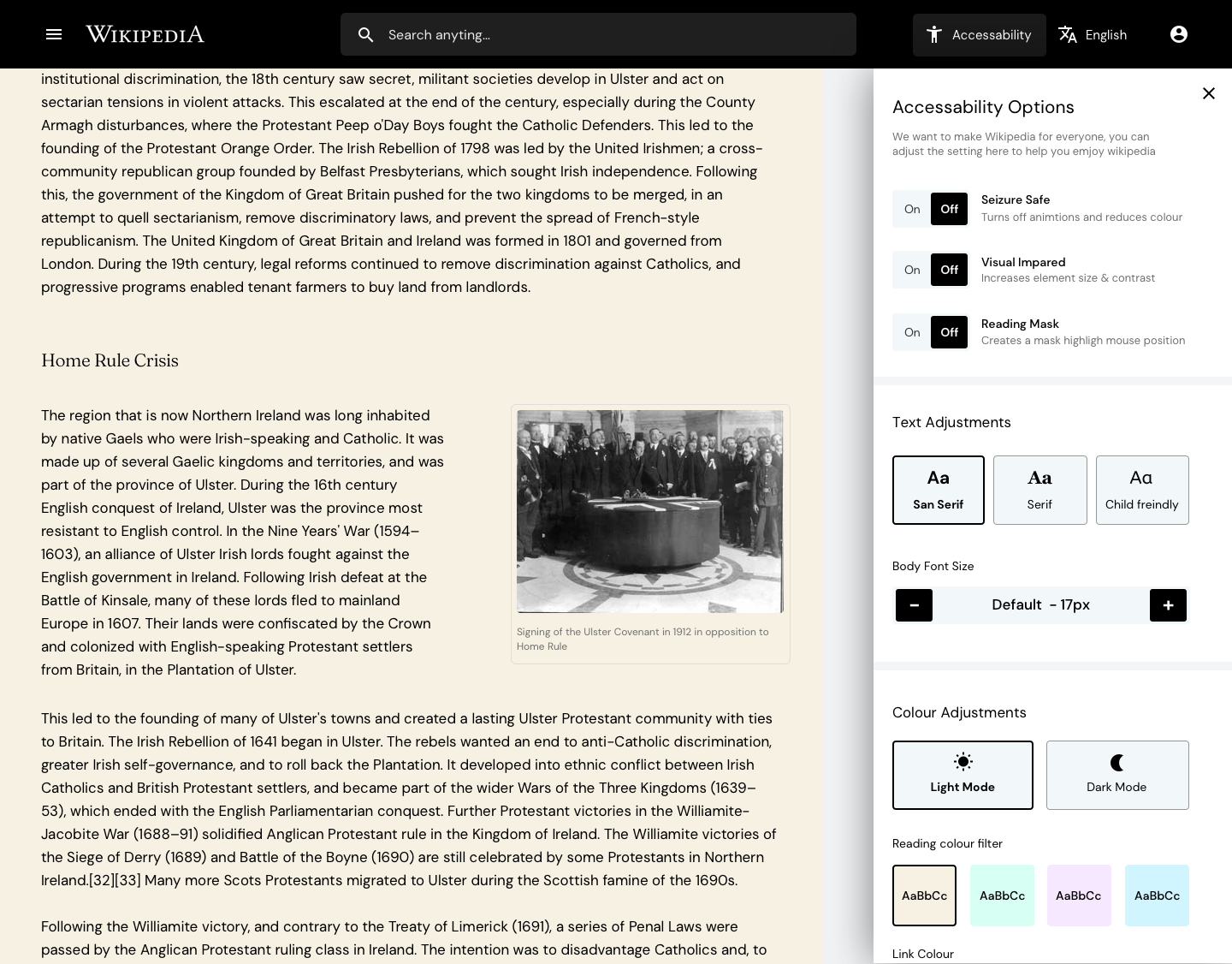
    Mocked up design of how a Wikipedia 'accessibility options' panel might work.
    (Image credit: Kevinsdesign)

    We asked an expert to redesign Wikipedia – here’s what they came up with

    • TechRadar Pro asked UK-based designer Kevinsdesign to improve the design of Wikipedia. The screenshots in the article are fun to look through, showcasing a useful ‘table of contents’ side panel, a homepage of discovery options, and accessibility and language options brought to the forefront.
    • Kevinsdesign interviewed four users to discover their friction points with the existing website, before mocking up the designs. He spent most of his time thinking through the accessibility options. He said:
    • “Wikipedia is accessed by billions worldwide with the common goal of consuming written articles, however reading isn’t a given for everyone, between 5-10% of the population are dyslexic (myself included), even more have visual impairments and so on. Things like colour contrast, font size, and even black text on white backgrounds can make content very hard to consume.”
    • “I asked the question: could I bake in accessibility options to the new design that would break down these barriers and make Wikipedia more accessible to people? The new accessibility option in the menu allows the user to customize the setting to their needs, be it making the font size bigger, making the content seizure safe, changing the font to child friendly and even adding a color overlay to the article which for many dyslexics massively helps them read.”
    • These options are captured in the screenshot above.

    Wix Launches First of Its Kind Accessibility Tool to Help Make The Web Accessible for Everyone

    • Wix is a popular platform for building and hosting websites, choosing from pre-built themes and customising the content. It has now launched its ‘Accessibility Wizard’, which is built into the CMS.
    • You can use the wizard to scan your site for accessibility issues, detecting things like images with missing alt text, improper heading orders, or insufficient colour contrast. The wizard provides detailed instructions on how to fix each issue.
    • The article above is frustratingly thin on detail, but you can find out more on Wix’s official blog post. It arose from a checklist which Wix created and asked website editors to follow, but users found this too heavy and time-consuming to follow.

    What Is It Like to Use a Screen Reader?

    • Anthony Vasquez shares some things you may not know about how some people use screen readers. The article is a follow-up to a Screen Readers in the Wild seminar. Some video demonstrations from the seminar are linked below:
    • “Often, developers go too far treating images as decorative”, (perhaps because it’s easier to specify an empty alt="" attribute than to come up with good alternative text? ~Chris), leading Anthony to feel he’s missing out on something, and to try to derive context from the surrounding content. Anthony praises The Atlantic for getting alt text right, with a good mix of short and long descriptions.
    • Anthony mostly navigates pages using arrow keys, which can “reveal important information” that is otherwise missed by tabbing. However, computer science student Su Park – who also demonstrated in the webinar – navigates mostly with tabbing and shortcut keys. Anthony says it is important to test both interaction styles.
    • The article finishes with a little detail on what refreshable Braille displays are.

    Did you know that you can subscribe to dai11y, week11y, fortnight11y or month11y updates! Every newsletter gets the same content; it is your choice to have short, regular emails or longer, less frequent ones. Curated with ♥ by developer @ChrisBAshton.

  • week11y issue 74

    Your weekly frequent11y newsletter, brought to you by @ChrisBAshton:

    WebAIM Million – 2021 Update

    • This is an annual report that uses the WAVE web accessibility testing tool to analyse the homepages of the top 1 million websites. Compared to last year:
      • The number of detectable accessibility errors dropped from 60.9 to 51.4.
      • The number of DOM elements in the page has increased from 864 to 887.
      • 97.4% of home pages had detectable WCAG 2 failures, down from 98.1%. These were most commonly missing alt text, empty links & buttons, missing language metadata and low contrast text. The latter affected 86.4% of all homepages.
      • Almost half of all form inputs are not properly labelled. However, more websites are properly using headings.
      • The presence of JavaScript libraries (and, counter-intuitively, the presence of ARIA) tends to correlate with a higher number of accessibility errors.
      • .ru (Russian) and .cn (Chinese) websites had twice as many accessibility errors as .us (American) and .ca (Canadian) websites.
      • And finally, a sign of the system working(?): web site categories that were subject to increased civil rights complaints and lawsuits in 2020 were among the most improved.

    Accessibility devices at CES 2021 reflect growing focus on inclusive tech

    • The entirely virtual CES in January 2021 saw a number of assistive technologies, as companies begin to realise the importance of inclusivity and the money that can be made. Some highlights include:
      • Mantis Q40 – a $2.5k QWERTY keyboard with built-in braille display.
      • Oticon More – a hearing aid with built-in neural network, trained on 12 million real life sounds, to help process speech in noisy environments.
      • Sravi – an app that uses AI based lip-reading technology to recognise specific phrases from lip movements. It is aimed at people with speech difficulties, or patients in critical care with ailments that render them incapable of speaking. The app is in trials within the UK’s National Health Service.

    iOS 14 review: access all areas?

    • This is another one from the bookmarks that I’ve just gotten around to reading! Colin Hughes reviews the accessibility of iOS 14. He has muscular dystrophy and therefore relies on voice control.
    • Since iOS 11, iPhone users have been able to activate an auto-answer capability for incoming phone calls, but Colin notes that it requires you to touch the screen to set it up in the first instance. You can also make calls by saying “Hey Siri, call…”, but there’s no equivalent for ending the call, so if you go to voicemail you are stuck until the mailbox times out. This is still an issue in iOS 14.
    • Since iOS 13, the Announce Messages with Siri feature reads out your incoming messages and allows you to respond hands-free. Colin hoped this would be expanded to other apps like WhatsApp or Facebook Messenger, via an underlying API, but this has not happened in iOS 14.
    • Voice Control now supports UK English, which has improved the accuracy of Colin’s dictation, though the accuracy remains low and using the app is frustrating when compared with Voice Access in Android 11, which is “incredible” by comparison.
    • Colin also cites “improvements to the VoiceOver screen reader, a new Back Tap Feature, sign language in FaceTime calls, and Headphones Accommodations to help you hear better”. However, overall, Colin is disappointed that some of the the basics are still neglected.

    Did you know that you can subscribe to dai11y, week11y, fortnight11y or month11y updates! Every newsletter gets the same content; it is your choice to have short, regular emails or longer, less frequent ones. Curated with ♥ by developer @ChrisBAshton.

  • week11y issue 73

    Your weekly frequent11y newsletter, brought to you by @ChrisBAshton:

    Introducing Editoria11y: Accessibility Autocorrect

    • The folks at Princeton University have released a tool, editoria11y, as a frontend module of JS and CSS (but also a Drupal module, and a WordPress plugin is in the works).
    • The tool aims to catch only editorial accessibility errors, rather than the “ALL the errors” approach used by other accessibility tools, which arguably flag too much. As noted in the article: “they do not just mark mistakes the author just made, they mark color issues the designer made, technical issues the developer made…”.
    • The demo shows editoria11y in action, warning the editor about common issues such as missing alt attributes, but also more nuanced things like when the alt text is too long or if ALL CAPS is used.
    • The article concludes with a vision for the future: what if authoring tools made it easier to make accessible content by default? “For example, the default table in most content management systems does not have headers. The onus is on the user to know to click ‘properties’ and add accessibility features; maybe it is time to reverse that?”.

    Modern CSS Upgrades To Improve Accessibility

    • Stephanie Eckles shares some useful CSS tips. I’ve cherry-picked some highlights:
    • The use of max() to ensure that a focus outline is always at least 1px wide, whilst allowing it to be relatively sized with em:
      • button:focus { outline: max(1px, 0.1em) solid red }
    • Use of focus-visible to only apply focus styles when you’ve tabbed in via a keyboard (not mouse click):
      • button:focus-visible { ... }
    • Use of CSS grid to maintain the correct tab list order across multiple columns:
    • Stephanie uses currentColor throughout her examples. I don’t remember coming across it before, but it’s a way in CSS of defining a colour throughout your component, so that you only have to set that colour in one place. That’s not explained in the article, but there’s a good write-up of currentColor on DigitalOcean.
    • Finally, I love this quick global rule for disabling animations for users who prefer reduces motion:
      • @media (prefers-reduced-motion: reduce) {
        *, *::before, *::after {
        animation-duration: 0.01ms !important;
        animation-iteration-count: 1 !important;
        transition-duration: 0.01ms !important;
        scroll-behaviour: auto !important;
        }
        }

    Adobe unveils ambitious multi-year vision for PDF: Introduces Liquid Mode

    • An Adobe announcement from September 2020, which I’ve somehow only just come across. Adobe Acrobat Reader on iOS, Android and Chromebook now has a ‘Liquid Reader’ mode, which is a button in the UI that processes the current PDF in the cloud and then renders a mobile-friendly version of the content. There’s a video showing how it works. It uses AI to identify headings, images, lists, tables etc, making otherwise inaccessible PDFs more usable on mobile. That said, this shouldn’t be used as an excuse to continue to churn out PDFs instead of good, accessible content.

    EyeMine V2 is here!

    • EyeMine is free eye-control software for the game Minecraft. It allows players to navigate the world, mine resources, fight enemies, and essentially complete every in-game task using just their eyes. The source code is available on GitHub.
    • There is a 4 minute video demonstrating how it works: the screen is split into two panels, one containing the game view and one containing the EyeMine panel. Players shift their gaze to the EyeMine panel to change context, e.g. equip a pickaxe for mining, before shifting their gaze back to the game window.
    • EyeMine can also be used in conjunction with a switch for key selection or as a direct control for mining and building.
    • I think it’s worth celebrating that a relatively feature-rich game such as Minecraft can be played with just your eyes, given the right modifications. This is an accessibility success story that makes web accessibility look like a walk in the park in comparison!

    An opinionated guide to accessibility testing

    • Iain Bean shares his approach to accessibility testing a website:
      1. First impressions (on page load) – are there auto-playing videos, etc? There may be a number of obvious a11y issues to fix right off the bat.
      2. Tab around the page, checking if every interactable element can be focused, and has a focus state. Iain points out that Firefox and Safari don’t tab very well by default on OSX, so need to be configured. Iain shares a useful bookmarklet which, when pressed, hides your cursor, helping you to test by keyboard navigation alone. There’s also an unexpected shout-out to my article, I Used The Web For a Day With Just a Keyboard… thanks Iain!
      3. The next step is automated testing: Iain clicks the tota11y bookmarklet, which brings up an overlay and highlights problems in the page such as low contrast, missing alt text, inputs without labels etc. He then runs Lighthouse, and a couple of the other tools mentioned on Web Accessibility Evaluation Tools.
      4. Finally, Iain tests his site with a variety of screen readers.
    • This approach sounds similar to the Three Phase Attack approach to testing I wrote about in 2016: starting with the lowest effort testing and working your way to the more laborious steps, with gradually diminishing returns. There are only so many browsers, operating systems and assistive technologies you’ll have time to test in, but you’ll usually find most issues by testing your site with a small handful of distinct combinations.

    Did you know that you can subscribe to dai11y, week11y, fortnight11y or month11y updates! Every newsletter gets the same content; it is your choice to have short, regular emails or longer, less frequent ones. Curated with ♥ by developer @ChrisBAshton.

  • week11y issue 72

    Your weekly frequent11y newsletter, brought to you by @ChrisBAshton:

    Clubhouse, the Shift to Spoken Social Media, and the Voices That Will Be Silenced

    • Lawrence Weru discusses the Clubhouse app and what it is like as a person with a stutter. The invite-only app can gather over 1,000 people together in “rooms” for voice chats, where you can raise a ‘hand’ to ask to speak on the stage. He describes the anxiety stutterers feel when ‘raising the hand’ to speak on Clubhouse, and the instinct to just stay silent.
    • Lawrence has listened to several hours of Clubhouse conversations per week, but it was 49 days before he heard someone with a stutter take to the stage. To put that into context, around 15% of Americans have a speech/language/voice disorder, often starting between the ages of 2 and 6, with a 1 in 4 chance of it staying for life.
    • There is an increasing reliance on voice to interact with technology, making life difficult for stutterers: automated phone systems which require specific words without substitution, and Siri/Alexa which misinterpret pauses in speech as the end of the command. Clubhouse, and Twitter’s similar new “Spaces” feature, are continuing the move towards real-time voice. There’s an unfortunate lack of suggested solutions in the article, but it is worth a read to be made aware of the issue.

    Checking Windows High Contrast Mode on a Mac for free

    • Microsoft estimates that 60 million people use Windows High Contrast Mode (WHCM) regularly. The mode is under-tested compared to VoiceOver, which Adrian Roselli claims is over-represented. Marcus Herrmann shares his tips for developers wanting to test WHCM on their Apple machines:
      • Download VirtualBox.
      • Get a Windows 10 virtual machine (VM).
      • Write down the Windows admin password – which is Passw0rd! – as you’ll be asked for it a lot.
      • Launch VirtualBox and select your virtual machine. Optional: use VirtualBox to take a restorable ‘snapshot’ as soon as you’ve got it working, as the Windows license on these VMs expire after 90 days.
      • To activate WHCM, click on the search field next to the Start button and search for “high contrast”.
    • Marcus notes that there are 4 High Contrast themes available in Windows 10: “High Contrast Black”, “High Contrast White”, “High Contrast #1” and “High Contrast #2”. You should ideally test in each.

    Uber ordered to pay $1.1m to blind woman who was refused rides 14 times

    • Lisa Irving filed a complaint against Uber in 2018, after, on multiple occasions, being denied a ride or being harassed by Uber drivers not wanting to transport her and her guide dog. An independent arbitrator this month ruled in her favour, ordering Uber to award her £790,000, or $1.1 million.
    • Ms Irving’s lawyers said: “Of all Americans who should be liberated by the rideshare revolution, the blind and visually impaired are among those who stand to benefit the most. However, the track record of major rideshare services has been spotty at best and openly discriminatory at worst”.
    • Uber had claimed that it wasn’t liable for its drivers conduct because they were contractors. This has been struck down in the UK after a lengthy legal battle, and was dismissed by the arbitrator, who concluded that Uber still had contractual supervision over the drivers.

    Add punctuation to your alt text

    • Eric Bailey reminds us that we should always finish our alt text with punctuation, such as a full stop/period. This makes the screen reader voice pause slightly before announcing the next words in the sequence, which feels a lot more natural. Example code:
    • <img src="puppy.jpg" alt="A golden retriever puppy wearing a tiny raincoat." />

    Chrome now instantly captions audio and video on the web

    • Live Captions, Google’s real-time captioning feature, is available now on Chrome. The technology, which first appeared on Pixel phones in 2019, has captions appearing as a small, movable box at the bottom of the browser. The captions are generated in real time from the sound of the audio, so there is a slight delay and a fair few mistakes, but it is still a useful feature, and works offline too.
    • “Live Captions can be enabled in the latest version of Chrome by going to Settings, then the Advanced section, and then Accessibility.”

    Did you know that you can subscribe to dai11y, week11y, fortnight11y or month11y updates! Every newsletter gets the same content; it is your choice to have short, regular emails or longer, less frequent ones. Curated with ♥ by developer @ChrisBAshton.

  • week11y issue 71

    Your weekly frequent11y newsletter, brought to you by @ChrisBAshton:

    Is your CAPTCHA keeping humans out?

    • CAPTCHAs are important for preventing DDoS attacks, as they prevent botnets from accessing processor-intensive parts of websites such as login forms. But they can give false positives, where CAPTCHAs filter out humans, which is particularly bad in the COVID-19 era where it is essential to be able to access services virtually. The article goes on to describe the history of CAPTCHA development:
    • reCAPTCHA is a CAPTCHA service company that was acquired by Google; it accounts for around 93% of all CAPTCHAs on the web.
    • Early versions of CAPTCHA software had users deciphering distorted words and numbers, and typing these into a box. These should no longer be used today, as they are entirely visual and therefore inaccessible to users with visual impairments.
    • reCAPTCHA version 2, released in 2014, analyses the way the cursor moves across the screen to determine whether the motion is likely to be human. If it isn’t, it presents the user with an audio or visual challenge, such as clicking images which contain fire hydrants.
    • reCAPTCHA version 3 was released in 2018; it eliminates user challenges altogether and returns a “probability score” indicating the likelihood the user is human. It is up to the developers to take extra steps if the score is low, e.g. authenticate the user through an email link.
    • The article closes by asking developers not to roll out their own CAPTCHA solutions, which are likely to be less accessible than the industry standards.

    Alt text that informs: Meeting the needs of people who are blind or low vision

    • A really interesting article by Microsoft that is not (as I suspected from the headline) your typical “how to write good alt text” article.
    • A recent Microsoft study found that users who rely on alt text want different alt text depending on the context of the image:
    • “For example, if a photo of a person appeared in a news story, people might want a description that includes details about the setting of the image to give a sense of place. But if a photo of a person appeared on a social media or dating website, people might want increased details about that person’s appearance, including some details that may be subjective and/or sensitive, such as race, perceived gender, and attractiveness”.
    • “One participant mentioned that knowing the race and gender of people in photos of board members on an employer/employment website might help them understand whether the company values a diverse workplace. These latter examples illustrate practical and ethical challenges for emerging AI systems, such as whether AI systems can – or should – be trained to provide subjective judgments or information about sensitive demographic attributes.”
    • The article includes a table of contexts (such as e-commerce, news, dating) cross-checked against properties in an image that would be important to include in the alt text (e.g. weather, expression, hair colour), as indicated by the study’s participants.
    • Microsoft concludes that new categories of metadata should be produced to feed into improved machine learning models, and there should be “custom vision-to-language models” that give different alt text depending on the context in which an image appears.

    Next up is a Steve Faulkner special, as I’ve had two of his blog posts bookmarked for some time!

    • re-upped: placeholder – the piss-take label
      • “While the hint given by the controls label is shown at all times, the short hint given in the placeholder attribute is only shown before the user enters a value. Furthermore, placeholder text may be mistaken for a pre-filled value, and as commonly implemented the default color of the placeholder text provides insufficient contrast and the lack of a separate visible label reduces the size of the hit region available for setting focus on the control.”
      • This bonus article from HTMHell adds that translation tools such as Google Translate may not translate attribute values, placeholder text gets cut off beyond the size of the field, and “if browsers auto-fill fields, users have to cut-and-paste auto-filled values to check if browsers filled in fields correctly”.
    • aria-description: By Public Demand and to Thunderous Applause
      • The new aria-description attribute coming to WAI-ARIA 1.3 is similar to aria-label (takes a string of text associated with an element), but is intended for more verbose information. Steve sees it as replacing aria-describedby in those cases where the linked element is visually hidden, i.e. <a href="#" aria-describedby="help">Help</a><div id="help" class="visually-hidden">This description is for screen reader users only</div>.
      • It’s supported in Chrome, Firefox and Edge already.
      • Steve closes with some advice: for aria-label, a word or phrase is better than a sentence, and for aria-describedby or aria-description, a sentence is better than a paragraph.

    Apple Music Adds “Saylists” to Help People with Speech-Sound Disorders

    • At the end of March, Apple worked with Warner Music to launch the “Saylists” feature on Apple Music. This feature helps users find songs with lyrics and sounds which can be challenging to vocalise if you have a speech-sound disability/disorder (SSD), as one in 12 children in the UK do. Getting people with SSD to repeat hard and challenging sounds (such as words beginning with “ch”, “g”, “k” and “z”) is one of the most successful strategies to treat the disorder.

    Did you know that you can subscribe to dai11y, week11y, fortnight11y or month11y updates! Every newsletter gets the same content; it is your choice to have short, regular emails or longer, less frequent ones. Curated with ♥ by developer @ChrisBAshton.

  • week11y issue 70

    Your weekly frequent11y newsletter, brought to you by @ChrisBAshton:

    Automated accessibility testing: Leveraging GitHub Actions and pa11y-ci with axe

    • A blog post describing how to install pa11y-ci to your project and run it automatically with GitHub Actions. pa11y-ci is a Continuous Integration wrapper around pa11y, which is an automated accessibility tool that scans your web pages for issues.
    • You can configure the WCAG standard to which the tool validates (WCAG 2 A, AA or AAA), and tell it to run the tests using aXe-core using the axe ‘runner’ (htmlcs is the default runner, though the article doesn’t describe why you should use one over the other).
    • Once you have pa11y working locally (using NPM package files to declare your dependencies), you can write a .github/workflows/pa11y.yml file to define your GitHub Action. The article explains how to get GitHub Actions to run your pa11y tests when you open a PR to your repository.

    Next up is a two-article WCAG special:

    • WCAG 2.1 Checklist
      • A checklist by Raghavendra Satish Peri, an accessibility evangelist working for Deque. It lists each guideline for WCAG 2.1 A and AA compliance, along with a summary of each and a “Points to Ponder” section, containing useful tidbits like “Always provide alternative options like audio or OTP (one time password) for CAPTCHA.”.
      • It’s a long page, but not as dauntingly long as the official WCAG guidelines page, which also lacks the specifics of the “Points to Ponder” section (in favour of linking off to extensive ‘understanding’ pages, e.g. Understanding Success Criterion 1.2.1). Some people might prefer Ravhavendra’s checklist.
    • WCAG guide
      • A ‘quick reference’ guide to WCAG, built by designer Marcelo Sales. It displays each success criterion (SC) as a ‘flash card’, summarising each SC in one paragraph. There are options to filter by compliance levels A/AA/AAA, and there’s also a real-time fuzzy-matching search, so you can easily search for, say, “focus”, and see all relevant SC’s.

    And we finish with another special two-parter, this time to do with accessible front-end components!

    • A Complete Guide To Accessible Front-End Components
      • A Smashing Magazine article that does a bit too much, in my opinion! It begins with a table of contents, listing common UI components but also media preferences such as dark mode and prefers-reduced-motion. Each anchor link jumps to the specific part of the article which either describes how to build it, or links to an article which describes how to build it, or links to a library that implements it well.
      • Then the components list comes to a quiet close and there’s a long section promoting different a11y resources and tools. I discovered a11ysupport.io, which describes which ARIA roles and HTML features are supported in popular combinations of browser and screen reader.
      • A useful resource, well worth a read, but I’m not entirely clear as to what it’s trying to be!
    • Accessible front-end components: claims vs reality
      • This article by Hidde de Vries references the first article, and warns that we must do our due diligence when using third-party components that claim to be “accessible”. Some “accessible” components may have good colour contrast but not work with just a keyboard, or may work fine when zoomed in but not be interactable with voice navigation. You should perform some basic checks on the component yourself.
      • Look for specifics in the claims – what WCAG standard do the maintainers claim their component conforms to? How was it tested (e.g. formal WCAG testing, checklists, or automated tests), and what kind of browser support does it have?
      • Check the GitHub issues on the project – particularly ones mentioning WCAG or accessibility – and read the maintainers’ responses.
      • Are the maintainers open about any caveats / planned fixes? See if the project has an accessibility statement.

    Did you know that you can subscribe to dai11y, week11y, fortnight11y or month11y updates! Every newsletter gets the same content; it is your choice to have short, regular emails or longer, less frequent ones. Curated with ♥ by developer @ChrisBAshton.

  • week11y issue 69

    Your weekly frequent11y newsletter, brought to you by @ChrisBAshton:

    iPhones can now tell blind users where and how far away people are

    • An article from October 2020, but it taught me something I didn’t know: iOS 14.2 allows you to detect whether there are people in view (using your camera), and how far away they are. iOS will say how far the person is away, in feet or metres. The user can set a tone corresponding to difference, i.e. if somebody gets too close the tone changes. For deafblind people, there is a haptic pulse option instead, which goes faster as people get closer.
    • It isn’t explicitly mentioned in the article, but this feature is aimed at allowing blind users to keep a safe distance from people during the coronavirus pandemic.

    In Praise of the Unambiguous Click Menu

    • Mark Root-Wiley shares his thoughts on why hover-based menus should be a thing of the past. They violate Jakob’s Law of Usability: that users prefer your site to work the same way as all the other sites they already know. This is because there are several different hover menu behaviours in the wild, so it’s impossible to predict which one a site is using until you click around. For example, is the top menu item a link to its own page, or a ‘fake’ link (href="#")?
    • Hover menus are also difficult to use on touch screen devices, which have no concept of hover, and also require careful pointer precision; it’s easy to accidentally hide the submenu again by moving the cursor out of its range.
    • Mark suggests using click menus instead, following the guidance of the US Web Design System, Bootstrap and others.

    Wearable tech helps this blind runner compete in ultramarathons

    • In 2017, Englishman Simon Wheatcroft was the first blind person to run the New York City Marathon solo, without being tethered to a sighted running guide. He managed this by wearing a “Wayband” on his wrist; the device has built-in GPS and vibrates to keep the wearer on a set path.
    • Simon collaborated with New York based startup WearWorks to develop a prototype of the band in 2016, and the product is set to launch officially this year.
    • It is hoped that the band will enable blind users to “travel independently and discreetly” without audio instructions, which could help them explore unfamiliar places by themselves.

    3D-printed exoskeleton allows paralysed woman to “walk”

    • An blog post by accessibility consultant Nicolas Steenhout, which has resurfaced recently. It gives his opinion of a CNET article about a paralysed woman whose 3D-printed exoskeleton allows her to “walk”. As Nicolas points out, the $150k exoskeleton holds the woman up, and moves her in a way that looks like walking, but she isn’t actually “walking”.
    • The article is well worth a read, detailing some of the considerations the engineers at 3D Systems had to factor in, such as ensuring that hard parts of the exoskeleton don’t bump into parts of the body. (This wouldn’t be felt by the paralysed wearer, and would lead to bruising an abrasions that could become infected).
    • What I found most interesting was Nicolas’ suggestion that such developments could be considered ableist. He references a previous blog post where he debunked the idea that you need to “stand” to cook or socialise. Nicolas’ implication here is that the exoskeleton offers no benefits over a traditional electric wheelchair, other than conforming to societal norms.

    Did you know that you can subscribe to dai11y, week11y, fortnight11y or month11y updates! Every newsletter gets the same content; it is your choice to have short, regular emails or longer, less frequent ones. Curated with ♥ by developer @ChrisBAshton.

  • week11y issue 68

    Your weekly frequent11y newsletter, brought to you by @ChrisBAshton:

    Building an Accessibility Library

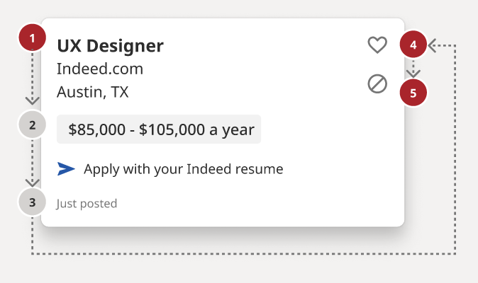
    Screenshot of a "UX Designer" job ad on the Indeed website, with numbered and coloured dots alongside the job location, salary and interaction buttons, to show reading order.
    Screenshot from the A11y Annotation Kit. The grey dots denote reading order, and the red dots indicate elements that can receive focus.
    • Stephanie Hagadorn, UX Design Lead at Indeed, writes about the creation of the “A11y Annotation Kit“. This is a Figma-based ‘accessibility library’, designed to improve the handover from designer to developer and prevent both roles from making the same old accessibility mistakes around things like colour contrast issues.
    • See the screenshot above: designers can, for example, use grey and red numbered dots to indicate the desired reading and tab order of a component. In addition, the kit gives designers a constant refresher and summary of a11y guidelines, which have been translated from the more “verbose” WCAG specifications.
    • Stephanie says: “All components are prefilled with the correct CSS or HTML elements so designers don’t have to remember things like the autocomplete value for a street field (it’s “address-level1”) or the correct landmark role for a footer (that’s “contentinfo.”). This helps developers use the right values as well.”

    How to make “Read more” links accessible

    • “Read more” links are a poor experience for screen reader users, who often browse the web by navigating lists of every link in the page. Therefore, each link should make sense when read out of context; “read more” doesn’t.
    • This article lists six different ways to improve your “read more” links:
      1. Change the link text to be more descriptive, which has the benefit of benefiting sighted users too.
      2. Hidden text within the link, e.g. Read more <span class="sr-only"> about what Digital Access do</span>
      3. Remove the “read more” link – it often repeats a link slightly further up in the DOM, so has no real purpose.
      4. Nest the “read more” link in a contextual element. This was a new one for me: WCAG actually allows links that don’t make sense out of context, provided it is nested in an element that does provide the context, which might be a paragraph, list item, table cell, whatever. Screen readers can be made to “read the current sentence” relatively easily, so screen reader users can get context this way, though it is less intuitive.
      5. Use aria-label on the link, to replace the link text.
      6. Use aria-labelledby to reference other text on the page (such as the heading). <h2 id="heading">Digital Access</h2><a id="read-more" aria-labelledby="read-more heading">Read more</a> would be read out as something like “Read more Digital Access, link”.
    • Note that “read more” links make for a poor user experience, but many implementations are not inherently inaccessible. There’s a dedicated “Read more” example on Success Criterion 2.4.4: Link Purpose (In Context) which confirms that these links don’t fail that SC, provided that the context can be derived from the surrounding paragraph (solution number 4 in the article above).

    This Free App Reads Money for People Who Are Blind or Visually Impaired

    • EyeNote is a free app for iOS, which can recognise US bank notes using your device’s camera. Only half the note needs to be visible for it to be recognised, but the app can’t detect whether or not notes are counterfeit.
    • There is a privacy mode which, when activated, uses vibrations or audible beeps (‘pulses’) rather than announcing the value of notes with a voice. For example, one dollar is one pulse, two dollars is two pulses, and five dollars is three pulses.

    Beautiful accessibility with Floating Focus

    • Dutch tech agency Q42 have published an NPM package – @q42/floating-focus-a11y – which embodies a new approach to styling the :focus state of form controls and links. Their solution animates the outline from one tabbed control to the next, making it easier to keep track of where the focus is at all times, particularly if your focusable elements aren’t very close together.
    • You can see this in action on the Rijksmuseum website. I actually really like the effect, although it is quite complex under the hood and doesn’t work without JavaScript, so you’d still want to provide some fallback focus styles for when JS isn’t available, somewhat defeating the purpose of the project. And of course, there is a whole school of thought around not disabling native browser focus styles. But it is an interesting UX nonetheless, and attempts have been made to consider accessibility, such as not rendering any animation when prefers-reduced-motion is set.

    Show/hide password accessibility and password hints tutorial

    • Nicolas Steenhout describes how he implemented a standard show/hide feature for password inputs, with accessibility in mind. Show/hide is useful for those with memory issues, or essential tremors, or anybody who wants to double-check what they typed in. Nicolas’ tutorial is for a registration form rather than a sign in form, but much of the advice applies to both.
    • Password constraints (e.g. “Minimum 8 characters”) should be visible up front, not only shown after a failed form submission. These constraints should be in a list that is aria-hidden, alongside the same information in a paragraph that is visible to screen readers only (class="sr-only"), as the paragraph is less verbose than the list.
    • The input should go after the hint, and should have an aria-describedby associated with the hint. It should have aria-required="true", rather than HTML’s native required, as the latter announces the input is “invalid” the first time it receives focus (and thus still empty). Finally, it needs an autocomplete with a value of new-password, in this example, or current-password for a sign-in form. (This attribute is used by password managers).
    • Now for the show/hide functionality: this should be a <button role="switch" aria-pressed="false">. When it is pressed, you should change the value of the input from password to text, and update the aria-pressed value on the button.

    Did you know that you can subscribe to dai11y, week11y, fortnight11y or month11y updates! Every newsletter gets the same content; it is your choice to have short, regular emails or longer, less frequent ones. Curated with ♥ by developer @ChrisBAshton.