Category: dai11y

Accessibility themed newsletter: get your daily dose of a11y.

  • dai11y 17/03/2021

    Your daily frequent11y newsletter, brought to you by @ChrisBAshton:

    Imagining native skip links

    • A proposal by Kitty Giraudel that is so brilliant, it’s a wonder it hasn’t been thought of and implemented already: native skip links.
    • Every website ought to have a “Skip link” link as the first thing a keyboard user tabs to in the page. This is important for keyboard users and screen reader users, so that they can jump directly to the main content of the page (usually the <main> element or the first <h1>), skipping over all of the menus and header content that is duplicated on every page.
    • Building these “skip links” isn’t difficult, but many sites fail to implement them, or do so incorrectly. So why not make it the responsibility of the browser?
    • Kitty is clear that a native skip link should have as little customisability as possible, from the website’s perspective. All we should be able to set is the destination of the link, via a <meta> or <link> tag such as <meta name="skip-link" value="#content" />, where value is a CSS selector referencing a node in the DOM.
    • Kitty even proposes a polyfill that sites might run to decide whether or not to include their bespoke skip link (in the event that the browser doesn’t have one natively). Not that this matters hugely in practice, as Kitty points out that a native skip link would not interfere with a bespoke one in any way, since the focus would have shifted over the bespoke skip link by the time it would have been reached.
    • If you like the idea, be sure to +1 it on the WebWeWant GitHub discussion!

    Prefer longer newsletters? You can subscribe to week11y, fortnight11y or even month11y updates! Every newsletter gets the same content; it is your choice to have short, regular emails or longer, less frequent ones. Curated with ♥ by developer @ChrisBAshton.
  • dai11y 15/03/2021

    Your daily frequent11y newsletter, brought to you by @ChrisBAshton:

    The Automated Accessibility Coverage Report (PDF)

    • Thanks to GDS colleague Anika Henke, who discovered this report via the “Accessibility Testing Coverage: Automation and Intelligent Guided Testing” talk at axe-con. According to the report, Deque’s accessibility testing engine axe-core finds 57.38% of accessibility issues, rather than the “widely accepted belief that automated accessibility testing only provides 20-30% of accessibility testing coverage”.
    • The discrepancy comes from theory vs practice. The 20-30% figure is the proportion of all possible accessibility issues that can be detected with tools, whereas the 57% figure comes from issues actually found on these sample websites.
    • In addition, the 20-30% figure only counts unique issue types, whereas the 57% figure takes into account the number of times each issue occurs. In other words, if an issue that can be detected with automated tools accounts for a large proportion of all accessibility issues in the wild, then it’s reasonable to conclude that automated tools do in fact detect a larger proportion of accessibility issues than theorised. Deque hopes that this report will “remove the stigma attached to automated testing”.
    • It’s worth noting that Deque analysed new client sites in getting the statistics for this report, which is based on the analysis of over 13,000 pages.

    Prefer longer newsletters? You can subscribe to week11y, fortnight11y or even month11y updates! Every newsletter gets the same content; it is your choice to have short, regular emails or longer, less frequent ones. Curated with ♥ by developer @ChrisBAshton.

  • dai11y 12/03/2021

    Your daily frequent11y newsletter, brought to you by @ChrisBAshton:

    Inaccessibility Warnings in the Browser anyone?

    • An interesting proposal by Martin Mengele: should we show warnings in the browser when a site is deemed to have accessibility issues? The warning about insecure connections, which all modern browsers now display prominently when connecting over HTTP, helped to drive a large HTTPS adoption; Martin argues that an equivalent for accessibility could be the visual deterrent some websites need.

    Prefer longer newsletters? You can subscribe to week11y, fortnight11y or even month11y updates! Every newsletter gets the same content; it is your choice to have short, regular emails or longer, less frequent ones. Curated with ♥ by developer @ChrisBAshton.

  • dai11y 11/03/2021

    Your daily frequent11y newsletter, brought to you by @ChrisBAshton:

    WordPress.org Removes Fake Reviews for AccessiBe Plugin

    • Accessibility consultant Joe Dolson noticed a pattern amongst the reviews for the accessiBe WordPress plugin, which had 31 five-star reviews, 2 four-star reviews and 2 one-star reviews. Many of the accounts of the positive reviews had interacted with some of the same plugins, and tended to be one-sentence reviews. WordPress removed the majority of the reviews, leaving 3 one-star reviews and 1 five-star review at the time of writing.
    • accessiBe has repeatedly come under fire for claiming that their overlay automatically makes your site WCAG-compliant. Adrian Roselli refutes this in detail, and presents evidence that suggests the company has paid for praise before.

    Prefer longer newsletters? You can subscribe to week11y, fortnight11y or even month11y updates! Every newsletter gets the same content; it is your choice to have short, regular emails or longer, less frequent ones. Curated with ♥ by developer @ChrisBAshton.

  • dai11y 10/03/2021

    Your daily frequent11y newsletter, brought to you by @ChrisBAshton:

    Gold Nanoparticles Inside Contact Lenses Correct Color Blindness

    • Researchers in the United Arab Emirates have developed contact lenses that could help correct red-green colour blindness. The lenses are created with gold nanocomposites and hydrogel, creating pink-tinted lenses. These could be a popular alternative to tinted eyewear. The next steps will involve human trials.

    Prefer longer newsletters? You can subscribe to week11y, fortnight11y or even month11y updates! Every newsletter gets the same content; it is your choice to have short, regular emails or longer, less frequent ones. Curated with ♥ by developer @ChrisBAshton.

  • dai11y 09/03/2021

    Your daily frequent11y newsletter, brought to you by @ChrisBAshton:

    Hiding Content Responsibly

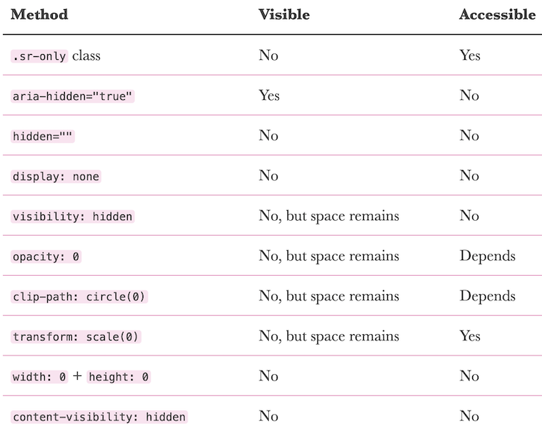
    Screenshot from Kitty’s article: a handy table of different hiding methods and their implications for assistive technologies.
    • Kitty Giraudel writes about the HTML attributes and CSS properties commonly used to ‘hide’ content, either visually or from assistive technologies (AT), or both. They then go into detail on each one:
      • An sr-only class is great for visually hiding something while preserving it for AT.
      • aria-hidden is great for hiding content from AT while keeping it visually displayed (e.g. decorative SVGs). However, make sure that there are no focusable elements within these areas, as they are still focusable.
      • display: none or the hidden attribute hide content from everyone, although their contents can still be referenced via aria-describedby/aria-labelledby, which could be handy to avoid vocalising something twice. Use this over width: 0 and height: 0.
      • visibility: hidden hides content visually and from AT (equivalent to display: none) but keeps the space, helping to avoid layout shift. Generally you’ll want to use this over opacity: 0 and clip-path: circle(0), which are inconsistently treated by AT, and over transform: scale(0), which has limited uses.
      • You’ll also want to use visibility: hidden over the Chrome-only content-visibility: hidden, which has low browser support.

    Prefer longer newsletters? You can subscribe to week11y, fortnight11y or even month11y updates! Every newsletter gets the same content; it is your choice to have short, regular emails or longer, less frequent ones. Curated with ♥ by developer @ChrisBAshton.

  • dai11y 08/03/2021

    Your daily frequent11y newsletter, brought to you by @ChrisBAshton:

    Amazon Echo Show 8 extends the power of Alexa to people with disabilities

    • An article from last November, reviewing the accessibility of Amazon’s Echo Show 8. It highlights a bunch of accessibility features I’d never considered the Echo devices to have:
      • Like phones and tablets, it has a pinch-and-zoom feature to allow you to magnify the screen.
      • Using VoiceView – Echo’s built in screen reader – information on the screen can be swiped through and interacted with by a blind person.
      • Screen colours can be inverted, providing higher contrast, and there are colour correction modes for colour blindness too.
      • Finally, Alexa Captioning shows subtitles for Alexa responses, making the devices viable for deaf users.

    Prefer longer newsletters? You can subscribe to week11y, fortnight11y or even month11y updates! Every newsletter gets the same content; it is your choice to have short, regular emails or longer, less frequent ones. Curated with ♥ by developer @ChrisBAshton.

  • dai11y 05/03/2021

    Your daily frequent11y newsletter, brought to you by @ChrisBAshton:

    Accessible motion: why it’s essential and how to do it right

    • Stephanie Cree shares some good UX tips for making your motion accessible:
      • Keep animation at the point of focus, to prevent zoomed in users from missing it outside the part of the page they’re zoomed in on.
      • Avoid flashes more than 3 times per second, which could trigger epileptic seizures.
      • Avoid parallax scrolling where the background and foreground move at different speeds, which can cause motion sickness.
      • Keep animations shorter than 1 second long.
      • Provide a setting to turn off all motion on your website. And, to facilitate this, you’ll need to design all elements of the page with and without motion.

    Prefer longer newsletters? You can subscribe to week11y, fortnight11y or even month11y updates! Every newsletter gets the same content; it is your choice to have short, regular emails or longer, less frequent ones. Curated with ♥ by developer @ChrisBAshton.

  • dai11y 04/03/2021

    Your daily frequent11y newsletter, brought to you by @ChrisBAshton:

    Material Design Text Fields Are Badly Designed

    • Smashing Magazine article by Adam Silver, describing what’s wrong with the text fields in Material Design (Google’s design system).
    • Material Design uses “float labels”: text that appears in the input, like a placeholder, but moves above the input when you focus on the element. This is better than relying on placeholders, which disappear on focus, and which can make it hard to remember what the input is for.
    • However, float labels share the other drawbacks associated with placeholders; namely:
      • Float labels that are longer than the input itself get cut off.
      • The presence of text inside the input can make it appear as though it’s been filled in already.
      • As a result, in order to help the user distinguish between inputs that have been filled in and those that have not, float labels tend to have poor contrast, making them harder to read.
    • Adam concludes that Google sacrificed usability for minimalism, and that forms that use conventional text labels can be beautiful too.

    Prefer longer newsletters? You can subscribe to week11y, fortnight11y or even month11y updates! Every newsletter gets the same content; it is your choice to have short, regular emails or longer, less frequent ones. Curated with ♥ by developer @ChrisBAshton.

  • dai11y 03/03/2021

    Your daily frequent11y newsletter, brought to you by @ChrisBAshton:

    The no-mouse challenge: Taking the keyboard navigation red pill^

    • Denis Boudreau describes “the no-mouse challenge”: start a timer, open a website and see how long it takes you to run into a brick wall. Participants in his workshops are “blown away” at the brittle nature of the web once you go off the beaten track of mouse navigation. He likens this to “taking the red pill” in The Matrix; the sudden realisation of how inaccessible most sites are. Common issues encountered are:
      • Losing your place, due to a lack of focus styling.
      • Triggering modal windows and having difficulty focussing on them.
      • Jumping around the page at random, due to confusing & illogical page order.
      • Skipping over entire sections of the page that really should be interactable.
    • One person who took the challenge is Mickey Mellen, in his article, “An hour without a mouse“. It references my own article – which is always nice to see! – and also shares a useful resource on Chrome keyboard shortcuts.
    • Both articles reference the 7% of working-age adults with severe dexterity difficulties, who might struggle to use a mouse. Combined with screen reader users, that’s about 10% of users who depend on keyboard support.

    Prefer longer newsletters? You can subscribe to week11y, fortnight11y or even month11y updates! Every newsletter gets the same content; it is your choice to have short, regular emails or longer, less frequent ones. Curated with ♥ by developer @ChrisBAshton.