Category: dai11y

Accessibility themed newsletter: get your daily dose of a11y.

  • dai11y 31/03/2021

    Your daily frequent11y newsletter, brought to you by @ChrisBAshton:

    Wearable tech helps this blind runner compete in ultramarathons

    • In 2017, Englishman Simon Wheatcroft was the first blind person to run the New York City Marathon solo, without being tethered to a sighted running guide. He managed this by wearing a “Wayband” on his wrist; the device has built-in GPS and vibrates to keep the wearer on a set path.
    • Simon collaborated with New York based startup WearWorks to develop a prototype of the band in 2016, and the product is set to launch officially this year.
    • It is hoped that the band will enable blind users to “travel independently and discreetly” without audio instructions, which could help them explore unfamiliar places by themselves.

    Prefer longer newsletters? You can subscribe to week11y, fortnight11y or even month11y updates! Every newsletter gets the same content; it is your choice to have short, regular emails or longer, less frequent ones. Curated with ♥ by developer @ChrisBAshton.
  • dai11y 30/03/2021

    Your daily frequent11y newsletter, brought to you by @ChrisBAshton:

    In Praise of the Unambiguous Click Menu

    • Mark Root-Wiley shares his thoughts on why hover-based menus should be a thing of the past. They violate Jakob’s Law of Usability: that users prefer your site to work the same way as all the other sites they already know. This is because there are several different hover menu behaviours in the wild, so it’s impossible to predict which one a site is using until you click around. For example, is the top menu item a link to its own page, or a ‘fake’ link (href="#")?
    • Hover menus are also difficult to use on touch screen devices, which have no concept of hover, and also require careful pointer precision; it’s easy to accidentally hide the submenu again by moving the cursor out of its range.
    • Mark suggests using click menus instead, following the guidance of the US Web Design System, Bootstrap and others.

    Prefer longer newsletters? You can subscribe to week11y, fortnight11y or even month11y updates! Every newsletter gets the same content; it is your choice to have short, regular emails or longer, less frequent ones. Curated with ♥ by developer @ChrisBAshton.

  • dai11y 29/03/2021

    iPhones can now tell blind users where and how far away people are

    • An article from October 2020, but it taught me something I didn’t know: iOS 14.2 allows you to detect whether there are people in view (using your camera), and how far away they are. iOS will say how far the person is away, in feet or metres. The user can set a tone corresponding to difference, i.e. if somebody gets too close the tone changes. For deafblind people, there is a haptic pulse option instead, which goes faster as people get closer.
    • It isn’t explicitly mentioned in the article, but this feature is aimed at allowing blind users to keep a safe distance from people during the coronavirus pandemic.

    Prefer longer newsletters? You can subscribe to week11y, fortnight11y or even month11y updates! Every newsletter gets the same content; it is your choice to have short, regular emails or longer, less frequent ones. Curated with ♥ by developer @ChrisBAshton.

  • dai11y 26/03/2021

    Your daily frequent11y newsletter, brought to you by @ChrisBAshton:

    Show/hide password accessibility and password hints tutorial

    • Nicolas Steenhout describes how he implemented a standard show/hide feature for password inputs, with accessibility in mind. Show/hide is useful for those with memory issues, or essential tremors, or anybody who wants to double-check what they typed in. Nicolas’ tutorial is for a registration form rather than a sign in form, but much of the advice applies to both.
    • Password constraints (e.g. “Minimum 8 characters”) should be visible up front, not only shown after a failed form submission. These constraints should be in a list that is aria-hidden, alongside the same information in a paragraph that is visible to screen readers only (class="sr-only"), as the paragraph is less verbose than the list.
    • The input should go after the hint, and should have an aria-describedby associated with the hint. It should have aria-required="true", rather than HTML’s native required, as the latter announces the input is “invalid” the first time it receives focus (and thus still empty). Finally, it needs an autocomplete with a value of new-password, in this example, or current-password for a sign-in form. (This attribute is used by password managers).
    • Now for the show/hide functionality: this should be a <button role="switch" aria-pressed="false">. When it is pressed, you should change the value of the input from password to text, and update the aria-pressed value on the button.

    Prefer longer newsletters? You can subscribe to week11y, fortnight11y or even month11y updates! Every newsletter gets the same content; it is your choice to have short, regular emails or longer, less frequent ones. Curated with ♥ by developer @ChrisBAshton.

  • dai11y 25/03/2021

    Your daily frequent11y newsletter, brought to you by @ChrisBAshton:

    Beautiful accessibility with Floating Focus

    • Dutch tech agency Q42 have published an NPM package – @q42/floating-focus-a11y – which embodies a new approach to styling the :focus state of form controls and links. Their solution animates the outline from one tabbed control to the next, making it easier to keep track of where the focus is at all times, particularly if your focusable elements aren’t very close together.
    • You can see this in action on the Rijksmuseum website. I actually really like the effect, although it is quite complex under the hood and doesn’t work without JavaScript, so you’d still want to provide some fallback focus styles for when JS isn’t available, somewhat defeating the purpose of the project. And of course, there is a whole school of thought around not disabling native browser focus styles. But it is an interesting UX nonetheless, and attempts have been made to consider accessibility, such as not rendering any animation when prefers-reduced-motion is set.

    Prefer longer newsletters? You can subscribe to week11y, fortnight11y or even month11y updates! Every newsletter gets the same content; it is your choice to have short, regular emails or longer, less frequent ones. Curated with ♥ by developer @ChrisBAshton.

  • dai11y 24/03/2021

    Your daily frequent11y newsletter, brought to you by @ChrisBAshton:

    This Free App Reads Money for People Who Are Blind or Visually Impaired

    • EyeNote is a free app for iOS, which can recognise US bank notes using your device’s camera. Only half the note needs to be visible for it to be recognised, but the app can’t detect whether or not notes are counterfeit.
    • There is a privacy mode which, when activated, uses vibrations or audible beeps (‘pulses’) rather than announcing the value of notes with a voice. For example, one dollar is one pulse, two dollars is two pulses, and five dollars is three pulses.

    Prefer longer newsletters? You can subscribe to week11y, fortnight11y or even month11y updates! Every newsletter gets the same content; it is your choice to have short, regular emails or longer, less frequent ones. Curated with ♥ by developer @ChrisBAshton.

  • dai11y 23/03/2021

    Your daily frequent11y newsletter, brought to you by @ChrisBAshton:

    How to make “Read more” links accessible

    • “Read more” links are a poor experience for screen reader users, who often browse the web by navigating lists of every link in the page. Therefore, each link should make sense when read out of context; “read more” doesn’t.
    • This article lists six different ways to improve your “read more” links:
      1. Change the link text to be more descriptive, which has the benefit of benefiting sighted users too.
      2. Hidden text within the link, e.g. Read more <span class="sr-only"> about what Digital Access do</span>
      3. Remove the “read more” link – it often repeats a link slightly further up in the DOM, so has no real purpose.
      4. Nest the “read more” link in a contextual element. This was a new one for me: WCAG actually allows links that don’t make sense out of context, provided it is nested in an element that does provide the context, which might be a paragraph, list item, table cell, whatever. Screen readers can be made to “read the current sentence” relatively easily, so screen reader users can get context this way, though it is less intuitive.
      5. Use aria-label on the link, to replace the link text.
      6. Use aria-labelledby to reference other text on the page (such as the heading). <h2 id="heading">Digital Access</h2><a id="read-more" aria-labelledby="read-more heading">Read more</a> would be read out as something like “Read more Digital Access, link”.
    • EDIT: a previous version of this dai11y article may have implied that “read more” links are universally inaccessible. The reality is more nuanced than that. They make for a poor user experience, but many implementations are not inherently inaccessible. There’s a dedicated “Read more” example on Success Criterion 2.4.4: Link Purpose (In Context) which confirms that these links don’t fail that SC, provided that the context can be derived from the surrounding paragraph (solution number 4 in the article above).

    Prefer longer newsletters? You can subscribe to week11y, fortnight11y or even month11y updates! Every newsletter gets the same content; it is your choice to have short, regular emails or longer, less frequent ones. Curated with ♥ by developer @ChrisBAshton.

  • dai11y 22/03/2021

    Your daily frequent11y newsletter, brought to you by @ChrisBAshton:

    Building an Accessibility Library

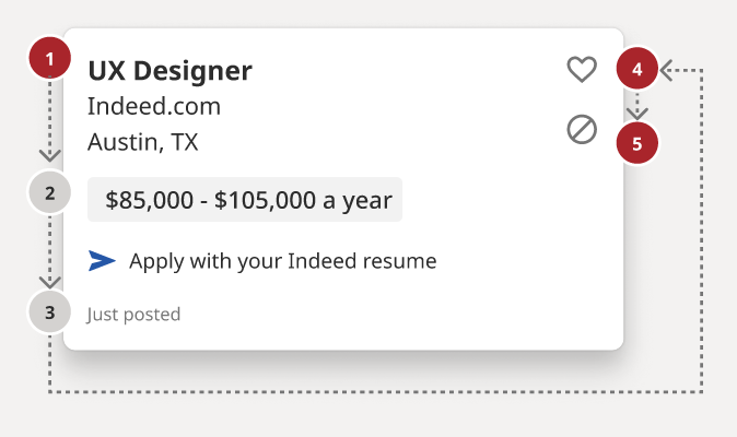
    Screenshot of a "UX Designer" job ad on the Indeed website, with numbered and coloured dots alongside the job location, salary and interaction buttons, to show reading order.
    Screenshot from the A11y Annotation Kit. The grey dots denote reading order, and the red dots indicate elements that can receive focus.
    • Stephanie Hagadorn, UX Design Lead at Indeed, writes about the creation of the “A11y Annotation Kit“. This is a Figma-based ‘accessibility library’, designed to improve the handover from designer to developer and prevent both roles from making the same old accessibility mistakes around things like colour contrast issues.
    • See the screenshot above: designers can, for example, use grey and red numbered dots to indicate the desired reading and tab order of a component. In addition, the kit gives designers a constant refresher and summary of a11y guidelines, which have been translated from the more “verbose” WCAG specifications.
    • Stephanie says: “All components are prefilled with the correct CSS or HTML elements so designers don’t have to remember things like the autocomplete value for a street field (it’s “address-level1”) or the correct landmark role for a footer (that’s “contentinfo.”). This helps developers use the right values as well.”

    Prefer longer newsletters? You can subscribe to week11y, fortnight11y or even month11y updates! Every newsletter gets the same content; it is your choice to have short, regular emails or longer, less frequent ones. Curated with ♥ by developer @ChrisBAshton.

  • dai11y 19/03/2021

    Your daily frequent11y newsletter, brought to you by @ChrisBAshton:

    Disabled buttons don’t have to suck

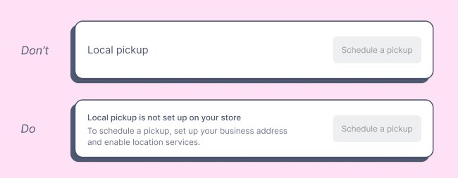
    Text "local pickup" next to disabled button "Schedule a pickup" is considered inaccessible. Provide context such as "To schedule a pickup, set up your business address"
    Credit: Justine Win.
    • Product designer Justine Win describes three alternatives to using disabled buttons, which can otherwise lead to a confusing experience (“Why can’t I click this?”):
      1. Only show what’s actionable (i.e. don’t show the button in the first place)
      2. Provide context (i.e. show the disabled button, but pairing it with additional information – see screenshot above)
      3. Enable the button by default, then show error as needed. For example, a login form where the login button is enabled, but if you don’t fill in the username or password field, a validation error is shown.

    Prefer longer newsletters? You can subscribe to week11y, fortnight11y or even month11y updates! Every newsletter gets the same content; it is your choice to have short, regular emails or longer, less frequent ones. Curated with ♥ by developer @ChrisBAshton.

  • dai11y 18/03/2021

    Your daily frequent11y newsletter, brought to you by @ChrisBAshton:

    HTML test cases

    • A useful resource for testing: a complete list of form controls, and a table of how their associated labels/legends are announced by screen readers. For example, check out input type="url" – the page describes what is announced on VoiceOver, NVDA and JAWS in Chrome, Firefox, Safari and Edge. Each page has an example of the form control for you to test your screen reader on too. Worth bookmarking!

    Prefer longer newsletters? You can subscribe to week11y, fortnight11y or even month11y updates! Every newsletter gets the same content; it is your choice to have short, regular emails or longer, less frequent ones. Curated with ♥ by developer @ChrisBAshton.