Welcome to your monthly frequent11y newsletter, brought to you by @ChrisBAshton. I hope you enjoy these a11y articles I’ve collated and summarised for you. (Psst – if you find these emails too long, consider switching to shorter, more frequent updates). Now on with the show!
Five 2022 accessibility trends
A UX Collective article outlining predicted trends for 2022:
- The web will become more accessible – particularly the websites of larger companies.
- The SOAR report found that 62% of the Alexa 100 websites were accessible to screen readers, up from 40% in 2020.
- The WebAIM Million project found a very slight improvement in the accessibility of homepages across the web (from 2020 to 2021), but it will take until “the 2070s or 2080s” at this rate for the entire web to be accessible.
- Digital accessibility lawsuits will continue to increase
- More than 4000 accessibility lawsuits (based on the Americans with Disabilities Act) were filed in the USA in 2021.
- The Hooters case found that companies can be sued even if they already have remediation efforts underway and if they’ve already entered into a settlement agreement with another party.
- We’ll see less usage of accessibility overlays
- Over 200 overlay customers were sued in 2021 for lack of accessibility on their website.
- There could well be counterclaims against overlay companies from these customers.
- One overlay company, AudioEye, had a stock value of $42 in February 2021, but recently fell to less than $7.
- WCAG 2.2 will be the new standard most companies use to determine accessibility
- The standard is expected to be finalised by the end of March 2022. WCAG 2.1 took just 4 months from being finalised to being referenced in its first settlement agreement; WCAG 2.2 is likely to follow a similar trend.
- The article suggests that the most difficult of the new WCAG 2.2 criteria to implement will be SC 3.3.7: Accessible Authentication.
- Large companies will want to get a head start on WCAG 3.0
WordleBot is a shortcut that brings accessibility to your Wordle results
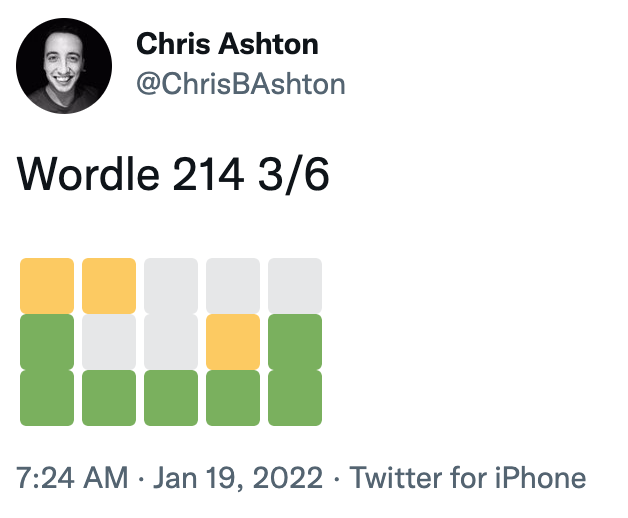
Unless you’ve been living under a rock in 2022, you’ll no doubt have come across Wordle, the viral word guessing game that has people sharing their results in a grid on social media, like so:
The resulting grid of coloured squares represents how many letters of each guess was correct, and ultimately how many guesses were needed before the correct word was arrived at. But it’s something of an accessibility nightmare for screen reader users.
Federico Viticci has attempted to fix the issue, by building WordleBot. This is a shortcut for iOS and macOS which edits the text in your clipboard to have a more accessible output, like so:
Wordle 207 5/6
⬜🟨🟨⬜⬜ (2 partial)
🟨🟨⬜⬜⬜ (2 partial)
⬜🟩🟨🟩⬜ (1 partial, 2 perfect)
⬜🟩⬜🟩🟩 (3 perfect)
🟩🟩🟩🟩🟩 (Wordle done on Line 5)— Federico Viticci (@viticci) January 12, 2022
It’s a nice idea, and a valiant effort by Federico, but is a manual workaround that only works for Apple customers. I’d like to see somebody build a Twitter bot that automatically responds to inaccessible Wordle tweets and provides alt text responses – or better yet, the creator of Wordle could change the share text directly.
PS: Wordle has inspired all sorts of creative endeavours, including a Wordle-to-music generator, Wordle-to-Townscaper and Wordle cross-stitching!
a11ymyths.com
(Accessibility Myths, shared by Smashing Magazine)
Sergei Kriger debunks 22 myths about accessibility on the web, such as accessibility only being for blind users. I’ve not heard of all of these myths, so some items were added just in keeping with the format, I think, but it’s worth a quick read nonetheless, and as prompted at the end of the page, you’re encouraged to “show this website to your manager”.
Also see its sister website, a11yfacts.com, for a list of statistics on disabilities (e.g. 15% of the world’s population has a disability) and how certain demographics use the web (e.g. 67.7% of screen reader users use headings for navigating).
Game Demos Need to Come Back For Many Reasons, Especially for Accessibility
Thought-provoking article by Ben Bayliss, describing how game demos were a great vehicle for testing a game’s accessibility before purchasing the game. Demos used to come on a disc bundled with PlayStation Official Magazine (and others), but in the digital era are increasingly hard to find.
Without demos, disabled gamers are forced to watch YouTube videos of other people reviewing the games, to figure out whether or not it will be accessible to them. “Major game outlets rarely touch on accessibility in our reviews or editorials that go live around launch”.
Some companies are beginning to make an effort in this area. “Ubisoft have been more proactive in inviting disabled content creators and journalists to events such as Ubisoft Forward, allowing them to spend time with the game and inform their audience specifically about accessibility”. It also “shares its efforts through blog posts and has a dedicated team“.
“Some studios such as SMG Studio and Team 17 released videos showing accessibility features available at launch. This is vital information to be sharing, but there’s a huge difference between a blog post or a short clip on accessibility features and how these actually feel in play. And that goes for both accessibility and the game as a whole in general.”
Building The Most Inaccessible Site Possible
In this 35m video from Smashing Meets (December 2021), Manuel Matuzović starts off with a simple HTML site that is considered 100% accessible by Lighthouse. He then deliberately breaks its accessibility as much as possible, without Lighthouse noticing. He calls this process “Progressive Degradation”.
He wraps all content in a <div aria-hidden="true">, which lowers the score because the wrapped content contained focusable descendents. Manuel then made these non-focussable (swapping the input button for a <div>, and changing the href of a link to an onclick). This then raised the accessibility score back to 100%.
It was quite fun seeing how Manuel disables keyboard zoom shortcuts (by adding a listener to the onkeydown event). He also overrides the cursor with a custom image that is offset 100 pixels from the actual click area, making it very difficult to click accurately! Manuel finishes by applying a filter to the text so that it is visually faded out (having already set himself the goal of not using display: none, visibility: hidden or opacity: 0, which would be too easy). As a bonus, he translates all text to HTML entities, so that people can’t even ‘view source’ to read the content.
The aim of the talk is not to make fun of Lighthouse, but to point out that automated accessibility testing can only be used as a guide. It is not a reliable summary of how accessible your site actually is. Indeed, Manuel runs his website through a few more automated tools at the end of the talk, none of which detects all of the issues that he’s introduced.
Standardizing Focus Styles With CSS Custom Properties
Stephanie Eckles shares a useful snippet for setting your focus styles consistently:
:is(a, button, input, textarea, summary) {
  --outline-size: max(2px, 0.08em);
  --outline-style: solid;
  --outline-color: currentColor;
}

:is(a, button, input, textarea, summary):focus {
  outline: var(--outline-size) var(--outline-style) var(--outline-color);
  outline-offset: var(--outline-offset, var(--outline-size));
}
This applies focus styles to all standard interactable elements, and provides hooks for you to customise parts of the outline style where needed, e.g.
summary {
  --outline-color: lightskyblue;
}
Some designers like to only apply focus styles when an interactable element is tabbed to via keyboard (as opposed to clicked on with a mouse). Stephanie explains how to use the :focus-visible selector to achieve this. The :focus rule above can be swapped± for :focus-visible, and then an outline: none applied when the focussed element is not :focus-visible.
:is(a, button, input, textarea, summary):focus-visible {
  outline: var(--outline-size) var(--outline-style) var(--outline-color);
  outline-offset: var(--outline-offset, var(--outline-size));
}
:is(a, button, input, textarea, summary):focus:not(:focus-visible) {
  outline: none;
}
± whilst browser support for the :focus-visible selector is still gaining traction, Stephanie advises not replacing the :focus rule, but duplicating it instead. Browsers throw out selectors they don’t understand, so we can’t simply join the selectors with a comma (i.e. :is(...), :is(...):focus-visible {}). By maintaining both a :focus and a :focus-visible block, we ensure that browsers that don’t support :focus-visible – but do support CSS custom properties – have visible focus styles. At time of writing, those browsers are Safari and ‘UC Browser for Android’.
Web Almanac 2021, Chapter 9: Accessibility
The Web Almanac is “HTTP Archive’s annual state of the web report”, which started in 2019. It is split into 24 chapters concerning all sorts of topics, such as security, CDNs, SEO, Jamstack, and Ecommerce. We’re going to concentrate on chapter 9 – Accessibility – which in itself is a long read.
Depressing statistics:
- Just 22% of sites have sufficient colour contrast; roughly unchanged from 2019 and 2020.
- 24% of desktop homepages, and 29% of mobile homepages, disable user zooming/scaling. This includes many of the top 1,000 sites globally.
- Around 69% of font sizes are set with
px, as opposed to more scalable/accessible alternatives such asem. - There’s a mixture of usage of HTML5 elements. Just 28% of sites have a
<main>element, but around 62% have<header>and<nav>elements. - Surprisingly, more than half of sites make use of
tabindexattributes. - Just 58% of sites have properly ordered headings, i.e. no levels skipped.
- We’re generally poor at creating accessible tables. Just 5% of sites which make use of tables provide a corresponding
<caption>element. - Almost a third of form inputs have no accessible name (i.e. no label). Around 58% of sites use a
placeholderattribute, which is not very accessible to assistive technologies, and of these sites, nearly 65% had nolabel, implying that theplaceholderis being improperly used as a label. - Videos were found on 5% of sites. Of these, a corresponding
<track>element – designed to have the same benefits asalttext for images – was found on less than 1% of videos. That said, “this figure may not account for video content loaded by a third party<iframe>, such as an embedded YouTube video”.
Positive statistics:
- 80.5% of sites have a
langattribute, with 99.7% of these being valid values. - Surprisingly, almost 32% of sites use the
prefers-reduced-motionmedia query; a relatively recent CSS addition. - Less than 1% of pages make use of an accessibility overlay.
Interesting tidbits:
- 91% of desktop pages have
:focus { outline: 0; }declared. “In some cases, it is removed so that a more effective custom style can be applied. In many cases it is simply removed and never replaced, which can render a page unusable for keyboard users”. The almanac doesn’t dig deeper on numbers though. - Around 20% of sites are estimated to have a skip link (there’s no reliable automated test for this).
- CAPTCHAs were found on around 10% of sites. These are notoriously inaccessible.
- 18-19% of pages contain at least one anchor element with
role="button". “A native<button>element would be a better choice, per the first rule of ARIA.” - The most popular ARIA attribute is
aria-hidden(used by 53% of sites), followed byaria-label(52%). - 14.3% of pages have the class
sr-onlyorvisually-hiddenon some elements, implying that they are providing text that is only visible to screen reader users.
The chapter concludes:
As an industry it is time that we acknowledge the story told by the numbers in this chapter; we are failing people with disabilities. The numbers from 2021 have not moved substantially from 2020. We need to do better, and this has to come from a combination of top-down leadership and investment (including the ongoing participation from browsers) and bottom-up effort to push our practices forward and advocate for the needs, safety and inclusion of people with disabilities using the web.
University Students Create Cutting-edge Wearable Navigation Devices

An article from July 2020 that’s been in my bookmarks for… well, you do the math.
A group of students from Harvard University have launched a startup called Foresight, a “wearable navigation aid for people with vision impairments”. It connects to the user’s camera, worn in a placeholder around the neck, which detects nearby objects and triggers tacticle ‘soft textile units’ on the body. These ‘inflate’ to provide haptic feedback as objects approach and pass, with the pressure increasing as objects get closer.
Why Don’t Developers Take Accessibility Seriously?
Melanie Sumner writes an engaging CSS Tricks article, exploring different perspectives on web accessibility in 3 ‘acts’:
- Melanie laments how the accusatory tone of some accessibility advocates doesn’t help. Developers have a lot to learn in their careers beyond just HTML/JS/CSS. In the absence of good accessibility from educational resources, frameworks and tooling, it’s no wonder that the output isn’t perfect. Implying that devs are deliberately excluding people, or are crap at their jobs, is only going to make them defensive.
- But for users who need better accessibility in order to navigate the web, the frustration “can boil over”. It can feel to them like they don’t matter, and the only way of getting heard is to demand the treatment afforded to them in law. Melanie says this can lead to a negative feedback cycle; some tech folks may opt out of listening because of the “rude” way it is delivered to them, and others may become overwhelmed as they begin to recognise the responsibility on their shoulders.
- The final act concerns a designer who feels ‘restricted’ by accessibility. They want to use certain colours, knowing it doesn’t pass colour contrast guidelines. “Please consider this: you’re not designing for yourself. This is not like physical art. It’s a false choice to think that a design can either be beautiful or accessible.”
Melanie concludes by asking us to approach our work, and the people around us, with compassion and curiosity. Don’t try to fix the past, but be resolute going forward: make sure the code samples you write in your next documentation are accessible; include accessible annotations in your next design; include an accessibility talk in your next conference.
EU Runs World’s Largest Accessibility Test
A Deque article that is well worth a read. The EU Web Accessibility Directive (issued in October 2016) stipulated that all government agencies in the EU were required to ensure their websites and apps are accessible by June 2021.
Every country has to monitor the accessibility of its digital assets annually and report its findings to the EU every three years. December 23rd, 2021 was the end of the first reporting period. This article looks at those reports and picks out some highlights; I’ve pasted some key paragraphs below:
“Having a fully accessible website is sort of like having a dust-free house. If you work hard at it, it is something you might achieve, but keeping it that way is almost impossible. The real question is how common and how substantial the accessibility problems are. This is difficult to say, as there is no standard way to measure this. Unfortunately, this means that in the next report, it will be difficult to judge if web accessibility in those countries improved over time.”
“Kudos to the countries that did attempt to quantify their findings. We can’t make direct comparisons between countries because they don’t use the same metrics, [but] three years from now we will be able to see to what extent accessibility has improved. One example is www.toegankelijkheidsverklaring.nl, a register of Dutch Government websites, ranked A to E.”
“The European standard EN 301 549 (v2.1.2) includes a good number of accessibility requirements that are not part of the Web Content Accessibility Guidelines (WCAG). For example, section 11.7 requires apps to support user preferences configurable through the operating system. It is therefore notable that more than half of the countries did not consider the additional EN requirements in their monitoring efforts.”
“All 27 EU members conducted research. The United Kingdom produced a report as well, though there was no formal obligation to the EU. The UK ceased to be a member state of the European Union on the 31st of January 2020. What we loved was how the UK communicated their results and retested the sites 3 months later to see how much they had progressed. This showed that sharing these results greatly improved these sites.”
“[This] is a great step forward for establishing digital accessibility as a standard across Europe. As always, there is room for improvement. The need for standard metrics in accessibility, for example, is a common limitation of the current standards, which the upcoming WCAG 3.0 may address. The next reporting period for the EU ends in December 2024, although we hope monitoring agencies will consider publishing preliminary results annually.”
Be the change you want to see in the world
This isn’t an article, but I just wanted to share a story from frequent11y subscriber Nick, who recently contacted me by email.
Nick noticed that common electrical items such as extension cords and adapters, sold for consumer use, have important safety information embossed on the items themselves. Despite being in all-capitals, the text can be hard to read, as the text is not coloured – only raised – and is written in small type.
The safety information is certified by a certifying organisation such as Underwriters Laboratories (UL). Nick reached out to UL to ask them to consider making it mandatory in their certification standards that contrast be sufficient across all kinds of products. For an analogy, he cited an IT standard and described how to determine contrast between two colors. He received a response promising to forward his request to the relevant people.
I think this serves as an important reminder that there is always more that can be done to improve accessibility, and sometimes all it takes is an email to invite change.
Next-generation spinal implants help people with severe paralysis walk, cycle, and swim
“Three men paralyzed in motorcycle accidents have become the first success stories for a new spinal stimulation device that could enable faster and easier recoveries than its predecessors.”
“The men, who had no sensation or control over their legs, were able to take supported steps within 1 day of turning on the electrical stimulation, and could stroll outside with a walker after a few months, researchers report today.”
“The nerve-stimulating device doesn’t cure spinal cord injury, and it likely won’t eliminate wheelchair use, but it raises hopes that the assistive technology is practical enough for widespread use.”
“For now, sending commands to the device is cumbersome. Users must select their desired movement on a tablet, which sends Bluetooth commands to a transmitter worn around the waist. That device must be positioned next to a “pulse generator” implanted in the abdomen, which then activates electrodes along the spine. Setting up to use the stimulation takes 5 to 10 minutes. But the next generation of devices should allow users to activate the pulse generator by giving voice commands to a smartwatch.”
The article goes into detail about how this device differs from previous spinal cord stimulators, and a bit about the history of such devices, which have their roots in the 1980s and were originally intended to treat chronic pain.
Shirt with magnetic buttons provides independence
I came across the above post on LinkedIn about a year ago; a video of a man called Lincoln, who has cerebral palsy, putting on a shirt unaided. The shirt looks like a standard button shirt, but uses magnets for fastening. The typically viral LinkedIn post was lacking in detail, so I did some Googling, and found the company that creates these shirts.
US-based MagnaReady was started by Maura Horton when her husband Don developed Parkinson’s Disease. When he started having difficulty fastening his shirt in 2009, Maura had the idea about using magnets, and eventually started the company. Watch the video (~5m) for the full story.
Sadly, Don passed away in 2016, but the company remains active and has a range of casual, athletic and sleepwear clothing for men and women.
The crisis is real: Where are the web accessibility professionals?
A WebAIM article with some real food for thought.
“The number of job listings with ‘accessibility’ in the title grew 78% in the year ending in July [2021] from the previous 12 months”. That’s on top of the 38% increase from the previous year. By 2027, the global accessibility testing market is poised to hit $606 million. Demand for accessibility professionals has never been higher.
But there’s relatively low take-up amongst newcomers to the industry. “WebAIM’s 2021 Survey of Web Accessibility Practitioners had a significantly higher level of respondents that were over the age of 45 (37.3%) than did the 2020 Stack Overflow survey of web professionals as a whole (8.9%).” The article suggests that the industry may reach chronic shortages when these individuals retire.
The article blames a lack of mandatory accessibility teaching in higher education, and calls for companies to pay accessibility professionals higher salaries to attract more people into this part of the industry.
Which accessibility settings do the Dutch really use on their phone?
I came across this article via a LinkedIn post by Gareth Ford Williams, which also summarises the article quite nicely.
This article looks at how over a million people use their phones in the Netherlands. 43% of users surveyed use at least one accessibility setting, the most common one being “adjust text size” (33%). Interestingly, of that 33%, 13% made the text smaller (meaning 20% made the text larger).
Only 1.27% of respondents have closed captions switched on by default, but as Gareth points out, this is likely because they’re more comfortable setting this feature on the app or website level. The figure is closer to 80% when looking at Netflix, Facebook and Twitter.
There are a whole host of other statistics about all sorts of accessibility features throughout, and reference to why such features might be enabled. This can include situational impairments (disabling “shake to undo” while on a rattling bus or train), educational (non-native speakers enabling captions while learning a new language), etc, as well as disabilities.
2021’s sample size of >1 million respondents is in stark contrast to the original study in 2020, which had just 268. The end of the article goes into detail about how it managed to achieve such high numbers this time around.
Whew, that was a long newsletter! Did you know that you can subscribe to smaller, more frequent updates? The dai11y, week11y and fortnight11y newsletters get exactly the same content. The choice is entirely up to you! Curated with ♥ by developer @ChrisBAshton.