EDIT (6th February, 2015): since publishing this post, I’ve been informed about Element Queries; a W3C discussion about the need for element queries and their required implementation. When I say “Localised CSS”, I was referring to what the world now knows as Element Queries – only I didn’t know it yet. It can be hard to know what to Google in preparation for your blog post! Anyway, I have now contributed my Localised CSS polyfill to the Element Queries group.
For historical note, the original blog post is captured below in its unedited form.
We’ve been doing responsive design all wrong.
I’m not talking about what the end-user sees. If we follow current best practices (mobile-first, progressive-enhancement, unobtrusive JavaScript and the like), mobile users and those reliant on screen-readers have never had it better than they do today.
I’m talking about the way we develop. We’re making lives hard for ourselves, setting ourselves up for challenges we can’t possibly win. We’ve tried to make life easier by using pre-processing tools like SASS, allowing us to use variables in our CSS and split it into logical modules. We use CSS linting tools to spot bugs and duplication before it happens. We try and follow a “mobile-first” development mindset, standardising the approach we take to development, improving consistency in our codebase and lessening the learning curve for other developers joining our projects (as well as providing an efficiency boost when rendering on mobile devices).
Despite all this; robust and elegant responsive designs are very hard to achieve. Why? Because they require the developer to keep a massive, ever-growing mental model of the design in their heads.
Example: imagine a typical WordPress template. Its sidebar contains a widget-like list of the latest articles, represented by a title and thumbnail. Clicking on any of these list items takes the user to the corresponding article page.

On a narrow viewport width of say, 300px, the screen is too small to accommodate the sidebar on the side, so the sidebar slots underneath the main content. Within the sidebar, we want the article thumbnail to stretch to the width of the screen (width: 100%) and the article title to slot below it. This is our “mobile” view*.

Stretch the viewport width to say, 500px, and now the article thumbnail is looking pixelated and taking up too much screen space. We want to set a width of 50% for the thumbnail, and have the items listed horizontally (float: left) so that we have two article thumbnails per line.

Viewing the theme on an even wider viewport, say 800px, means we have enough space for the sidebar to float to the right hand side of the page now. It no longer needs to slot underneath the main content. But, naturally, the sidebar itself is no longer the full width of the screen.

The sidebar is now about 200px wide, but our thumbnails are set at 50% width, so are only taking up a pitiful 100px each – we need to add an additional media query to make the thumbnails 100% width again when the viewport is 800px wide.

The resulting CSS might look a bit like this:
.list .list-item {
  display: block;
}
@media only screen (and min-width: 500px) {
  .list .list-item {
    width: 50%;
    float: left;
  }
}
@media only screen (and min-width: 800px) {
  .list .list-item {
    width: 100%;
    float: none;
  }
}
That’s complicated, which is bad enough. But even worse than complicated media queries are unmaintainable media queries.
Let’s say a couple of months down the line, designers decide to change the width at which the sidebar is able to float to the right, from 800px to a new threshold of 900px. If we forget to update the media queries for our article list, anyone coming to the site on a 850px screen will see the sidebar below the main content (i.e. full width of the screen) but with MASSIVE 100%-width thumbnails!
This scenario is just one component of the website. Most websites are made up of dozens of individual components. Think of the world’s largest websites, where different components are developed by different teams. How on earth do they communicate and keep that kind of information up to date?
Wouldn’t it be nice if we could write CSS that responds locally to changes in the size of element containers, rather than globally to changes in the size of the viewport? Instead of a bunch of horrible, complicated media queries which require the developer to maintain a mental model of every breakpoint in their responsive design, we could write simple CSS like this*:
.list .list-item {
  display: block;
}
@media only local (and min-width: 500px) {
  .list .list-item {
    width: 50%;
    float: left;
  }
}
In this proposed solution, we’re instructing the browser to apply a width of 50% and a “float: left” style to the “list-item” class only when the “list” element is a minimum width of 500px. The keyword here is inside the media query, and that word is “local”.
For a proof of concept, I created a GitHub repository: Localised CSS.
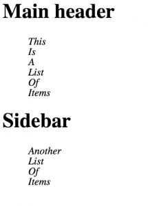
Here is the working example from the repository. When the viewport is narrow, the list of items is displayed as a block (i.e. each one sits below the previous one).
When the viewport is a bit wider, the “display: inline” comes into effect, and the list items display one after the other in a horizontal line.

So far, there’s nothing special here – both scenarios can be easily achieved using standard media queries. But let’s make our viewport a little wider…

This screenshot shows our localised CSS working with a wider screen. Now that the screen is sufficiently wide, I’ve made the decision to move the sidebar up alongside the main container, thereby making the sidebar smaller. The really exciting thing here is that both lists are displayed according to the contexts of their containers, NOT the viewport.
The implications of this are massive. By writing localised CSS, we are no longer required to think what the state of the system will be globally when deciding how we should render our element locally. We’re effectively decoupling the responsive design of our components from the responsive design of the system as a whole. We could create truly elegant, reusable, portable components, and fluid, robust, truly responsive overall designs.
Localised CSS is not without its problems, and we face a number of difficulties:
- The fact that it’s a JavaScript library means there’ll be a momentary “flash” of unstyled content while the JavaScript is downloading and executing. Also, users with JavaScript disabled will only see the default (mobile**) CSS you supply.
- Getting hold of the raw CSS – since we’re using JavaScript, only stylesheets from the website domain can be processed. External stylesheets raise cross-domain issues.
- How to write the CSS in the first place (should it be an element nested inside a media query, or a media query nested inside an element? Should both be allowed?)
- Parsing the CSS is a fairly complex problem.
- How to apply that localised CSS (e.g. if setting ‘style’ attribute directly, we risk overriding any existing style attribute).
- How should we re-render efficiently? On each render, the script performs element width calculations. DOM manipulation is expensive.
- How can we handle infinite loops? For example, let’s say a child element is set to be 400px wide if its container is less than 300px wide. This naturally makes the container 400px wide, meaning we remove the child’s 400px-wide style on the next render, meaning the container becomes less than 300px wide again, and so on…
If we can overcome these issues and make localised CSS a viable technique, thousands of developer-hours spent on complicated front-end bugs can be saved, amounting to billions of dollars in saved revenue, allowing for accelerated advancement in other key areas of tech, meaning we get time travel machines and water-to-chocolate generators that little bit faster.
My tongue may be somewhat in my cheek, but I genuinely believe a more modular approach to front-end development is a critical step to improving site maintainability.
Are you a front-end developer? This is a call to arms. Fork my Localised-CSS repository, help me overcome these difficulties, and make this dream a reality.
Become a part of the next web development revolution! The world needs localised CSS.
Footnote:
* This CSS isn’t as clear as I’d like it to be. I tried a few things such as setting the container explicitly, i.e. “@media only local and (container: ‘.list’) and (min-width: 300px)”, but the “container” attribute is invalid and means this block of CSS is not delivered correctly via the JavaScript CSSStyleSheet property API.
** I disapprove of the term “mobile” view, since mobiles have such a range of dimensions these days, and the line between “mobile” and “tablet” is definitely blurring. Still, it gets the point across.
