Category: fortnight11y

Accessibility themed newsletter released every fortnight.

  • fortnight11y issue 58

    Your fortnightly frequent11y newsletter, brought to you by @ChrisBAshton:

    US Accessibility Lawsuits

    There have been a number of accessibility related lawsuits in America of late. As ever, I’ll try my best to summarise, but bear in mind I am no legal expert.

    On Reconsideration, Judge Albright Transfers AudioEye, Inc. v. accessiBe Ltd. In December 2020, AudioEye accused accessiBe of infringing 9 patents, as well as committing false advertisement. The lawsuit has dragged on since then on the basis of where the case should be heard. It was originally filed in the Western District of Texas (WDTX), but accessiBe requested that it is heard in New York (WDNY) instead. After initially declining, the Judge has now agreed to transfer the case to WDNY; the article goes into details on why.

    As Refining harm in Web Accessibility cases: Harty v. West Point Realty describes, New York is the most popular district court to process ADA web accessibility cases. In this West Point Realty case, the plaintiff attempted to visit the hotel’s website but “couldn’t discern from the room description whether the accessibility features in the hotel room meet his needs”. This allegedly violates the Department of Justice’s 2010 ADA regulations that require hotels to “identify and describe accessible features in the hotels and guest rooms offered through its reservation service“.

    However, in such cases, the plaintiff must demonstrate that the violation brought them harm, something author Ken Nakata summarises as the “no harm, no foul” rule. It’s clear that the plaintiff would suffer a real harm should they book the hotel room believing that it is accessible, and then can’t navigate their wheelchair into the bathroom. But Ken doesn’t believe this lawsuit will succeed on the basis of “emotional injury” alone.

    The final case I’d like to look at – also centred in New York – is Early Win for Deaf Plaintiff in VR Captioning Lawsuit. In 2020, Dylan Panarra, who is deaf, filed a lawsuit against the HTC corporation, arguing that they violated the ADA for failing to include captioning in their virtual reality content (housed on their subscription service “Viveort Infinity”). The case is still ongoing, and is the first known case about virtual reality captioning, so is an important one to keep an eye on.

    24×24 pixel cursor bookmarklet

    Adrian Roselli shares a JavaScript bookmarklet which turns your cursor into a 24 by 24 pixel square.

    It is designed to test the new Understanding Success Criterion 2.5.8: Target Size (Minimum), which will be introduced in WCAG 2.2 (currently draft). The criterion specifies that “the target offset is at least 24 CSS pixels to every adjacent target”, to “help ensure targets can be easily activated without accidentally activating an adjacent target”.

    Adrian adds a disclaimer that, as this is a new SC, it is still in flux and may not even be a square when done. Follow the GitHub discussions for updates.

    Google: Accessibility Not A Direct Ranking Factor

    This is a short article that’s well worth a quick read. Google’s Search Advocate John Mueller says, in an office-hours hangout recorded on March 25th, that accessibility plays no part in Google search ranking. In other words, an accessible site is no more likely to be ranked higher in search results than a less accessible one.

    The underlying reason for this is measurability: no automated tools can give a true evaluation of accessibility, though there are things like Google’s own Core Web Vitals which provide some automated ways of measuring accessibility.

    Google already considers the mobile-friendliness of a site in the search ranking, which helped encourage companies across the world to invest in responsive. It feels like there’s a real opportunity here to make businesses value accessibility more by making it a search ranking factor. But for now at least, this isn’t on Google’s roadmap.

    The Future of CSS: CSS Toggles

    Article by @bramus, discussing the new CSS Toggles Unofficial Proposal Draft, alongside the demo site for the proposed feature.

    “CSS toggles are a mechanism for associating toggleable state with a DOM element”. Perhaps this is best summarised in a code example:

    html {
      toggle-root: lightswitch; /* Create a toggle named lightswitch. It will cycle between 0 (inactive, default) and 1 (active) */
    }
    
    button {
      toggle-trigger: lightswitch; /* When clicking the button, toggle the lightswitch */
    }
    
    html:toggle(lightswitch) {
      /* Styles to apply when the lightswitch toggle is active */
    }

    This should make it much easier to define global toggles such as dark/light mode, applying reduced motion, switching to low data modes, etc, allowing us to apply the necessary styles without relying on JavaScript.

    For now, this is just a prototype, and is subject to change. To start using this today, you’d need to use the polyfill.

    I’m Deaf And I Have ‘Perfect’ Speech. Here’s Why It’s Actually A Nightmare.

    Rachel Zemach writes about some of the frustrating encounters she’s had, as someone who became Deaf at the age of 10 (and had already learned to speak). Her speech is indistinguishable from someone who is not deaf, and she can ‘lip read’, which is problematic, as we’ll discuss below.

    Incidentally, I’d come across the term ‘Deaf’ (with a capital D) before, but wasn’t quite sure when it should be used. Rachel links to an article describing the difference, which essentially comes down to whether or not the subject sees their deafness as an identity; a community that shares a mutual culture and language. Hence Rachel “became Deaf” at the age of 10, and “someone who is not deaf” refers simply to the medical definition of hearing loss. But I digress…

    Lip-reading is hard, and pretty inaccurate: “55% to 70% of English is not lip-readable because many sounds are made deep in the mouth or throat”. This makes Rachel’s encounters with waiters and the like all the more frustrating, when, upon realising Rachel can lip-read and speak, they push to communicate only in speech. This contrasts heavily with when Rachel is out with her Deaf friends, who can not or choose not to lip-read/speak, where waiters are far more willing to ‘pantomime’ gestures to communicate.

    Rachel has concluded that she will try and avoid speaking in future. She finishes with a request:

    If you’re a hearing person, please, when you meet someone who says they can’t hear you, take your cues from them. Do they want you to write what you have to say? Do they want you to take down your mask and speak slowly? Do they want you to pantomime? Deaf and hard-of-hearing people are the experts on how to communicate with them. Ask them openly and earnestly and respect their solutions, which they’ll undoubtedly have.

    Routing: I’m not smart enough for a SPA

    I came across this via Anselm Hannemann’s Web Development Reading List. The author, Taylor Hunt, goes into a lot of detail about why they chose a traditional website over a Single Page Application (SPA), for a recent project.

    There are a lot of accessibility concerns to consider when building an SPA, including:

    • Restoring scroll positions between navigations
    • Focussing on the last-used element when going ‘back’
    • Focussing on an appropriate element when going ‘forward’
    • And all the other client-side gubbins: back/forward history buttons, double-clicks, timeouts, ‘CMD + Click’, etc…

    But the bit that struck me the most was this guideline from the article. We should favour:

    • Security even over accessibility (“downgrading HTTPS ciphers for old browsers isn’t worth letting credit cards be stolen”)
    • Accessibility even over speed (“a fast site for only the able creates inequality, but a slower site for everyone creates equality”).
    • Speed even over slickness (deliver a fast site rather than an unnecessarily fancy one).

    The battle of security vs accessibility was something that struck me in my article, I Used The Web For A Day On Internet Explorer 8, where I was faced with the dilemma that certain sites forced TLS 1.1, and my browser was only capable of TLS 1.0. The sites’ security policies made them inaccessible to me, but I had to concede that this was probably the right call.

    Cabinet Office signs £400k deal for digital accessibility audits

    To audit the accessibility of its digital services, the Cabinet Office has signed a two year deal with Digital Accessibility Centre (DAC) – a non-profit organisation based in Wales.

    Adding context to the deal, which Civil Service World values at £436,632, the article states: “Research conducted over the past two years, and published by the CDDO in January, found that about 99% of public sector websites contained accessibility issues representing a potential problem for users with physical or cognitive impairments – as well as a possible breach of the new regulatory requirements.”

    Side note: DAC are not to be confused with Deque (pronounced “dee queue”), a leading accessibility organisation that also does accessibility audits. Not knowing how the latter was pronounced, I must admit I mixed up the two when I heard colleagues talking about their accessibility audits, and only recently clarified it in a work chat!


    Did you know that you can subscribe to dai11y, week11y, fortnight11y or month11y updates! Every newsletter gets the same content; it is your choice to have short, regular emails or longer, less frequent ones. Curated with ♥ by developer @ChrisBAshton.
  • fortnight11y issue 57

    Your fortnightly frequent11y newsletter, brought to you by @ChrisBAshton:

    GOV.UK fixes a noisy screenreader issue

    GOV.UK had discovered that in recent versions of screen readers, its contact form was too aggressive in announcing how many characters were remaining. This was despite the existing markup of aria-live="polite".

    I’ve been keeping an eye on the GitHub issue for this, and a fix was merged recently. There are now three elements responsible for character count announcements:

    1. A static element: “You can use up to 200 characters”. This is visible for non-JavaScript users, and visually hidden otherwise.
    2. An injected, live-updating element showing the characters remaining. This has aria-hidden="true" to hide itself from screen readers.
    3. An injected, debounced element showing characters remaining, visually hidden and aria-live="polite". It only updates after 1 second of inactivity, and only announces once the user has passed the threshold (if a threshold has been set).

    This looked like quite a thorny issue to resolve – well done to the Design System team for getting it updated! I hope to see an official blog post on it soon 🤞

    Interesting WebAIM threads

    WebAIM (“Web Accessibility In Mind”) is a non-profit organization based at Utah State University, and is most famous for its annual accessibility analysis of the top million websites.

    It also has an email discussion list, whereby anyone with an accessibility question can start a thread asking for advice. These next threads landed in my inbox recently, and looked pretty interesting:

    First, Links within image captions. Jo wanted to check whether having links inside <figcaption> was an accessibility fail. The consensus seemed to be that it was OK.

    Next, Links that open new windows and/or go off site: “do they need to have an icon or additional text?”. There was initially consensus that the absence of these would not be a WCAG fail, but on further sleuthing, the conclusion was that it would in fact violate SC 3.2.2 .

    Finally, Accessibility a external content, in which Christopher wonders if there’s a material difference between linking to, and embedding, inaccessible content. The motivation for the question was that if people knew they needed to wrap captions around an embedded video that lacks them, but didn’t need to if simply linking off to the video, then people might decide to only use linking from now on. It led to an interesting discussion, but nothing conclusive.

    Introduction to Web Accessibility course

    Quick shout-out to edx.org, which is offering a free “Introduction to Web Accessibility” course. It takes an estimated 4-5 hours per week, for 4 weeks, to complete the course, but you can go at your own pace.

    It covers WCAG, POUR, finding W3C resources, and how you can check pages for issues.

    Can the internet be made accessible for all?

    This is a video clip (5m28s) from the BBC’s Dragon’s Den. Rene and Andy Perkins have founded a company, CityMaaS, aimed at improving accessibility on the web. They’ve created a product, Assist Me, which they hope to see companies embed on their websites (at a subscription fee of £30 to £45 per month). Assist Me is a button that triggers a popup menu where the user can adjust font size, turn on a screen reader, etc. In other words, this is an accessibility overlay.

    The investors didn’t probe into why accessibility overlays are bad, but did express that this sort of assistive technology should exist on the user’s machine so that it can be used on any website. The founders’ response was that this puts the onus (and expense) on the user, and is therefore wrong.

    The company has a couple of other products but they didn’t get much airtime. The Mobility Map looked promising – a way of seeing the accessibility information of any public place. But it’s behind a paywall, which is disappointing, as I really think there’s a gap in the market for making it easier to find accessible housing.

    None of their products look any good to me, but I do applaud any opportunity to raise awareness of digital accessibility issues on prime time TV.

    Braille Scanner iOS app

    Developer Aaron Stephenson has developed a free ‘Braille Scanner’ app for iOS, which allows you to take a picture of a paper Braille document, and it will convert it to text, using a combination of image processing and machine learning. It supports Unified English Braille grade 1 and does not currently read other types of Braille.

    One use case would be for people who are learning Braille and want to double-check what they’ve written. Watch a video demonstrating how Braille Scanner works on Twitter.

    Free events at AbilityNet

    Kelly from the charity AbilityNet got in touch with me to let me know about some free events that might be of interest to frequent11y readers.

    Training on Wednesday 4th May (10am BST): How to build a disability inclusive workplace. “Discover where your organisation currently sits on our disability inclusion gap analysis scale overall and at each stage in the employee lifecycle”.

    The “inert” attribute is finally coming to the web

    Stefan Judis writes about the HTML inert attribute. When applied to a container, it renders all children inaccessible, i.e. you can no longer tab to or interact with any form elements within.

    This will be super useful for properly implenting modal windows, such as a confirmation dialog asking if you’re sure you want to delete your account. With inert, you can ensure the user can’t tab away from the modal and continue to navigate around the page.

    Browser support has been very poor, but that’s about to change. Stefan summarises:

    Now, Safari Tech Preview ships it with v143, Chrome will enable the attribute with Chrome 102 in May and Firefox implements the feature behind the html5.inert.enabled flag.

    PS: Stefan writes a fantastic weekly newsletter about web development – I suggest checking it out!


    Did you know that you can subscribe to dai11y, week11y, fortnight11y or month11y updates! Every newsletter gets the same content; it is your choice to have short, regular emails or longer, less frequent ones. Curated with ♥ by developer @ChrisBAshton.

  • fortnight11y issue 56

    Your fortnightly frequent11y newsletter, brought to you by @ChrisBAshton:

    We start with a “resources special”, covering tools, training and libraries that have landed in my inbox recently!

    Web Accessibility by Google

    This is a free Udacity course, aimed at giving “advanced” skills to developers over a span of approximately 2 weeks. It covers developing for screen readers, semantic markup, and managing focus, with material by industry heavyweights such as Rob Dodson.

    This course relates to an optional (paid) “Nanodegree program” that gives you a certification in being a “Front End Web Developer”.

    Usability Testing with People with Disabilities

    Knowbility.org – a nonprofit org based in Texas, serving globally – has an “AccessWorks database” of hundreds of people with disabilities including blindness, deafness, mobility impairments and cognitive disabilities.

    You can hire these volunteers to help with usability testing your website. Knowbility works as the go-between, negotiating the quote with the business, educational institution, government agency, or nonprofit.

    I have no experience of working with them, so can’t vouch for how well it works, but I like the idea; anything that makes recruiting real users easier seems like a good thing. It looks like the users get paid at least $75 per test.

    Designing accessible services

    This guidance by the UK Home Office covers best design practices for supporting users with a variety of disabilities, including anxiety, autism, deafness, dyslexia, low vision, mobility disabilities and blindness.

    Each category is summarised in just a handful of key points, so it doesn’t take long to read them all.

    The main thing I’d like to highlight are the PDF posters (1.2Mb), which cover the same information but in bright, clear visuals. These are well worth printing off and putting up around the office.

    Highcharts for accessibility

    Highcharts JS is a library for creating beautiful interactive charts. (Ex colleagues in BBC Visual Journalism, take note – I think you’ll like this!)

    This accessibility focussed page showcases how a well-built Highcharts chart can be accessible. The first demo shows how you can dig out every piece of information using keyboard tabbing (not just mouse hovering).

    The second demo shows screen reader support. If you just want a quick demonstration, there’s even a video showing how it works with screen readers (though the embed doesn’t seem to be working at time of writing, so I had to dig the YouTube URL out using developer tools).

    I love the showcase of low-vision features, where things like bar charts have patterns on them rather than just colours, making charts accessible to colour-blind users.

    There are even options for “sonification” – playing the chart back as sound which can be “highly effective for conveying trends” – as well as “tactile export” (which can be printed for low-vision users, using specialist hardware).

    Age-positive image library launched to tackle negative stereotypes of later life

    “The Centre for Ageing Better has launched a free library of positive and realistic images of people aged 50 and over.”

    “The images, which depict older people in non-stereotypical ways, are available for download and free to use.”

    The library is available here: https://ageingbetter.resourcespace.com/pages/home.php

    This library launch follows a recent report “An old age problem?” which looked at depictions of later life across society. It found that stock image libraries often use unrealistically positive or negative depictions of people in later life, and recommended that in both words and pictures, the media should attempt to communicate a more diverse representation of what it means to be older without resorting to stereotype and caricature.

    Another resource that may be useful is this suite of age-positive icons, also created by The Centre for Ageing Better.

    Now onto the rest of the newsletter…

    Guidance on Web Accessibility and the ADA

    The U.S. Department of Justice (DOJ) has issued the above guidance on Web Accessibility and the ADA (Americans with Disabilities Act). This has prompted a number of articles, I’ve covered a couple of them here.

    Justice Department Breaks its Silence Regarding Website Accessibility” describes how the guidance explains at a high level how state/local governments (Title II), and “places of public accommodation” (Title III), can make their websites accessible. It “confirms the DOJ’s view that the websites of places of public accommodation must be accessible”, but does not make clear whether the ADA applies to the websites of online-only businesses.

    In “Why we should be disappointed by DOJ’s web accessibility guidance“, Ken Nakata provides some useful history. Ken worked at DOJ, writing “the Department’s last technical assistance piece for web accessibility” in 2003, and leaving in 2004, mistakenly thinking DOJ would continue to make digital accessibility a priority.

    DOJ “announced plans for developing new regulations” back in 2010, but scrapped that in 2017 after a few false starts. The inaction left opportunities wide open for plaintiffs to litigate against inaccessible sites, and “2021 was another record-breaking year in web accessibility litigation”.

    Ken’s issue with the latest guidance is that it makes “exactly the same recommendations that DOJ made 19 years earlier”. The requirements are too “abstract”. The guidance provides links to the Web Content Accessibility Guidelines (WCAG), but does not specify which version should be conformed to, if any. Ken wants the guidance to be clearer, and suggests that they require that sites conform to WCAG 2.1 A/AA. Ken cites governments and universities around the world that use this as a basis.

    I’m not US-based, so have only skimmed through the guidance. It links out to several court cases regarding digital accessibility, covering both Title II and Title III, which looks like a useful reference to bookmark. More interesting is the accessibility resources section; particularly the 18F Accessibility Guide and Accessibility at digital.gov, which links to the U.S. Web Design System.

    a11yphant: “Learning web accessibility made easy”

    I haven’t tried this, so can’t vouch for how good it is, but have come across it in a few a11y newsletters of late. Worth checking out:

    a11yphant teaches web accessibility, one step at a time, broken down into manageable pieces. We call these challenges. You won’t need to read large amounts of text to complete those. Instead, you will learn by applying the concepts in code. Get started with your first web accessibility challenge and improve your skills.

    There are currently only four ‘challenges’ (valid HTML document, headings, content elements and page regions). The current ones are all classed as ‘easy’; there are no ‘medium’ or ‘hard’ challenges yet. Hopefully more will be released soon.

    WCAG, but in language I can understand

    Designer/developer Martin Underhill has written “a single article summing up each success criterion (SC) in WCAG 2.1 in as close to a single paragraph as [he] can manage”, because the guidelines themselves are not the easiest read. He leads with a disclaimer that this is not aimed at any audience other than himself, and obviously for brevity a lot of SC exceptions are missing.

    It’s a really useful overview – here are some examples:

    • 1.1.1 Non-text Content
      • Images should have descriptive (alt) text.
    • 1.3.2 Meaningful Sequence
      • The visual presentation of the content matches what’s read out by a screen reader.
    • 2.1.2 No Keyboard Trap
      • There shouldn’t be a situation where you enter a modal with the keyboard and can’t get back to where you were.

    Alongside digitala11y.com, which does a similar thing but breaking each SC down into its own short article, there are now plenty of ‘simplified explanations’ of WCAG to refer to.


    Did you know that you can subscribe to dai11y, week11y, fortnight11y or month11y updates! Every newsletter gets the same content; it is your choice to have short, regular emails or longer, less frequent ones. Curated with ♥ by developer @ChrisBAshton.
  • fortnight11y issue 55

    Your fortnightly frequent11y newsletter, brought to you by @ChrisBAshton:

    Giving a damn about accessibility

    A useful resource for advocates, created by accessibility professional Sheri Byrne-Haber in partnership with UX Collective.

    The handbook (PDF – 13.3 MB) is beautifully illustrated throughout its 49 pages, and covers the different ‘people challenges’ you will face as an accessibility advocate, and how to overcome them:

    • People who are allergic to change. There’s little you can do about these.
    • People who want to see the “business case” for accessibility. Their request is irrelevant: people with disabilities should not need to produce a business case to get an organisation to do the right thing.
    • People who want to see detailed proof for every accessibility recommendation. Your first step should be to prove that WCAG applies to the inaccessible product.
    • People who prioritise the creation of inaccessible new features over making old features accessible. Classic example: the Twitter ‘audio tweet’ “fiasco” (which I covered in dai11y 28/08/2020).
    • People who believe “it only impacts a small number of users”. Sheri equates this attitude to “the moral equivalent of pickpocketing”: supporting an environment where inaccessible tools are generated.
    • People who don’t believe that disabled people are part of the target demographic of their product. This is a “circular logical fallacy” as if people are excluded from using your product, they’ll never start to become your customer.
    • People who brought you accessibility overlays. I’ve covered overlays a fair bit already.

    The second half of the handbook is more broad. I’ve picked out some highlights:

    “[Organisations should] reward employees for releasing accessible software, not just making their deadlines with whatever they hurl over the fence”.

    “Perfectionism is a bad approach to accessibility”. Every moment you wait for ‘perfect’ increases the length of time people have to continue using an inaccessible product. “Your first attempt at making anything accessible will be awful – but even awful is better than 98% of what other people are doing”.

    Accessibility is not a ‘project’: it requires ongoing commitment, best done in a continuous process improvement feedback loop.

    Sheri praises design systems for building in accessibility that spreads throughout the software. And she recommends implementing an accessibility ‘release gate’, which sets the expectation from the beginning that only accessible software will be released.

    “Good accessibility professionals speak at accessibility events. Great accessibility professionals speak at design events”. Talk accessibility at an a11y event and you’re preaching to the choir; talk accessibility at a design event and you’re preaching to a lot of “non-believers”.

    This was a quick skim, but the whole handbook is worth a read, and doesn’t take as long as you’d think!

    Overlay Position and Recommendations

    The International Association of Accessibility Professionals (IAAP) has published a statement outlining its position on controversial accessibility overlay widgets/plugins. This can be referred to as an authoritative position on the subject, alongside other community efforts such as https://overlayfactsheet.com.

    It is a short statement, so worth reading fully in its own right. But here are a couple of highlights:

    [IAAP acknowledges] “the deceptive nature of marketing claims that a single addition of a line of code… provides full compliance with web accessibility standards, mandates, regulations, or laws currently.”

    However, it is noticeably more open to the technology than other resources I’ve read. For example:

    “IAAP recognizes the importance of automating functions related to accessibility and that artificial intelligence (AI) and other emerging technologies have great potential in improving accessibility. IAAP calls upon Overlay providers to engage with advocacy groups and the broader accessibility community to ensure that Overlays are developed and implemented in a way that improves access to websites and applications.”

    Place Your Bets: How Accessible Is PokerStars VR?

    Accessibility advocates from Equal Entry rated the accessibility of the popular VR game PokerStars VR. The article highlights a couple of articles written by the participants in this area, covering 360 video audio descriptions (which I covered in dai11y 01/01/2021) and VR from a deaf person’s perspective.

    The group recall being immediately dropped into a public space, without any training, and being a bit overwhelmed by being approached by strangers before they’d had a chance to orient themselves.

    One of the group, Meryl, is deaf, and had to pull her goggles up to check the Google Meet captions and chat box. In doing so, she kept accidentally turning off her goggles.

    Holding cards, and picking up poker chips, was difficult, even with full mobile dexterity.

    It’s not all bad news though: when testing the game in greyscale, the team noted that the poker chips had their value in text, and card suits have different symbols, so the game doesn’t rely on colour alone to denote information. It did note that the hearts and clubs are in the same shade, however, and would perhaps benefit from two different shades.

    The group concluded with some recommendations for PokerStars VR. The game needs:

    1. Addition of subtitles
    2. Ability to change size and contrast of text
    3. More use of haptic, alongside visual/audio feedback
    4. Controller remapping
    5. Display settings (e.g. brightness, contrast)
    6. Several improvements to controlling movement/locomotion/rotation

    Are we live?

    Scott O’Hara dives deep into ARIA live in this technical post, detailing all the different ways of implementing a live region that inform screen readers that something has updated:

    1. You can use specific ARIA region roles: alert, log or status
    2. You can use aria-live, with one of the following states: assertive, polite, off
    3. You can use HTML’s native output element, which has an implicit ARIA role of status

    A common use case is the ‘notification’ design pattern whereby a message appears at the top of the screen. Developers often inject this notification into the page on an as-needed basis, but this doesn’t work very well for screen readers other than VoiceOver. The best approach is to ensure an empty live region exists on the page from the beginning, and then inject notification text into it.

    The ARIA working group are apparently reviewing and planning to make big updates to live regions in ARIA 1.4. This is still a way off, as ARIA 1.2 is still only a W3C Candidate Recommendation Draft.

    Their bionic eyes are now obsolete and unsupported

    A worrying look at retinal implants provided by Second Sight, which has been in financial difficulty and no longer supports the products.

    In the early 2000’s, the company produced the Argus I implant, and a second generation Argus II later. The former has a 16 electrode array, and the latter a 60 electrode array, each capable of rendering one ‘pixel’. The electrodes “stimulate the eye in different patterns multiple times per second, creating flashes of light that correspond to a low resolution video feed”. It does not provide normal vision by any means, rather it allows users to “perceive shades of grey that appear and disappear as they move their heads”.

    After the 4 hour surgical procedure, patients had mixed success. Whilst some patients struggled to see even basic patterns and shapes, others were able to visit the grocery store without the use of a cane, and even able to ski and shoot arrows.

    But the company discontinued its retinal implant business in 2019 and nearly went out of business in 2020. After a public offering to raise money in June 2021, its stock price plunged, and in February 2022 the company announced a proposed merger with an early stage company called Nano Precision Medical.

    It is now focussing on a brain implant called Orion, which would bypass the eye altogether and “directly stimulate the visual cortex”. This would in theory be applicable to a wider market.

    But the early adopters who had retinal implants installed now face an uncertain future. With the implants no longer maintained, when they stop working, they cannot be fixed. Barbara Campbell was walking through a New York City subway station at rush-hour when her world suddenly went dark. Jeroen Perk’s video processing unit fell to the ground and shattered; he had to source a replacement from another patient who was no longer using their device.

    The implants can have medical complications too, such as interfering with MRIs. Whilst 83% of patients “experienced no serious events after two years”, some required surgery for hemorrhages, low eye pressure and detached retinas.

    As a developer myself, I’m all too used to apps, libraries, frameworks and even hardware becoming obsolete. But the industry needs to have a serious think about how it can ensure longevity for patients of such invasive and life-changing technology.

    Wordle has a colour-blind mode: Here’s how to activate it

    Did you know that the viral online game Wordle has a mode aimed at colour-blind users? To activate it, go to the settings dial and enable the “high contrast mode” toggle.

    The setting changes the colours of guessed letters from red and green, to blue and orange. It also changes the colour of the boxes that are shared to social media when you share your result.

    Switching to this mode doesn’t impact the game at all, but will make it easier for your colour-blind friends/followers to engage with your shared scores. Consider switching to the high contrast mode today!

    Carousels: No one likes you

    Joni Halabi gives a breakdown of why carousels are terrible, and why website owners must stop asking developers to build them.

    The points are pretty conclusive. For one, apparently just 1% of users interact with carousels, and of that tiny percentage, the overwhelming majority simply click on the first slide. Why build something hardly anyone is going to use?

    But more importantly, carousels are really, really hard to make accessible. Auto-rotating carousels, particularly, are a no-go, with all sorts of usability issues such as not allowing the user time to read the contents of each slide, or having the user accidentally click on the wrong slide because they clicked mid-animation.

    Movement such as this needs a pause button, by the way – would a non visual user be able to navigate to the button? How about to the previous/next buttons? Would they even know those buttons exist? Can a keyboard-only user easily go back and forth between the directional buttons?

    Joni concludes with a request: to think about the content of your page, and only highlight the important stuff. She also links to https://shouldiuseacarousel.com/ as another resource worth reading.


    Did you know that you can subscribe to dai11y, week11y, fortnight11y or month11y updates! Every newsletter gets the same content; it is your choice to have short, regular emails or longer, less frequent ones. Curated with ♥ by developer @ChrisBAshton.
  • fortnight11y issue 54

    After a couple of weeks off, your regular installment of frequent11y returns!

    Why Don’t Developers Take Accessibility Seriously?

    Melanie Sumner writes an engaging CSS Tricks article, exploring different perspectives on web accessibility in 3 ‘acts’:

    1. Melanie laments how the accusatory tone of some accessibility advocates doesn’t help. Developers have a lot to learn in their careers beyond just HTML/JS/CSS. In the absence of good accessibility from educational resources, frameworks and tooling, it’s no wonder that the output isn’t perfect. Implying that devs are deliberately excluding people, or are crap at their jobs, is only going to make them defensive.
    2. But for users who need better accessibility in order to navigate the web, the frustration “can boil over”. It can feel to them like they don’t matter, and the only way of getting heard is to demand the treatment afforded to them in law. Melanie says this can lead to a negative feedback cycle; some tech folks may opt out of listening because of the “rude” way it is delivered to them, and others may become overwhelmed as they begin to recognise the responsibility on their shoulders.
    3. The final act concerns a designer who feels ‘restricted’ by accessibility. They want to use certain colours, knowing it doesn’t pass colour contrast guidelines. “Please consider this: you’re not designing for yourself. This is not like physical art. It’s a false choice to think that a design can either be beautiful or accessible.”

    Melanie concludes by asking us to approach our work, and the people around us, with compassion and curiosity. Don’t try to fix the past, but be resolute going forward: make sure the code samples you write in your next documentation are accessible; include accessible annotations in your next design; include an accessibility talk in your next conference.

    EU Runs World’s Largest Accessibility Test

    A Deque article that is well worth a read. The EU Web Accessibility Directive (issued in October 2016) stipulated that all government agencies in the EU were required to ensure their websites and apps are accessible by June 2021.

    Every country has to monitor the accessibility of its digital assets annually and report its findings to the EU every three years. December 23rd, 2021 was the end of the first reporting period. This article looks at those reports and picks out some highlights; I’ve pasted some key paragraphs below:

    “Having a fully accessible website is sort of like having a dust-free house. If you work hard at it, it is something you might achieve, but keeping it that way is almost impossible. The real question is how common and how substantial the accessibility problems are. This is difficult to say, as there is no standard way to measure this. Unfortunately, this means that in the next report, it will be difficult to judge if web accessibility in those countries improved over time.”

    “Kudos to the countries that did attempt to quantify their findings. We can’t make direct comparisons between countries because they don’t use the same metrics, [but] three years from now we will be able to see to what extent accessibility has improved. One example is www.toegankelijkheidsverklaring.nl, a register of Dutch Government websites, ranked A to E.”

    “The European standard EN 301 549 (v2.1.2) includes a good number of accessibility requirements that are not part of the Web Content Accessibility Guidelines (WCAG). For example, section 11.7 requires apps to support user preferences configurable through the operating system. It is therefore notable that more than half of the countries did not consider the additional EN requirements in their monitoring efforts.”

    “All 27 EU members conducted research. The United Kingdom produced a report as well, though there was no formal obligation to the EU. The UK ceased to be a member state of the European Union on the 31st of January 2020. What we loved was how the UK communicated their results and retested the sites 3 months later to see how much they had progressed. This showed that sharing these results greatly improved these sites.”

    “[This] is a great step forward for establishing digital accessibility as a standard across Europe. As always, there is room for improvement. The need for standard metrics in accessibility, for example, is a common limitation of the current standards, which the upcoming WCAG 3.0 may address. The next reporting period for the EU ends in December 2024, although we hope monitoring agencies will consider publishing preliminary results annually.”

    Be the change you want to see in the world

    This isn’t an article, but I just wanted to share a story from frequent11y subscriber Nick, who recently contacted me by email.

    Nick noticed that common electrical items such as extension cords and adapters, sold for consumer use, have important safety information embossed on the items themselves. Despite being in all-capitals, the text can be hard to read, as the text is not coloured – only raised – and is written in small type.

    The safety information is certified by a certifying organisation such as Underwriters Laboratories (UL). Nick reached out to UL to ask them to consider making it mandatory in their certification standards that contrast be sufficient across all kinds of products. For an analogy, he cited an IT standard and described how to determine contrast between two colors. He received a response promising to forward his request to the relevant people.

    I think this serves as an important reminder that there is always more that can be done to improve accessibility, and sometimes all it takes is an email to invite change.

    Next-generation spinal implants help people with severe paralysis walk, cycle, and swim

    “Three men paralyzed in motorcycle accidents have become the first success stories for a new spinal stimulation device that could enable faster and easier recoveries than its predecessors.”

    “The men, who had no sensation or control over their legs, were able to take supported steps within 1 day of turning on the electrical stimulation, and could stroll outside with a walker after a few months, researchers report today.”

    “The nerve-stimulating device doesn’t cure spinal cord injury, and it likely won’t eliminate wheelchair use, but it raises hopes that the assistive technology is practical enough for widespread use.”

    “For now, sending commands to the device is cumbersome. Users must select their desired movement on a tablet, which sends Bluetooth commands to a transmitter worn around the waist. That device must be positioned next to a “pulse generator” implanted in the abdomen, which then activates electrodes along the spine. Setting up to use the stimulation takes 5 to 10 minutes. But the next generation of devices should allow users to activate the pulse generator by giving voice commands to a smartwatch.”

    The article goes into detail about how this device differs from previous spinal cord stimulators, and a bit about the history of such devices, which have their roots in the 1980s and were originally intended to treat chronic pain.

    Shirt with magnetic buttons provides independence

    I came across the above post on LinkedIn about a year ago; a video of a man called Lincoln, who has cerebral palsy, putting on a shirt unaided. The shirt looks like a standard button shirt, but uses magnets for fastening. The typically viral LinkedIn post was lacking in detail, so I did some Googling, and found the company that creates these shirts.

    US-based MagnaReady was started by Maura Horton when her husband Don developed Parkinson’s Disease. When he started having difficulty fastening his shirt in 2009, Maura had the idea about using magnets, and eventually started the company. Watch the video (~5m) for the full story.

    Sadly, Don passed away in 2016, but the company remains active and has a range of casual, athletic and sleepwear clothing for men and women.

    The crisis is real: Where are the web accessibility professionals?

    A WebAIM article with some real food for thought.

    “The number of job listings with ‘accessibility’ in the title grew 78% in the year ending in July [2021] from the previous 12 months”. That’s on top of the 38% increase from the previous year. By 2027, the global accessibility testing market is poised to hit $606 million. Demand for accessibility professionals has never been higher.

    But there’s relatively low take-up amongst newcomers to the industry. “WebAIM’s 2021 Survey of Web Accessibility Practitioners had a significantly higher level of respondents that were over the age of 45 (37.3%) than did the 2020 Stack Overflow survey of web professionals as a whole (8.9%).” The article suggests that the industry may reach chronic shortages when these individuals retire.

    The article blames a lack of mandatory accessibility teaching in higher education, and calls for companies to pay accessibility professionals higher salaries to attract more people into this part of the industry.

    Which accessibility settings do the Dutch really use on their phone?

    I came across this article via a LinkedIn post by Gareth Ford Williams, which also summarises the article quite nicely.

    This article looks at how over a million people use their phones in the Netherlands. 43% of users surveyed use at least one accessibility setting, the most common one being “adjust text size” (33%). Interestingly, of that 33%, 13% made the text smaller (meaning 20% made the text larger).

    Only 1.27% of respondents have closed captions switched on by default, but as Gareth points out, this is likely because they’re more comfortable setting this feature on the app or website level. The figure is closer to 80% when looking at Netflix, Facebook and Twitter.

    There are a whole host of other statistics about all sorts of accessibility features throughout, and reference to why such features might be enabled. This can include situational impairments (disabling “shake to undo” while on a rattling bus or train), educational (non-native speakers enabling captions while learning a new language), etc, as well as disabilities.

    2021’s sample size of >1 million respondents is in stark contrast to the original study in 2020, which had just 268. The end of the article goes into detail about how it managed to achieve such high numbers this time around.


    Did you know that you can subscribe to dai11y, week11y, fortnight11y or month11y updates! Every newsletter gets the same content; it is your choice to have short, regular emails or longer, less frequent ones. Curated with ♥ by developer @ChrisBAshton.

  • fortnight11y issue 53

    Your fortnightly frequent11y newsletter, brought to you by @ChrisBAshton:

    A UX Collective article outlining predicted trends for 2022:

    1. The web will become more accessible – particularly the websites of larger companies.
      • The SOAR report found that 62% of the Alexa 100 websites were accessible to screen readers, up from 40% in 2020.
      • The WebAIM Million project found a very slight improvement in the accessibility of homepages across the web (from 2020 to 2021), but it will take until “the 2070s or 2080s” at this rate for the entire web to be accessible.
    2. Digital accessibility lawsuits will continue to increase
      • More than 4000 accessibility lawsuits (based on the Americans with Disabilities Act) were filed in the USA in 2021.
      • The Hooters case found that companies can be sued even if they already have remediation efforts underway and if they’ve already entered into a settlement agreement with another party.
    3. We’ll see less usage of accessibility overlays
      • Over 200 overlay customers were sued in 2021 for lack of accessibility on their website.
      • There could well be counterclaims against overlay companies from these customers.
      • One overlay company, AudioEye, had a stock value of $42 in February 2021, but recently fell to less than $7.
    4. WCAG 2.2 will be the new standard most companies use to determine accessibility
      • The standard is expected to be finalised by the end of March 2022. WCAG 2.1 took just 4 months from being finalised to being referenced in its first settlement agreement; WCAG 2.2 is likely to follow a similar trend.
      • The article suggests that the most difficult of the new WCAG 2.2 criteria to implement will be SC 3.3.7: Accessible Authentication.
    5. Large companies will want to get a head start on WCAG 3.0

    WordleBot is a shortcut that brings accessibility to your Wordle results

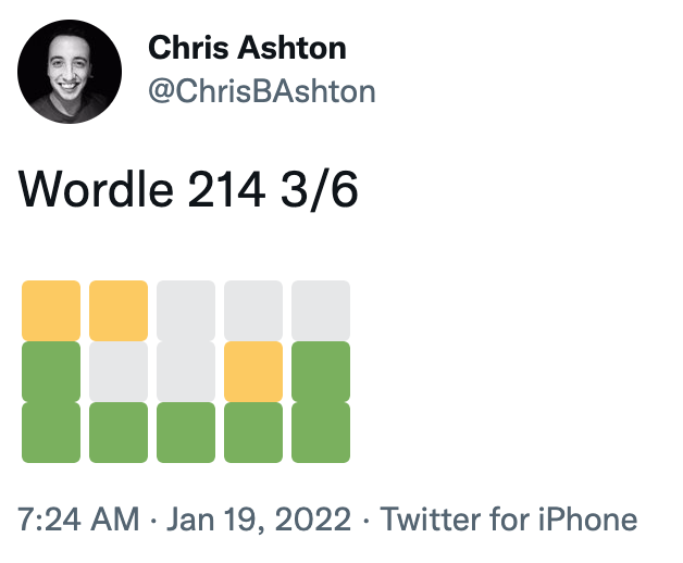
    Unless you’ve been living under a rock in 2022, you’ll no doubt have come across Wordle, the viral word guessing game that has people sharing their results in a grid on social media, like so:

    Screenshot of ChrisBAshton's tweet: "Wordle 214 3/6", followed by three rows of coloured squares.
    I’m not just sharing this one because I got a fantastic score…

    The resulting grid of coloured squares represents how many letters of each guess was correct, and ultimately how many guesses were needed before the correct word was arrived at. But it’s something of an accessibility nightmare for screen reader users.

    Federico Viticci has attempted to fix the issue, by building WordleBot. This is a shortcut for iOS and macOS which edits the text in your clipboard to have a more accessible output, like so:

    Wordle 207 5/6

    ⬜🟨🟨⬜⬜ (2 partial)
    🟨🟨⬜⬜⬜ (2 partial)
    ⬜🟩🟨🟩⬜ (1 partial, 2 perfect)
    ⬜🟩⬜🟩🟩 (3 perfect)
    🟩🟩🟩🟩🟩 (Wordle done on Line 5)— Federico Viticci (@viticci) January 12, 2022

    It’s a nice idea, and a valiant effort by Federico, but is a manual workaround that only works for Apple customers. I’d like to see somebody build a Twitter bot that automatically responds to inaccessible Wordle tweets and provides alt text responses – or better yet, the creator of Wordle could change the share text directly.

    PS: Wordle has inspired all sorts of creative endeavours, including a Wordle-to-music generator, Wordle-to-Townscaper and Wordle cross-stitching!

    a11ymyths.com

    (Accessibility Myths, shared by Smashing Magazine)

    Sergei Kriger debunks 22 myths about accessibility on the web, such as accessibility only being for blind users. I’ve not heard of all of these myths, so some items were added just in keeping with the format, I think, but it’s worth a quick read nonetheless, and as prompted at the end of the page, you’re encouraged to “show this website to your manager”.

    Also see its sister website, a11yfacts.com, for a list of statistics on disabilities (e.g. 15% of the world’s population has a disability) and how certain demographics use the web (e.g. 67.7% of screen reader users use headings for navigating).

    Game Demos Need to Come Back For Many Reasons, Especially for Accessibility

    Thought-provoking article by Ben Bayliss, describing how game demos were a great vehicle for testing a game’s accessibility before purchasing the game. Demos used to come on a disc bundled with PlayStation Official Magazine (and others), but in the digital era are increasingly hard to find.

    Without demos, disabled gamers are forced to watch YouTube videos of other people reviewing the games, to figure out whether or not it will be accessible to them. “Major game outlets rarely touch on accessibility in our reviews or editorials that go live around launch”.

    Some companies are beginning to make an effort in this area. “Ubisoft have been more proactive in inviting disabled content creators and journalists to events such as Ubisoft Forward, allowing them to spend time with the game and inform their audience specifically about accessibility”. It also “shares its efforts through blog posts and has a dedicated team“.

    “Some studios such as SMG Studio and Team 17 released videos showing accessibility features available at launch. This is vital information to be sharing, but there’s a huge difference between a blog post or a short clip on accessibility features and how these actually feel in play. And that goes for both accessibility and the game as a whole in general.”

    Building The Most Inaccessible Site Possible

    In this 35m video from Smashing Meets (December 2021), Manuel Matuzović starts off with a simple HTML site that is considered 100% accessible by Lighthouse. He then deliberately breaks its accessibility as much as possible, without Lighthouse noticing. He calls this process “Progressive Degradation”.

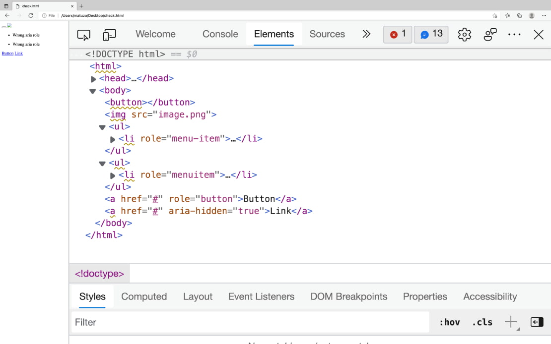
    He wraps all content in a <div aria-hidden="true">, which lowers the score because the wrapped content contained focusable descendents. Manuel then made these non-focussable (swapping the input button for a <div>, and changing the href of a link to an onclick). This then raised the accessibility score back to 100%.

    It was quite fun seeing how Manuel disables keyboard zoom shortcuts (by adding a listener to the onkeydown event). He also overrides the cursor with a custom image that is offset 100 pixels from the actual click area, making it very difficult to click accurately! Manuel finishes by applying a filter to the text so that it is visually faded out (having already set himself the goal of not using display: none, visibility: hidden or opacity: 0, which would be too easy). As a bonus, he translates all text to HTML entities, so that people can’t even ‘view source’ to read the content.

    The aim of the talk is not to make fun of Lighthouse, but to point out that automated accessibility testing can only be used as a guide. It is not a reliable summary of how accessible your site actually is. Indeed, Manuel runs his website through a few more automated tools at the end of the talk, none of which detects all of the issues that he’s introduced.

    Standardizing Focus Styles With CSS Custom Properties

    Stephanie Eckles shares a useful snippet for setting your focus styles consistently:

    :is(a, button, input, textarea, summary) {
      --outline-size: max(2px, 0.08em);
      --outline-style: solid;
      --outline-color: currentColor;
    }
    
    :is(a, button, input, textarea, summary):focus {
      outline: var(--outline-size) var(--outline-style) var(--outline-color);
      outline-offset: var(--outline-offset, var(--outline-size));
    }

    This applies focus styles to all standard interactable elements, and provides hooks for you to customise parts of the outline style where needed, e.g.

    summary {
      --outline-color: lightskyblue;
    }

    Some designers like to only apply focus styles when an interactable element is tabbed to via keyboard (as opposed to clicked on with a mouse). Stephanie explains how to use the :focus-visible selector to achieve this. The :focus rule above can be swapped± for :focus-visible, and then an outline: none applied when the focussed element is not :focus-visible.

    :is(a, button, input, textarea, summary):focus-visible {
      outline: var(--outline-size) var(--outline-style) var(--outline-color);
      outline-offset: var(--outline-offset, var(--outline-size));
    }
    :is(a, button, input, textarea, summary):focus:not(:focus-visible) {
      outline: none;
    }

    ± whilst browser support for the :focus-visible selector is still gaining traction, Stephanie advises not replacing the :focus rule, but duplicating it instead. Browsers throw out selectors they don’t understand, so we can’t simply join the selectors with a comma (i.e. :is(...), :is(...):focus-visible {}). By maintaining both a :focus and a :focus-visible block, we ensure that browsers that don’t support :focus-visible – but do support CSS custom properties – have visible focus styles. At time of writing, those browsers are Safari and ‘UC Browser for Android’.

    Web Almanac 2021, Chapter 9: Accessibility

    The Web Almanac is “HTTP Archive’s annual state of the web report”, which started in 2019. It is split into 24 chapters concerning all sorts of topics, such as security, CDNs, SEO, Jamstack, and Ecommerce. We’re going to concentrate on chapter 9 – Accessibility – which in itself is a long read.

    Depressing statistics:

    • Just 22% of sites have sufficient colour contrast; roughly unchanged from 2019 and 2020.
    • 24% of desktop homepages, and 29% of mobile homepages, disable user zooming/scaling. This includes many of the top 1,000 sites globally.
    • Around 69% of font sizes are set with px, as opposed to more scalable/accessible alternatives such as em.
    • There’s a mixture of usage of HTML5 elements. Just 28% of sites have a <main> element, but around 62% have <header> and <nav> elements.
    • Surprisingly, more than half of sites make use of tabindex attributes.
    • Just 58% of sites have properly ordered headings, i.e. no levels skipped.
    • We’re generally poor at creating accessible tables. Just 5% of sites which make use of tables provide a corresponding <caption> element.
    • Almost a third of form inputs have no accessible name (i.e. no label). Around 58% of sites use a placeholder attribute, which is not very accessible to assistive technologies, and of these sites, nearly 65% had no label, implying that the placeholder is being improperly used as a label.
    • Videos were found on 5% of sites. Of these, a corresponding <track> element – designed to have the same benefits as alt text for images – was found on less than 1% of videos. That said, “this figure may not account for video content loaded by a third party <iframe>, such as an embedded YouTube video”.

    Positive statistics:

    • 80.5% of sites have a lang attribute, with 99.7% of these being valid values.
    • Surprisingly, almost 32% of sites use the prefers-reduced-motion media query; a relatively recent CSS addition.
    • Less than 1% of pages make use of an accessibility overlay.

    Interesting tidbits:

    • 91% of desktop pages have :focus { outline: 0; } declared. “In some cases, it is removed so that a more effective custom style can be applied. In many cases it is simply removed and never replaced, which can render a page unusable for keyboard users”. The almanac doesn’t dig deeper on numbers though.
    • Around 20% of sites are estimated to have a skip link (there’s no reliable automated test for this).
    • CAPTCHAs were found on around 10% of sites. These are notoriously inaccessible.
    • 18-19% of pages contain at least one anchor element with role="button". “A native <button> element would be a better choice, per the first rule of ARIA.”
    • The most popular ARIA attribute is aria-hidden (used by 53% of sites), followed by aria-label (52%).
    • 14.3% of pages have the class sr-only or visually-hidden on some elements, implying that they are providing text that is only visible to screen reader users.

    The chapter concludes:

    As an industry it is time that we acknowledge the story told by the numbers in this chapter; we are failing people with disabilities. The numbers from 2021 have not moved substantially from 2020. We need to do better, and this has to come from a combination of top-down leadership and investment (including the ongoing participation from browsers) and bottom-up effort to push our practices forward and advocate for the needs, safety and inclusion of people with disabilities using the web.

    University Students Create Cutting-edge Wearable Navigation Devices

    Harvard University 'Foresight'; a black vest with a smartphone holder on the chest and a smartphone in the holder.
    ‘Foresight’

    An article from July 2020 that’s been in my bookmarks for… well, you do the math.

    A group of students from Harvard University have launched a startup called Foresight, a “wearable navigation aid for people with vision impairments”. It connects to the user’s camera, worn in a placeholder around the neck, which detects nearby objects and triggers tacticle ‘soft textile units’ on the body. These ‘inflate’ to provide haptic feedback as objects approach and pass, with the pressure increasing as objects get closer.


    Did you know that you can subscribe to dai11y, week11y, fortnight11y or month11y updates! Every newsletter gets the same content; it is your choice to have short, regular emails or longer, less frequent ones. Curated with ♥ by developer @ChrisBAshton.

  • fortnight11y issue 52

    Happy New Year! 🎉 New year, new look: you may have noticed the format for this fortnight’s issue is different. I’ve separated each article by heading, and done away with the bulletpoint list format. The old format never felt quite right, and made things like code examples difficult to add, but it did help keep the word count down! I’ll try to keep being concise. Please do drop me an email to let me know what you think about the new format!

    Without further ado, on with the issue.

    How many people with disabilities use our site?

    Hidde Devries writes the one article that you’ll want to direct people to whenever they ask that question.

    Implicitly, the person who asked that question is trying to find the return on investment. Hidde asks “what will we do with that data? What if it is a very low percentage? Whatever it is, equal access is still the right thing to aim for, a human right that is required by law”. He quotes:

    When we work on making our devices accessible by the blind, I don’t consider the bloody ROI. When I think about doing the right thing, I don’t think about an ROI. If that’s a hard line for you, then you should get out of the stock.

    Apple CEO Tim Cook

    Hidde points out too that even if we could get an accurate number – and we can’t, due to the user’s privacy being more important than our analytics – it doesn’t show the market potential. It doesn’t show how many disabled users have turned to competitors because they couldn’t access your site.

    Finally, making accessibility improvements will often benefit more people than just the intended audience. Think of a ‘dark mode’, which many people like to set, not just those who want to avoid headaches etc.

    In short, Hidde’s standard answer to this question is this:

    We can’t measure assistive technology usage for (good) privacy reasons, our analytics won’t show customers that went to a more accessible competitor, and accessibility benefits everyone.

    Dyslexic Myths Presented as Truths

    Gareth Ford Williams writes about the Smashing Magazine article Adding A Dyslexia-Friendly Mode To A Website, which I covered in dai11y 13/12/2021. He is highly critical of it, both here and as a comment on the article itself, for the following reasons.

    Firstly, the entire concept of a ‘dyslexia mode’ is “appalling”; Gareth touches on the ethics and possible GDPR breaches by building such a mode, especially if it allows us to ‘diagnose’ users and store this medical information in a cookie or in a profile.

    A lot of the advice in the article, Gareth claims, is aimed at accommodating users who have Irlen Syndrome, not dyslexia. The former is a problem with the brain’s ability to process visual information, whereas the latter is an audio condition. Gareth also says some of the advice, such as “fewer distractions”, are for other cognitive groups such as ADD, ADHD or ASD.

    The research quoted in the article has “only 27 subjects, all the same age, in the same class”, so not a reliable sample size. Gareth also argues a lot of the points around font choices, use of Comic Sans etc is presented without evidence.

    Thanks to James Buller for notifying me of Gareth’s response to the article. I’ve now added a disclaimer to my previous dai11y article, pointing to this one.

    Accessibility monitoring of public sector websites and mobile apps 2020-2021

    This report details how the Central Digital and Data Office (CDDO) monitored around 600 public sector websites for accessibility issues over almost two years. They tested based on the EN 301 549 standard, version 2.1.2, which maps closely to WCAG 2.1 accessibility levels A and AA.

    Accessibility issues were found on “nearly all” of the sites. The CDDO would send a report to the website owner and check again after 12 weeks, by which time 59% had fixed the issues or set “short-term deadlines” for fixing the remaining issues. 20% of organisations did not respond to the initial contact.

    “Disproportionate burden may be claimed where the impact of fully meeting the accessibility regulations is too much for an organisation to reasonably complete”. 32% of websites contacted claimed disproportionate burden. Some of these provided detailed reasoning as to the costs and benefits to their users. Some organisations were grateful for their audit report, which was sometimes the first they’d heard about accessibility regulations. Others did not respond positively; one stated it “took valuable resources away from priority pandemic-related work”.

    The most common issues were a lack of keyboard focus styles, low colour contrast and “parsing issues” (e.g. no label associated with form input). Accessibility statements are becoming out of date (many were published in September 2018/2019), with just 7% containing all required information. By the end of the monitoring process, 80% had full compliance.

    The report details what tools CDDO used and how the audit was conducted. Worth a read!

    On the <dl>

    Ben Myers walks us through the <dl> (‘description list’ – previously ‘definition list’ prior to HTML5) element. Name-value pairs are a common UI pattern you’ll have seen all over the place, for example:

    Publisher: New Riders Pub; 3rd edition (October 19, 2009)
    Language: English
    Paperback: 411 pages

    You could mark this up as a series of <div>s, but a screen reader user would lose out on benefits such as knowing how many name-value groups are in the list, and skipping over the list. It is better to use semantic markup, like so:

    <dl>
      <dt>Publisher</dt>
      <dd>New Riders Pub; 3rd edition (October 19, 2009)</dd>
      <dt>Language</dt>
      <dd>English</dd>
      <dt>Paperback</dt>
      <dd>411 pages</dd>
    </dl>
    

    You can use multiple <dd> (description detail) elements per <dt> (description term) if appropriate, e.g. associating multiple authors with a book. Just list the multiple <dd>s one after the other.

    You are also allowed to wrap your <dt>Foo</dt><dd>Bar</dd> element groups with a <div></div>, if needed, for style purposes. This is the only element that is allowed to wrap these.

    If you have multiple description lists in your page, you can differentiate them by adding an aria-label attribute to each <dl> element.

    WCAG 3 is not ready yet

    Article by Eric Eggert, reminding people that WCAG 3 won’t be released for another 3-5 years. The new standard is still in draft form and is subject to change. Commercial and public projects are, generally, required by law to comply to WCAG 2, and WCAG 3 is not backwards compatible, so we must take care to continue to abide by WCAG 2 in the meantime. WCAG 2.1 is the latest official standard, with 2.2 coming sometime this year.

    Eric focuses in on the new colour contrast algorithm that’s coming in WCAG 3: “the visual contrast algorithm, APCA, is a stark departure from the luminosity contrast algorithm used in WCAG 2”. Unlike in WCAG 2, APCA takes font face, size and weight into account, better representing how colour perception works in practice. The trade-off of extra complexity “might be totally worth it”, but there is little actionable advice in the specification at time of writing.

    If we were to have a “modular WCAG”, similar to what CSS is doing, we could package up new success criteria into a new version. Eric says this would give room to change ratings and evaluation guidelines per criterion, without having to release a new major version. It’s an interesting thought!

    Fix web accessibility systematically

    Another WCAG 3 related post by Eric Eggert, who claims the new standard will not be the silver bullet some people think it will.

    Eric laments the current situation of accessibility technologies: the complex set of documents including WCAG 2, ATAG 2 (standards for authoring tools), UAAG 2 (for browsers / user agents), ARIA, ARIA Authoring Practices (designed to be technologically neutral, so lacking HTML best practice), HTML Accessibility API Mappings and ARIA in HTML. This is a complex world for developers. ““Don’t use ARIA unless you have to” is a common phrase uttered by accessibility experts, but how are ordinary developers supposed to know when they have to?”

    The situation isn’t helped by a lack of interoperability, and a lack of traction in browsers. <input type="date"> has been standardised for over a decade, but still “lacks accessibility support in modern browsers”. Early thoughts around ARIA were that “most aspects of it would be converted into native HTML quickly: combo boxes, dialogs, tab panels”, etc – but a world with natively accessible features right out of the box “did not come to pass”. Instead, ARIA is now a meta language that sits between technologies, defining an accessibility vocabulary for them. ARIA takes on features of HTML, instead of the other way around.

    Releasing a new WCAG version will not fix the situation: Eric wants to see much more work done in browsers themselves. Making a form input with a missing label should trigger a console warning for developers. Standardising accessibility support in native elements would greatly simplify documentation and improve reliability. The easier accessibility is to teach, the more accessible the resulting websites.

    https://buttonbuddy.dev/

    A useful micro website by Stephanie Eckles. It explains the requirements for accessible contrast on buttons, and includes a generator for creating buttons of sufficient contrast.

    You have the option of using a colour picker, or switching to “Use text input” mode to put in the CSS hex codes that you intend to use. The generator will then tell you whether or not the button has sufficient contrast, factoring in whether or not the button will be used with ‘large text’ (which is subject to different contrast requirements, detailed on the website).

    The world’s most accessible websites

    This is a study by ToolTester.com, but take its findings with a big pinch of salt.

    The study looks at “the 200 most popular websites in the world”. This list of sites was allegedly “collected from data by Similarweb”, but comparing the study data with the top websites on similarweb.com, a lot of moderation has evidently taken place: the study omits adult websites, non-English websites, and (inexplicably) Reddit.

    asos.com is deemed the ‘least accessible’ site, with the “percentage of site inaccessible” graded as 21.38%. This story has been covered by the Mirror and also covered by ChargedRetail.co.uk, which is what brought my attention to the study in the first place. Both news sources implied that the 21% figure applies to the whole website – the Mirror even headlines ‘1 in 5 pages blocked’ – but according to the ToolTester methodology (at the end of the study), only the homepage was tested.

    ToolTester used ‘Arc Toolkit’ – a Chrome extension – to perform automated tests across these sites. It doesn’t look as though any manual testing was performed. For these reasons, I really think this study is lacking in detail and substance, but it’s an interesting data point nonetheless.

    ASOS performed poorly due to errors including poor colour contrast, missing ARIA and missing labels. Instagram came second in inaccessibility, lots of user generated content with no alt text causing the bulk of issues, but there are other more easily fixable issues, including a lack of alt text on the login page and a lack of ARIA labels on play buttons. Facebook also makes the bottom 10 list.

    Government websites NIH.gov, CDC.gov and GOV.UK fared best, with LinkedIn, H&M, PayPal and Amazon not far behind. All of these websites had more than 99% of their ‘site’ (read: homepage) considered accessible.

    Amazing haptic speaker lets visually impaired people read braille in midair

    ATM with additional big black pad hardware attached to it. A person's hand is hovering above the pad, their fingertips above a separate portion at the top of it, where the braille sensory happens.
    Copyright: Viktorija Paneva. Source: https://www.digitaltrends.com

    This is not a new article, but has been in my bookmarks since May 2020. Researchers at Bayreuth University in Germany have developed a speaker system which emits ultrasound waves that allow people to read braille in mid-air. The research is particularly pertinent during this coronavirus pandemic, where avoiding touching public surfaces is generally a good thing!

    The technology is made up of a 16×16 grid of speakers, and can detect a hand up to a distance of 70cm.

    You can read the full academic study, “HaptiRead: Reading Braille as Mid-Air Haptic Information“.

    Don’t make users switch caps letters to lowercase

    A quick tip by Stas Melnikov: add autocapitalize="off" attribute to your text input to have mobile browsers open a lowercase keyboard (as opposed to an all-caps keyboard). This is well suited to login forms which ask for the user’s email address.

    Accessibility of Content Management Systems – what’s stopping us?

    Back in October 2020, I wrote about how W3C decided not to use WordPress because it was considered inaccessible. They opted for the proprietary Craft CMS instead, as “the Craft team had made the commitment for Craft v4 to comply with ATAG AA standards“. At the time, this spawned a bit of an internet war, pitting ‘accessibility’ against ‘open source’.

    In today’s article (also available as a video, 26m), Marie Manandise reflects on her role at Studio 24, the agency tasked with redesigning the W3C site. Marie’s job was to choose the right CMS.

    Marie talks of “the accessibility paradox”, where CMS providers all claim to “care very much about accessibility”, even when none of them are considered accessible. She suggests that we take for granted how difficult accessibility is to get right, and what resources are needed.

    For example, to properly test that website navigation is accessible to a non-sighted user, Marie says you need to do paired testing: a sighted and non-sighted user sitting side by side, in front of a screen. And that you need to test in the same manner every time you update your website.

    CMS developers “don’t have the knowledge to make the assessment” as to whether or not their CMS is accessible. “Most of us are clueless at accessibility”. Accessibility groups embedded in CMS vendor organisations tend to be “operating in the margins”. Marie says that accessibility experts have an image problem, and don’t carry the “aura of security experts, for example”.

    So what can we do about it? Echoing Eric Eggert’s points the other day, the answer is to simplify the learning material / specifications, and to ensure that accessibility is on the curriculum at courses and bootcamps.


    Did you know that you can subscribe to dai11y, week11y, fortnight11y or month11y updates! Every newsletter gets the same content; it is your choice to have short, regular emails or longer, less frequent ones. Curated with ♥ by developer @ChrisBAshton.

  • fortnight11y issue 51

    Your fortnightly frequent11y newsletter, brought to you by @ChrisBAshton:

    The endless search for “here” in the unhelpful “click here” button

    • Eric Bailey articulates all the reasons why you should stop using links and buttons with the text value “here” or “click here”. This is such a common mistake across the web and is a habit we need to break out of.
    • Compare the following two sentences:
      1. Click here to learn about how to roast Brussels sprouts
      2. Learn how to roast Brussels sprouts
    • The former makes no sense out of context. If a screen reader user pulls up a list of all links in the page, they’re not going to know what “click here” is referring to. “How to roast Brussels sprouts” is the main action, and makes sense on its own. The latter also has a greater surface area to click on. Finally, some users activate links by saying the name of the link; the latter works well for that, whereas the former would be problematic if there were several links called “click here”.
    • Now consider these instructions: “Click the button below”. There are two problems here:
      • “Click” only makes sense in a desktop/laptop mouse context. It doesn’t make sense for keyboard or touchscreen users. Yes, they’ll probably still understand what to do, but that doesn’t mean we can’t use more universal language, such as “Select”.
      • “Below” is also problematic. What if our content has been translated into a vertically-oriented language, and therefore makes no sense? What if the design is different for desktop, such that the link ‘below’ is actually to the side? What if we’re reading this in VR – does “below” now mean someone will think it’s underneath them? The web is a highly malleable place. Better to use language like “next/previous” or “following/preceding”.
    • Eric ends by pointing to the proposed CSS Logical Properties module. This favours “start/end” properties rather than the more traditional “top/right/bottom/left”, as the latter have an implicit default writing mode of left-to-right & top-to-bottom – not a good look for a global technology.

    WebAIM guidance on Alternative Text

    • This guidance was given a fresh update in October 2021, so I’m reading it anew.
    • “Although technology is getting better at recognizing what an image depicts, algorithms alone cannot understand what an image means within the context of the overall page. A maple leaf might represent Canada, or it might just illustrate the leaf of a tree.”
    • There are several examples of good vs bad alt text, and clarifications around when an empty alt text is appropriate. But I knew that already, so have cherry-picked some of the more interesting content in the points that follow.
    • Other than the alt attribute, “alternative text can be presented within visible body text near the image” or even “on a separate page, linked from either the image or a text link adjacent to the image” (but only “when the text equivalent cannot be presented succinctly”). Note that the longdesc attribute is deprecated and should not be used.
    • A trip down memory lane: image maps. The main image associated with the <map> must have an alt attribute that describes the content within the image, but is not otherwise presented with each image map hot spot. For example, a State of New York map that has an <area> for each county might have alt="Counties of New York", whereas its hot spots would each have an alt attribute containing the name of the county. If the main image does not convey content (just a container for the hot spots), then alt="" is appropriate.
    • Finally, a note on <figure> and <figcaption>. The <img> within the <figure> must have non-empty alt attribute, which should not just be a repeat of the <figcaption> contents. I was surprised by this, so I read the linked How do you figure? blog post by Scott O’Hara. Some highlights from that post:
      • “One of the biggest misunderstandings of using a figcaption is that it’s used in place of image alternative text”.
      • “A figcaption is meant to provide a caption or summary to a figure, conveying additional information that may not be directly apparent from reviewing the figure itself. If an image is given an empty alt, then the figcaption is in effect describing nothing. And that doesn’t make much sense, does it?”
      • Moreover, using an empty alt="" on the image causes serious screen reader issues. It’s essentially the same as an <img alt="" /> anywhere else in the page; in other words, it’s treated as decorative, and ignored by the screen reader. So an empty alt="" will mean your entire <figure> gets skipped over.

    VR Game Gravitational Blends Puzzles With Real Accessibility Challenges

    • Electric Monkeys Studio has built a VR game set in the future, in a scientific facility where gravitational technology is being discovered. The protagonist, Sebastian, uses a wheelchair, presenting an extra challenge in navigating the environment after an explosion destroys much of the facility, as you have to find ways around obstacles in your path.
    • It’s promising to see more representation of wheelchair users, adding to games like Life is Strange and Sly Cooper. In November 2020, Bethesda added wheelchairs to Fallout 76 after a fan asked the developer to add her aid to the game.
    • The article lacks detail on the gameplay, but there are a few reviews on Steam. Whilst there are complaints around the graphical quality and the controls, one positive reviewer goes into detail about some of the accessibility constraints forced on the player, which I thought was interesting:
    • “You can’t look around very much without seeing the start of ‘tunnel vision’ and colors fading, and a red icon reminding you to push a button to re-orient. I accept this because a person with paralysis mainly turns their head, not their body. In real life, such a person has to make big adjustments just to see in a different direction. Yes, it’s annoying, and holds you back. I accept it as simulating part of what it feels like to be this person.”
    • As a VR player myself, one of the most immersion-ruining aspects is movement. Pressing a button to walk or run kind of pulls you out of the experience (and can cause motion sickness), so to have a game where being seated matches what your character is doing, is quite a clever solution to the problem.

    Adding A Dyslexia-Friendly Mode To A Website

    • Smashing Magazine article by John C Barstow. I thought this was going to be one of those “choose a dyslexic-friendly font” type article, but it covers a lot more than that!
    • According to John, “research shows that standard fonts like Helvetica and Times New Roman are just as readable as purpose-built fonts like Dyslexie or Open Dyslexic”. He goes on to clarify that the most important factor is the spacing between letters and words. The reason fonts like Comic Sans are so popular with dyslexic readers is the wider spacing found in that font.
    • We can increase the letter spacing of our chosen font using the ch unit, which is based on the size of the 0 glyph – often a good approximation of the average character width. John comes up with this CSS: .dyslexia-mode { letter-spacing: 0.35ch; word-spacing: 1.225ch; }, which gives a 3.5x letter spacing.
    • Ligatures are when multiple characters are merged into a single glyph; you’ll often see this when “f” and “i” are rendered next to one another, forming a joined-together “fi”. Dyslexic readers may struggle with ligatures, so we can disable the feature with font-variant-ligatures: none, though this may be disabled automatically by some browsers when the letter spacing is set high enough.
    • I learned about Heydon Pickering’s owl selector (* + *), which can be used to apply consistent line-spacing, e.g. * + * { margin-top: 1.5em }.
    • John finishes up by applying a slightly bigger font weight to his text, to counteract the extra whitespace (font-weight: 600, which is “demi-bold”, apparently). He also applies style to his bold text, to differentiate it from the demi-bold regular text: .dyslexia-mode strong { color: #000 }.
    • There’s also a tip around avoiding unnecessarily distracting elements, such as background images, for which you can use the :not pseudo-class. Example: body:not(.dyslexia-mode) main { background-image: url("...") }.
    • The article concludes with a CodePen showing the before-and-after. The comments below the article are also worth a read.

    Collaborative planning, the forgotten step of accessible development

    • A deque article describing “a11yBID”, or “Accessibility Business Informed Development”.
    • It’s essentially BDD (“Behaviour Driven Development”), in that it involves conversations between stakeholders and cross-functional team members to define Acceptance Criteria (AC), often in a formatted plain language format called Gherkin.
    • a11yBID is different to BDD as it “doesn’t discover classic business requirements as BDD does. Instead, it clarifies the accessibility-specific aspects of those business requirements”.
    • Starting with high-fidelity designs (i.e. PDFs), the process begins with an “a11y Amigos” meeting between the designer, the tester and the business analyst. The group reviews the design from an a11y perspective, asking questions around focus management etc, and drafting the “a11yAC” user stories. Here is an example of one:
      • Scenario: A blind screen reader user can understand that content is loading
      • Given I am a blind screen reader user
      • And I have submitted the form
      • And a loading spinner is visible as I await a response from the server
      • When I navigate to the loading spinner image
      • Then I hear the image role
      • And I hear the alt text as “loading”
    • The article concludes with some general advice to make a11yBID scale. For example, making use of a design system and component library, so that you can reuse tried-and-tested designs.

    The CSS “content” property accepts alternative text

    Niagara-made audio game nominated for accessibility Game Award

    • The Vale: Shadow of the Crown, by Falling Squirrel games company, is an audio-only game, released in August 2021.
    • The game gained a nomination at this year’s Game Awards (which was watched by 80 million people in 2020).
    • I found a more informative article on digitaltrends, which notes that the games origins weren’t “altruistic” in nature; the studio director simply didn’t have any design experience, so wanted to build a game on a scale that he could afford!
    • “The story centers around Alex — a feisty, intensely brave, and blind princess — and her companion, Shepherd, and their journey to save their realm from destruction”. The game uses 3D audio technology and controller feedback to immerse the player in the story. There are no visuals other than the menu, which can also be navigated by audio only, i.e. this game is fully accessible to visually impaired players.

    Did you know that you can subscribe to dai11y, week11y, fortnight11y or month11y updates! Every newsletter gets the same content; it is your choice to have short, regular emails or longer, less frequent ones. Curated with ♥ by developer @ChrisBAshton.

  • fortnight11y issue 50

    At long last, we’ve hit the 50 issue milestone (or, if you count all the dai11y, week11y, fortnight11y and month11y newsletters together, over 600!). I’ve been publishing fortnight11y newsletters for over two years now, with the first issue published in November 2019.

    I didn’t honestly know if I’d be able to keep it up, especially after stepping down from frontend web development and becoming a backend developer. But I’ve really enjoyed keeping up to date with the ever-evolving world of accessibility, and sharing my learnings with you. As ever, please do spread the word about the newsletter – your friends and colleagues can sign up here – and do drop me a line if there’s anything you can think of to improve the newsletter (or any feedback you’d like to give).

    Without further ado, let’s kick-off issue 50 with a double HTMHell digest!

    Edge dev tools screenshot: A demo site with broken html like empty buttons, img without alt, wrong aria roles, missing aria roles, and aria-hidden on focusable elements.
    Screenshot of Edge browser’s “Elements” tab, showing ‘warning’ underlines on inaccessible HTML.
    • Debugging HTML: Accessibility
      • “In Chrome or Edge open DevTools, click the Elements tab, select the element you want to inspect and click the Accessibility tab. The accessibility pane shows you how the element is represented in the accessibility tree, which ARIA attributes it has, and its computed properties.”
      • Buttons need a label (denoted by Name:, populated by fields such as aria-label, title, or button innerText).
      • Buttons need a suitable role (denoted by Role: "button").
      • Buttons need to be focusable (denoted by Focusable: true).
      • Note that you also need to be able to activate buttons with Space or Enter, but this information isn’t exposed in the Accessibility tab.
      • There are also instructions for Firefox, which uses a different accessibility API. For example, the role name in Firefox will be pushbutton, rather than button.
    • Debugging HTML: Linting
      • The Edge browser now highlights accessibility issues directly in the elements panel of the DevTools (see screenshot).
      • “The built-in linter highlights potential issues in your HTML by marking affected elements with a squiggly yellow line”.
      • “If you hover over the opening tag, a tooltip with a description of the issue appears.”

    The ADA lawsuit settlement involving an accessibility overlay

    • A UX Collective article about a recent case against accessibility overlays.
    • Eyebobs is an online glasses company that used an accessibility overlay to attempt to conform to WCAG. It was sued by a blind plaintiff in January 2021, for violations of the ADA (Americans with Disabilities Act).
    • The case enrolled Karl Groves as an expert witness, who wrote a 35-page indictment of how inaccessible the Eyebobs site was even with the overlay. Karl also created overlayfactsheet.com, to educate on how accessibility overlays don’t work.
    • The settlement requires Eyebobs to take the following actions:
      • Create an accessibility coordination team
      • Perform an accessibility audit of its ‘digital properties’ (using an accessibility consultant)
      • Adopt an accessibility statement
      • Implement an accessibility strategy
      • Provide accessibility training to its employees
    • It must comply with these measures within two years.
    • It must also work with third-parties (such as embedded maps) to make their content accessible. The deadline for this can be extended up to five years, reflecting the added complexity.
    • The article ends with a link to Lighthouse vs ADP – “the next lawsuit to keep an eye out for”.

    Next, a two-article special – both written by Raghavendra Satish Peri:

    • The Captcha Conundrum & Accessible Alternatives
      • Raghavendra, a blind, accessibility specialist, talks through the problems they faced trying to create an account on Wikipedia. They were faced with a CAPTCHA (Completely Automated Turing test to tell Computers and Humans Apart). It was visual only, and had no audio alternative and no option to use a one-time confirmation code sent to email or phone.
      • Some CAPTCHA solutions do provide an audio alternative, but this is inaccessible to deafblind users.
      • In addition to email/phone options, you could also use the honeypot method, whereby a text field is added to the form but visually hidden. Bots will find the input and fill it with text, so you can avoid a lot of spam form submissions by filtering out all submissions that contain that input.
      • Another inclusive option is a logical or mathematical test, e.g. “Is fire hot or cold?”, as bots will struggle with this. It can be confusing for some users to know how to respond, however.
      • Google’s reCAPTCHA is apparently quite good, requiring only a box to be checked. However, it sometimes treats screenreader behaviour as bot behaviour.
      • Raghavendra concludes “it’s always better to offer multiple options that work for multiple types of disabilities than just one or two”.
    • Scroll to top: Where should the focus land?
      • This is more of a placeholder than an article, in which Raghavendra asks us, the community, where the focus should land when activating a “scroll to top” link. What exactly is the ‘top’? It’s easy enough to visually scroll to the top of the page, but where should the keyboard focus go? We have three options:
        1. Move focus to the <body> tag (a poor experience in NVDA, as nothing is announced).
        2. Move focus to the “Skip to main content” link.
        3. Move focus to the <h1> heading level one, or <main> region landmark.
      • There is no definitive answer, but there are some interesting comments at the bottom. The community seems largely split on whether it should be 2 or 3.

    Blind People Won the Right to Break Ebook DRM. In 3 Years, They’ll Have to Do It Again

    • This Wired article details how accessibility advocates in America regularly have to go to court in order to be granted an exemption to the Digital Millennium Copyrights Act (DMCA). The exemptions, which last for three years at a time, mean that blind people are able to circumvent copy protections on ebooks for the sake of accessibility. It would otherwise be illegal for these users to use third party programs (such as JAWS) to lift text and save in a different, accessible file format.
    • In 2014, publishers fought Amazon for enabling a text-to-speech (TTS) feature on the Kindle, claiming that it violated their copyright on audiobooks. To this day, publishers are able to disable TTS on their books, which makes it difficult for blind people to consume their content.
    • Even when TTS is enabled by the publisher, many ebooks lack alternative text for their illustrations. Non-profit initiatives like Bookshare can provide semi-accessible versions of inaccessible books, but they must agree not to change the content, meaning they’re not permitted (or, in the world of academia, sufficiently qualified) to fill in any missing alternative text.
    • In Europe, there is already a law (the European Accessibility Act) requiring all ebooks published in the EU to be fully accessible from June 2025. There is hope that this might set a precedent in the USA, meaning that advocates would no longer have to fight the case for exemption every three years.

    Next:

    • Chancey Fleet writes a Twitter thread about their experience using Google Translate’s new “Transcribe” feature for iOS.
    • Chancey wanted to watch Netflix’s House of Flowers, which is in Spanish. It has English subtitles, but the ‘audio description’ of scenes is in Spanish.
    • Chancey uses VoiceOver with a Braille screen reader, i.e. it outputs to a Braille display rather than as speech. Chancey wanted to use Transcribe to catch the dialog and audio description, translate it, and output it to Braille.
    • Evidently, Google was not happy with this, failing immediately with “PLUG IN HEADPHONES TO USE TRANSCRIBE WITH VOICEOVER”. Chancey tried to fool it by plugging in a Lightning headphone dongle, but that didn’t work. They tried closing VoiceOver, starting the Transcribe, and then launching VoiceOver again, at which point the transcribing immediately stopped with the same error message.
    • Why was this happening? Because VoiceOver speech would, naturally, mess with the effectiveness of the transcription. However, outputting to Braille would not interfere with the transcription. This is not a scenario that the team behind Transcribe have considered, so Transcribe simply shuts down, rather than giving the user a friendly warning and then allowing them to continue.
    • In my developer career, I have sometimes been asked if it is possible to detect whether someone is using a screen reader, to give them a different experience. This Twitter thread shows exactly why this is a bad idea. You’re never going to know your users better than they know themselves.

    Letting users tick a ‘none’ checkbox

    • A GOV.UK blog post from the Design System team, describing why they’ve added a new feature to the checkboxes component.
    • When answering questions, users can be unsure what to do if none of the options apply to them. Users “want to give a clear answer, especially if they’re concerned about completing an application accurately and truthfully”.
    • Additionally, some users might assume that if they leave the checkboxes unchecked, that the system will return them to the question later, not realising that they’ve actually skipped the question.
    • Some services using the checkboxes component were already adding their own “None” option, which was not ideal as it meant users could provide contradictory answers, such as “None” in addition to other options.
    • Supporting “None” natively in the component meant that the developers were able to add JavaScript to prevent users from ticking the “None” checkbox in addition to other boxes. It also meant they could style the option slightly differently.
    • It is still up to services to decide on the wording of the “None” checkbox. The blog post advises against directions like “None of the above”, as this is a visual reference that makes little sense to screen reader users. “None of these” is better.

    Twitch streamer beats Dark Souls 3 with a single button

    • Twitch streamer Rudeism used a homemade, single-buttoned controller to complete Dark Souls 3, a notoriously difficult game. In order for the one-button system to work, he mapped the game’s inputs to Morse code.
    • He pressed the button 258,250 times during his two-month run of the game.
    • During the challenge, Rudeism raised money for AbleGamers: “a nonprofit organization that advocates for accessibility in the video game industry”. He was also advocating for games to support more accessibility options and difficulty modifiers as standard.

    Did you know that you can subscribe to dai11y, week11y, fortnight11y or month11y updates! Every newsletter gets the same content; it is your choice to have short, regular emails or longer, less frequent ones. Curated with ♥ by developer @ChrisBAshton.

  • fortnight11y issue 49

    Your fortnightly frequent11y newsletter, brought to you by @ChrisBAshton:

    Accessibility inception: sharing your knowledge (video, 46m)

    • This is a Mischa Andrews talk from #ID24 in November 2017. I’ve had it in my bookmarks for a while, and am so pleased I’ve finally managed to watch it.
    • Mischa talks openly and candidly about how you can effect accessibility change in your organisation, whilst overcoming the inevitable office politics that come with the territory.
    • I liked the idea of creating a “decoy audience”. Let’s say you have a colleague who feels they have nothing to learn about accessibility – they “know it all already” – but they consistently make accessibility mistakes. You can teach them how to do things properly, without bruising their ego, by arranging a talk or workshop about accessibility, and inviting them to present part of it. The theory is that they can continue to feel good about their own knowledge, whilst also opening up to learning from your side of the talk.
    • A common tactic used by organisations is to have a ‘gatekeeper’ for accessibility, e.g. someone doing accessibility testing as part of the acceptance tests at the end of a project. Mischa warns that you have to tread carefully here, as it’s often too late or difficult to do much about accessibility issues if they’re left until the end of the process. You may also find people try to work around you, such as go to your manager or try to argue that their project shouldn’t go through the normal process. It is best to only use this ‘gatekeeper’ tactic if your organisation is already practising good accessibility.
    • Make it as easy as possible to do the right thing, e.g. by adding accessibility information directly as code comments, or embedded in Word templates, rather than expecting people to seek out and find the guidance independently.
    • Practice what you preach. You may be seen as the a11y expert in the organisation, and people will reuse your resources, such as colour choices, etc, on the assumption that they’ve already been accessibility tested.
    • It is useful to memorise a handful of things that can be used as opportunities to motivate people – and to convince people to listen to you. If you know statistics around how many people have particular kinds of disabilities, or how much money the organisation loses through being inaccessible, or what accessibility laws your country has to abide by, or the difference between different versions of WCAG, you’ll look knowledgeable enough for your words to carry more weight. You can also slip these facts into conversations, which can help to inspire the next generation of accessibility advocates in your organisation.

    Next is a two-article special, covering accessibility advances by Android and Apple!

    Google Improving Smartphone Accessibility

    • Two new features are coming to Android smartphones: “Camera Switches“, and “Project Activate”. These features will allow users to use gestures like smiling, raising eyebrows, or looking in a particular direction, to issue a command such as returning to the homescreen or opening notifications.
    • The gestures are configurable: users can set how long to hold the gesture for, or how big the gesture must be, to issue the command.
    • “The updates are aimed at people with motor and speech disabilities, Google said, and the new tools were developed with feedback from people who rely on alternative communication technology.”

    Apple is testing AirPods as possible hearing aids, posture improvers and in-ear thermometers

    • Apple is prototyping to see motion sensors inside AirPods can be used to tell users if they’re slouching. They’re also experimenting with measuring core body temperature, and perhaps most excitingly, whether or not AirPods can be used as “proper hearing aids” (they already come with a ‘conversation boost‘ feature).
    • Under US federal law, devices marketed as hearing aids must “be sold through licensed specialists, who adjust them to the specific user”. However, “in July, President Biden signed an executive order directing the Department of Health and Human Services to allow hearing aids to be sold over the counter and be adjusted by consumers”; promising news for Apple.

    Buttons vs. Links

    • Eric Eggert describes the difference between a link and a button:
      • A link changes what the URL in the browser points to; either a new page, or a file to download, or a frame to update the source of.
      • A button performs an action. Originally only available as an <input type="submit" />, with the sole purpose of submitting forms, then along came the <button> element which allowed more versatility. It’s great for creating things like calculators, where the end result URL is not an important thing to be able to share.
    • Links and buttons have different roles. Assistive technologies announce them as “link” and “button” respectively, and this sets a user expectation as to the behaviour.
    • Screen readers have a way of easily presenting all the links in the page; buttons are harder to surface.
    • Links can be activated with the return key, whereas buttons can be activated with return or space.
    • Context is important. You can style a link to look like a button, and that’s fine, if the button says something like “Read the full story”, which hints that it will take you to another page.
    • Eric concludes that the link vs button debate is a grey area. He’s surprisingly unopinionated in the close: “there is no one true way to code or design something”.

    As a bonus for the above article, I also read THE BUTTON CHEAT SHEET (buttoncheatsheet.com). It compares different ways of marking up buttons and button-like things. I don’t really see how useful it can be, but it’s worth a quick look through, if only to see how many different ways it can be done.

    Three Olay jars of cream, in different colours, each topped with a white easy-open lid.
    Credit: beautypackaging.com

    Olay Designs An Easy-Open Lid—& Shares the Inclusive Design

    • Olay, the beauty products manufacturer, have designed a new lid prototype for its creams, designed to be accessible.
    • It has an “easy open winged cap”, “extra grip raised lid”, “high contrast product label”, and Braille text spelling out “face cream”.
    • The lids are currently only available on Olay’s website.
    • The design is open-source, meaning other beauty brands are free to use it and build upon it.

    Gorillas’ nav: a case study

    • A really interesting article by developer & accessibility advocate Kitty Giraudel, explaining how they built the main navigation on their employer’s website, Gorillas.
    • It’s a hamburger menu style across all screen sizes, not just on mobile. You have to tap on the ‘hamburger’ to expand the menu and show the menu items.
    • This behaviour comes for free with the <details>/<summary> HTML elements, which as native elements, work without JavaScript. However, clicking outside of the menu should cause the menu to ‘close’ again, and that doesn’t happen with those elements, so Kitty & the team replace the elements with a <button> if JavaScript is available, adding a listener to the click and focusin events to close the menu if the event takes place outside of the menu container.
    • “Landmarks such as <nav> can be listed by assistive technologies, [therefore] it’s important that the <nav> itself is not the element whose visibility is being toggled. Otherwise, it’s undiscoverable when hidden”. So Kitty’s implementation wraps the menu in a <nav role="navigation"> and the CSS visibility toggling is only applied to its contents, not to the <nav> element itself.
    • Kitty walks through a good example of progressive enhancement in CSS, using the @supports query to check if backdrop-filter is supported before overriding the background-color.
    • Elsewhere on the Gorillas page, there is a language selector. Kitty points out that they avoided using flags to denote language, as flags are ultimately for countries, not languages (think UK vs USA flags for English).
    • The language selector uses 2-letter codes, e.g. “EN” for “English”, with visually hidden text to clarify the language name: <a href="/en" hreflang="en">EN<span class="sr-only" lang="en"> — English</span></a>. Note the hreflang attribute, which I hadn’t heard of before, but is supposed to indicate the language of the page that is being linked to. Kitty admits it “might do nothing”, given the lack of documentation on it.
    • They initially tried applying an aria-hidden to the 2-letter language codes to avoid assistive technologies reading them out (as they’re often incorrect, e.g. “DE” being pronounced “duh”). However, this would fail WCAG SC 2.5.3 Label in name, as voice navigation users should be able to navigate the page by what they see, e.g. “click DE”.
    • Finally, I’ve learned that “When using aria-expanded="true", the label should not mention “open” or “close” (or similar) as the state is already conveyed via the attribute”.

    Vicky Teinaki shares this tip on Twitter: “I was today years old when I found out that I can share a Google Slides presentation in html (for screen reader users and magnification users) by swapping out ‘/edit’ in the URL for ‘/htmlpresent’.”

    Share presentation in html (for screen reader users and magnification users): 
https://docs.google.com/presendation/d/[link censored]/htmlpresent
    Screenshot of a Google Slides URL, ending in “/htmlpresent”.

    National Convention Sponsorship Statement Regarding accessiBe

    • The (American) National Federation of the Blind made a statement in June, about accessiBe, the market leading ‘accessibility overlay’ company that I’ve written about several times now.
    • I missed this when it came out, and wouldn’t have known about it were it not for Steve Faulkner’s tweet. He picks out this pretty damning quote:
    • “This week, the Board of Directors reviewed accessiBe’s business practices at the urging of members who have researched and interacted with the company, and the Board believes that accessiBe currently engages in behavior that is harmful to the advancement of blind people in society”.
    • The statement goes on to announce that the NFB has “revoked accessiBe’s sponsorship of the convention”.

    Did you know that you can subscribe to dai11y, week11y, fortnight11y or month11y updates! Every newsletter gets the same content; it is your choice to have short, regular emails or longer, less frequent ones. Curated with ♥ by developer @ChrisBAshton.