Category: dai11y

Accessibility themed newsletter: get your daily dose of a11y.

  • dai11y 15/09/2021

    Your daily frequent11y newsletter, brought to you by @ChrisBAshton:

    a11y-automation.dev

    • A useful reference of a11y fails, describing at a glance whether or not each failure can be linted, tested, or manually tested.
    • For example “Autoplaying media” has a “Linting status” of “Could Exist”, a “Testing status” of “Exists”, and a “Manual testing status” of “Should Exist”.

    Prefer longer newsletters? You can subscribe to week11y, fortnight11y or even month11y updates! Every newsletter gets the same content; it is your choice to have short, regular emails or longer, less frequent ones. Curated with ♥ by developer @ChrisBAshton.
  • dai11y 13/09/2021

    This frequent11y issue is a Twitter special! I’ve already recently written about how Twitter’s new design has been giving users headaches. But there have been a flurry of other articles about Twitter, so I thought I’d round them up for you.

    • What’s Really Wrong With the New Twitter Font
      • An interview with Frederick Brennan, who designs open source fonts, though is better known for founding and then trying to shut down the imageboard site 8chan.
      • “[Twitter’s newly commissioned font] Chirp is extremely similar to GT America, which is itself based on Franklin Gothic. They changed the spacing ever so slightly and changed the square dots over i and j, and then the period and comma to be circular”
      • Frederick says that typeface readability is cultural; “in the Middle Ages, people found Gothic lettering to be extremely readable”. Given enough time, people would get used to the new font.
      • There’s a problem with the hinting, causing some letters to look one pixel too tall or short on particular screen sizes. “This is something really fundamental and basic to type design. This definitely points to [Twitter] cheaping out.”
    • Twitter’s web redesign isn’t as accessible as it should be, experts say
      • This TechCrunch article explains that the new high-contrast design, whilst generally making things more legible for those with low vision, is causing ‘strain’ for some users.
      • In September last year, Twitter introduced two dedicated accessibility teams, after previously relying on employees to volunteer to do accessibility work on top of their regular jobs. Whilst this was a positive move, some experts suggest that Twitter did not include disabled people in the design decisions early enough; Twitter disputes this.
      • Twitter has made a11y improvements in other areas, including SRT subtitle file support for videos, and live captioning.
      • The article calls out a saturation slider that Discord added to its desktop app accessibility settings.
      • “Web accessibility isn’t one-size fits all — while some users may need a high-contrast display, others who suffer from chronic migraines might require a more muted experience”. It’s odd that Twitter did not offer an option to reduce contrast or change font, as it already has customisation options for dark/light modes, font size and link colours.
    • Twitter’s new font and Last of Us 2: an accessibility lesson to be learned
      • Continuing the customisation theme, this UX Collective article suggests Twitter should give users more choice over their UI settings, taking inspiration from Last of Us 2, which has over 60 different accessibility settings. It is possible to play the game entirely by sound, or one-handed.
      • The game’s designers initially broke the settings down into ‘accessibility modes’ for hearing impaired gamers, or for those with motor control issues. But users wanted to really be able to fine tune their settings, so the designers had to “give up their nice, tidy menus in favour of something a little messier”.

    Prefer longer newsletters? You can subscribe to week11y, fortnight11y or even month11y updates! Every newsletter gets the same content; it is your choice to have short, regular emails or longer, less frequent ones. Curated with ♥ by developer @ChrisBAshton.

  • dai11y 10/09/2021

    Your daily frequent11y newsletter, brought to you by @ChrisBAshton:

    FlickType gives up on accessible iPhone keyboard after ‘abuse’ from Apple

    • “FlickType, maker of the accessible iPhone keyboard that has become popular among those with vision impairment, has confirmed it is discontinuing its app after years of obstacles and “abuse” from Apple’s App Store approval team.”
    • “The announcement comes after FlickType submitted an update to fix bugs related to iOS 15 and got “incorrectly” rejected by Apple. The team says Apple has ignored repeated requests for clarification and support.”
    • “FlickType was designed to make iPhone easier to operate for blind users — and it worked. A 2018 report from the American Foundation for the Blind found the keyboard greatly increased typing accuracy and speed, and was significantly easier to use than Apple’s for those with vision impairment.”

    Prefer longer newsletters? You can subscribe to week11y, fortnight11y or even month11y updates! Every newsletter gets the same content; it is your choice to have short, regular emails or longer, less frequent ones. Curated with ♥ by developer @ChrisBAshton.

  • dai11y 09/09/2021

    Your daily frequent11y newsletter, brought to you by @ChrisBAshton:

    Google Announces Seismic Change to Docs

    • A WebAIM article talking about the May announcement by Google that it would switch to canvas-based rendering for Google Docs. The “current HTML-based rendering approach” has inconsistencies across platforms, and performance issues, which can be addressed by switching to canvas.
    • Google claims “compatibility for supported assistive technologies such as screen readers, braille devices, and screen magnification features, will not be impacted by the canvas-based rendering change”. No technical approach is outlined in the announcement, but there have been discussions of leveraging a “hidden” DOM through the Accessibility Object Model (AOM).
    • The WebAIM article has a section on “Accessibility Community Feedback” which highlights concerns from the community. An interesting point is that developers look up to Google and try to emulate how they do things, so this change could cause third party sites to switch to canvas based rendering with little regard for the screen reader experience.
    • As of mid August, there is no update on a timeline for when the changes will be rolled out. The proof of concept released by Google has only “rudimentary assistive technology support” and “significant improvements” will be needed before it is up to par.

    Prefer longer newsletters? You can subscribe to week11y, fortnight11y or even month11y updates! Every newsletter gets the same content; it is your choice to have short, regular emails or longer, less frequent ones. Curated with ♥ by developer @ChrisBAshton.

  • dai11y 08/09/2021

    Your daily frequent11y newsletter, brought to you by @ChrisBAshton:

    HTMHell Issue #12 – crossed out content

    • The good person behind HTMHell describes the two ways to represent crossed out text in HTML: <del></del>, and <s></s>. They clarify in the article that “crossed out” has semantic meaning that doesn’t necessarily have to manifest itself as crossed out text.
    • The <s> element should be used for highlighting contents that are no longer accurate or relevant. Think “Original price: £10, Special offer: £8″.
    • The <del> element should be used for highlighting a removal from the document, to retain an edit history. Example:
      • The man's name was <del datetime="2021-09-03T17:42:36">Mrak</del> <ins datetime="2021-09-03T17:42:40">Mark</ins>.
    • Different screen readers announce the deletions/insertions in different ways. The article goes into some detail around how to use CSS pseudo elements to add your own textual prefixes/suffixes.

    Prefer longer newsletters? You can subscribe to week11y, fortnight11y or even month11y updates! Every newsletter gets the same content; it is your choice to have short, regular emails or longer, less frequent ones. Curated with ♥ by developer @ChrisBAshton.

  • dai11y 07/09/2021

    Hello! After a week off work, your daily frequent11y newsletter returns…

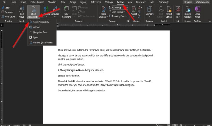
    How to use the Accessibility Checker in Microsoft Office

    Screenshot showing where to click to enable to accessibility checker in Word. Source: thewindowsclub.com
    • Perhaps obvious if you know how, but as someone who has used Office tools a fair bit over the years, I don’t think I’d ever known about the Accessibility Checker!
    • To use in Microsoft Word, Excel, OneNote, or PowerPoint:
      • click on the “Review” tab
      • then the “Check Accessibility” menu trigger
      • then the “Check Accessibility” option
      • It will display accessibility information in a panel on the right
    • The article is very light on detail, but I imagine this tool captures issues like text being too small or obscured, and colour contrast issues.

    Prefer longer newsletters? You can subscribe to week11y, fortnight11y or even month11y updates! Every newsletter gets the same content; it is your choice to have short, regular emails or longer, less frequent ones. Curated with ♥ by developer @ChrisBAshton.

  • dai11y 27/08/2021

    Your daily frequent11y newsletter, brought to you by @ChrisBAshton:

    Link shorteners: the long and short of why you shouldn’t use them

    • A blog post by the Government Communication Service.
    • In the old days of social media, URLs used to count towards the character limit, so using a URL shortener was often a necessity. This isn’t the case anymore.
    • Whilst these URL shorteners provide insights into how often a link is clicked, they offer little more than the social media platforms and Google Analytics offer natively.
    • Short URLs provide no clue as to the content, and can’t be trusted. Some link shortening tools threaten user privacy too, installing cookies when people follow our links.
    • GCS go into more detail on creating accessible links for social media:
      • One link per post (as “people who navigate via keyboard shortcuts often find it frustrating to navigate to multiple links”)
      • Clear calls to action (“Read guidance on applying for a driving license + LINK”)
      • Use capital letters at the start of each word in a hashtag, e.g. #AccessibilityAwareness. These tags are often turned into links, and assistive technologies reading the link text should read the words correctly when capitalised.

    Prefer longer newsletters? You can subscribe to week11y, fortnight11y or even month11y updates! Every newsletter gets the same content; it is your choice to have short, regular emails or longer, less frequent ones. Curated with ♥ by developer @ChrisBAshton.

  • dai11y 26/08/2021

    Your daily frequent11y newsletter, brought to you by @ChrisBAshton:

    Hyperlegible: an approach to accessible type design (video, 10 minutes)

    • Linus Boman, who I was lucky enough to have as a housemate a few years ago, is a design expert. Here, he talks about the new Atkinson Hyperlegible Font – which he helped to develop – and which is now freely available on Google Fonts for personal and commercial use.
    • The font is designed to be as accessible as possible whilst still embodying harmonious design (avoiding the trap of becoming “some kind of ransom note”, as Linus puts it).
    • Linus describes how each glyph’s apertures are widened to make it easier to distinguish, and walks through other techniques such as adding serifs to differentiate between homoglyphs (e.g. lowercase L and uppercase i).
    • At around 7 minutes in, the video does a particularly good job of illustrating how conditions such as blurry vision or diabetic retinopothy affect the legibility of the characters.
    • Linus has quite an active YouTube channel which is definitely worth checking out further!

    Prefer longer newsletters? You can subscribe to week11y, fortnight11y or even month11y updates! Every newsletter gets the same content; it is your choice to have short, regular emails or longer, less frequent ones. Curated with ♥ by developer @ChrisBAshton.

  • dai11y 25/08/2021

    Your daily frequent11y newsletter, brought to you by @ChrisBAshton:

    Accessibility of the section element

    • Scott O’Hara writes about the <section> element, designed for representing a group of content that has an “overarching theme”. Headings within each <section> are meant to be scoped semantically within that section (you could in theory put <h1> tags inside each <section>), but in practice, nothing different gets programmatically exposed to assistive technologies.
    • The only thing <section> currently does in that regard is to define an implicit role="region". However, this does not get announced to screen readers unless it is given a name, either via aria-labelledby, aria-label, or title.
    • Scott recommends naming <section> elements only when absolutely necessary: “if everything’s a landmark then there’s nothing really special about them, is there?”. Instead, Scott suggests using proper heading levels to indicate sections and sub-sections of content.

    Prefer longer newsletters? You can subscribe to week11y, fortnight11y or even month11y updates! Every newsletter gets the same content; it is your choice to have short, regular emails or longer, less frequent ones. Curated with ♥ by developer @ChrisBAshton.

  • dai11y 24/08/2021

    Your daily frequent11y newsletter, brought to you by @ChrisBAshton:

    Do not assume users turn off CSS or JavaScript

    • I’ve seen this before, but Stefan Judis’ newsletter pointed it out to me again.
    • This is the Government Digital Service’s “service manual” on “Building a resilient frontend using progressive enhancement”.
    • It maintains that we don’t support no-JS / no-CSS browsers for the sake of a minority of individuals who may disable such features. Instead, we do so to account for all manner of other circumstances, including network errors, ad blockers, firewalls and proxies, all of which can interfere with the loading and execution of CSS/JS.
    • Making services work without JS or CSS makes them more accessible to a wide variety of users.

    Prefer longer newsletters? You can subscribe to week11y, fortnight11y or even month11y updates! Every newsletter gets the same content; it is your choice to have short, regular emails or longer, less frequent ones. Curated with ♥ by developer @ChrisBAshton.