Category: dai11y

Accessibility themed newsletter: get your daily dose of a11y.

  • dai11y 19/01/2022

    Your daily frequent11y newsletter, brought to you by @ChrisBAshton:

    WordleBot is a shortcut that brings accessibility to your Wordle results

    Unless you’ve been living under a rock in 2022, you’ll no doubt have come across Wordle, the viral word guessing game that has people sharing their results in a grid on social media, like so:
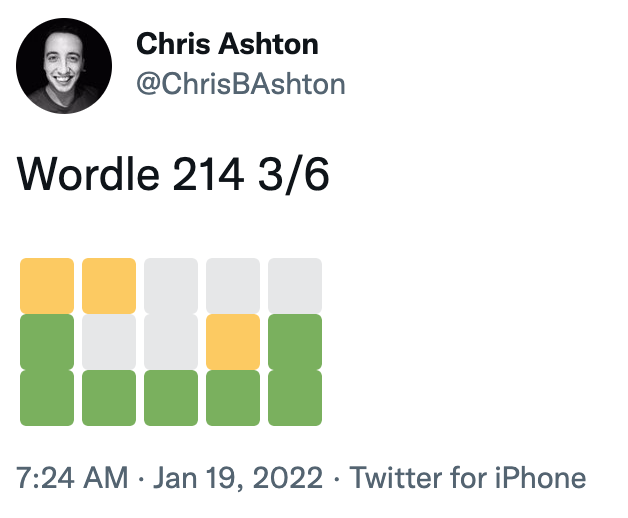
    Screenshot of ChrisBAshton's tweet: "Wordle 214 3/6", followed by three rows of coloured squares.
    I’m not just sharing this one because I got a fantastic score…

    The resulting grid of coloured squares represents how many letters of each guess was correct, and ultimately how many guesses were needed before the correct word was arrived at. But it’s something of an accessibility nightmare for screen reader users.

    Federico Viticci has attempted to fix the issue, by building WordleBot. This is a shortcut for iOS and macOS which edits the text in your clipboard to have a more accessible output, like so:

    Wordle 207 5/6

    ⬜🟨🟨⬜⬜ (2 partial)
    🟨🟨⬜⬜⬜ (2 partial)
    ⬜🟩🟨🟩⬜ (1 partial, 2 perfect)
    ⬜🟩⬜🟩🟩 (3 perfect)
    🟩🟩🟩🟩🟩 (Wordle done on Line 5)β€” Federico Viticci (@viticci) January 12, 2022

    It’s a nice idea, and a valiant effort by Federico, but is a manual workaround that only works for Apple customers. I’d like to see somebody build a Twitter bot that automatically responds to inaccessible Wordle tweets and provides alt text responses – or better yet, the creator of Wordle could change the share text directly.

    PS: Wordle has inspired all sorts of creative endeavours, including a Wordle-to-music generator, Wordle-to-Townscaper and Wordle cross-stitching!


    Prefer longer newsletters? You can subscribe to week11y, fortnight11y or even month11y updates! Every newsletter gets the same content; it is your choice to have short, regular emails or longer, less frequent ones. Curated with β™₯ by developer @ChrisBAshton.

  • dai11y 18/01/2022

    Your daily frequent11y newsletter, brought to you by @ChrisBAshton:

    Five 2022 accessibility trends

    A UX Collective article outlining predicted trends for 2022:

    1. The web will become more accessible – particularly the websites of larger companies.
      • The SOAR report found that 62% of the Alexa 100 websites were accessible to screen readers, up from 40% in 2020.
      • The WebAIM Million project found a very slight improvement in the accessibility of homepages across the web (from 2020 to 2021), but it will take until “the 2070s or 2080s” at this rate for the entire web to be accessible.
    2. Digital accessibility lawsuits will continue to increase
      • More than 4000 accessibility lawsuits (based on the Americans with Disabilities Act) were filed in the USA in 2021.
      • The Hooters case found that companies can be sued even if they already have remediation efforts underway and if they’ve already entered into a settlement agreement with another party.
    3. We’ll see less usage of accessibility overlays
      • Over 200 overlay customers were sued in 2021 for lack of accessibility on their website.
      • There could well be counterclaims against overlay companies from these customers.
      • One overlay company, AudioEye, had a stock value of $42 in February 2021, but recently fell to less than $7.
    4. WCAG 2.2 will be the new standard most companies use to determine accessibility
      • The standard is expected to be finalised by the end of March 2022. WCAG 2.1 took just 4 months from being finalised to being referenced in its first settlement agreement; WCAG 2.2 is likely to follow a similar trend.
      • The article suggests that the most difficult of the new WCAG 2.2 criteria to implement will be SC 3.3.7: Accessible Authentication.
    5. Large companies will want to get a head start on WCAG 3.0

    Prefer longer newsletters? You can subscribe to week11y, fortnight11y or even month11y updates! Every newsletter gets the same content; it is your choice to have short, regular emails or longer, less frequent ones. Curated with β™₯ by developer @ChrisBAshton.

  • dai11y 14/01/2022

    Your daily frequent11y newsletter, brought to you by @ChrisBAshton:

    Don’t make users switch caps letters to lowercase

    A quick tip by Stas Melnikov: add autocapitalize="off" attribute to your text input to have mobile browsers open a lowercase keyboard (as opposed to an all-caps keyboard). This is well suited to login forms which ask for the user’s email address.


    Prefer longer newsletters? You can subscribe to week11y, fortnight11y or even month11y updates! Every newsletter gets the same content; it is your choice to have short, regular emails or longer, less frequent ones. Curated with β™₯ by developer @ChrisBAshton.

  • dai11y 13/01/2022

    Your daily frequent11y newsletter, brought to you by @ChrisBAshton:

    We’re almost halfway through January, and this is the first time I’ve given my dai11y newsletter the correct year in the name! πŸ˜‚ I’ve now gone back and fixed all previous dai11y newsletters from 2022. Apologies if I led anyone to believe they’d gone back in time.

    https://buttonbuddy.dev/

    A useful micro website by Stephanie Eckles. It explains the requirements for accessible contrast on buttons, and includes a generator for creating buttons of sufficient contrast.

    You have the option of using a colour picker, or switching to “Use text input” mode to put in the CSS hex codes that you intend to use. The generator will then tell you whether or not the button has sufficient contrast, factoring in whether or not the button will be used with ‘large text’ (which is subject to different contrast requirements, detailed on the website).


    Prefer longer newsletters? You can subscribe to week11y, fortnight11y or even month11y updates! Every newsletter gets the same content; it is your choice to have short, regular emails or longer, less frequent ones. Curated with β™₯ by developer @ChrisBAshton.

  • dai11y 12/01/2022

    Your daily frequent11y newsletter, brought to you by @ChrisBAshton:

    Accessibility of Content Management Systems – what’s stopping us?

    Back in October 2020, I wrote about how W3C decided not to use WordPress because it was considered inaccessible. They opted for the proprietary Craft CMS instead, as “the Craft team had made the commitment for Craft v4 to comply with ATAG AA standards“. At the time, this spawned a bit of an internet war, pitting ‘accessibility’ against ‘open source’.

    In today’s article (also available as a video, 26m), Marie Manandise reflects on her role at Studio 24, the agency tasked with redesigning the W3C site. Marie’s job was to choose the right CMS.

    Marie talks of “the accessibility paradox”, where CMS providers all claim to “care very much about accessibility”, even when none of them are considered accessible. She suggests that we take for granted how difficult accessibility is to get right, and what resources are needed.

    For example, to properly test that website navigation is accessible to a non-sighted user, Marie says you need to do paired testing: a sighted and non-sighted user sitting side by side, in front of a screen. And that you need to test in the same manner every time you update your website.

    CMS developers “don’t have the knowledge to make the assessment” as to whether or not their CMS is accessible. “Most of us are clueless at accessibility”. Accessibility groups embedded in CMS vendor organisations tend to be “operating in the margins”. Marie says that accessibility experts have an image problem, and don’t carry the “aura of security experts, for example”.

    So what can we do about it? Echoing Eric Eggert’s points the other day, the answer is to simplify the learning material / specifications, and to ensure that accessibility is on the curriculum at courses and bootcamps.


    Prefer longer newsletters? You can subscribe to week11y, fortnight11y or even month11y updates! Every newsletter gets the same content; it is your choice to have short, regular emails or longer, less frequent ones. Curated with β™₯ by developer @ChrisBAshton.

  • dai11y 11/01/2022

    Your daily frequent11y newsletter, brought to you by @ChrisBAshton:

    Amazing haptic speaker lets visually impaired people read braille in midair

    ATM with additional big black pad hardware attached to it. A person's hand is hovering above the pad, their fingertips above a separate portion at the top of it, where the braille sensory happens.
    Copyright: Viktorija Paneva. Source: https://www.digitaltrends.com

    This is not a new article, but has been in my bookmarks since May 2020. Researchers at Bayreuth University in Germany have developed a speaker system which emits ultrasound waves that allow people to read braille in mid-air. The research is particularly pertinent during this coronavirus pandemic, where avoiding touching public surfaces is generally a good thing!

    The technology is made up of a 16×16 grid of speakers, and can detect a hand up to a distance of 70cm.

    You can read the full academic study, “HaptiRead: Reading Braille as Mid-Air Haptic Information“.


    Prefer longer newsletters? You can subscribe to week11y, fortnight11y or even month11y updates! Every newsletter gets the same content; it is your choice to have short, regular emails or longer, less frequent ones. Curated with β™₯ by developer @ChrisBAshton.

  • dai11y 10/01/2022

    Your daily frequent11y newsletter, brought to you by @ChrisBAshton:

    The world’s most accessible websites

    This is a study by ToolTester.com, but take its findings with a big pinch of salt.

    The study looks at “the 200 most popular websites in the world”. This list of sites was allegedly “collected from data by Similarweb”, but comparing the study data with the top websites on similarweb.com, a lot of moderation has evidently taken place: the study omits adult websites, non-English websites, and (inexplicably) Reddit.

    asos.com is deemed the ‘least accessible’ site, with the “percentage of site inaccessible” graded as 21.38%. This story has been covered by the Mirror and also covered by ChargedRetail.co.uk, which is what brought my attention to the study in the first place. Both news sources implied that the 21% figure applies to the whole website – the Mirror even headlines ‘1 in 5 pages blocked’ – but according to the ToolTester methodology (at the end of the study), only the homepage was tested.

    ToolTester used ‘Arc Toolkit’ – a Chrome extension – to perform automated tests across these sites. It doesn’t look as though any manual testing was performed. For these reasons, I really think this study is lacking in detail and substance, but it’s an interesting data point nonetheless.

    ASOS performed poorly due to errors including poor colour contrast, missing ARIA and missing labels. Instagram came second in inaccessibility, lots of user generated content with no alt text causing the bulk of issues, but there are other more easily fixable issues, including a lack of alt text on the login page and a lack of ARIA labels on play buttons. Facebook also makes the bottom 10 list.

    Government websites NIH.gov, CDC.gov and GOV.UK fared best, with LinkedIn, H&M, PayPal and Amazon not far behind. All of these websites had more than 99% of their ‘site’ (read: homepage) considered accessible.


    Prefer longer newsletters? You can subscribe to week11y, fortnight11y or even month11y updates! Every newsletter gets the same content; it is your choice to have short, regular emails or longer, less frequent ones. Curated with β™₯ by developer @ChrisBAshton.

  • dai11y 07/01/2022

    Your daily frequent11y newsletter, brought to you by @ChrisBAshton:

    Fix web accessibility systematically

    Another WCAG 3 related post by Eric Eggert, who claims the new standard will not be the silver bullet some people think it will.

    Eric laments the current situation of accessibility technologies: the complex set of documents including WCAG 2, ATAG 2 (standards for authoring tools), UAAG 2 (for browsers / user agents), ARIA, ARIA Authoring Practices (designed to be technologically neutral, so lacking HTML best practice), HTML Accessibility API Mappings and ARIA in HTML. This is a complex world for developers. “β€œDon’t use ARIA unless you have to” is a common phrase uttered by accessibility experts, but how are ordinary developers supposed to know when they have to?”

    The situation isn’t helped by a lack of interoperability, and a lack of traction in browsers. <input type="date"> has been standardised for over a decade, but still “lacks accessibility support in modern browsers”. Early thoughts around ARIA were that “most aspects of it would be converted into native HTML quickly: combo boxes, dialogs, tab panels”, etc – but a world with natively accessible features right out of the box “did not come to pass”. Instead, ARIA is now a meta language that sits between technologies, defining an accessibility vocabulary for them. ARIA takes on features of HTML, instead of the other way around.

    Releasing a new WCAG version will not fix the situation: Eric wants to see much more work done in browsers themselves. Making a form input with a missing label should trigger a console warning for developers. Standardising accessibility support in native elements would greatly simplify documentation and improve reliability. The easier accessibility is to teach, the more accessible the resulting websites.


    Prefer longer newsletters? You can subscribe to week11y, fortnight11y or even month11y updates! Every newsletter gets the same content; it is your choice to have short, regular emails or longer, less frequent ones. Curated with β™₯ by developer @ChrisBAshton.

  • dai11y 06/01/2022

    Your daily frequent11y newsletter, brought to you by @ChrisBAshton:

    WCAG 3 is not ready yet

    Article by Eric Eggert, reminding people that WCAG 3 won’t be released for another 3-5 years. The new standard is still in draft form and is subject to change. Commercial and public projects are, generally, required by law to comply to WCAG 2, and WCAG 3 is not backwards compatible, so we must take care to continue to abide by WCAG 2 in the meantime. WCAG 2.1 is the latest official standard, with 2.2 coming sometime this year.

    Eric focuses in on the new colour contrast algorithm that’s coming in WCAG 3: “the visual contrast algorithm, APCA, is a stark departure from the luminosity contrast algorithm used in WCAG 2”. Unlike in WCAG 2, APCA takes font face, size and weight into account, better representing how colour perception works in practice. The trade-off of extra complexity “might be totally worth it”, but there is little actionable advice in the specification at time of writing.

    If we were to have a “modular WCAG”, similar to what CSS is doing, we could package up new success criteria into a new version. Eric says this would give room to change ratings and evaluation guidelines per criterion, without having to release a new major version. It’s an interesting thought!


    Prefer longer newsletters? You can subscribe to week11y, fortnight11y or even month11y updates! Every newsletter gets the same content; it is your choice to have short, regular emails or longer, less frequent ones. Curated with β™₯ by developer @ChrisBAshton.

  • dai11y 05/01/2022

    Your daily frequent11y newsletter, brought to you by @ChrisBAshton:

    On the <dl>

    Ben Myers walks us through the <dl> (‘description list’ – previously ‘definition list’ prior to HTML5) element. Name-value pairs are a common UI pattern you’ll have seen all over the place, for example:

    Publisher: New Riders Pub; 3rd edition (October 19, 2009)
    Language: English
    Paperback: 411 pages

    You could mark this up as a series of <div>s, but a screen reader user would lose out on benefits such as knowing how many name-value groups are in the list, and skipping over the list. It is better to use semantic markup, like so:

    <dl>
      <dt>Publisher</dt>
      <dd>New Riders Pub; 3rd edition (October 19, 2009)</dd>
      <dt>Language</dt>
      <dd>English</dd>
      <dt>Paperback</dt>
      <dd>411 pages</dd>
    </dl>
    

    You can use multiple <dd> (description detail) elements per <dt> (description term) if appropriate, e.g. associating multiple authors with a book. Just list the multiple <dd>s one after the other.

    You are also allowed to wrap your <dt>Foo</dt><dd>Bar</dd> element groups with a <div></div>, if needed, for style purposes. This is the only element that is allowed to wrap these.

    If you have multiple description lists in your page, you can differentiate them by adding an aria-label attribute to each <dl> element.


    Prefer longer newsletters? You can subscribe to week11y, fortnight11y or even month11y updates! Every newsletter gets the same content; it is your choice to have short, regular emails or longer, less frequent ones. Curated with β™₯ by developer @ChrisBAshton.