Category: week11y

Accessibility themed newsletter released every week.

  • week11y issue 137

    Welcome to the first week11y of 2023! I’ve had a nice little break from the newsletter, but am looking forward to getting going again.

    But first: a big thank you to everyone who completed my survey. It’s really useful knowing what’s most important to you (so much so that I’ll leave it open, in case anyone else wants to fill it in). Developments in a11y specifications, as well as tools/resources to help with a11y testing/design, are the subject areas that were most requested, and I have an example of each in this issue!

    I will also continue writing my summary for each resource, as most of you said you find this useful. Another idea pitched was to start ‘collections’ of bookmarks, so that these links aren’t lost into the ether after they’re published. Whilst these newsletters are posted to my website, they’re not organised beyond date, so I’ll definitely give that some consideration. Now, on with the issue!


    Giphy is adding alt text to make GIFs more accessible

    Giphy is working with Scribely (a “content accessibility solutions provider”) to add descriptive text to its most popular animated gifs. It will be professionally hand written, not auto-generated.

    Giphy is also planning to expose the alt text through its APIs, so that third party platforms can benefit from the alt text too. Twitter, for example, has a partnership with Giphy, so any Giphy content shared to Twitter might soon be more accessible.

    It does seem a bit sad that we’re celebrating a major company beginning to recognise the importance of alt text as we’re entering into 2023. But a step in the right direction nevertheless.


    The 411 on 4.1.1

    Adrian Roselli writes about WCAG SC 4.1.1: a 13.5 years old rule that first came out in WCAG 2.0. Roughly, it stipulates that content should have proper markup (elements only nested as per specifications, no duplicate attributes or IDs, etc).

    One of the authors recently-ish filed a proposal to clarify the language, claiming that the original intent of the criterion was narrower than the current interpretation reflects. Moreover, it’s been argued that 4.1.1 as a whole should be deprecated now that browsers more predictably handle nesting, closing elements and duplicate attributes. It may disappear as early as WCAG 2.2.

    Adrian goes into technical detail on why each thing covered by 4.1.1 is either no longer relevant, or considers where that thing might be better covered by other Success Criteria. He anticipates that the W3C will “come out with a clearer and better considered mapping for former 4.1.1 issues”.


    Swearing and automatic captions

    Eric Bailey highlights the issue of how automatic captions deal with swearing. A number of providers automatically censor certain words, displaying a string of asterisks instead. There are lots of problems with this:

    1. It’s nannying what a Deaf person should be hearing, creating a lack of equivalency in experience.
    2. It undoes the speaker’s agency, “diluting the message they’re trying to communicate”. People get passionate, people swear, it is a deliberate act.
    3. It wrongly assumes that captioning is only ever used in a professional or ‘business’ context.
    4. It also asserts that all professional or business contexts should be swear free – why?
    5. It creates confusion: the audience is left trying to figure out what the word is, and may even imagine a far ruder word than the captioning software was trying to save them from!
    6. It falls victim to inaccuracy. Non-swear words get accidentally censored, whereas actual swear words get imaginatively interpreted (Eric cites “Titz”, a municipality in Germany).

    Eric experiments with speaking specific swear words into a number of different applications that provide automatic captioning, e.g. Zoom, Google Meet and TikTok. The results were mixed – you can watch videos of each in the article. I particularly enjoyed the summary for Skype: “many swears were initially displayed and then replaced with asterisks, making the entire point moot.”

    We then move onto ‘voice control’ technologies, such as voice access (a native Windows 11 feature). It censors (with asterisks) the swear words you’re transcribing – a disappointing outcome for inclusivity. Apple’s equivalent, Voice Control, doesn’t censor. Dragon Home censors by mishearing words, e.g. “shipped”.

    Censoring swear words is kind of a default approach built into a lot of software. It’s often implemented with little thought, on the reasonable enough assumption that this is the correct, ‘safe’ approach, to avoid the risk of abuse of your product and/or reputational damage to your company. But there’s a serious accessibility issue at the heart of this, and Eric hits the nail on the head. Well worth a read.


    colorandcontrast.com

    This is a very deep dive into colour, contrast, and how people differ in how they see things. It has interactive examples throughout, which really help to illustrate the concepts. Definitely one worth a bookmark.

    It begins with the biology of the eye, before going into colour vision and visual impairments, and different vision effects. It then covers properties of colour (lightness and hue, but also chromaticity and chroma), the relationships between colour, the different colour models used in technology (RGB vs CMYK etc) and different ways of measuring contrast.

    It ends with a chapter on light vs dark mode, and a chapter on user interfaces and data visualisations, which will be perhaps the most relevant sections to skim through.


    Did you know that you can subscribe to dai11y, week11y, fortnight11y or month11y updates! Every newsletter gets the same content; it is your choice to have short, regular emails or longer, less frequent ones. Curated with ♥ by developer @ChrisBAshton.
  • week11y issue 136

    We’re fast approaching Christmas, and I have a gift for you. You can shape the future direction of this newsletter by filling in my survey! It would really help me to understand what you like or don’t like, which subjects you’d like to read more about, all that lovely stuff. All I Want for Christmas is You(r) thoughts on my newsletter – please fill it in! 🎄 Now on with the show…

    HTMHell Advent Calendar 2022

    Manuel Matuzović’s famous “HTMHell” site cites lots of examples of bad HTML practices, copied from real websites. See “button disguised as a link“.

    Last year, Manuel created an ‘advent calendar’ of links to other sites, linking to articles about HTML.

    This year, Manuel has enlisted the help of 24 authors from all over the world, to write and publish articles specifically for Manuel’s calendar.

    Visit the calendar link above to see the articles published so far, or follow along on Twitter.


    Should browsers offer site-specific user preference controls? (yes!)

    Stefan Judis dreams about what could be made possible in browsers in this short opinion-piece.

    Users can set an OS-level or browser-level preference for light or dark mode, but there’s currently little support for configuring this on a per-site basis. What if you simply prefer a particular mode on a specific site, even if it goes against your global settings?

    Stefan highlights Safari’s website-specific controls menu, which can only be accessed after enabling them via toolbar settings. Here, users can set preferences on page zoom, autoplay, and permissions including location and camera access, on a per-site basis. Stefan feels other preference should be configurable here too.

    Stefan would like to see ‘preference queries’ not only easily configurable globally, but easily overrideable on a per-site basis. These include:

    • prefers-reduced-motion
    • prefers-reduced-transparency
    • forced-colors
    • prefers-color-scheme
    • prefers-reduced-data

    Hopefully one brave browser will lead the way and this could become a reality one day.


    A Guide To Keyboard Accessibility: HTML And CSS (Part 1)

    This is a comprehensive run-through of a lot of the stuff you may already know: how different tabindex values affect keyboard behaviour, the new(ish) :focus-within CSS selector to be able to apply focus styles on a container element, the new (and not ready to use yet) inert attribute that promises to make modal dialogs much easier to implement, and so on.

    There are some nuggets of handy tips and links to resources that were new to me though. Did you know that Firefox allows you to tab to any area that is scrollable (i.e. even if it isn’t a form control or link)?

    There’s a reminder to not use outline: none in your CSS (to eliminate the element’s outline), as it is used by Windows High Contrast Mode. And, despite showing an example that demonstrates otherwise, we’re told to avoid wrapping <input> with <label> because it doesn’t work well with Dragon speech recognition software.

    We’re warned against the use of display: contents, which effectively makes the element’s children direct descendents of the element’s container (i.e. the childrens’ grandparent), but “without losing semantics”. It’s an interesting concept, but one that is quite buggy, and best avoided. There’s also a section about CSS grid and flexbox, and the care needed to ensure that tabbing continues to be in a predictable order.

    I liked the section about ‘skip links’ towards the end of the article. It reminds us that we can provide multiple skip links at the top of the page, e.g. to skip to main content, or to skip to a list of all articles. We can also apply skip links within content, e.g. if there is an embedded map in the page and it has lots of focussable elements, you may want to give the keyboard user an option of skipping over it.

    Further reading: MDN web docs page demonstrating lots of different input types, so that you can try interacting with each one of them using your keyboard.


    A Guide To Keyboard Accessibility: JavaScript (Part 2)

    In this second part of a two-part series, we move away from HTML and CSS and take a closer look at JavaScript.

    The click event listener listens for a mouse click, but is also triggered by the Enter key (on buttons and links) and the Space key on buttons only. For other keys, you’d need to use the keydown event. This is often used for things like enabling the Esc key to close a modal. You can use keycode.info to find out which key code corresponds to the key you’re listening for.

    Another important event is blur, which indicates that the element has lost focus. Combined with the keydown event, you can use this to add and remove a class on the given element, so that the state is wiped clean on each interaction and you can (for example) continually open and close a modal.

    Next, we learn about the focus() method, which allows you to bring the keyboard focus to a particular element. It can be used with the preventScroll argument to ensure the browser doesn’t scroll as part of the interaction. There’s also a new focusVisible argument, which would prevent the focussed element from displaying its focus styling, but this currently only works in Firefox.

    There’s a section on “roving tabindex which looks interesting – check out the demo. Sadly, the role="tab" and role="tabpanel" attributes are left unexplained, but there’s lots of detail about the actual JavaScript implementation.

    The inert attribute mentioned in dai11y 15/12/2022 (intended for things like modals) gets a second showing here: the author talks us through how we should implement a modal at the moment (with inert not yet supported). We give it a role="dialog" and aria-modal="true" for screen reader, and a tabindex="-1" to make it programmatically focussable. Then, we create a function to open the modal, but need to keep track of which element opened it, as we’ll need to return focus to that element when closing the modal. The code looks something like:

    let focusedElementBeforeModal;
    const modal = document.querySelector("[role='dialog']");
    
    const openModal = () => {
      focusedElementBeforeModal = document.activeElement;
      modal.hidden = false;
      modal.focus();
    };

    There’s some more detail about modals / focus traps and how to use the new inert attribute, towards the end of the article.


    Did you know that you can subscribe to dai11y, week11y, fortnight11y or month11y updates! Every newsletter gets the same content; it is your choice to have short, regular emails or longer, less frequent ones. Curated with ♥ by developer @ChrisBAshton.
  • week11y issue 135

    Your weekly frequent11y newsletter, brought to you by @ChrisBAshton:

    Lefty dentists and inclusive design

    An article about the barriers faced by left-handed dentists, in what the article author, Robert Stribley, calls “a failure of inclusive design”. Robert’s dentist immediately “became a better dentist” after graduating dental school, as they were able to set up their working environment to best suit them.

    Barriers occur in everyday situations:

    The pen you have to sign things with at the bank is often positioned for right-handed people. The machines for swiping your subway card here in New York are exclusively positioned for right-handed people. And scissors? Ask left-handed people about scissors. When you’re left-handed, you realize how insensible it is for scissors to be designed exclusively for right-handed people. In fact, when I was living in Pusan, Korea in the mid-90s, I found that ambidextrous scissors were available everywhere, so I bought two pairs and still use them to this day.

    Going back a few decades, children were literally punished for being left-handed, and were forced to write right-handed. Between the early 1900’s and 1960’s, the rate of left-handedness appeared to “increase” as it gradually became more accepted – but the proportion has almost certainly been constant throughout, it’s just that a large number of left-handed people had to suppress their instincts and learn to live right-handed.

    Robert compares this to “the idea that transgender people have suddenly been materializing in our society, due to either being transgender becoming trendy or, worse, because (some critics posit) children being “groomed” by adults to be trans. Of course, the simpler answer is simply that transgender people are rising in numbers because they’re no longer being stigmatized to the degree that they once were”.

    Robert, a creative director & “UXer”, amongst other things, concludes with this:

    As we come to understand the diversity of our shared human experience then, we’re increasingly exposed to opportunities to develop more inclusive design practices. This applies across the whole spectrum of design, including the design of physical products and digital experiences.

    There are both noble and practical reasons to practice inclusive design. And no good reasons not to.


    When to use target=”_blank”

    An old CSS-Tricks article by Chris Coyier, worth reading as a refresher.

    The default value for the target attribute, if unspecified, is “_self”, meaning links open within the same window. Using “_blank” forces links to open in a new window or tab. Users can opt in to opening in new tabs by using CMD + Click when opening links, so they have the choice without being forced into any one decision.

    Chris points out some bad reasons that have been used in the past to justify forcing links to open in new tabs:

    • For branding, metrics and engagement. Opening new tabs means people still have your website on their original tab, keeping them on your site.
    • Because internal and external links are different. Quite a few sites only open ‘external’ in a new tab.
    • Because the link is to a PDF. Users can still use the back button, so why a new tab? (PS if you’re trying to make it easier to download, use a download attribute on the link instead).
    • Because your client wants it that way. Chris suggests educating them about not frustrating their users.
    • Because it’s an infinite scroll page (to avoid the issue of handling ‘back’ behaviour after a long scroll).

    Chris then lists some good reasons for opening in new tabs:

    • Because there is user-initiated media playing.
    • Because the user is working on something that would be lost if the current page changed.
    • Because there is a technologically obscure reason. Chris cites “building an email where people in Outlook Kangaroo 2009 Enterprise Edition need to open it but links need to have target=”blank” on them otherwise they open in the sidebar viewing panel”…!

    Last but not least, don’t forget to add the rel="noopener" attribute when opening in new tabs, for security reasons. This is less relevant now we’re approaching 2023, but the article hasn’t been updated to remove that advice yet, so I’d err on the side of caution and keep doing it.


    Linux Accessibility: an unmaintained Mess

    Devin Prater shares his experiences of trying to use Linux as a blind person.

    He reminisces about the days of Gnome 2 on Vinux, which was “accessible and easy to use” when used with Orca, the Linux GUI screen reader. Around 2015, Sonar came along, based on Antergos (Arch Linux). Both projects “are no more”, due to infighting when the two planned to merge.

    With Vinux and Sonar abandoned, many blind Linux users moved to mainstream distributions, which vary in their accessibility. Devin shares tale after tale of the barriers he faces and overcomes, only to be faced with another barrier. I won’t reproduce it all here, but safe to say that even when doing everything right, Devin would need to enable settings on a per-app basis, find things were incompatible and that key processes would crash. If someone as technically competent as Devin faces these issues, other users have no hope.

    Devin ends with a call to action, for the open source community to care enough about accessibility to “clean up the mess they started”. He was forced to reinstall Windows, and highlights how not being able to use Linux is impacting his ability to get a skilled, well-paid job. Devin points out that the blind community are the very people that stand to benefit most from gaining system administrator skills and so on, if the accessibility barriers can be overcome.


    Setting up an Accessibility Book Club

    Beverley Newing, Accessibility Lead at the Ministry of Justice Digital and Technology, describes how they set up an ‘Accessibility Book Club’.

    The club helped Beverley to create accountability, to ensure they were setting aside time to read and hear about the experiences of disabled people. The club can read books, or watch films/documentaries/TV series, but the item has to be about (or written by) someone disabled, or be on the topic of disability.

    Beverley suggests using an online location as a meeting point, e.g. Google Meet. Create a calendar placeholder and a series of questions to serve as discussion prompts. Finally, create a Slack poll (or similar) so that the next media item can be voted upon.

    The author has open-sourced a “collection of resources to help run an accessibility book club”. The linked app is down at time of writing, but you can access the resources on GitHub.


    Did you know that you can subscribe to dai11y, week11y, fortnight11y or month11y updates! Every newsletter gets the same content; it is your choice to have short, regular emails or longer, less frequent ones. Curated with ♥ by developer @ChrisBAshton.

  • week11y issue 134

    Your weekly frequent11y newsletter, brought to you by @ChrisBAshton:

    Why you should never use px to set font-size in CSS

    Josh Collinsworth dispels the myth that it doesn’t matter whether you use px, em or rem for your font sizes.

    Whilst px stands for “pixels”, it no longer translates into physical pixels on the screen, as browsers scale up pixels on higher resolution screens. “Pixels on the iPhone 14 Pro are so microscopic that 16px, in literal device pixels, would be about the size of printed type at 2pt font size”.

    em once referred to the physical size of an “m” character, but now refers to “current font size”. rem stands for “root em“, and refers to the root font size. By default, 1 em and 1 rem are equal to 16px (the default font size of most browsers). But whilst 1 rem generally remains at a constant 16px, the ‘pixel size’ of 1 em changes based on its context.

    With the CSS .container { font-size: 200% } and .container p { font-size: 1em }, the 1em here will actually render as a 32px size, not 16px.

    Understanding how this works is the key to unlocking why defining font sizes in px is a bad idea. em and rem work with the user’s font size – the user can change the browser’s default font size and everything will scale accordingly. Defining font sizes in px overrides the user’s choices.

    The misconception most likely comes from this: developers zooming in to test their web page, and noting that fonts seem to scale up and down irrespective of the unit type used. However, not everything scales in the same way.

    If you set CSS of p { border-bottom: 2px solid black; margin-bottom: 20px }, and then change the default browser font size to 64px, you’ll see some large text, but the surrounding spacing and borders don’t scale with it. Setting these values with em or rem would mean they would scale with the text. Zooming in and out does scale the border and spacing, but it’s so undersized compared to the root font size that it looks terrible. See screenshots in the article.

    For similar reasons, it’s important not to use px in your media queries. If the user overrides their root font size, you may find that your breakpoint does not trigger at the width that you expect it to.

    Josh summarises with a recommendation to use rem by default, only using a smattering of em where it’s important to make something relative to the size of its container, and only using px for certain aesthetic elements that you would not want to scale with the user’s font size.


    https://randoma11y.com/

    A helpful utility for generating accessible color combinations. View the project on GitHub or follow it on Twitter.


    Why we need CSS Speech

    Léonie Watson describes how all modern browsers allow you to “listen to content”, either natively or through some plugin/extension, and how developers currently have very little control over how content gets read. “In the same way an organisation chooses a logo… it stands to reason that they may also [wish to] choose a particular voice that represents their brand”.

    Speech Synthesis Markup Language (SSML) is intended for this purpose, but involves mixing in special markup inside your HTML. Léonie argues that this returns us to the bad old days of having to mix styling into our HTML, before CSS allowed us to separate content from its presentation. (By the way, SSML isn’t supported in any browsers yet).

    Léonie points us to the CSS Speech Module. It is a W3C Candidate Recommendation, thus has not yet achieved the status of W3C Recommendation. In short, it proposes a set of CSS properties to let authors define the aural presentation of content, whether read out by someone’s screen reader, a browser’s read-aloud capability, or a platform Text To Speech (TTS).

    The speak: property would act like the display: property; the latter determines whether an element is visible, and the former would determine whether the element should be spoken. These would be linked; if an element is set to display: none, for example, then the element would also not be spoken, unless an override is provided. Other properties proposed include voice-family, voice-pitch, voice-rate and voice-volume.

    Léonie is hoping to edit the CSS Speech module, stripping it down to its bare minimum, as the current proposal is “too big, too wordy, and has too many features”.


    Did you know that you can subscribe to dai11y, week11y, fortnight11y or month11y updates! Every newsletter gets the same content; it is your choice to have short, regular emails or longer, less frequent ones. Curated with ♥ by developer @ChrisBAshton.

  • week11y issue 133

    Your weekly frequent11y newsletter, brought to you by @ChrisBAshton:

    What Does X% of Issues Mean?

    Adrian Roselli ponders what tools mean when they claim to find up to X% of issues. What do “issues” mean in this context?

    He ran a Twitter poll with a few options; most people interpreted “issues” to mean ‘issues validating against the 78 Success Criteria from WCAG 2.1’. But this was closely followed by people who thought it meant “against the tool’s own list of items”, i.e. tests unique to the tool. Finally, a small minority thought it might be against Techniques for WCAG 2.1, which “provides 90 different ways of failing assorted Success Criteria”.

    Not a hugely informative post, but an interesting thought piece. Adrian recommends asking vendors to clarify exactly what they mean by “issues”.


    4 Required Tests Before Shipping New Features

    Stephanie Eckles shares 4 quick checks you should make before pushing to production.

    1. Almost 85% of homepages have text contrast issues – so check your colour contrast. Stephanie lists some automated tools that can detect these issues.
      • Use ButtonBuddy to choose accessible colours for your buttons and their focus states. For the text, background colour, and transition between focus states, there are five con trast considerations you’ll need to make!
    2. Next consider keyboard interaction – here’s a handy set of rules, which I’ve copied directly from the article:
      • If it opens something, it may need to close with Escape.
      • If it’s scrollable, it needs to respond to Up/Down arrow keys.
      • If it’s a group of related options (like autocomplete or tabs), it may need to respond to Up/Down or Left/Right arrow keys (search phrase: roving tabindex).
      • If it opens a dialog/modal, it needs to prevent tab access with elements outside of that experience (search phrases: “trapping focus” and “inert”).
      • If it’s interactive at all, it needs to be able to gain keyboard focus, and that focus needs to have a visible style.
      • If a sighted mouse user can explore and make independent selections (like in an autocomplete), a keyboard user needs to be able to as well. This likely means allowing a combination of tab, arrow keys, and Enter to explore and then make a selection.
      • If a :hover triggers content, then so should :focus (ex. menus). You will also need a way to close this content, whether that’s a tap/click outside or Escape key, and ensure that the method you choose is also accessible for touchscreen users.
    3. All focusable elements must have visible styles.
    4. WCAG SC 1.4.10 Reflow stipulates that your design should be able to accommodate a zoom of up to 400% on desktop. Watch out for sticky navigation, ‘contained scroll’ areas becoming cut-off, or overflows that cut off content.

    Why ‘dark mode’ causes more accessibility issues than it solves

    H Locke, a UX designer, talks about astigmatism, which affects around 47% of the UK population. Actually Locke points out it affects most of the population, but the 47% figure is those that require corrective treatment, such as lenses or glasses.

    The condition affects the shape of the eye, making it more ‘rugby ball’ shaped than football shaped. This leads to light being focused at more than one place in the eye, and can cause blurred vision, headaches and eye strain.

    Locke says that the ‘dark mode’ on certain websites can cause an effect called ‘halation’, for those with astigmatism. There’s a mocked up screenshot in the article, demonstrating the effect, but it essentially makes the area surrounding highlights blurry. In dark mode, there are a lot of highlights (e.g. white images are more pronounced), so the text around the images becomes blurred.

    Dark mode advocates often cite it as an accessibility feature – and it is an improvement for some people – but Locke reminds us of the importance of making such modes optional.


    Did you know that you can subscribe to dai11y, week11y, fortnight11y or month11y updates! Every newsletter gets the same content; it is your choice to have short, regular emails or longer, less frequent ones. Curated with ♥ by developer @ChrisBAshton.

  • week11y issue 132

    Your weekly frequent11y newsletter, brought to you by @ChrisBAshton:

    ‘Accessibility at the Edge’ W3C CG Is an Overlay Smoke Screen

    Adrian Roselli brings attention to the Accessibility at the Edge community group, hosted on W3.org. People would be forgiven for assuming that such groups are supported by the World Wide Web Consortium (W3C), but Adrian talks us through the process, which requires just five people to show their support for a proposed group in order for it to be created.

    This group started off as the “Overlay Community Group”, founded by the Chief Operating Officer at UserWay – an overlay company. Adrian argues that the renaming of the group was an attempt to distance the founders from the original purpose of the group, which would have been quite easy to argue a self-serving interest in.

    What follows is seemingly a long history of careful censorship, with difficult questions and critical comments never getting past the ‘approval’ stage on the group, thus never being seen. Adrian worries that the group could now be used to “provide a veneer of credibility”, by “using the W3C brand [in] their own ongoing marketing efforts”.

    Definitely food for thought, and something to keep an eye on.


    Are Captions More Accessible on the Top of the Screen?

    An interesting article about the placement of closed captions, which so often is put at the bottom of the screen by default.

    The author describes how they were seated in an auditorium, which tall people sat in front of them, making it difficult to read the captions at the bottom of the screen (“I lean to the left. I lean to the right”).

    On Zoom, the captions window can be moved anywhere on the screen by dragging it. It’s also possible to reposition the captions on YouTube videos.

    No solid conclusions here, unfortunately, but some more interesting experiences in the comments, e.g. captions covering the name of the speaker in news bulletins.


    For Blind Internet Users, the Fix Can Be Worse Than the Flaws

    A (paywalled) New York Times article, offering a rare mainstream insight into the use of overlays that claim to fix accessibility problems and defend companies from litigation.

    It tells the story of Patrick Perdue, who had been happily using a radio equipment shop website for some time, before the shop started using an automated accessibility overlay from accessiBe. Patrick found that the site was suddenly unusable, hiding checkout and shopping cart buttons from his screen reader, as well as hiding the site’s search box and headers.

    “I’ve not yet found a single [overlay] that makes my life better”, says Patrick. And the litigation promise doesn’t appear to be holding water either, with over 400 companies sued over accessibility last year, despite having an accessibility widget or overlay on their website.

    The three major overlay providers, AudioEye, UserWay and accessiBe all claim their products will get better over time and acknowledge that their current offerings “aren’t perfect”. Accessibility experts would prefer companies not to use such overlays, believing that hiring and training employees to build their websites to be more accessible is the answer. Mr Moradi of AudioEye advocates a hybrid approach that combines automation and manual fixes, with the expectation that automation abilities will gradually improve.


    aria-label is a code smell

    Eric Bailey highlights a snippet from the WebAIM Million report:

    Increased ARIA usage on pages correlated to higher detected errors. The more ARIA attributes that were present, the more detected accessibility errors could be expected.

    He references the increased complexity of ‘support’ in the context of ARIA, which is determined by:

    • Operating system being used,
    • Operating system’s version,
    • Browser being used,
    • Browser’s version,
    • Assistive technology being used,
    • Assistive technology’s version, and
    • Complexity of the underlying code.

    When aria-label is used on a non-interactive element – which is not what it is intended for – assistive technology handles it in different ways. It will either not be announced at all, or will be announced in strange ways.

    Even when declared on an interactive element, there are known issues. It only has partial support in Edge with Narrator, and, if you think of a play/pause toggle, in many cases it does not convey name changes when focused.

    Eric also cites examples of people using aria-label to override an otherwise visible name. Users who use their voice to navigate, such as “Click ‘snapshot’”, may be surprised when their voice command does not work, as the underlying accessible name is different (and not visible to them).

    Some browsers do not translate aria-label content, so things like Google translated pages won’t work properly. Finally, aria-label content is not very robust to things like stylesheets failing to load. An alternative – visually hidden text – will at least still be visible if the styles fail to load.

    Worth reading the Hacker News comments on this too.


    Did you know that you can subscribe to dai11y, week11y, fortnight11y or month11y updates! Every newsletter gets the same content; it is your choice to have short, regular emails or longer, less frequent ones. Curated with ♥ by developer @ChrisBAshton.

  • week11y issue 131

    Your weekly frequent11y newsletter, brought to you by @ChrisBAshton:

    A First Look at the Websites and Software Applications Accessibility Act Bill

    The “Websites and Software Applications Accessibility Act” (or #A11yAct) has been put forward to the United States Congress. If it succeeds, it will build on the Americans with Disabilities Act (ADA).

    Its aim is to lead to clearer regulations for digital accessibility requirements in the US. Here, Ben Myers looks at it from a web developer’s perspective. He opens with a disclaimer that he’s not a lawyer. For a legal perspective, read “Proposed web and software accessibility legislation introduced in United States Congress“.

    Ben summarises the bottom line for us:

    • Websites and apps will need to be accessible, period – no longer any need to demonstrate a link to a physical, bricks-and-mortar place (an idea called “nexus”).
    • Regulations would be updated every three years.
    • It’s not a silver bullet, but it will give disabled users more recourse against inaccessible products.

    Ben then gives a short history of the ADA and why new legislation is necessary. One issue is the idea of ‘nexus’, and another is that it did not keep up with the times, but the main issue is ambiguity. The lack of published regulations means individual courts are left to interpret the act, leading to inconsistent outcomes in accessibility lawsuits.


    Are you sure that’s a number input?

    Kilian Valkhof highlights how <input type="number"> is often used incorrectly, despite it being available in browsers for around 8 years now.

    Number inputs display a ‘spinbox’ (up and down buttons) to make it easier to increment or decrement the input. This kind of indicates the type of thing this input type should be used for: non-identifying numbers.

    Instead, a lot of sites use number inputs for things like 2FA codes, social security numbers and credit card numbers. These are identifiers, where if you’re off by just 1 digit it’s much the same as being off in ALL the digits. Having a spinbox for this provides no value.

    If your input is a set of digits that is used to identify someone or something, it’s not a number type, even if the input itself is entirely made of numbers. What you want in those cases is <input type="numeric">.


    Perceived affordances and the functionality mismatch

    Léonie Watson shares a design problem she encountered on Twitter. When you have ‘buttons’ grouped together in a row, and only one can be ‘active’ at any one time, how should it be marked up?

    This fits quite nicely with a standard radio button form control, where you can only select one radio input. Choosing any other radio input automatically de-selects the previously chosen one. Exactly what we’re trying to achieve in this design problem.

    However, whilst that might work well enough for sighted users who use a mouse, it creates a UX issue for keyboard users and screen reader users. This is because, whilst the inputs may look like buttons – which can be tabbed between – they are marked up as radio buttons, which require a different key input to navigate between the options. Once on a radio control, hitting ‘tab’ simply skips to the next interactable element after the radio control (with the exception of Firefox).

    Léonie explains quite a bit about ‘affordance’: designing things in such a way that users can use their past experiences to already have a good idea about how something is supposed to work. She argues that whilst this concept works in the real world, it hasn’t translated to the digital world very well.

    Lea Verou, the person who asked the original question on Twitter, ended up creating a custom component and accompanying article.


    Did you know that you can subscribe to dai11y, week11y, fortnight11y or month11y updates! Every newsletter gets the same content; it is your choice to have short, regular emails or longer, less frequent ones. Curated with ♥ by developer @ChrisBAshton.

  • week11y issue 130

    Your weekly frequent11y newsletter, brought to you by @ChrisBAshton:

    Brief Note on Super- and Subscript text

    Adrian Roselli explores how different screen readers deal with superscript and supscript text.

    Firstly, it’s useful to note that there are multiple different positions of super/sub script, set using the vertical-align CSS property:

    • baseline is used for representing the lower character in fractions and abbreviations, alongside super for the upper character
    • text-top is used for going above the ascender line, such as to represent footnotes
    • sub is used for going below the baseline, such as to represent the numbers in chemical compounds

    This is hard to describe textually, and difficult to represent visually due to the limitations of WordPress, so I suggest you check out the examples on CodePen!

    But that’s all really more of an aside. Adrian’s focus here is on what screen readers do with the <sub> and <sup> elements. What isn’t hugely clear from Adrian’s article is what he actually hopes to hear from his screen reader. That can be deduced from one of his bug reports:

    I expect to hear the sub- and super-script text as marked up by <sub> and <sup>. Failing that, I expect there is at least a setting… to expose superscript and subscript text audibly to users.

    Adrian tests each screen reader in turn. Where the super/sub text is not ‘enabled’, it’s unclear whether the contents are simply not announced as <sub>/<sup> elements, or whether the contents of those elements are ignore completely, which would be far worse! In my experiment with VoiceOver, the elements’ contents were announced but not the markup. Anyhow, these are Adrian’s findings:

    • NVDA has a setting to enable them, but this only works if vertical-align has NOT been set to text-top or baseline.
    • VoiceOver has no such setting, but does have an option for exposing the contents to Braille readers. There is also an option to increase text verbosity to the level that it exposes sub/super text, but this also announces the typeface and font size, for everything, so is completely impractical.
    • JAWS has no settings, and “ignores them completely”.

    accessguide.io

    A handy resource for learning about accessibility guidelines for the web. It covers common design patterns such as saving data after session timeout. It covers how to prevent interesting buggy edge cases such as accidentally hitting a button when trying to scroll past it. And it covers common accessibility problems such as identifying and describing form error messages to users.


    Two new bots can help newsrooms prioritize accessibility and alt text

    An interview with Patrick Garvin, former worker of Boston Globe.

    Patrick noticed that a lot of newsrooms tended to omit alt text on their social media, excluding a lot of people from reading that content. So he built an @AltAwareness Twitter bot, which listens for tweets that contain journalism-related hashtags and, essentially, calls them out when they include images but no alt text.

    He was inspired by an earlier bot by Matt Eason, which performs a similar service for people who use the #accessibility hashtag but fail to provide alt text. He’s also built a similar one that scans tweets from the UK government.

    Patrick found that his bot would get blocked a lot, and not have the effect he was hoping. So he built an @A11yAwareness bot which is more advisory in tone. “It doesn’t retweet anyone, it doesn’t call anyone out” – it tells people “Here is stuff that you might not know”. This has had a much more effective response from people who had been tweeting inaccessibly.


    Did you know that you can subscribe to dai11y, week11y, fortnight11y or month11y updates! Every newsletter gets the same content; it is your choice to have short, regular emails or longer, less frequent ones. Curated with ♥ by developer @ChrisBAshton.

  • week11y issue 129

    Your weekly frequent11y newsletter, brought to you by @ChrisBAshton:

    Abbreviations can be problematic

    Martin Underhill writes about the problems of using abbreviations such as NGL (“not gonna lie”) and how inaccessible these cultural shortcuts can be.

    There is an official ‘fix’ for this in HTML: <abbr title="Not gonna lie">NGL</abbr>, but it doesn’t show a tooltip when a touchscreen user touches it, nor is it necessarily exposed in things like RSS feeds. It isn’t always announced to screen reader users, and it isn’t included in the browser’s tab index.

    The best solution is simple: don’t abbreviate, and use the words. Or, if you must use an acronym multiple times, define the first appearance with brackets.


    Website Slammed for Not Allowing Users To Send Emails if They’re Colorblind

    Someone in America who tried sending an email to their township (district/council) was unable to, because the anti-spam measures used on the site was not accessible to colour-blind people.

    It showed a little square box filled with a green colour, and asked the user to select the right colour from a dropdown list. As RealLaurenBoebert wrote: “If you wanted to intentionally design a captcha that would let bots through, and keep colorblind people out, it would look exactly like this.”

    The name of the township is not mentioned, nor is there a link to the web page that contains (or contained) the issue. I imagine the measure would also have been impossible for screen reader users to pass. Let’s hope it’s been replaced with an accessible alternative now.

    This story highlights the risks of rolling out your own anti-spam measures, which require careful consideration to be accessible.


    Designing Better Inline Validation UX

    Vitaly Friedman writes a lengthy analysis of the different approaches to inline validation.

    There are places where it is useful and non-controversial, e.g. a password strength indicator, where a live feedback mechanism lets you know whether or not your password is strong or weak as you fill in the field.

    Other places are full of nuance. It is difficult to know whether a user has deliberately or accidentally skipped a field, and whether or not they intend to go back to it. At what point do you intervene?

    You could validate on page load, which is a poor experience for users: all error messages by default, until they fill in the form. This is more distracting than helpful.

    Or you could validate on form submit, which is a clear message of intent from the user: “I think I’m finished”. But then the resulting errors can be overwhelming, especially if there are several things the user has to go back and fix.

    Vitaly gives many snippets of general guidance to follow, such as:

    1. Never disabling copy and paste
    2. Validating early when the format is predictable (e.g. if an input must begin with a particular sequence of characters, like a country code at the beginning of an IBAN)
    3. Use the ‘reward early, punish late’ mechanism (don’t show errors by default, but do show an error when leaving the field, if the input is wrong. When the user goes back to fix it, remove the error as soon as the input looks good – NOT waiting until the user leaves the field again).

    Definitely worth a skim!


    Did you know that you can subscribe to dai11y, week11y, fortnight11y or month11y updates! Every newsletter gets the same content; it is your choice to have short, regular emails or longer, less frequent ones. Curated with ♥ by developer @ChrisBAshton.

  • week11y issue 128

    Your weekly frequent11y newsletter, brought to you by @ChrisBAshton:

    Better accessible names

    Hidde de Vries shares some great tips for naming your labels and aria-labels:

    • Describe what the thing does, rather than what it looks like, e.g. “Next slide” vs “Arrow right”
    • Frontload the most unique part of the thing, e.g. in a list of albums, use “Midnight Marauders – Album” over “Album – Midnight Marauders”
    • Be concise: 1-3 words is ideal
    • Avoid roles, e.g. use “Close” instead of “Close button”, as the role will be announced by screen readers anyway
    • Keep names unique, e.g. “See also: [name of page]” vs “Click here”
    • Start names with a capital letter, and don’t end with a period – names aren’t sentences. This should lead to better pronunciation by screen readers.

    Which fonts to use for your charts and tables

    At first glance, this blog post looks like an advert for the website it’s hosted on: Datawrapper. But it’s packed with informative and useful content, and written by Lisa Charlotte Muth – so let’s dive in. Of course, due to the subject area, some of this will be quite subjective. Your mileage may vary.

    The first recommendation is to use sans-serif typefaces as a general rule, as opposed to serif ones which are most useful for long texts such as articles. Sans-serif looks cleaner and is easier to skim. You can still use serif sparingly, such as for the chart title or labels.

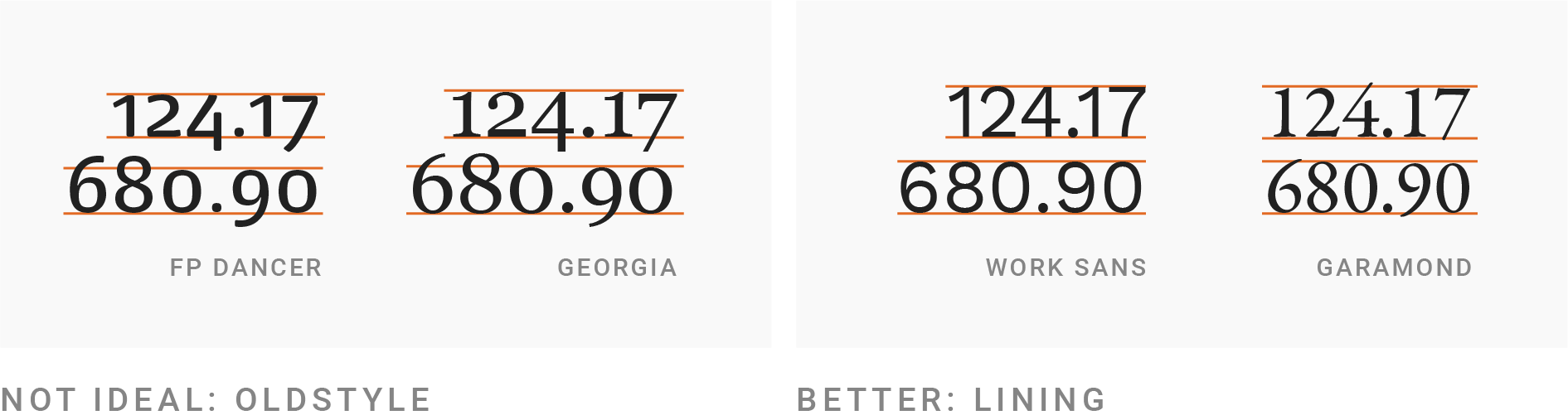
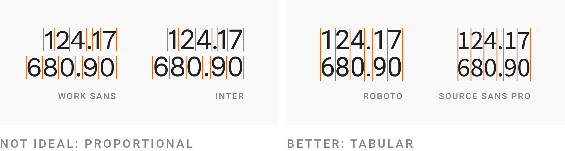
    Next, your font choice should have lining and tabular numbers. Lining numbers all have the same height, whereas ‘old style’ numbers go above/below the line (e.g. the ‘tail’ in the number 9). The picture in the article demonstrates this much more easily than I can describe! Similarly, tabular numbers all have the same width.

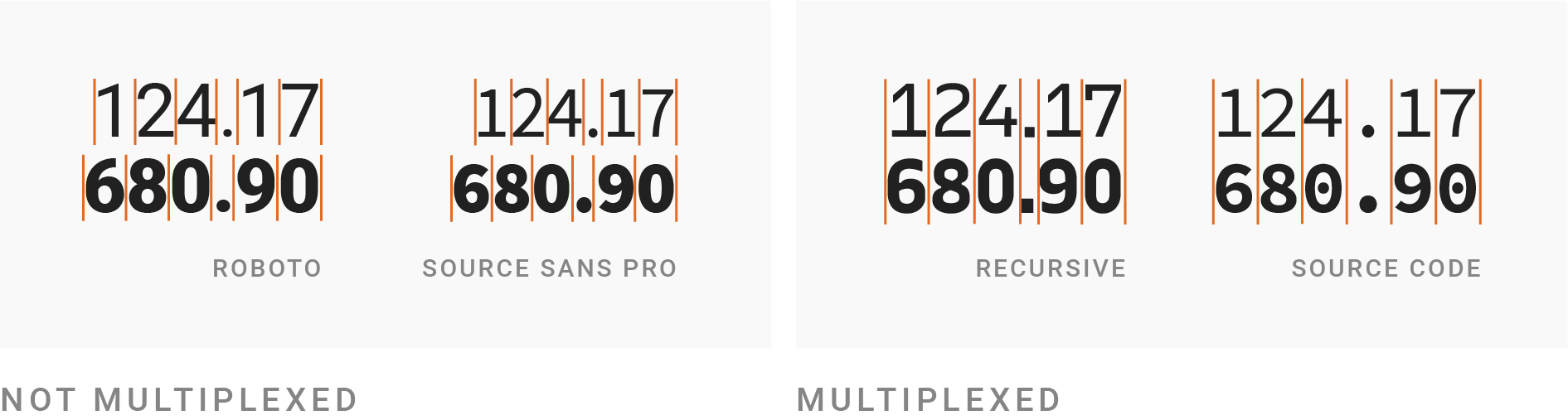
    Going one step further, choose a multiplexed font: one where the height and width of each character is the same regardless of whether the weight of the font is bold. This can be useful for bolding a particular row in a table, whilst still making the table look neat. Bold, by the way, should be used sparingly, to emphasise things.

    There’s a warning about ensuring your chosen font supports all the glyphs you need, such as characters for specific languages (ü ß é). And also a suggestion to choose a font that is not too wide nor too thin, though it then links to some well-known exceptions to the rule, so don’t take that as gospel.

    Only at the halfway point is WCAG mentioned, followed by advice about ensuring your text is big enough and has a high enough contrast. Some specific sizes and ratios are given, if you’re unfamiliar.

    Finally, there’s a note about using UPPERCASE text sparingly, and the often unwanted side-effect of said text becoming much wider than before. This can be corrected through a three step process: spacing out the letters more (called ‘tracking’ or ‘letter-spacing’), decreasing the font size to make it shorter, and then making the text bolder to aim for the same letter stroke width as the original text.


    Giving your future self a little credit with progressive enhancement

    This article alludes to the concept of technical credit, which is the antithesis of tech debt. It is the idea that putting in some effort now will make things easier on ourselves in future.

    The article describes the difference between progressive enhancement and graceful degradation, and cites some useful statistics. Around 0.2% of users ‘opt out’ of the modern web by disabling JavaScript. But at least around an extra 0.9% face pages where JavaScript simply fails to load, for whatever reason. These figures are based on a 2013 study run by Government Digital Service. The author re-ran GDS’s experiment and put the figure closer to 3% of users for whom JavaScript doesn’t load.

    The author underlines the fact that these are 3% of visits, not users – so the real figure of ‘how many users fail to get some of your JavaScript?’ is probably much higher. He visualises this with an animated gif of emoji faces, representing users on their journey on your site.

    The article is full of thought provoking soundbites like “An escalator can never break… it can only become stairs”. Worth a read!


    Did you know that you can subscribe to dai11y, week11y, fortnight11y or month11y updates! Every newsletter gets the same content; it is your choice to have short, regular emails or longer, less frequent ones. Curated with ♥ by developer @ChrisBAshton.