Smashing Magazine article by John C Barstow. I thought this was going to be one of those “choose a dyslexic-friendly font” type article, but it covers a lot more than that!
According to John, “research shows that standard fonts like Helvetica and Times New Roman are just as readable as purpose-built fonts like Dyslexie or Open Dyslexic”. He goes on to clarify that the most important factor is the spacing between letters and words. The reason fonts like Comic Sans are so popular with dyslexic readers is the wider spacing found in that font.
We can increase the letter spacing of our chosen font using the ch unit, which is based on the size of the 0 glyph – often a good approximation of the average character width. John comes up with this CSS: .dyslexia-mode { letter-spacing: 0.35ch; word-spacing: 1.225ch; }, which gives a 3.5x letter spacing.
Ligatures are when multiple characters are merged into a single glyph; you’ll often see this when “f” and “i” are rendered next to one another, forming a joined-together “fi”. Dyslexic readers may struggle with ligatures, so we can disable the feature with font-variant-ligatures: none, though this may be disabled automatically by some browsers when the letter spacing is set high enough.
I learned about Heydon Pickering’s owl selector (* + *), which can be used to apply consistent line-spacing, e.g. * + * { margin-top: 1.5em }.
John finishes up by applying a slightly bigger font weight to his text, to counteract the extra whitespace (font-weight: 600, which is “demi-bold”, apparently). He also applies style to his bold text, to differentiate it from the demi-bold regular text: .dyslexia-mode strong { color: #000 }.
There’s also a tip around avoiding unnecessarily distracting elements, such as background images, for which you can use the :not pseudo-class. Example: body:not(.dyslexia-mode) main { background-image: url("...") }.
The article concludes with a CodePen showing the before-and-after. The comments below the article are also worth a read.
A deque article describing “a11yBID”, or “Accessibility Business Informed Development”.
It’s essentially BDD (“Behaviour Driven Development”), in that it involves conversations between stakeholders and cross-functional team members to define Acceptance Criteria (AC), often in a formatted plain language format called Gherkin.
a11yBID is different to BDD as it “doesn’t discover classic business requirements as BDD does. Instead, it clarifies the accessibility-specific aspects of those business requirements”.
Starting with high-fidelity designs (i.e. PDFs), the process begins with an “a11y Amigos” meeting between the designer, the tester and the business analyst. The group reviews the design from an a11y perspective, asking questions around focus management etc, and drafting the “a11yAC” user stories. Here is an example of one:
Scenario: A blind screen reader user can understand that content is loading
Given I am a blind screen reader user
And I have submitted the form
And a loading spinner is visible as I await a response from the server
When I navigate to the loading spinner image
Then I hear the image role
And I hear the alt text as “loading”
The article concludes with some general advice to make a11yBID scale. For example, making use of a design system and component library, so that you can reuse tried-and-tested designs.
The before/after pseudo elements are often paired with content to add text or icons next to your elements. Example: .item::before { content: "★" }. Used in HTML, <a class="item" href="#">new story</a> would be read out by screen readers as “black star new story”.
The content property supports alternative text. The code looks like this: .item::before { content: "★" / "Highlighted" }, which would now read as “Highlighted new story”.
The game gained a nomination at this year’s Game Awards (which was watched by 80 million people in 2020).
I found a more informative article on digitaltrends, which notes that the games origins weren’t “altruistic” in nature; the studio director simply didn’t have any design experience, so wanted to build a game on a scale that he could afford!
“The story centers around Alex — a feisty, intensely brave, and blind princess — and her companion, Shepherd, and their journey to save their realm from destruction”. The game uses 3D audio technology and controller feedback to immerse the player in the story. There are no visuals other than the menu, which can also be navigated by audio only, i.e. this game is fully accessible to visually impaired players.
Did you know that you can subscribe to dai11y, week11y, fortnight11y or month11y updates! Every newsletter gets the same content; it is your choice to have short, regular emails or longer, less frequent ones. Curated with ♥ by developer @ChrisBAshton.
The game gained a nomination at this year’s Game Awards (which was watched by 80 million people in 2020).
I found a more informative article on digitaltrends, which notes that the games origins weren’t “altruistic” in nature; the studio director simply didn’t have any design experience, so wanted to build a game on a scale that he could afford!
“The story centers around Alex — a feisty, intensely brave, and blind princess — and her companion, Shepherd, and their journey to save their realm from destruction”. The game uses 3D audio technology and controller feedback to immerse the player in the story. There are no visuals other than the menu, which can also be navigated by audio only, i.e. this game is fully accessible to visually impaired players.
Prefer longer newsletters? You can subscribe to week11y, fortnight11y or even month11y updates! Every newsletter gets the same content; it is your choice to have short, regular emails or longer, less frequent ones. Curated with ♥ by developer @ChrisBAshton.
A deque article describing “a11yBID”, or “Accessibility Business Informed Development”.
It’s essentially BDD (“Behaviour Driven Development”), in that it involves conversations between stakeholders and cross-functional team members to define Acceptance Criteria (AC), often in a formatted plain language format called Gherkin.
a11yBID is different to BDD as it “doesn’t discover classic business requirements as BDD does. Instead, it clarifies the accessibility-specific aspects of those business requirements”.
Starting with high-fidelity designs (i.e. PDFs), the process begins with an “a11y Amigos” meeting between the designer, the tester and the business analyst. The group reviews the design from an a11y perspective, asking questions around focus management etc, and drafting the “a11yAC” user stories. Here is an example of one:
Scenario: A blind screen reader user can understand that content is loading
Given I am a blind screen reader user
And I have submitted the form
And a loading spinner is visible as I await a response from the server
When I navigate to the loading spinner image
Then I hear the image role
And I hear the alt text as “loading”
The article concludes with some general advice to make a11yBID scale. For example, making use of a design system and component library, so that you can reuse tried-and-tested designs.
Prefer longer newsletters? You can subscribe to week11y, fortnight11y or even month11y updates! Every newsletter gets the same content; it is your choice to have short, regular emails or longer, less frequent ones. Curated with ♥ by developer @ChrisBAshton.
The before/after pseudo elements are often paired with content to add text or icons next to your elements. Example: .item::before { content: "★" }. Used in HTML, <a class="item" href="#">new story</a> would be read out by screen readers as “black star new story”.
The content property supports alternative text. The code looks like this: .item::before { content: "★" / "Highlighted" }, which would now read as “Highlighted new story”.
Prefer longer newsletters? You can subscribe to week11y, fortnight11y or even month11y updates! Every newsletter gets the same content; it is your choice to have short, regular emails or longer, less frequent ones. Curated with ♥ by developer @ChrisBAshton.
EDIT: it is possible there is some misinformation in the linked article. Please see Gareth Ford Williams’ highly critical rebuttal of this article, published in dai11y 21/12/2021. My original coverage of the article is below, and has not been edited.
—
Smashing Magazine article by John C Barstow. I thought this was going to be one of those “choose a dyslexic-friendly font” type article, but it covers a lot more than that!
According to John, “research shows that standard fonts like Helvetica and Times New Roman are just as readable as purpose-built fonts like Dyslexie or Open Dyslexic”. He goes on to clarify that the most important factor is the spacing between letters and words. The reason fonts like Comic Sans are so popular with dyslexic readers is the wider spacing found in that font.
We can increase the letter spacing of our chosen font using the ch unit, which is based on the size of the 0 glyph – often a good approximation of the average character width. John comes up with this CSS: .dyslexia-mode { letter-spacing: 0.35ch; word-spacing: 1.225ch; }, which gives a 3.5x letter spacing.
Ligatures are when multiple characters are merged into a single glyph; you’ll often see this when “f” and “i” are rendered next to one another, forming a joined-together “fi”. Dyslexic readers may struggle with ligatures, so we can disable the feature with font-variant-ligatures: none, though this may be disabled automatically by some browsers when the letter spacing is set high enough.
I learned about Heydon Pickering’s owl selector (* + *), which can be used to apply consistent line-spacing, e.g. * + * { margin-top: 1.5em }.
John finishes up by applying a slightly bigger font weight to his text, to counteract the extra whitespace (font-weight: 600, which is “demi-bold”, apparently). He also applies style to his bold text, to differentiate it from the demi-bold regular text: .dyslexia-mode strong { color: #000 }.
There’s also a tip around avoiding unnecessarily distracting elements, such as background images, for which you can use the :not pseudo-class. Example: body:not(.dyslexia-mode) main { background-image: url("...") }.
The article concludes with a CodePen showing the before-and-after. The comments below the article are also worth a read.
Prefer longer newsletters? You can subscribe to week11y, fortnight11y or even month11y updates! Every newsletter gets the same content; it is your choice to have short, regular emails or longer, less frequent ones. Curated with ♥ by developer @ChrisBAshton.
Eric Bailey articulates all the reasons why you should stop using links and buttons with the text value “here” or “click here”. This is such a common mistake across the web and is a habit we need to break out of.
Compare the following two sentences:
Click here to learn about how to roast Brussels sprouts
The former makes no sense out of context. If a screen reader user pulls up a list of all links in the page, they’re not going to know what “click here” is referring to. “How to roast Brussels sprouts” is the main action, and makes sense on its own. The latter also has a greater surface area to click on. Finally, some users activate links by saying the name of the link; the latter works well for that, whereas the former would be problematic if there were several links called “click here”.
Now consider these instructions: “Click the button below”. There are two problems here:
“Click” only makes sense in a desktop/laptop mouse context. It doesn’t make sense for keyboard or touchscreen users. Yes, they’ll probably still understand what to do, but that doesn’t mean we can’t use more universal language, such as “Select”.
“Below” is also problematic. What if our content has been translated into a vertically-oriented language, and therefore makes no sense? What if the design is different for desktop, such that the link ‘below’ is actually to the side? What if we’re reading this in VR – does “below” now mean someone will think it’s underneath them? The web is a highly malleable place. Better to use language like “next/previous” or “following/preceding”.
Eric ends by pointing to the proposed CSS Logical Properties module. This favours “start/end” properties rather than the more traditional “top/right/bottom/left”, as the latter have an implicit default writing mode of left-to-right & top-to-bottom – not a good look for a global technology.
This guidance was given a fresh update in October 2021, so I’m reading it anew.
“Although technology is getting better at recognizing what an image depicts, algorithms alone cannot understand what an image means within the context of the overall page. A maple leaf might represent Canada, or it might just illustrate the leaf of a tree.”
There are several examples of good vs bad alt text, and clarifications around when an empty alt text is appropriate. But I knew that already, so have cherry-picked some of the more interesting content in the points that follow.
Other than the alt attribute, “alternative text can be presented within visible body text near the image” or even “on a separate page, linked from either the image or a text link adjacent to the image” (but only “when the text equivalent cannot be presented succinctly”). Note that the longdesc attribute is deprecated and should not be used.
A trip down memory lane: image maps. The main image associated with the <map> must have an alt attribute that describes the content within the image, but is not otherwise presented with each image map hot spot. For example, a State of New York map that has an <area> for each county might have alt="Counties of New York", whereas its hot spots would each have an alt attribute containing the name of the county. If the main image does not convey content (just a container for the hot spots), then alt="" is appropriate.
Finally, a note on <figure> and <figcaption>. The <img> within the <figure>must have non-empty alt attribute, which should not just be a repeat of the <figcaption> contents. I was surprised by this, so I read the linked How do you figure? blog post by Scott O’Hara. Some highlights from that post:
“One of the biggest misunderstandings of using a figcaption is that it’s used in place of image alternative text”.
“A figcaption is meant to provide a caption or summary to a figure, conveying additional information that may not be directly apparent from reviewing the figure itself. If an image is given an empty alt, then the figcaption is in effect describing nothing. And that doesn’t make much sense, does it?”
Moreover, using an empty alt="" on the image causes serious screen reader issues. It’s essentially the same as an <img alt="" /> anywhere else in the page; in other words, it’s treated as decorative, and ignored by the screen reader. So an empty alt="" will mean your entire <figure> gets skipped over.
Electric Monkeys Studio has built a VR game set in the future, in a scientific facility where gravitational technology is being discovered. The protagonist, Sebastian, uses a wheelchair, presenting an extra challenge in navigating the environment after an explosion destroys much of the facility, as you have to find ways around obstacles in your path.
It’s promising to see more representation of wheelchair users, adding to games like Life is Strange and Sly Cooper. In November 2020, Bethesda added wheelchairs to Fallout 76 after a fan asked the developer to add her aid to the game.
The article lacks detail on the gameplay, but there are a few reviews on Steam. Whilst there are complaints around the graphical quality and the controls, one positive reviewer goes into detail about some of the accessibility constraints forced on the player, which I thought was interesting:
“You can’t look around very much without seeing the start of ‘tunnel vision’ and colors fading, and a red icon reminding you to push a button to re-orient. I accept this because a person with paralysis mainly turns their head, not their body. In real life, such a person has to make big adjustments just to see in a different direction. Yes, it’s annoying, and holds you back. I accept it as simulating part of what it feels like to be this person.”
As a VR player myself, one of the most immersion-ruining aspects is movement. Pressing a button to walk or run kind of pulls you out of the experience (and can cause motion sickness), so to have a game where being seated matches what your character is doing, is quite a clever solution to the problem.
Did you know that you can subscribe to dai11y, week11y, fortnight11y or month11y updates! Every newsletter gets the same content; it is your choice to have short, regular emails or longer, less frequent ones. Curated with ♥ by developer @ChrisBAshton.
Electric Monkeys Studio has built a VR game set in the future, in a scientific facility where gravitational technology is being discovered. The protagonist, Sebastian, uses a wheelchair, presenting an extra challenge in navigating the environment after an explosion destroys much of the facility, as you have to find ways around obstacles in your path.
It’s promising to see more representation of wheelchair users, adding to games like Life is Strange and Sly Cooper. In November 2020, Bethesda added wheelchairs to Fallout 76 after a fan asked the developer to add her aid to the game.
The article lacks detail on the gameplay, but there are a few reviews on Steam. Whilst there are complaints around the graphical quality and the controls, one positive reviewer goes into detail about some of the accessibility constraints forced on the player, which I thought was interesting:
“You can’t look around very much without seeing the start of ‘tunnel vision’ and colors fading, and a red icon reminding you to push a button to re-orient. I accept this because a person with paralysis mainly turns their head, not their body. In real life, such a person has to make big adjustments just to see in a different direction. Yes, it’s annoying, and holds you back. I accept it as simulating part of what it feels like to be this person.”
As a VR player myself, one of the most immersion-ruining aspects is movement. Pressing a button to walk or run kind of pulls you out of the experience (and can cause motion sickness), so to have a game where being seated matches what your character is doing, is quite a clever solution to the problem.
Prefer longer newsletters? You can subscribe to week11y, fortnight11y or even month11y updates! Every newsletter gets the same content; it is your choice to have short, regular emails or longer, less frequent ones. Curated with ♥ by developer @ChrisBAshton.
This guidance was given a fresh update in October 2021, so I’m reading it anew.
“Although technology is getting better at recognizing what an image depicts, algorithms alone cannot understand what an image means within the context of the overall page. A maple leaf might represent Canada, or it might just illustrate the leaf of a tree.”
There are several examples of good vs bad alt text, and clarifications around when an empty alt text is appropriate. But I knew that already, so have cherry-picked some of the more interesting content in the points that follow.
Other than the alt attribute, “alternative text can be presented within visible body text near the image” or even “on a separate page, linked from either the image or a text link adjacent to the image” (but only “when the text equivalent cannot be presented succinctly”). Note that the longdesc attribute is deprecated and should not be used.
A trip down memory lane: image maps. The main image associated with the <map> must have an alt attribute that describes the content within the image, but is not otherwise presented with each image map hot spot. For example, a State of New York map that has an <area> for each county might have alt="Counties of New York", whereas its hot spots would each have an alt attribute containing the name of the county. If the main image does not convey content (just a container for the hot spots), then alt="" is appropriate.
Finally, a note on <figure> and <figcaption>. The <img> within the <figure>must have non-empty alt attribute, which should not just be a repeat of the <figcaption> contents. I was surprised by this, so I read the linked How do you figure? blog post by Scott O’Hara. Some highlights from that post:
“One of the biggest misunderstandings of using a figcaption is that it’s used in place of image alternative text”.
“A figcaption is meant to provide a caption or summary to a figure, conveying additional information that may not be directly apparent from reviewing the figure itself. If an image is given an empty alt, then the figcaption is in effect describing nothing. And that doesn’t make much sense, does it?”
Moreover, using an empty alt="" on the image causes serious screen reader issues. It’s essentially the same as an <img alt="" /> anywhere else in the page; in other words, it’s treated as decorative, and ignored by the screen reader. So an empty alt="" will mean your entire <figure> gets skipped over.
Prefer longer newsletters? You can subscribe to week11y, fortnight11y or even month11y updates! Every newsletter gets the same content; it is your choice to have short, regular emails or longer, less frequent ones. Curated with ♥ by developer @ChrisBAshton.
Eric Bailey articulates all the reasons why you should stop using links and buttons with the text value “here” or “click here”. This is such a common mistake across the web and is a habit we need to break out of.
Compare the following two sentences:
Click here to learn about how to roast Brussels sprouts
The former makes no sense out of context. If a screen reader user pulls up a list of all links in the page, they’re not going to know what “click here” is referring to. “How to roast Brussels sprouts” is the main action, and makes sense on its own. The latter also has a greater surface area to click on. Finally, some users activate links by saying the name of the link; the latter works well for that, whereas the former would be problematic if there were several links called “click here”.
Now consider these instructions: “Click the button below”. There are two problems here:
“Click” only makes sense in a desktop/laptop mouse context. It doesn’t make sense for keyboard or touchscreen users. Yes, they’ll probably still understand what to do, but that doesn’t mean we can’t use more universal language, such as “Select”.
“Below” is also problematic. What if our content has been translated into a vertically-oriented language, and therefore makes no sense? What if the design is different for desktop, such that the link ‘below’ is actually to the side? What if we’re reading this in VR – does “below” now mean someone will think it’s underneath them? The web is a highly malleable place. Better to use language like “next/previous” or “following/preceding”.
Eric ends by pointing to the proposed CSS Logical Properties module. This favours “start/end” properties rather than the more traditional “top/right/bottom/left”, as the latter have an implicit default writing mode of left-to-right & top-to-bottom – not a good look for a global technology.
Prefer longer newsletters? You can subscribe to week11y, fortnight11y or even month11y updates! Every newsletter gets the same content; it is your choice to have short, regular emails or longer, less frequent ones. Curated with ♥ by developer @ChrisBAshton.
Issue 25 of month11y is a special one: it marks two years since the first issue in December 2019. If you count all the dai11y, week11y, fortnight11y and month11y newsletters together, I’ve now published over 600 newsletters!
I didn’t honestly know if I’d be able to keep it up, especially after stepping down from frontend web development and becoming a backend developer. But I’ve really enjoyed keeping up to date with the ever-evolving world of accessibility, and sharing my learnings with you. As ever, please do spread the word about the newsletter – your friends and colleagues can sign up here – and do drop me a line if there’s anything you can think of to improve the newsletter (or any feedback you’d like to give).
Without further ado, let’s kick-off issue 25 with a double HTMHell digest!
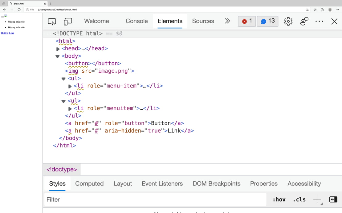
Screenshot of Edge browser’s “Elements” tab, showing ‘warning’ underlines on inaccessible HTML.
“In Chrome or Edge open DevTools, click the Elements tab, select the element you want to inspect and click the Accessibility tab. The accessibility pane shows you how the element is represented in the accessibility tree, which ARIA attributes it has, and its computed properties.”
Buttons need a label (denoted by Name:, populated by fields such as aria-label, title, or button innerText).
Buttons need a suitable role (denoted by Role: "button").
Buttons need to be focusable (denoted by Focusable: true).
Note that you also need to be able to activate buttons with Space or Enter, but this information isn’t exposed in the Accessibility tab.
There are also instructions for Firefox, which uses a different accessibility API. For example, the role name in Firefox will be pushbutton, rather than button.
This is a Mischa Andrews talk from #ID24 in November 2017. I’ve had it in my bookmarks for a while, and am so pleased I’ve finally managed to watch it.
Mischa talks openly and candidly about how you can effect accessibility change in your organisation, whilst overcoming the inevitable office politics that come with the territory.
I liked the idea of creating a “decoy audience”. Let’s say you have a colleague who feels they have nothing to learn about accessibility – they “know it all already” – but they consistently make accessibility mistakes. You can teach them how to do things properly, without bruising their ego, by arranging a talk or workshop about accessibility, and inviting them to present part of it. The theory is that they can continue to feel good about their own knowledge, whilst also opening up to learning from your side of the talk.
A common tactic used by organisations is to have a ‘gatekeeper’ for accessibility, e.g. someone doing accessibility testing as part of the acceptance tests at the end of a project. Mischa warns that you have to tread carefully here, as it’s often too late or difficult to do much about accessibility issues if they’re left until the end of the process. You may also find people try to work around you, such as go to your manager or try to argue that their project shouldn’t go through the normal process. It is best to only use this ‘gatekeeper’ tactic if your organisation is already practising good accessibility.
Make it as easy as possible to do the right thing, e.g. by adding accessibility information directly as code comments, or embedded in Word templates, rather than expecting people to seek out and find the guidance independently.
Practice what you preach. You may be seen as the a11y expert in the organisation, and people will reuse your resources, such as colour choices, etc, on the assumption that they’ve already been accessibility tested.
It is useful to memorise a handful of things that can be used as opportunities to motivate people – and to convince people to listen to you. If you know statistics around how many people have particular kinds of disabilities, or how much money the organisation loses through being inaccessible, or what accessibility laws your country has to abide by, or the difference between different versions of WCAG, you’ll look knowledgeable enough for your words to carry more weight. You can also slip these facts into conversations, which can help to inspire the next generation of accessibility advocates in your organisation.
Next is a two-article special, covering accessibility advances by Android and Apple!
Two new features are coming to Android smartphones: “Camera Switches“, and “Project Activate”. These features will allow users to use gestures like smiling, raising eyebrows, or looking in a particular direction, to issue a command such as returning to the homescreen or opening notifications.
The gestures are configurable: users can set how long to hold the gesture for, or how big the gesture must be, to issue the command.
“The updates are aimed at people with motor and speech disabilities, Google said, and the new tools were developed with feedback from people who rely on alternative communication technology.”
Apple is prototyping to see motion sensors inside AirPods can be used to tell users if they’re slouching. They’re also experimenting with measuring core body temperature, and perhaps most excitingly, whether or not AirPods can be used as “proper hearing aids” (they already come with a ‘conversation boost‘ feature).
Under US federal law, devices marketed as hearing aids must “be sold through licensed specialists, who adjust them to the specific user”. However, “in July, President Biden signed an executive order directing the Department of Health and Human Services to allow hearing aids to be sold over the counter and be adjusted by consumers”; promising news for Apple.
Eric Eggert describes the difference between a link and a button:
A link changes what the URL in the browser points to; either a new page, or a file to download, or a frame to update the source of.
A button performs an action. Originally only available as an <input type="submit" />, with the sole purpose of submitting forms, then along came the <button> element which allowed more versatility. It’s great for creating things like calculators, where the end result URL is not an important thing to be able to share.
Links and buttons have different roles. Assistive technologies announce them as “link” and “button” respectively, and this sets a user expectation as to the behaviour.
Screen readers have a way of easily presenting all the links in the page; buttons are harder to surface.
Links can be activated with the return key, whereas buttons can be activated with return or space.
Context is important. You can style a link to look like a button, and that’s fine, if the button says something like “Read the full story”, which hints that it will take you to another page.
Eric concludes that the link vs button debate is a grey area. He’s surprisingly unopinionated in the close: “there is no one true way to code or design something”.
As a bonus for the above article, I also read THE BUTTON CHEAT SHEET (buttoncheatsheet.com). It compares different ways of marking up buttons and button-like things. I don’t really see how useful it can be, but it’s worth a quick look through, if only to see how many different ways it can be done.
A really interesting article by developer & accessibility advocate Kitty Giraudel, explaining how they built the main navigation on their employer’s website, Gorillas.
It’s a hamburger menu style across all screen sizes, not just on mobile. You have to tap on the ‘hamburger’ to expand the menu and show the menu items.
This behaviour comes for free with the <details>/<summary> HTML elements, which as native elements, work without JavaScript. However, clicking outside of the menu should cause the menu to ‘close’ again, and that doesn’t happen with those elements, so Kitty & the team replace the elements with a <button> if JavaScript is available, adding a listener to the click and focusin events to close the menu if the event takes place outside of the menu container.
“Landmarks such as <nav> can be listed by assistive technologies, [therefore] it’s important that the <nav> itself is not the element whose visibility is being toggled. Otherwise, it’s undiscoverable when hidden”. So Kitty’s implementation wraps the menu in a <nav role="navigation"> and the CSS visibility toggling is only applied to its contents, not to the <nav> element itself.
Kitty walks through a good example of progressive enhancement in CSS, using the @supports query to check if backdrop-filter is supported before overriding the background-color.
Elsewhere on the Gorillas page, there is a language selector. Kitty points out that they avoided using flags to denote language, as flags are ultimately for countries, not languages (think UK vs USA flags for English).
The language selector uses 2-letter codes, e.g. “EN” for “English”, with visually hidden text to clarify the language name: <a href="/en" hreflang="en">EN<span class="sr-only" lang="en"> — English</span></a>. Note the hreflang attribute, which I hadn’t heard of before, but is supposed to indicate the language of the page that is being linked to. Kitty admits it “might do nothing”, given the lack of documentation on it.
They initially tried applying an aria-hidden to the 2-letter language codes to avoid assistive technologies reading them out (as they’re often incorrect, e.g. “DE” being pronounced “duh”). However, this would fail WCAG SC 2.5.3 Label in name, as voice navigation users should be able to navigate the page by what they see, e.g. “click DE”.
Finally, I’ve learned that “When using aria-expanded="true", the label should not mention “open” or “close” (or similar) as the state is already conveyed via the attribute”.
Vicky Teinaki shares this tip on Twitter: “I was today years old when I found out that I can share a Google Slides presentation in html (for screen reader users and magnification users) by swapping out ‘/edit’ in the URL for ‘/htmlpresent’.”
Screenshot of a Google Slides URL, ending in “/htmlpresent”.
The (American) National Federation of the Blind made a statement in June, about accessiBe, the market leading ‘accessibility overlay’ company that I’ve written about several times now.
I missed this when it came out, and wouldn’t have known about it were it not for Steve Faulkner’s tweet. He picks out this pretty damning quote:
“This week, the Board of Directors reviewed accessiBe’s business practices at the urging of members who have researched and interacted with the company, and the Board believes that accessiBe currently engages in behavior that is harmful to the advancement of blind people in society”.
The statement goes on to announce that the NFB has “revoked accessiBe’s sponsorship of the convention”.
A UX Collective article about a recent case against accessibility overlays.
Eyebobs is an online glasses company that used an accessibility overlay to attempt to conform to WCAG. It was sued by a blind plaintiff in January 2021, for violations of the ADA (Americans with Disabilities Act).
The case enrolled Karl Groves as an expert witness, who wrote a 35-page indictment of how inaccessible the Eyebobs site was even with the overlay. Karl also created overlayfactsheet.com, to educate on how accessibility overlays don’t work.
The settlement requires Eyebobs to take the following actions:
Create an accessibility coordination team
Perform an accessibility audit of its ‘digital properties’ (using an accessibility consultant)
Adopt an accessibility statement
Implement an accessibility strategy
Provide accessibility training to its employees
It must comply with these measures within two years.
It must also work with third-parties (such as embedded maps) to make their content accessible. The deadline for this can be extended up to five years, reflecting the added complexity.
The article ends with a link to Lighthouse vs ADP – “the next lawsuit to keep an eye out for”.
Raghavendra, a blind, accessibility specialist, talks through the problems they faced trying to create an account on Wikipedia. They were faced with a CAPTCHA (Completely Automated Turing test to tell Computers and Humans Apart). It was visual only, and had no audio alternative and no option to use a one-time confirmation code sent to email or phone.
Some CAPTCHA solutions do provide an audio alternative, but this is inaccessible to deafblind users.
In addition to email/phone options, you could also use the honeypot method, whereby a text field is added to the form but visually hidden. Bots will find the input and fill it with text, so you can avoid a lot of spam form submissions by filtering out all submissions that contain that input.
Another inclusive option is a logical or mathematical test, e.g. “Is fire hot or cold?”, as bots will struggle with this. It can be confusing for some users to know how to respond, however.
Google’s reCAPTCHA is apparently quite good, requiring only a box to be checked. However, it sometimes treats screenreader behaviour as bot behaviour.
Raghavendra concludes “it’s always better to offer multiple options that work for multiple types of disabilities than just one or two”.
This is more of a placeholder than an article, in which Raghavendra asks us, the community, where the focus should land when activating a “scroll to top” link. What exactly is the ‘top’? It’s easy enough to visually scroll to the top of the page, but where should the keyboard focus go? We have three options:
Move focus to the <body> tag (a poor experience in NVDA, as nothing is announced).
Move focus to the “Skip to main content” link.
Move focus to the <h1> heading level one, or <main> region landmark.
There is no definitive answer, but there are some interesting comments at the bottom. The community seems largely split on whether it should be 2 or 3.
This Wired article details how accessibility advocates in America regularly have to go to court in order to be granted an exemption to the Digital Millennium Copyrights Act (DMCA). The exemptions, which last for three years at a time, mean that blind people are able to circumvent copy protections on ebooks for the sake of accessibility. It would otherwise be illegal for these users to use third party programs (such as JAWS) to lift text and save in a different, accessible file format.
In 2014, publishers fought Amazon for enabling a text-to-speech (TTS) feature on the Kindle, claiming that it violated their copyright on audiobooks. To this day, publishers are able to disable TTS on their books, which makes it difficult for blind people to consume their content.
Even when TTS is enabled by the publisher, many ebooks lack alternative text for their illustrations. Non-profit initiatives like Bookshare can provide semi-accessible versions of inaccessible books, but they must agree not to change the content, meaning they’re not permitted (or, in the world of academia, sufficiently qualified) to fill in any missing alternative text.
In Europe, there is already a law (the European Accessibility Act) requiring all ebooks published in the EU to be fully accessible from June 2025. There is hope that this might set a precedent in the USA, meaning that advocates would no longer have to fight the case for exemption every three years.
Next:
Chancey Fleet writes a Twitter thread about their experience using Google Translate’s new “Transcribe” feature for iOS.
Chancey wanted to watch Netflix’s House of Flowers, which is in Spanish. It has English subtitles, but the ‘audio description’ of scenes is in Spanish.
Chancey uses VoiceOver with a Braille screen reader, i.e. it outputs to a Braille display rather than as speech. Chancey wanted to use Transcribe to catch the dialog and audio description, translate it, and output it to Braille.
Evidently, Google was not happy with this, failing immediately with “PLUG IN HEADPHONES TO USE TRANSCRIBE WITH VOICEOVER”. Chancey tried to fool it by plugging in a Lightning headphone dongle, but that didn’t work. They tried closing VoiceOver, starting the Transcribe, and then launching VoiceOver again, at which point the transcribing immediately stopped with the same error message.
Why was this happening? Because VoiceOver speech would, naturally, mess with the effectiveness of the transcription. However, outputting to Braille would not interfere with the transcription. This is not a scenario that the team behind Transcribe have considered, so Transcribe simply shuts down, rather than giving the user a friendly warning and then allowing them to continue.
In my developer career, I have sometimes been asked if it is possible to detect whether someone is using a screen reader, to give them a different experience. This Twitter thread shows exactly why this is a bad idea. You’re never going to know your users better than they know themselves.
A GOV.UK blog post from the Design System team, describing why they’ve added a new feature to the checkboxes component.
When answering questions, users can be unsure what to do if none of the options apply to them. Users “want to give a clear answer, especially if they’re concerned about completing an application accurately and truthfully”.
Additionally, some users might assume that if they leave the checkboxes unchecked, that the system will return them to the question later, not realising that they’ve actually skipped the question.
Some services using the checkboxes component were already adding their own “None” option, which was not ideal as it meant users could provide contradictory answers, such as “None” in addition to other options.
Supporting “None” natively in the component meant that the developers were able to add JavaScript to prevent users from ticking the “None” checkbox in addition to other boxes. It also meant they could style the option slightly differently.
It is still up to services to decide on the wording of the “None” checkbox. The blog post advises against directions like “None of the above”, as this is a visual reference that makes little sense to screen reader users. “None of these” is better.
Twitch streamer Rudeism used a homemade, single-buttoned controller to complete Dark Souls 3, a notoriously difficult game. In order for the one-button system to work, he mapped the game’s inputs to Morse code.
He pressed the button 258,250 times during his two-month run of the game.
During the challenge, Rudeism raised money for AbleGamers: “a nonprofit organization that advocates for accessibility in the video game industry”. He was also advocating for games to support more accessibility options and difficulty modifiers as standard.
Whew, that was a long newsletter! Did you know that you can subscribe to smaller, more frequent updates? The dai11y, week11y and fortnight11y newsletters get exactly the same content. The choice is entirely up to you! Curated with ♥ by developer @ChrisBAshton.
![Share presentation in html (for screen reader users and magnification users):
https://docs.google.com/presendation/d/[link censored]/htmlpresent](https://pbs.twimg.com/media/FD74f3hWQAQ8BUO?format=jpg&name=large)