Category: dai11y

Accessibility themed newsletter: get your daily dose of a11y.

  • dai11y 27/07/2022

    Your daily frequent11y newsletter, brought to you by @ChrisBAshton:

    Best Practices for Overlays

    Ken Nakata writes a thought-provoking article about controversial accessibility overlays.

    Ken was once opposed to overlays, but has come around to the idea, on the basis that they can work harmoniously with other accessibility initiatives. He concedes that the damage has already been done by inaccurate marketing of overlay companies, who falsely claim they can make websites fully accessible with a single line of code. But if we can allow overlays to mature and have these companies taper their claims, Ken envisages a future where overlays are widely used and useful.

    For example, a customer might hire an accessibility consultant, who spots a WCAG violation with a tab panel on their website. The developers fix that panel, but in the meantime, an overlay is programmed to spot and fix similar matches that don’t exactly match the original. As users come across these panels in the wild, the overlay does its best to fix the issue, and also automatically notifies the developers about the bug.

    Ken thinks overlays are an inevitability because:

    1. There is simply too much inaccessible content out there, and it won’t ever be fixed.
    2. Not all users are experts – more traditional assistive technology can be difficult to use.
    3. Technology gets better all the time.

    Ken finishes with a list of rules he believes all overlay producers should follow, containing good guidelines such as not automatically applying settings, and giving all users the option to quickly dismiss the panel.

    Definitely worth a read.


    Prefer longer newsletters? You can subscribe to week11y, fortnight11y or even month11y updates! Every newsletter gets the same content; it is your choice to have short, regular emails or longer, less frequent ones. Curated with ♥ by developer @ChrisBAshton.
  • dai11y 26/07/2022

    Your daily frequent11y newsletter, brought to you by @ChrisBAshton:

    Microsoft and Peel school board collaborate to launch Minecraft world focused on accessibility

    For those who don’t know, Minecraft has an education edition. (I wish I had this while I was in school!).

    That edition now has a new world, called BuildAbility. In partnership with America’s Peel District School Board (PDSB), it was launched on May 10th worldwide.

    BuildAbility is designed to “help students understand, identify, and work to eliminate accessibility barriers in their school and community”. Students learn about physical and technological barriers, as well as organisational attitudes and communication issues. They’re then encouraged to create solutions to those problems, in an open play area, trying to create the most accessible and inclusive experience.

    In the world, students will encounter physical barriers that disable wheelchair users, high noise levels in populous areas like the mall, etc. They can then rebuild parts of the world in an accessible way. Watch this brief video demonstrating the world (39s).


    Prefer longer newsletters? You can subscribe to week11y, fortnight11y or even month11y updates! Every newsletter gets the same content; it is your choice to have short, regular emails or longer, less frequent ones. Curated with ♥ by developer @ChrisBAshton.

  • dai11y 22/07/2022

    Your daily frequent11y newsletter, brought to you by @ChrisBAshton:

    Tech Journalism’s Accessibility Problem

    Monica Chin, computing reporter at The Verge, writes about the lack of accessibility content in tech magazines. She notes that most accessibility content is written by freelance journalists, or by staff journalists whose primary focus is something else.

    The lack of mainstream content makes it hard for disabled consumers to know whether the latest game, mobile phone or software will work for them. “I’ll often have to research reviews and watch like, six or seven so I can find all the information”, says Chris Reardon.

    Some journalists feel that the solution is to hire an accessibility reporter, to provide dedicated accessibility coverage, such as accessibility reviews that sit alongside standard product reviews. Others feel that every tech reporter should have accessibility in mind when writing content.

    Monica also highlights the risk of perpetuating harmful tropes and stereotypes. The solution isn’t to flood magazines with stories about ‘inspirational’ disabled people (a phenomenon disabled journalists have been protesting for years).

    There’s also the risk that exclusively allocating accessibility articles to disabled journalists has them become the ‘token person’ to represent specific topics. That said, journalists with a related disability should be given the first opportunity to cover an article, if they wish. John Loeffler writes “it’s one thing for me to talk about the Microsoft Surface Adaptive Kit. It’s another for someone who’s like, when this review is done, I’m going to be using this on my own personal device”.

    An example of where mainstream opinion differs from accessibility focussed views is the ‘touch bar’ integrated with MacBook Pros. CNET, The Verge and Engadget have all derided it as a useless piece of hardware that nobody asked for. (I happen to agree. They’re also prone to hardware failure; my sister has had no ends of issues with this aspect of her relatively new MacBook, just outside the warranty period!).

    But Steven Aquino writes about how useful he finds the accessibility features of the touch bar. It makes shortcuts easier to trigger for those who lack the fine motor skills required for keyboard shortcuts. It allows the sending of emails or adding of emojis with a single tap, instead of multiple interactions.

    Steven often felt in a minority, reporting on this. The mainstream sites just don’t touch on this stuff. Monica’s article is a call to action for tech reporting to do better.


    Prefer longer newsletters? You can subscribe to week11y, fortnight11y or even month11y updates! Every newsletter gets the same content; it is your choice to have short, regular emails or longer, less frequent ones. Curated with ♥ by developer @ChrisBAshton.

  • dai11y 18/07/2022

    Your daily frequent11y newsletter, brought to you by @ChrisBAshton:

    The negative impact of stylised captions on TikTok and Instagram

    It used to be that there was not enough captioned content on social media. People were posting videos but not captioning them, either because it wasn’t possible on the platform at the time or because they couldn’t be bothered.

    Auto captioning has become more and more popular, and it’s now quite simple to enable closed captions on your social media videos. As Courtney Craven puts it on their LinkedIn post, the resulting accuracy of caption can be “useless”.

    But another problem is how the captions are displayed: there’s an increasing trend for captions to display

    one

    or two

    words at

    a time.

    Courtney touches on some of the issues with that, as does accessibility consultant, Meryl Evans. This style of caption can be really hard to follow, and detract from the video itself, as one is so focussed on trying to keep up with the text. You understand language ‘as a unit’, not as one word at a time.

    I don’t think we can blame the content creators; they’ve been given a tool, and they’re using it. But social media companies need to work harder to not build inaccessibility into the tools they provide people.

    I’d be interested to know what kind of impact this has on screen reader users – send me an email if you have any insights!


    Prefer longer newsletters? You can subscribe to week11y, fortnight11y or even month11y updates! Every newsletter gets the same content; it is your choice to have short, regular emails or longer, less frequent ones. Curated with ♥ by developer @ChrisBAshton.

  • dai11y 15/07/2022

    Your daily frequent11y newsletter, brought to you by @ChrisBAshton:

    Purchasing Power Parity

    Accessibility of content based on price and economics is not something I’ve covered often, so I’m glad to have come across this really interesting article.

    Sophia Lucero writes about a trend she’s noticed in online courses and magazines: websites are beginning to charge different prices based on where in the world you’re visiting from. They generally charge less if you’re in, say, the Philippines, versus if you visit from the USA, on the basis that it’s a lot more difficult for someone from the former to raise the same amount of disposable income as someone from the latter. This is well explained by the Big Mac index.

    Many independent creators that are big names in the frontend world are offering this, from Wes Bos and Kent Dodds to Sara Vieira and Julia Evans. Sophia notes that they all seem to have rolled out their own implementations, based on their own “specific, personal reasoning that differed from one another”. There’s a certain amount of secrecy into the underlying methodologies used by some, as they (understandably) want to avoid being pulled into an economics fight. As a guide, you could use the calculator by Jack McDade, or for a (paid) automated implementation, you could use Parity Bar.

    The decision to roll out PPP is, for many, an altruistic decision, and relies on honesty, since it is fairly simple to spoof one’s location. However, it has actually increased revenue for the creators (50% in the case of Chris Ferdinandi), as the fact more people can afford it means there are higher sales.


    Prefer longer newsletters? You can subscribe to week11y, fortnight11y or even month11y updates! Every newsletter gets the same content; it is your choice to have short, regular emails or longer, less frequent ones. Curated with ♥ by developer @ChrisBAshton.

  • dai11y 13/07/2022

    Your daily frequent11y newsletter, brought to you by @ChrisBAshton:

    Divs are bad!

    An article by Manuel Matuzović, which he openly admits is a clickbait title! Manuel concedes that the <div> is useful for additional elements for styling, for structuring content when no other suitable element exists, and for when you need custom landmarks. He then lists the issues with using <div> incorrectly.

    Using a <div> inside a <details> element, for example, can break how the element is supposed to render in browsers, and might cause screen readers to not recognise the <summary> element properly:

    <details>
      <div>
        <summary>Show info</summary>
        Hi, I'm the info!
      </div>
    </details>

    Manuel works through plenty of other common examples (such as <ul><li> markup) which should not have a <div> nested in between the elements. It’s quicker to say where it can be used, and that’s in definition lists. The following example is fine:

    <dl>
      <div>
        <dt>Key:</dt>
        <dd>Value</dd>
      </div>
      <div>
        <dt>Key:</dt>
        <dd>Value</dd>
      </div>
    </dl>

    Manuel recommends installing Deque’s HTML validator bookmarklet to validate your web pages. It works on both server-rendered and client-rendered pages.


    Prefer longer newsletters? You can subscribe to week11y, fortnight11y or even month11y updates! Every newsletter gets the same content; it is your choice to have short, regular emails or longer, less frequent ones. Curated with ♥ by developer @ChrisBAshton.

  • dai11y 12/07/2022

    Your daily frequent11y newsletter, brought to you by @ChrisBAshton:

    WordPress Accessibility Day Returns November 2-3, 2022

    Deborah Edwards-Oñoro tells us about a virtual, accessibility focussed conference in November. Full details over at wpaccessibility.day.

    For a taste of what to expect from the day, check out the talks from 2020. It looks to be a good mix of beginner and advanced accessibility concepts, as well as technical and non-technical. There are some CMS/WordPress focussed talks, but a lot look quite generic, so this looks open and applicable to all.

    You can sign up for email updates on the website. For now, pencil November 2nd and 3rd in your diary!


    Prefer longer newsletters? You can subscribe to week11y, fortnight11y or even month11y updates! Every newsletter gets the same content; it is your choice to have short, regular emails or longer, less frequent ones. Curated with ♥ by developer @ChrisBAshton.

  • dai11y 11/07/2022

    Your daily frequent11y newsletter, brought to you by @ChrisBAshton:

    ScreenReader app

    A project I came across recently was the ScreenReader app, which is a learning aid to help you to use VoiceOver on iOS and TalkBack on Android. It contains exercises to navigate by headings and links, and to select, copy and paste text.

    The app is an initiative of the Appt Foundation. Its source code is available on GitHub under screenreader-android and screenreader-ios repositories.


    Prefer longer newsletters? You can subscribe to week11y, fortnight11y or even month11y updates! Every newsletter gets the same content; it is your choice to have short, regular emails or longer, less frequent ones. Curated with ♥ by developer @ChrisBAshton.

  • dai11y 08/07/2022

    Your daily frequent11y newsletter, brought to you by @ChrisBAshton:

    Over 96% of Government Websites Hide Disabled Men and Women on Their Site

    This article raises an important point about how photos of people are sourced and used.

    Sites such as Shutterstock are used to find stock photos of people to use on websites. Searching for “happy person”, “person smiling” or “happy face” rarely surfaces any pictures of visibly disabled individuals. However, “a quick search of ‘person in wheelchair’ revealed that plenty of images of happy disabled people do exist”.

    The article investigates an example image and concludes that this happens due to the way the images are tagged. The image in question is tagged with keywords centred around the person’s disability and age. The image therefore won’t show up in general searches and is “unlikely to be used on non-medical web pages”.

    According to the article, just 24 out of 502 government websites showed any photos of disabled people on non medical pages. However, this figure includes blog posts about a specific organisation or person, as well as articles about the Paralympics. It is extremely rare to see a stock photo including a visibly disabled person, for a general page.

    A few reasons are cited for this trend. Most countries have a ‘social norm’; a “stereotyped idea of how the average citizen looks”. When creating content designed to resonate with a wide audience, photos of the social norm are used to cater for the majority. It is hypothesised that not using pictures of the social norm might lead to fewer ‘conversions’ (clicks), reducing the perceived success of the web page.

    The article concludes with an appeal for government sites: to “normalise the use of diverse photographs, including individuals from all walks of life”. [This] is the only way to create an expectation for inclusion”.


    Prefer longer newsletters? You can subscribe to week11y, fortnight11y or even month11y updates! Every newsletter gets the same content; it is your choice to have short, regular emails or longer, less frequent ones. Curated with ♥ by developer @ChrisBAshton.

  • dai11y 07/07/2022

    Your daily frequent11y newsletter, brought to you by @ChrisBAshton:

    Please Stop Using Grey Text

    “W3 AGWG Invited Expert” and Readability and Color Science Researcher, Andrew Somers, argues that the WCAG 2 contrast specifications have been harmful to accessibility, as they don’t factor in how colours are perceived. Some colour combinations that shouldn’t pass, do, and some that should, don’t.

    Since the introduction of WCAG 2, Andrew argues there’s been a shift to using grey text instead of black. This breaks a 1000 year precedent of printed texts worldwide. Andrew acknowledges the irony in making this point on his article, which is hosted on Medium.com and which uses grey text.

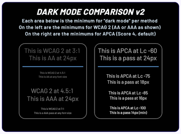
    Andrew also highlights issues with dark mode, where WCAG 2 contrast math “is not capable of providing useful contrast values”. The screenshot he uses to demonstrate the issue is pretty scathing.

    There is often a counter-argument to the use of black text: that it causes too much contrast and can be uncomfortable to read. Andrew’s counter-argument is that it is better to slightly darken the background behind the text, rather than lighten the text itself.


    Prefer longer newsletters? You can subscribe to week11y, fortnight11y or even month11y updates! Every newsletter gets the same content; it is your choice to have short, regular emails or longer, less frequent ones. Curated with ♥ by developer @ChrisBAshton.