Category: dai11y

Accessibility themed newsletter: get your daily dose of a11y.

  • dai11y 18/10/2022

    Your daily frequent11y newsletter, brought to you by @ChrisBAshton:

    accessguide.io

    A handy resource for learning about accessibility guidelines for the web. It covers common design patterns such as saving data after session timeout. It covers how to prevent interesting buggy edge cases such as accidentally hitting a button when trying to scroll past it. And it covers common accessibility problems such as identifying and describing form error messages to users.


    Prefer longer newsletters? You can subscribe to week11y, fortnight11y or even month11y updates! Every newsletter gets the same content; it is your choice to have short, regular emails or longer, less frequent ones. Curated with ♥ by developer @ChrisBAshton.

  • dai11y 11/10/2022

    Your daily frequent11y newsletter, brought to you by @ChrisBAshton:

    Designing Better Inline Validation UX

    Vitaly Friedman writes a lengthy analysis of the different approaches to inline validation.

    There are places where it is useful and non-controversial, e.g. a password strength indicator, where a live feedback mechanism lets you know whether or not your password is strong or weak as you fill in the field.

    Other places are full of nuance. It is difficult to know whether a user has deliberately or accidentally skipped a field, and whether or not they intend to go back to it. At what point do you intervene?

    You could validate on page load, which is a poor experience for users: all error messages by default, until they fill in the form. This is more distracting than helpful.

    Or you could validate on form submit, which is a clear message of intent from the user: “I think I’m finished”. But then the resulting errors can be overwhelming, especially if there are several things the user has to go back and fix.

    Vitaly gives many snippets of general guidance to follow, such as:

    1. Never disabling copy and paste
    2. Validating early when the format is predictable (e.g. if an input must begin with a particular sequence of characters, like a country code at the beginning of an IBAN)
    3. Use the ‘reward early, punish late’ mechanism (don’t show errors by default, but do show an error when leaving the field, if the input is wrong. When the user goes back to fix it, remove the error as soon as the input looks good – NOT waiting until the user leaves the field again).

    Definitely worth a skim!


    Prefer longer newsletters? You can subscribe to week11y, fortnight11y or even month11y updates! Every newsletter gets the same content; it is your choice to have short, regular emails or longer, less frequent ones. Curated with ♥ by developer @ChrisBAshton.
  • dai11y 10/10/2022

    Your daily frequent11y newsletter, brought to you by @ChrisBAshton:

    Website Slammed for Not Allowing Users To Send Emails if They’re Colorblind

    Someone in America who tried sending an email to their township (district/council) was unable to, because the anti-spam measures used on the site was not accessible to colour-blind people.

    It showed a little square box filled with a green colour, and asked the user to select the right colour from a dropdown list. As RealLaurenBoebert wrote: “If you wanted to intentionally design a captcha that would let bots through, and keep colorblind people out, it would look exactly like this.”

    The name of the township is not mentioned, nor is there a link to the web page that contains (or contained) the issue. I imagine the measure would also have been impossible for screen reader users to pass. Let’s hope it’s been replaced with an accessible alternative now.

    This story highlights the risks of rolling out your own anti-spam measures, which require careful consideration to be accessible.


    Prefer longer newsletters? You can subscribe to week11y, fortnight11y or even month11y updates! Every newsletter gets the same content; it is your choice to have short, regular emails or longer, less frequent ones. Curated with ♥ by developer @ChrisBAshton.
  • dai11y 06/10/2022

    Your daily frequent11y newsletter, brought to you by @ChrisBAshton:

    Abbreviations can be problematic

    Martin Underhill writes about the problems of using abbreviations such as NGL (“not gonna lie”) and how inaccessible these cultural shortcuts can be.

    There is an official ‘fix’ for this in HTML: <abbr title="Not gonna lie">NGL</abbr>, but it doesn’t show a tooltip when a touchscreen user touches it, nor is it necessarily exposed in things like RSS feeds. It isn’t always announced to screen reader users, and it isn’t included in the browser’s tab index.

    The best solution is simple: don’t abbreviate, and use the words. Or, if you must use an acronym multiple times, define the first appearance with brackets.


    Prefer longer newsletters? You can subscribe to week11y, fortnight11y or even month11y updates! Every newsletter gets the same content; it is your choice to have short, regular emails or longer, less frequent ones. Curated with ♥ by developer @ChrisBAshton.

  • dai11y 05/10/2022

    Your daily frequent11y newsletter, brought to you by @ChrisBAshton:

    Accessibility Report July 2022

    This is the first ever accessibility report from the Email Markup Consortium, intended to report on the state of a11y in the email industry.

    99.9% out of 35,604 HTML emails tested contain accessibility issues categorised as “Serious” or “Critical”. These emails were from multiple industries, in multiple languages (50% non-English). The testing was performed via the Parcel accessibility checker.

    The main issues were:

    • 86.1% of emails lacked a lang attribute on the first child of the <body> element. Apparently this has to be done (alongside adding to the <html> attribute, which 78.8% of emails lacked) as some email clients strip parts of the code before displaying it.
    • 85.7% of emails lacked a <h1> heading.
    • 78.4% of emails used a <table> for formatting, but did not set their role to presentation or none.
    • 61.6% of emails lacked discernible text for their links (e.g. using an image as a link, but providing no alt attribute for the image).
    • There are several more issues highlighted, each present in 9-45% of all emails.

    Emails are a different beast to the rest of the web, and tend not to get much focus on their accessibility. I’m pleased there is an initiative aiming to change that.


    Prefer longer newsletters? You can subscribe to week11y, fortnight11y or even month11y updates! Every newsletter gets the same content; it is your choice to have short, regular emails or longer, less frequent ones. Curated with ♥ by developer @ChrisBAshton.

  • dai11y 30/09/2022

    Your daily frequent11y newsletter, brought to you by @ChrisBAshton:

    Giving your future self a little credit with progressive enhancement

    This article alludes to the concept of technical credit, which is the antithesis of tech debt. It is the idea that putting in some effort now will make things easier on ourselves in future.

    The article describes the difference between progressive enhancement and graceful degradation, and cites some useful statistics. Around 0.2% of users ‘opt out’ of the modern web by disabling JavaScript. But at least around an extra 0.9% face pages where JavaScript simply fails to load, for whatever reason. These figures are based on a 2013 study run by Government Digital Service. The author re-ran GDS’s experiment and put the figure closer to 3% of users for whom JavaScript doesn’t load.

    The author underlines the fact that these are 3% of visits, not users – so the real figure of ‘how many users fail to get some of your JavaScript?’ is probably much higher. He visualises this with an animated gif of emoji faces, representing users on their journey on your site.

    The article is full of thought provoking soundbites like “An escalator can never break… it can only become stairs”. Worth a read!


    Prefer longer newsletters? You can subscribe to week11y, fortnight11y or even month11y updates! Every newsletter gets the same content; it is your choice to have short, regular emails or longer, less frequent ones. Curated with ♥ by developer @ChrisBAshton.

  • dai11y 28/09/2022

    Your daily frequent11y newsletter, brought to you by @ChrisBAshton:

    Which fonts to use for your charts and tables

    At first glance, this blog post looks like an advert for the website it’s hosted on: Datawrapper. But it’s packed with informative and useful content, and written by Lisa Charlotte Muth – so let’s dive in. Of course, due to the subject area, some of this will be quite subjective. Your mileage may vary.

    The first recommendation is to use sans-serif typefaces as a general rule, as opposed to serif ones which are most useful for long texts such as articles. Sans-serif looks cleaner and is easier to skim. You can still use serif sparingly, such as for the chart title or labels.

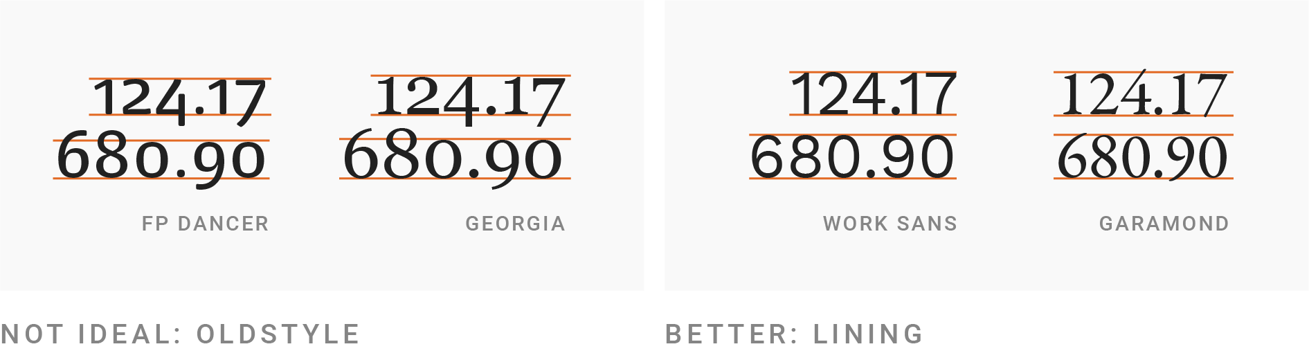
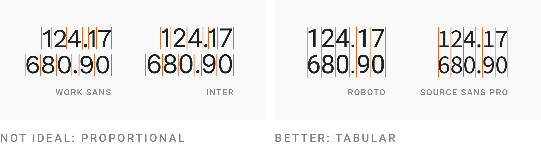
    Next, your font choice should have lining and tabular numbers. Lining numbers all have the same height, whereas ‘old style’ numbers go above/below the line (e.g. the ‘tail’ in the number 9). The picture in the article demonstrates this much more easily than I can describe! Similarly, tabular numbers all have the same width.

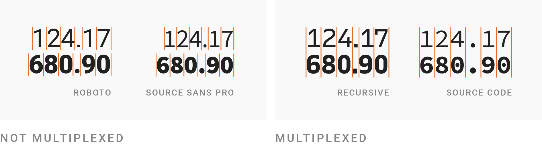
    Going one step further, choose a multiplexed font: one where the height and width of each character is the same regardless of whether the weight of the font is bold. This can be useful for bolding a particular row in a table, whilst still making the table look neat. Bold, by the way, should be used sparingly, to emphasise things.

    There’s a warning about ensuring your chosen font supports all the glyphs you need, such as characters for specific languages (ü ß é). And also a suggestion to choose a font that is not too wide nor too thin, though it then links to some well-known exceptions to the rule, so don’t take that as gospel.

    Only at the halfway point is WCAG mentioned, followed by advice about ensuring your text is big enough and has a high enough contrast. Some specific sizes and ratios are given, if you’re unfamiliar.

    Finally, there’s a note about using UPPERCASE text sparingly, and the often unwanted side-effect of said text becoming much wider than before. This can be corrected through a three step process: spacing out the letters more (called ‘tracking’ or ‘letter-spacing’), decreasing the font size to make it shorter, and then making the text bolder to aim for the same letter stroke width as the original text.


    Prefer longer newsletters? You can subscribe to week11y, fortnight11y or even month11y updates! Every newsletter gets the same content; it is your choice to have short, regular emails or longer, less frequent ones. Curated with ♥ by developer @ChrisBAshton.

  • dai11y 27/09/2022

    Your daily frequent11y newsletter, brought to you by @ChrisBAshton:

    Better accessible names

    Hidde de Vries shares some great tips for naming your labels and aria-labels:

    • Describe what the thing does, rather than what it looks like, e.g. “Next slide” vs “Arrow right”
    • Frontload the most unique part of the thing, e.g. in a list of albums, use “Midnight Marauders – Album” over “Album – Midnight Marauders”
    • Be concise: 1-3 words is ideal
    • Avoid roles, e.g. use “Close” instead of “Close button”, as the role will be announced by screen readers anyway
    • Keep names unique, e.g. “See also: [name of page]” vs “Click here”
    • Start names with a capital letter, and don’t end with a period – names aren’t sentences. This should lead to better pronunciation by screen readers.

    Prefer longer newsletters? You can subscribe to week11y, fortnight11y or even month11y updates! Every newsletter gets the same content; it is your choice to have short, regular emails or longer, less frequent ones. Curated with ♥ by developer @ChrisBAshton.

  • dai11y 23/09/2022

    Your daily frequent11y newsletter, brought to you by @ChrisBAshton:

    Improving accessibility with accessibility acceptance criteria

    A GOV.UK blog post from 2018, describing GDS’s use of ‘acceptance criteria’ for accessibility testing.

    These criteria are more specific than general WCAG guidance, and concentrate on specific checks to make at the component level for specific components. For example, GDS’ accessible autocomplete component must:

    • be focusable with a keyboard
    • enable the user to navigate the available matches using touch or keyboard
    • inform the user when a match is selected
    • inform the user which number the currently selected match is – for example, 1 of 3 (optional)
    • inform the user if a match is pre-selected
    • …and so on

    These criteria are a way of recording decisions made early on in development, and provide a sense check against making breaking changes when iterating the component in future. They also serve to raise awareness of accessibility issues from the start.

    To write criteria such as these, start with accessibility needs by identifying where there is a high risk of introducing an accessibility barrier, and documenting how to prevent it. The hard work has often already been done in the WCAG guidelines, so extract rules pertaining to what you’re building, and link back to the guidelines for context.

    Criteria are most useful when they’re specific and testable. Don’t be too generic. Also avoid defining the solution; describe an outcome instead.

    Continue to refine your criteria over time, e.g. when encountering bugs, add further criteria and treat them like a failing unit test.


    Prefer longer newsletters? You can subscribe to week11y, fortnight11y or even month11y updates! Every newsletter gets the same content; it is your choice to have short, regular emails or longer, less frequent ones. Curated with ♥ by developer @ChrisBAshton.

  • dai11y 22/09/2022

    Your daily frequent11y newsletter, brought to you by @ChrisBAshton:

    Mac VoiceOver Testing the Simple Way

    Scott Vandehey writes about a familiar problem: getting comfortable testing with VoiceOver. It’s an experience that can make new users feel, as he puts it, “overwhelmed”.

    The first issue is with enabling VoiceOver; Scott could never remember the CMD + F5 keyboard shortcut. On newer MacBooks, Scott recommends triple-clicking the TouchID button instead, which is the shortcut for opening the Accessibility Shortcuts panel, from which you can enable VoiceOver.

    To avoid having to go via the panel, you can also go to System Preferences -> Accessibility -> Shortcut and uncheck everything except VoiceOver. This means triple-clicking the TouchID button will immediately enable VoiceOver.

    As Scott only uses VoiceOver for testing, he uses the visual caption panel instead of listening to the speech, which he has muted by opening the VoiceOver Utility -> Speech -> Mute speech.

    With VoiceOver configured, Scott’s approach to testing is to TAB through all the content on the page, which doubles up as a test that all appropriate elements are reachable and have focus styles. This approach commonly reveals issues with lack of context around interactive elements, e.g. a button that simply says “Menu”.

    Next, Scott uses the Rotor to show a list of particular items in the page, such as headings and links. This is a useful way to check page structure and to ensure that all links have enough description.

    Finally, using VO + →, Scott reads the entire content of the page. He acknowledges most screen reader users won’t do this, but it often brings up some little surprises.


    Prefer longer newsletters? You can subscribe to week11y, fortnight11y or even month11y updates! Every newsletter gets the same content; it is your choice to have short, regular emails or longer, less frequent ones. Curated with ♥ by developer @ChrisBAshton.