Category: dai11y

Accessibility themed newsletter: get your daily dose of a11y.

  • dai11y 09/02/2023

    Your daily frequent11y newsletter, brought to you by @ChrisBAshton:

    “I Used The Web For A Day…” series

    I said earlier that I’d written some articles for Smashing Magazine in the past. As this issue is a Smashing Mag special, I thought I’d share those articles with you now! Mine was a short series on using the web for a day, but with a limitation: to highlight barriers to accessibility and provide tips on how to build a better web.

    You can read the articles below:


    Prefer longer newsletters? You can subscribe to week11y, fortnight11y or even month11y updates! Every newsletter gets the same content; it is your choice to have short, regular emails or longer, less frequent ones. Curated with ♥ by developer @ChrisBAshton.
  • dai11y 08/02/2023

    Your daily frequent11y newsletter, brought to you by @ChrisBAshton:

    When CSS Isn’t Enough: JavaScript Requirements For Accessible Components

    Stephanie Eckles shares those scenarios where you need a sprinkling of JavaScript to make components accessible. The TLDR is that these include “tooltips, modals, tabs, carousels, and dropdown menus”. Components marketed as “CSS-only”, that use methods like the “checkbox hack“, often do more harm than good.

    As a quick sense check, ask yourself the following:

    • Does the feature include showing and hiding of content? If so, you need JS to at minimum “toggle aria and enable closing on Esc
    • Is the natural focus order the most ideal? “If the natural order loses the relationship between a trigger and the element it triggered, or a keyboard user can’t even access the content via natural tab order, then you need JS to assist in focus management”
    • Does the effect rely on hover and/or focus? You may need JS to make an alternative solution “for touch screen users and those using desktop zoom of 200%+ or magnification software”

    Tooltips should be used as a last resort. Ask yourself why you’re adding this text to the UI, and where else it could go. But if you do use one, make sure it’s dismissable without moving hover or focus, that its contents can be hovered without it disappearing, and that it doesn’t disappear based on a timeout.

    Modals, as we’ve covered in previous frequent11y issues, would ideally be implemented with a HTML native <dialog> element, but it isn’t currently accessible. Custom solutions need JS because it should be dismissable with the Esc key, and the keyboard focus should be trapped inside. As to what to focus on when opening the modal, Stephanie’s presented a decision tree.

    Tabs need to toggle aria-selected to true for the current tab, create a roving tabindex to “distinguish tab selection from focus”, and move focus by responding to arrow key events, all of which require JavaScript. NB: a roving tabindex is a way of programmatically controlling the focus order of elements, e.g. by setting the selected tab to tabindex="0" and all the others to -1.

    Dropdown menus need JS, even though we now have CSS’s :focus-within property, because we still need to toggle aria-expanded, be able to close the open menu button with Esc and implement arrow keys for navigating between menu items.

    Carousels are notoriously considered a bad design pattern, but if you’re going to build one, you’ll need JS to provide paginated and prev/next controls, as well as auto play.


    Prefer longer newsletters? You can subscribe to week11y, fortnight11y or even month11y updates! Every newsletter gets the same content; it is your choice to have short, regular emails or longer, less frequent ones. Curated with ♥ by developer @ChrisBAshton.

  • dai11y 07/02/2023

    Your daily frequent11y newsletter, brought to you by @ChrisBAshton:

    Accessible Front-End Patterns For Responsive Tables (Part 1)

    Adrian Bece writes two in-depth articles about implementing responsive tables.

    He shares Adrian Roselli’s JavaScript snippet that applies the correct ARIA roles to table elements, which are to ensure that browsers continue to keep good table semantics even when certain CSS styles are applied. The snippet is from 2018, but an update in December 2022 suggests it is still needed for Safari. Note that the JS itself isn’t needed, but the resulting markup, which you could add to your HTML manually or in a preprocessor.

    Tables should have a <caption> element as the first child, with a nested heading describing the contents of the table. If it can’t be the first child – e.g. because you’ve added a wrapper element to make the table scrollable – you’ll need to include the table in a <figure> element, use a <figcaption> for the title, and apply a aria-labelledby to the table’s wrapper.

    Small / simple tables can be made neatly responsive with table { width: fit-content }, to remove any unnecessary space when viewing on larger screens. For tables with lots of columns, it becomes necessary to horizontally scroll, by applying an overflow: auto to the wrapper element, alongside a tabindex="0" to make it usable for keyboard users.

    Some OS’s hide scrollbars by default (I’m looking at you, macOS!), so you may want to consider adding a shadow gradient to indicate the table is scrollable. With background-attachment: local, local, scroll, scroll;, you can subtly hide and show the shadow on either ‘edge’ of the table depending on the direction you scroll. Another visual cue to let the user know a table is scrollable is to force a crop of the last visible column. You may want to consider making the table headers sticky, to keep them in view as you scroll.

    Adrian then discusses the stacking approach; useful for tables where the data isn’t supposed to be ‘compared’, e.g. a table of people and their contact information. In the demo, each ‘row’ gets pulled into its own ‘block’ on smaller screens. But this can make pages very tall on mobile. An alternative is the accordion pattern, where you may choose to only show the primary data column (e.g. user’s name) on smaller screens, with a button to expand and reveal the other columns as needed (see demo). Another space-saving option is to give users the ability to show/hide columns.

    In Part 2, Adrian looks at patterns for much larger tables, including how to improve their rendering performance by either paginating the results, virtualising the rendering (i.e. keeping the table in memory but only rendering the number of DOM nodes you need in view), or exploring the CSS contain: strict property. Adrian also touches on JavaScript libraries for enhancing tables, and some other special use cases such as rendering calendars.


    Prefer longer newsletters? You can subscribe to week11y, fortnight11y or even month11y updates! Every newsletter gets the same content; it is your choice to have short, regular emails or longer, less frequent ones. Curated with ♥ by developer @ChrisBAshton.

  • dai11y 06/02/2023

    This week is a Smashing Magazine special! It’s a great publication – which I’ve written for a few times – and I’ve had some of their a11y articles sitting in my bookmarks for a while. These articles are long and full of useful info, so it’s sure to be a bumper week. Let’s dive in!

    Making Sense Of WAI-ARIA: A Comprehensive Guide

    An article by Kate Kalcevich, Head of Accessibility Innovation at Fable. She recaps how HTML is parsed into two structures: the DOM and the Accessibility Tree. Assistive technologies access the accessibility tree nodes to understand the element role, state and name. Native HTML elements such as <input> populate both structures automatically, but custom components made up of <div>s and <span>s need extra markup to fill the accessibility tree properly. This markup is called ARIA (Accessible Rich Internet Applications).

    ARIA gives extra information about an element, but doesn’t give extra behaviour. For example, adding role="button" to a div won’t make it respond when you press the Enter key, but it does tell the accessibility tree what it’s claiming to be. The ARIA Authoring Practices Guide includes a list of what interactivity should be added to various components such as accordions, buttons, carousels, and the MDN web docs has a complete list of available roles.

    Kate cherry-picks some key ARIA states and properties:

    • aria-checked ("true" or "false") to indicate whether checkboxes and radio buttons are currently checked
    • aria-current ("true" or "false") to indicate the current page within breadcrumbs or pagination
    • aria-describedby – used with the id of an element containing extra information for a form field beyond just its label, e.g. examples of the required format for a field
    • aria-expanded ("true" or "false") to indicate if pressing a button will show more content (e.g. accordion)
    • aria-hidden ("true" or "false") to hide something that is visible, but you don’t want assistive technology users to know about it, e.g. a card component with image and text linking to the same place, but structured as two links; use aria-hidden="true" on one of the links.
    • aria-required ("true" or "false") to indicate if a form element has to be filled out before the form can be submitted

    And Kate rattles off some of the most common ARIA-related mistakes:

    • Using an aria-labelledby attribute with an ID that doesn’t exist
    • Adding roles unnecessary (<button role="button">)
    • Using child roles without parent roles (e.g. <li role="option"> without a direct parent with role="listbox")
    • Using role="menu" for navigation; it’s intended for things like custom menus on right click, not for general site navigation, which is more of a table of contents than a menu. For the latter, use <nav aria-label="Main menu">. Read Heydon Pickering’s Building Accessible Menu Systems for more.

    Finally, there’s a section on focus management, how to validate ARIA, and resources for frameworks and component libraries.


    Prefer longer newsletters? You can subscribe to week11y, fortnight11y or even month11y updates! Every newsletter gets the same content; it is your choice to have short, regular emails or longer, less frequent ones. Curated with ♥ by developer @ChrisBAshton.

  • dai11y 27/01/2023

    Your daily frequent11y newsletter, brought to you by @ChrisBAshton:

    PlayStation debuts highly customisable controller for gamers with disabilities at CES

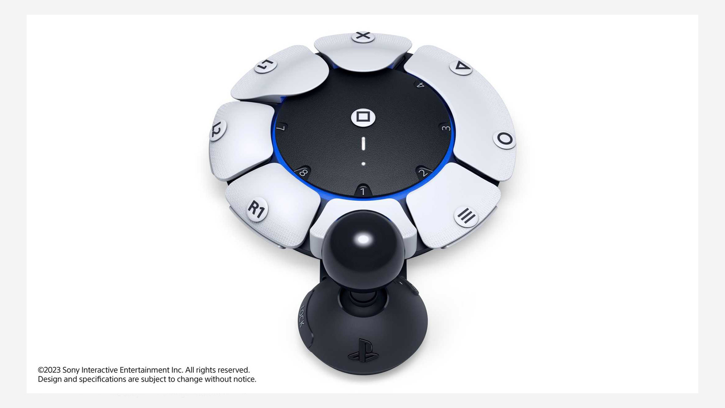
    Sony has unveiled an adaptable PlayStation controller, dubbed “Project Leonardo”. It is designed for gamers with limited motor control, who may not be able to hold the traditional controller.

    The article does a great job at summarising what’s unique about the controller:

    The controller consists of a circular gamepad that was designed to lay flat on a table or wheelchair tray, which is equipped with eight interchangeable buttons plus a joystick that can be rotated around this central module.

    The controller also comes with a kit of swappable components, allowing the shape, size and positioning of both the buttons and the joystick to be adapted to the personal needs and preferences of the user.

    The controller’s software is equally adaptable, allowing gamers to program multiple buttons with the same function, the same button with multiple functions or their preferred north orientation for the joystick.

    These settings can be stored in distinct button control profiles, with users able to switch between up to three profiles per console.

    It can also be used with a second Project Leonardo controller and one of the PS5’s wireless DualSense controllers, with all three able to act together as a single device.

    PlayStation is currently gathering feedback on the controller, meaning no release date or price has been set to date. The company’s announcement comes nearly five years after Microsoft released the Adaptive Controller for its Xbox console.

    Circular controller surrounded by 8 buttons, rather like a clock face. The buttons appear to be removable and modular, each with a different label, such as "X" or "R1". Attached to the controller is a joystick.
    The Project Leonardo controller. More pictures are available in the article.

    Prefer longer newsletters? You can subscribe to week11y, fortnight11y or even month11y updates! Every newsletter gets the same content; it is your choice to have short, regular emails or longer, less frequent ones. Curated with ♥ by developer @ChrisBAshton.

  • dai11y 25/01/2023

    Your daily frequent11y newsletter, brought to you by @ChrisBAshton:

    Comparing Manual and Free Automated WCAG Reviews

    Adrian Roselli looks at the homepage for a “popular site” and performs a manual review against the WCAG 2.1 A and AA standard, using “bookmarklets, assorted contrast checkers, dev tools, and assistive technology”, including “screen reader pairings of Chrome/JAWS, NVDA/Firefox, and VoiceOver/Safari on desktop”. He then runs the page through the following automated checkers:

    • axe DevTools v4.47.0 browser extension (using axe-core v4.6.2) for Chrome and Firefox
    • ARC Toolkit v5.4.2 browser extension for Chrome
    • WAVE Evaluation Tool v3.2.2.0 browser extension for Chrome and Firefox
    • Equal Access Accessibility Checker (EAAC) v3.1.42.9999 browser extension for Chrome and Firefox
    • NB, Adrian did not include Microsoft Accessibility Insights or Google Chrome Lighthouse because they use axe-core, the same engine as axe DevTools.

    He compares the results in detail, but the result is clear:

    In my manual review I found almost seven-and-a-half times (7½×) more issues than the tool with the next highest set of found issues across three times (3×) as many Success Criteria.

    Adrian is clear to say that using automated checkers isn’t a bad thing. Using them as a ‘first pass’ against your site can help flag some of the basics and allow you to then concentrate on more nuanced issues. But his concern is that “too many managers, bosses, stakeholders, and even testers, may do no more than run a free automated tool against a site or page and consider that sufficient”.

    For further reading, check out this GOV.UK blog post from 2017 that performed a similar experiment.


    Prefer longer newsletters? You can subscribe to week11y, fortnight11y or even month11y updates! Every newsletter gets the same content; it is your choice to have short, regular emails or longer, less frequent ones. Curated with ♥ by developer @ChrisBAshton.

  • dai11y 24/01/2023

    Your daily frequent11y newsletter, brought to you by @ChrisBAshton:

    Top 10 Accessibility News of 2022

    This is a round-up of last year’s “most talked about” accessibility news stories, brought to you by Equal Entry (who also have a newsletter you should subscribe to!).

    I won’t regurgitate the whole list, which is quite US-centric, but there are some interesting items that were actually completely new to me. It’s amazing how these passed me by, even while I put a fair chunk of my life into writing these newsletters!

    • Meetup.com added an accessibility overlay, receiving a lot of negative feedback from the WordPress and accessibility communities. It later removed the overlay.
    • Apple added Door Detection to iOS, to “help those who are blind or have low vision locate a door, know how far they are from it, and hear the door attributes. The user will know if the door is open or closed and whether they can open it by pulling, pushing, or turning a knob”.
    • Microsoft created Adaptive Accessories; a large range of mix and match inputs to replace or complement the traditional mouse and keyboard. Follow the link to see pictures of the accessories.
    • The Speech Accessibility Project was launched to improve speech technology for people with speech impediments and different speech patterns. It is being led by the University of Illinois Urbana-Champaign with support from industry heavyweights Amazon, Apple, Google, Meta and Microsoft.

    Spoiler alert: the top news story was Elon Musk’s takeover of Twitter and the subsequent firing of Twitter’s accessibility team.


    Prefer longer newsletters? You can subscribe to week11y, fortnight11y or even month11y updates! Every newsletter gets the same content; it is your choice to have short, regular emails or longer, less frequent ones. Curated with ♥ by developer @ChrisBAshton.

  • dai11y 20/01/2023

    Your daily frequent11y newsletter, brought to you by @ChrisBAshton:

    What we learned from our first accessibility conformance review

    Hidde de Vries writes about reviewing ‘Sanity Studio‘, a headless CMS, for accessibility. Hidde, who works for the studio, started by comparing the different accessibility guidelines, such as WCAG.

    There is actually a different standard for authoring apps: the Authoring Tool Accessibility Guidelines (ATAG). This “seemed like the obvious choice”, but the tool doesn’t create “web content” as defined by the WCAG. WCAG defines web content as HTML or PDF or similar, whereas Sanity stores the content as data.

    ATAG also doesn’t come with an evaluation methodology like the WCAG Evaluation Method (WCAG-EM), and doesn’t map to VPAT (“a format used to compare accessibility in the US and Europe”). Therefore, they decided to evaluate against WCAG Level A + AA, following WCAG-EM.

    We created the WCAG conformance audit with Eleventy WCAG Reporter and, once we had that, used the OpenACR Editor to create a VPAT(-like) report in HTML.

    Other complications included deciding the scope of the audit. For a highly customisable application that can accept lots of plugins, how far do you evaluate? They opted for a minimally customised and representative site that they use for client demonstrations.

    The end result was an audit covering 50 Success Criteria, of which 36 were satisfied. The remaining had issues identified, which is a “list of opportunities to improve accessibility in the Studio”.

    The article ends with a link to Collaboration Tool Accessibility User Requirements, which is a W3C working draft of guidelines for making real time collaboration more accessible.


    Prefer longer newsletters? You can subscribe to week11y, fortnight11y or even month11y updates! Every newsletter gets the same content; it is your choice to have short, regular emails or longer, less frequent ones. Curated with ♥ by developer @ChrisBAshton.

  • dai11y 19/01/2023

    Your daily frequent11y newsletter, brought to you by @ChrisBAshton:

    Google’s ‘Guided Frame’ helps visually impaired users shoot better pictures

    This article has been in my bookmarks since the Pixel 7 launch event on October 6th, 2022. Google announced “a number of features” including:

    • Guided Frame, which is a “voice coach that will tell users where to hold their phones in order to, for instance, take a selfie”. It directs you to move the phone up, down, or to the side, and automatically triggers the shutter when the AI believes you’re in shot.
    • True Tone, which is the result of Google teaming up with photographers and artists of color “to help ensure that photos are accurate and representative of everyone’s skin tone”.

    Prefer longer newsletters? You can subscribe to week11y, fortnight11y or even month11y updates! Every newsletter gets the same content; it is your choice to have short, regular emails or longer, less frequent ones. Curated with ♥ by developer @ChrisBAshton.

  • dai11y 17/01/2023

    Your daily frequent11y newsletter, brought to you by @ChrisBAshton:

    5 takeaways from screen reader usability interviews

    Frontend developer Jess Budd shares five things they’ve learned from user testing with screen reader users.

    1. “None” of the users interviewed used the tab key as their primary means of navigation – perhaps unlike the way many of us do manual testing! They’d typically bring up a list of all links or headings instead, and jump straight to the interesting bit.
    2. When asked to navigate to the homepage, none of the interviewees used the company logo in the top left corner, as most sighted users would. Instead, they searched for a link announced as “Home”. Side note: the alt text for the company logo should describe the functionality of the link, rather than the image itself, i.e. “Home” instead of “YourCompany”.
    3. Many of the users, upon bringing up a list of links, would type a letter to narrow the list down, e.g. “c”, looking for the contact page. So if your company has gone for more informal language, e.g. “Get in Touch!”, it will make it harder for screen reader users to find what they’re looking for.
    4. None of the interviewees made their browser window full screen. By default, the browser window only took up a portion of monitor space, giving the mobile styling and behaviour. We can’t assume people are experiencing our desktop layouts just because they’re not on a mobile.
    5. None of the interviewees use skip links. They have other, more efficient means at their disposal, and they say that skip links often don’t work well because it doesn’t always change the keyboard focus. This is one of those cases where skip links are often more useful for sighted users, even if we might be tempted to think otherwise.

    Prefer longer newsletters? You can subscribe to week11y, fortnight11y or even month11y updates! Every newsletter gets the same content; it is your choice to have short, regular emails or longer, less frequent ones. Curated with ♥ by developer @ChrisBAshton.